Graphic
Holly Craig Be Picky
-
Tauira / Student
Holly Craig -
Kaiako / Lecturers
Marcos Mortensen Steagall, Fiona Grieve
-
School
AUT Art + Design 2025
Description:
The growing concern over gut health has become increasingly prominent in modern society, particularly among youth communities. Recent studies have shed light on a noticeable decline in human gut health, largely attributed to the diminishing presence of probiotic-rich foods in our diets. This decline not only impacts our quality of life but also carries a host of other health implications. However, this downward trend can be countered by increasing our consumption of beneficial bacteria and probiotics, commonly found in fermented foods like pickles.
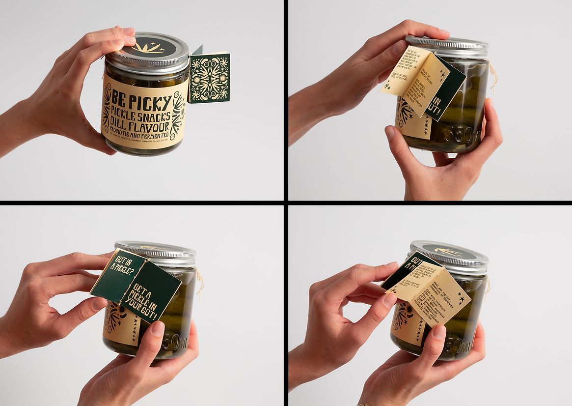
Gut in a pickle? Get a pickle in your gut!
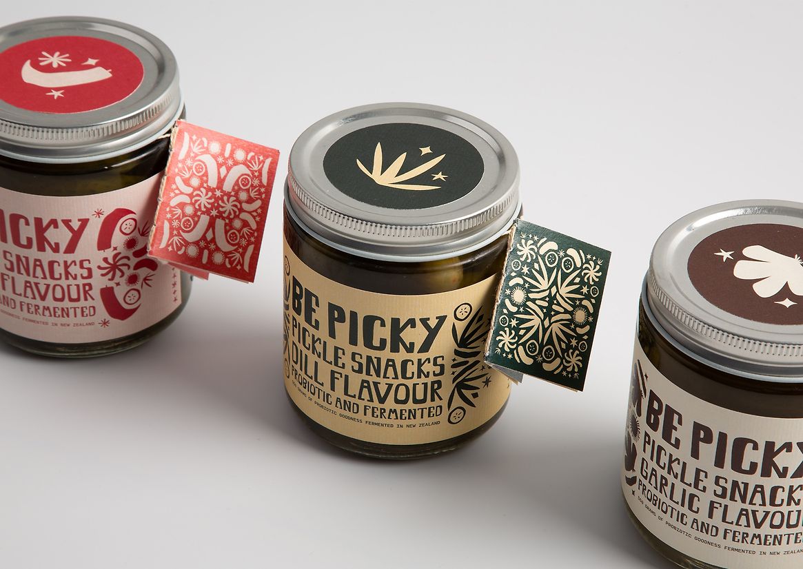
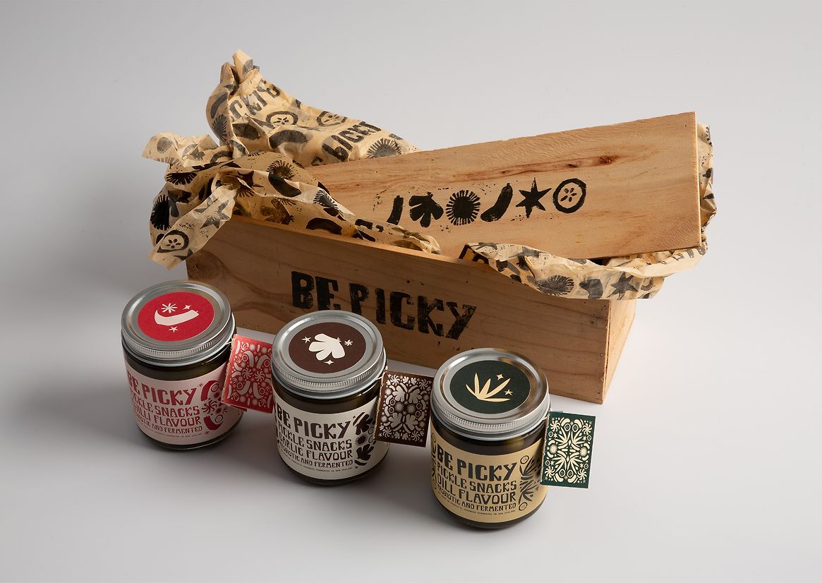
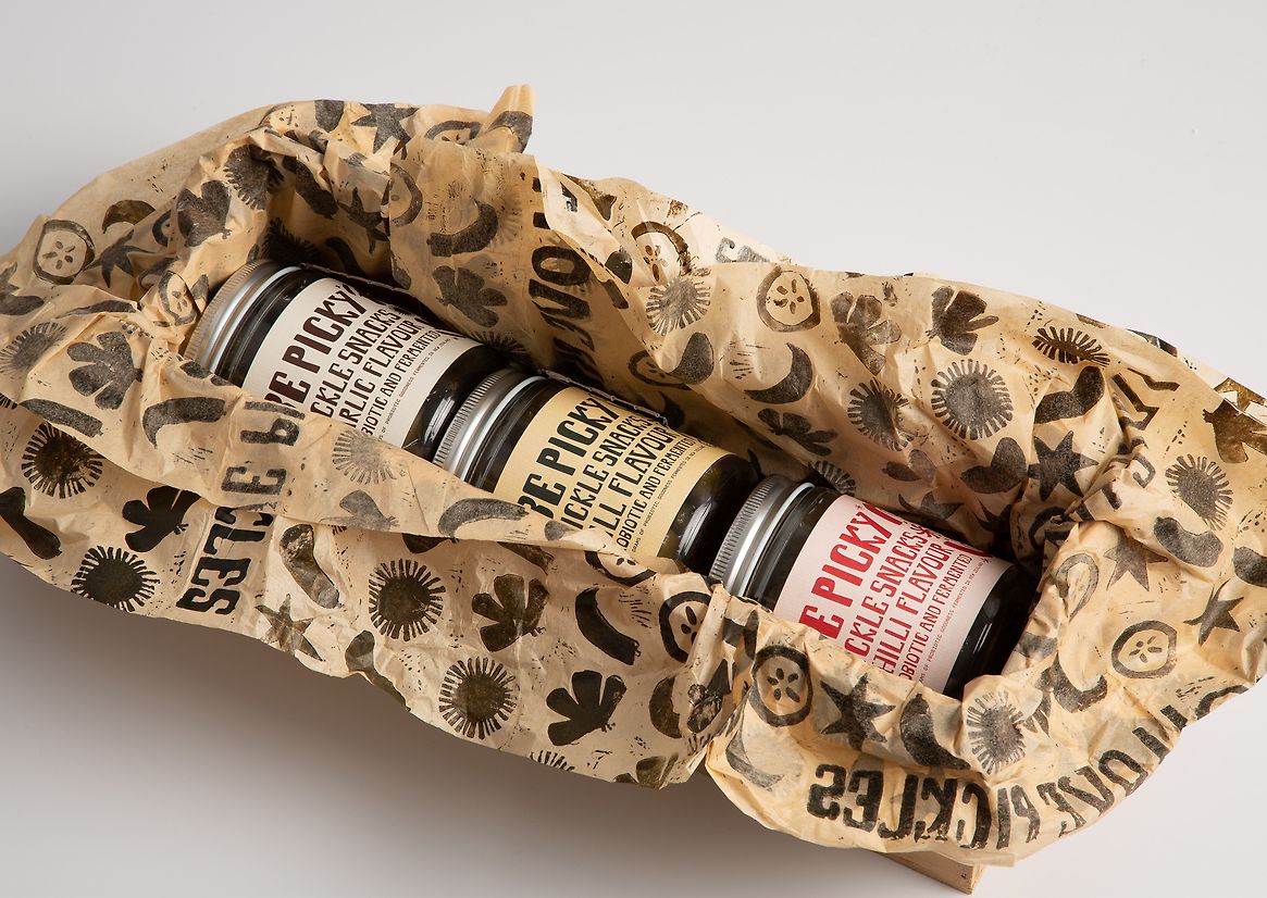
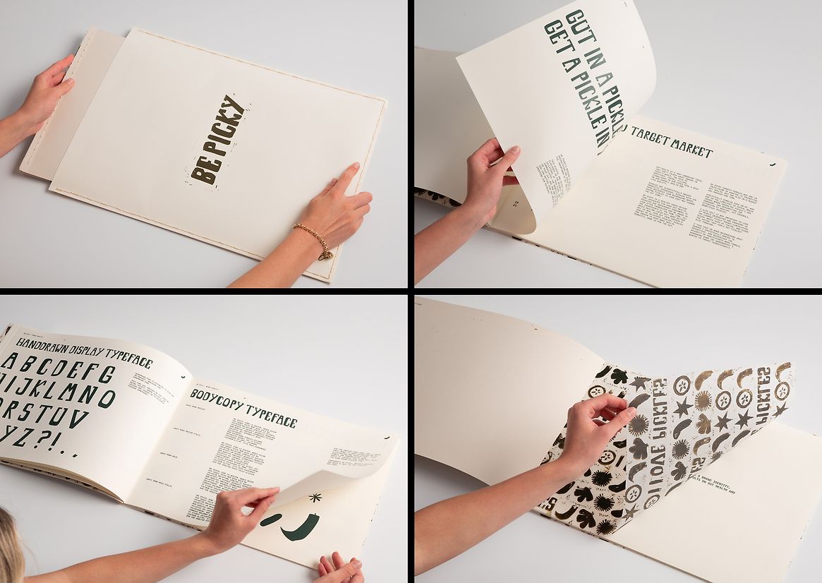
Be Picky is a healthy snack brand option that advocates for good gut health, by educating and encouraging consumers to make healthier food choices. Centred around the message of “being picky”, it is made up of a trio of different flavoured pickles to provide a healthy snack alternative, all while healing your gut. Each flavour comes equipped with a working attachment to inform and educate on the benefits of gut health, and the pivotal role pickles play in achieving it. Targeted at the young female demographic of Aotearoa, Be Picky strategically taps into the current trend of "hot girls eat pickles," aiming to empower young adults to enhance their health in a lively, advantageous, and educational manner.
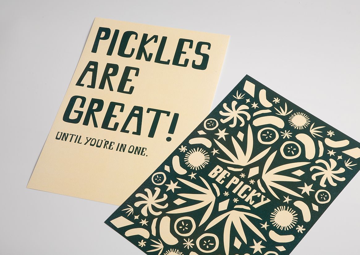
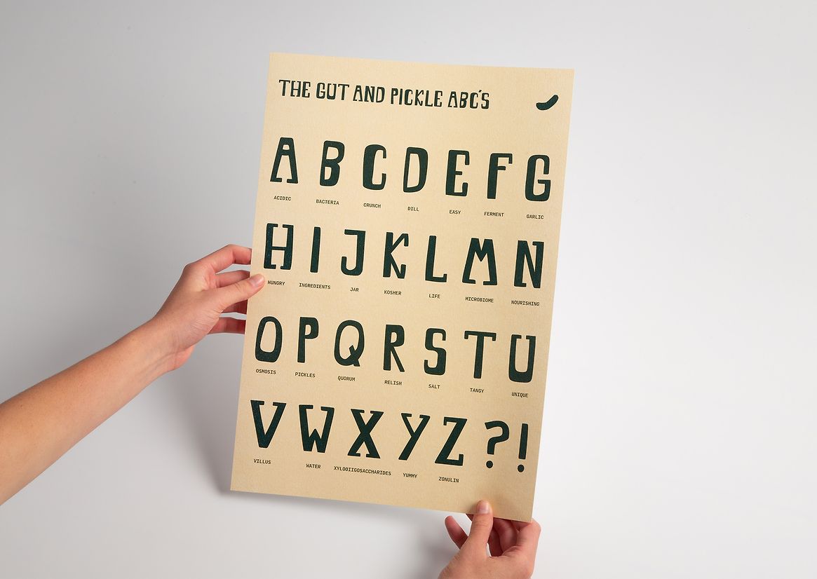
In order to create a working, fun and engaging brand identity it was designed a display font to actively display being picky. The organic nature of this font symbolises the importance of imperfection in our foods, and to stray away from artificial additives commonly found in our everyday diets. Leveraging this font, it was created a series of design collateral to back up the pickles and create an engaging brand to capture the target audience in a fun way.
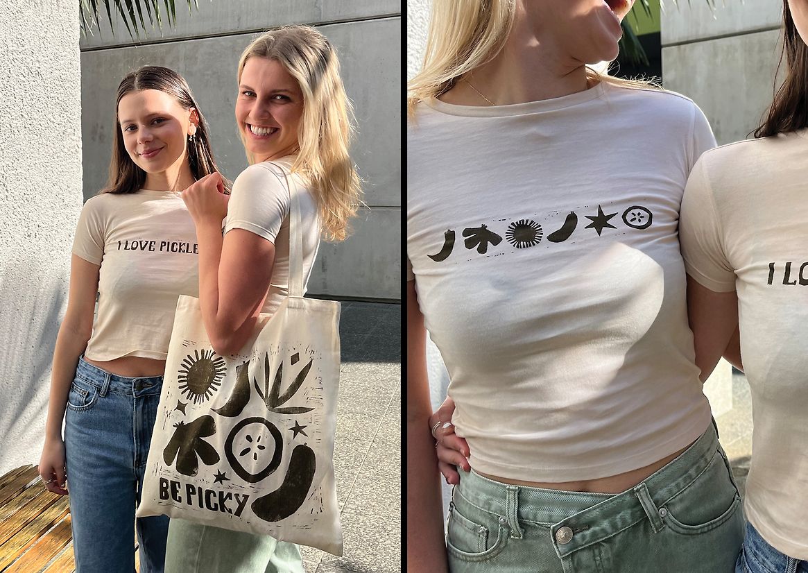
Reusable grocery bags were designed to be a healthy reminder, “what goes in the bag, goes in your gut” made to emphasise how crucial decisions for your gut start in the supermarket. The creation of baby tees in this project were designed to add a playful element, and are a popular fashion trend amongst young females to date. A light-hearted way to grasp the target audience's attention.
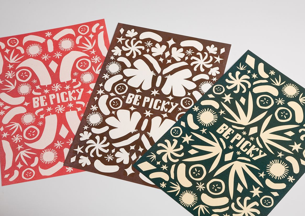
A series of six posters were created to raise conversation on the topic of gut health, including three illustrative posters displaying the ingredients to each flavour and typographic posters that infuse fun language into a series of serious conversations. The posters will be displayed in popular public areas to spark conversation and questions.
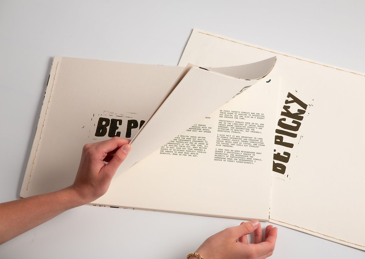
The educational attachments on the jars were handbound, while the grocery bags were crafted through linocut printing, and the baby tees were hand-dyed in coffee before also being linocut printed. These practices were emphasised in efforts to stay true to Be Picky’s core values.
Judge's comments:
A great example of cohesive design working across a lot of touchpoints, pushing a branding system further than was expected. A strong, singular, cleverly written message that felt clear and cohesive. High level of execution that felt grassroots and organic.