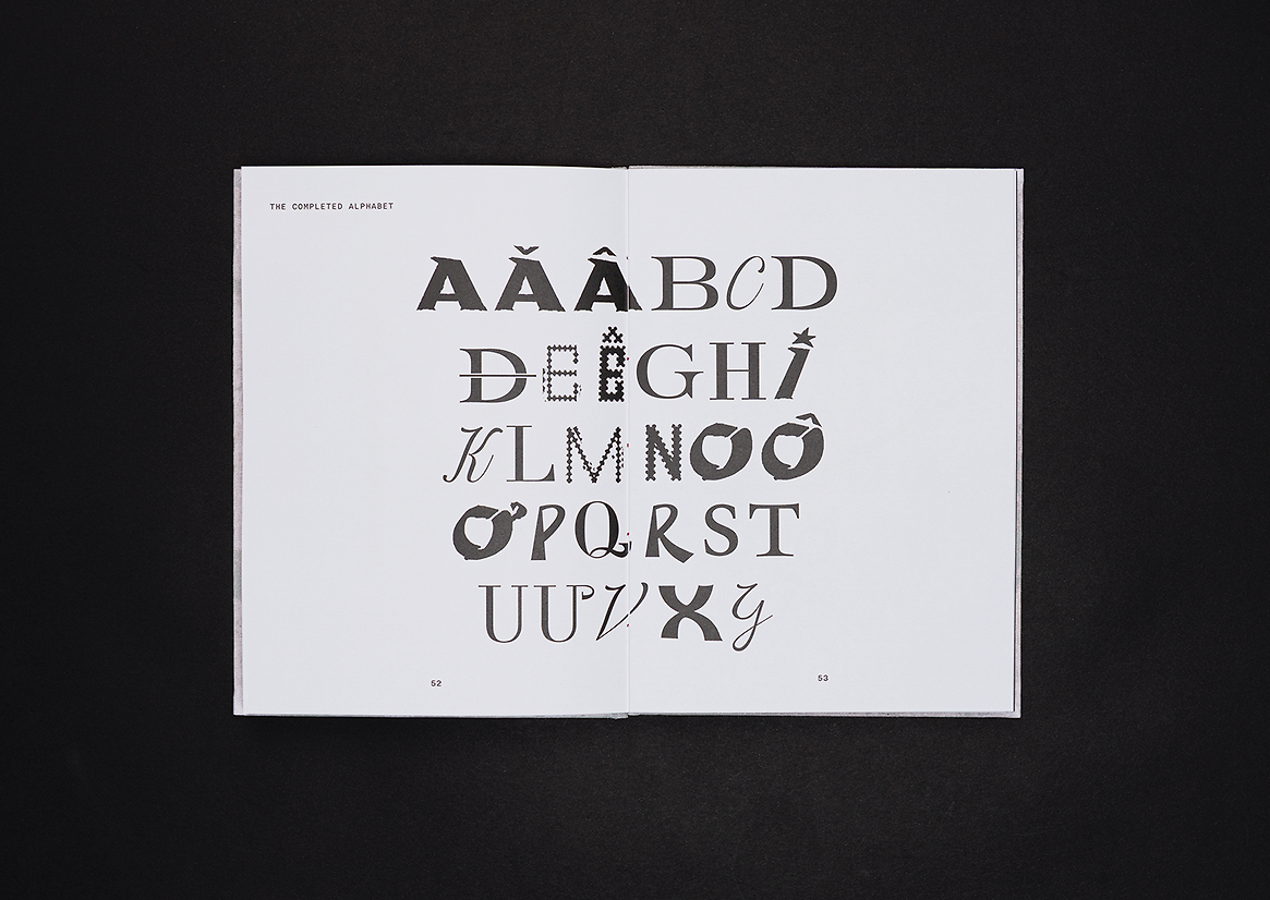
Nam Type is an autoethnographic study and collection of Vietnamese letterforms from the French colonial period. The project visually examines themes of cultural ancestry, tradition, and identity through typographic and editorial design. The result is a decorative collection of 29 Vietnamese letterforms with diacritics, inspired by historical initial letters and illuminated manuscripts. The work plays as a graphic dialogue through a personal narrative investigation; it curates and celebrates letterforms, reinterpreting them to illuminate the cultural fusion that defined this significant period. Nam Type aims to honour the complexities of Vietnam’s history and heritage through control and resistance, paying tribute to those who have fought and preserved the nation’s graphic language and the future they have shaped.
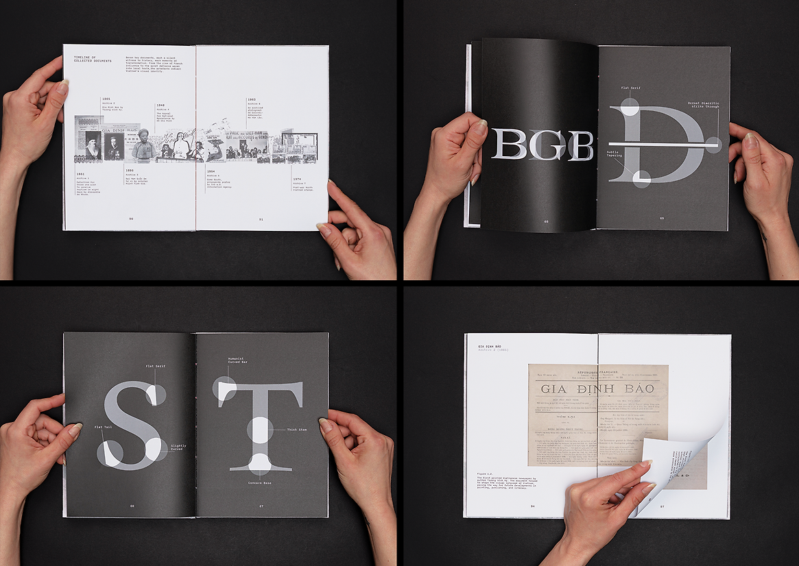
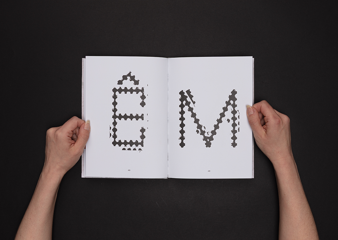
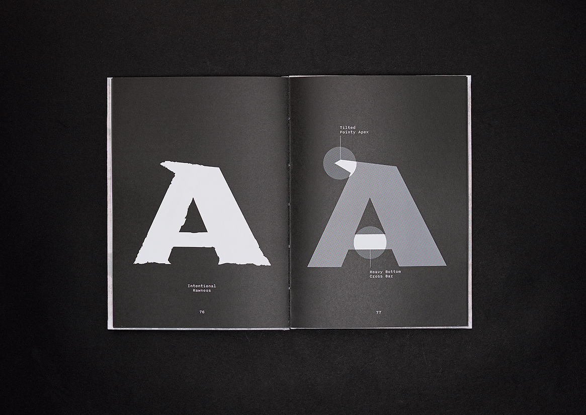
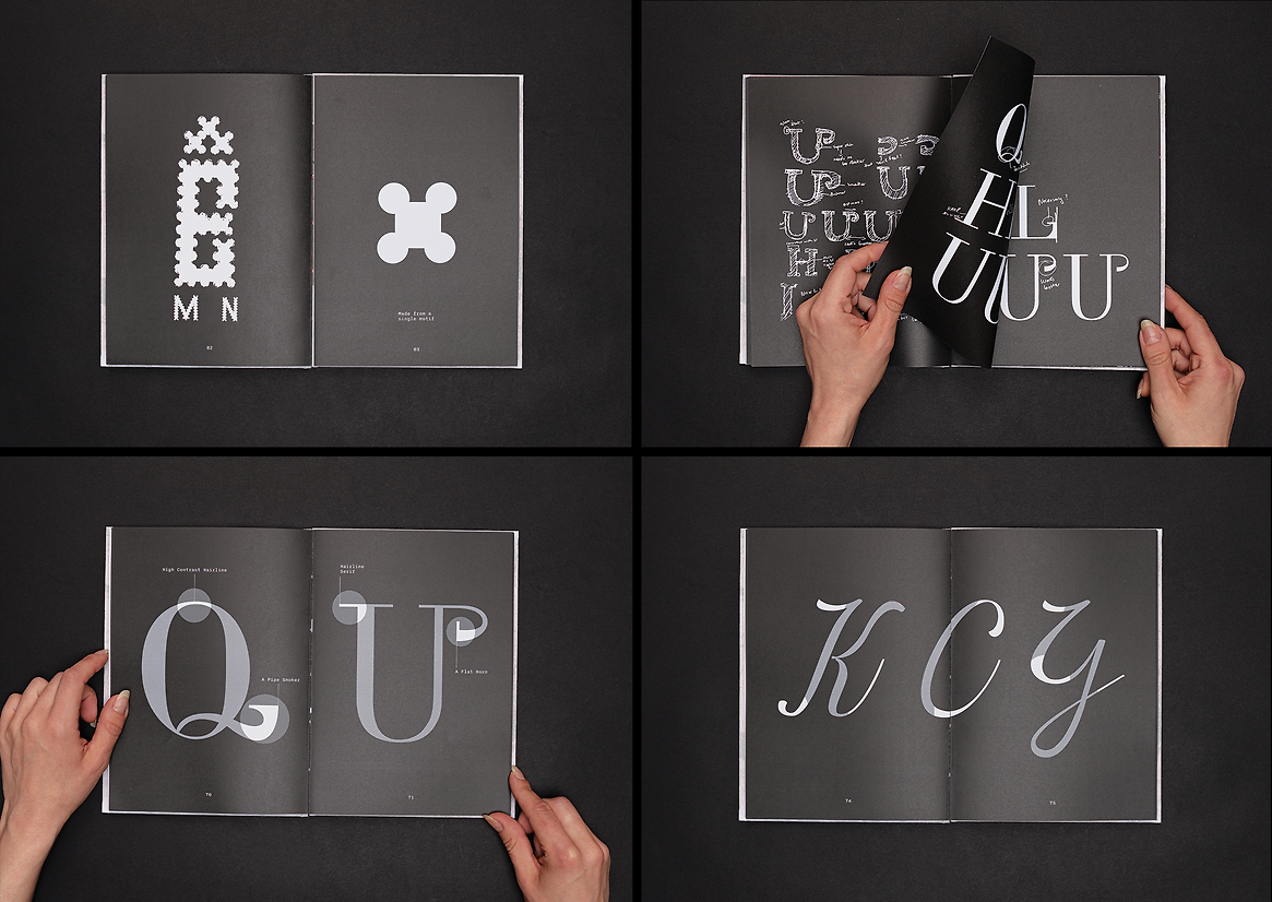
This collection of letterforms were designed to convey the vibrant history of Vietnam through visual language, reflecting the dynamic fusion of styles that characterise its cultural evolution. The project culminated in seven groups of mixed letterforms, each derived from seven historical documents. The set of letterforms was described in the final publication as blending Latin characters with Vietnamese diacritics as a testament to the cultural fusion that defined and shaped the nation’s visual language. Every type, property, curve, and terminal were examined in detail to find the most distinct characteristic, then further explored and applied to the rest of each letterform group. While each group possesses its fundamental features, they seamlessly integrate through careful kerning and alignment in glyph creation, ensuring precise dimensions and coherence in design.
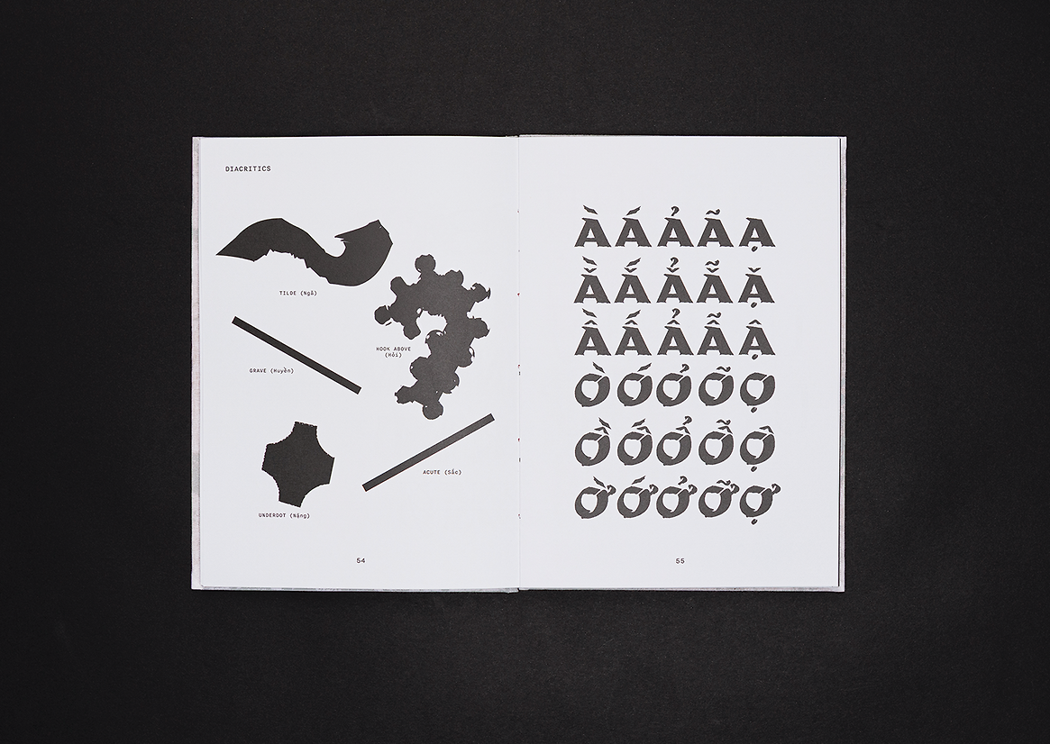
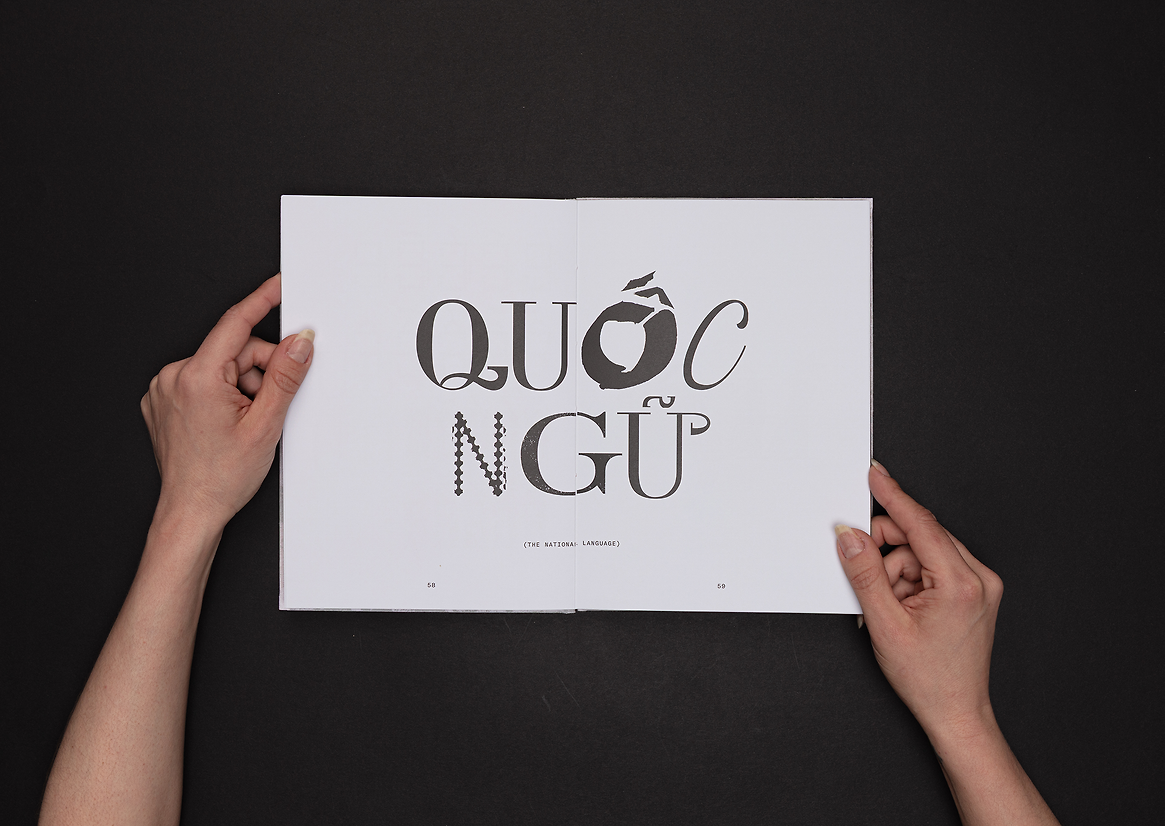
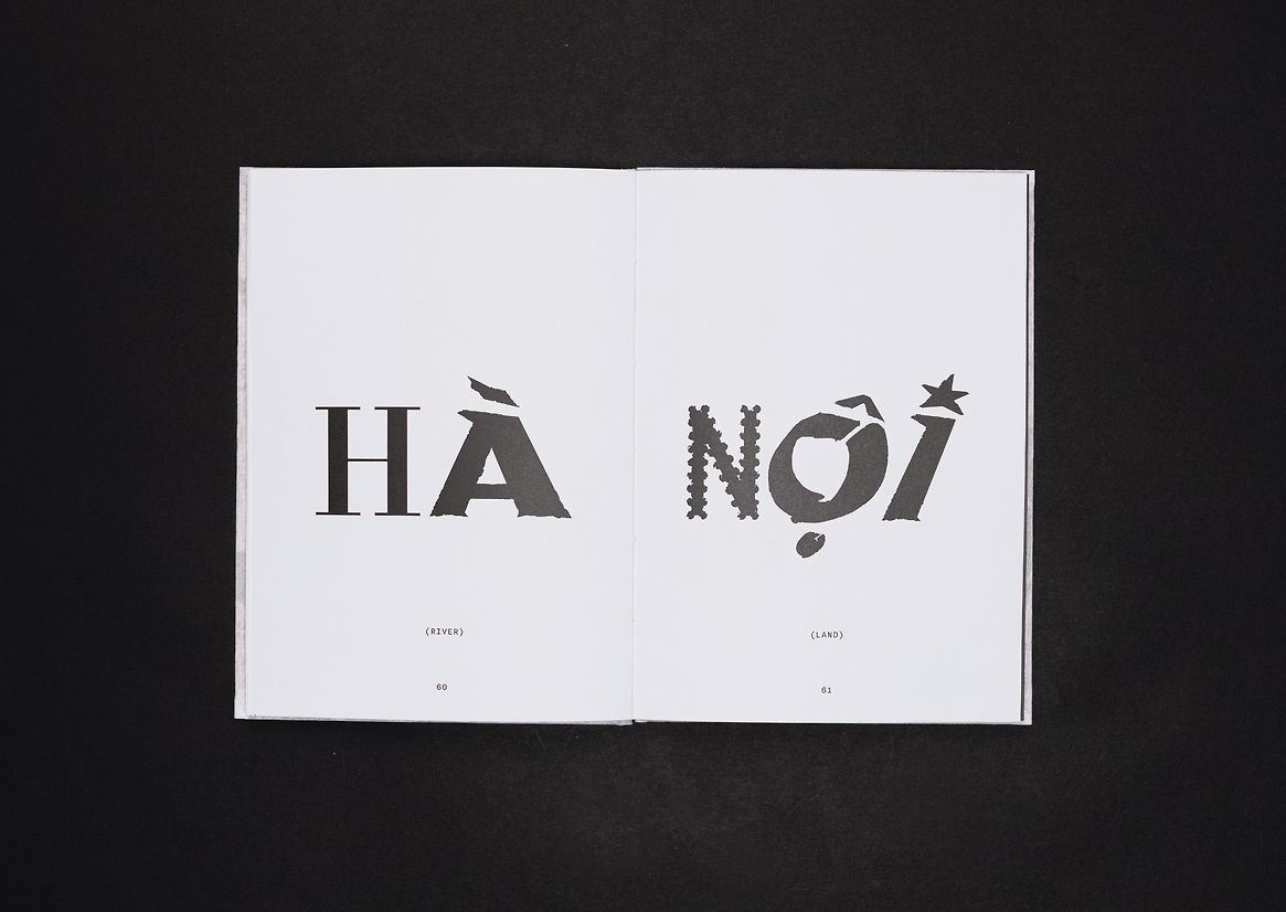
Diacritics are fundamental to the Vietnamese writing system, incorporating tones and vowel modifications. A carefully developed set of diacritics stands out as a key focus of this project, following the correct order of the Vietnamese alphabet. The project visually highlights the importance of accurately representing Vietnamese as a tonal language, where the tone can completely alter a word’s meaning. By showcasing these diacritics, the design emphasises the intricacies of the Vietnamese language and adds a unique character to Nam Type.
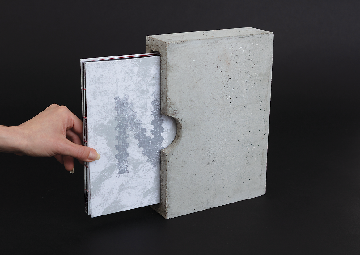
The choice of using concrete to elevate the tone of the project to emphasises the idea of cultural foundations. Just as the concrete hardens and solidifies over time, it reflects the strength and resilience of Vietnamese culture. The people have endured colonialism, war, and significant societal changes, yet their cultural identity remains intact and continues to evolve. This metaphor illustrates how challenges can reinforce cultural foundations, making them even more robust. Concrete was also chosen to communicate the harsh realities of urbanisation and industrialisation. The rapid development of cities following the war involved extensive use of concrete in high-rise buildings, roads, and bridges, signifying a shift toward a new national identity and economic growth. However, as Vietnam modernises, the proliferation of concrete structures can evoke feelings of alienation and a loss of traditional culture, highlighting the tension between progress and preservation. Overall, Nam Type aims to explore this complex history while inspiring and shaping the future of Vietnam, honouring those who have come before us.

Description:
Nam Type is an autoethnographic study and collection of Vietnamese letterforms from the French colonial period. The project visually examines themes of cultural ancestry, tradition, and identity through typographic and editorial design. The result is a decorative collection of 29 Vietnamese letterforms with diacritics, inspired by historical initial letters and illuminated manuscripts. The work plays as a graphic dialogue through a personal narrative investigation; it curates and celebrates letterforms, reinterpreting them to illuminate the cultural fusion that defined this significant period. Nam Type aims to honour the complexities of Vietnam’s history and heritage through control and resistance, paying tribute to those who have fought and preserved the nation’s graphic language and the future they have shaped.
This collection of letterforms were designed to convey the vibrant history of Vietnam through visual language, reflecting the dynamic fusion of styles that characterise its cultural evolution. The project culminated in seven groups of mixed letterforms, each derived from seven historical documents. The set of letterforms was described in the final publication as blending Latin characters with Vietnamese diacritics as a testament to the cultural fusion that defined and shaped the nation’s visual language. Every type, property, curve, and terminal were examined in detail to find the most distinct characteristic, then further explored and applied to the rest of each letterform group. While each group possesses its fundamental features, they seamlessly integrate through careful kerning and alignment in glyph creation, ensuring precise dimensions and coherence in design.
Diacritics are fundamental to the Vietnamese writing system, incorporating tones and vowel modifications. A carefully developed set of diacritics stands out as a key focus of this project, following the correct order of the Vietnamese alphabet. The project visually highlights the importance of accurately representing Vietnamese as a tonal language, where the tone can completely alter a word’s meaning. By showcasing these diacritics, the design emphasises the intricacies of the Vietnamese language and adds a unique character to Nam Type.
The choice of using concrete to elevate the tone of the project to emphasises the idea of cultural foundations. Just as the concrete hardens and solidifies over time, it reflects the strength and resilience of Vietnamese culture. The people have endured colonialism, war, and significant societal changes, yet their cultural identity remains intact and continues to evolve. This metaphor illustrates how challenges can reinforce cultural foundations, making them even more robust. Concrete was also chosen to communicate the harsh realities of urbanisation and industrialisation. The rapid development of cities following the war involved extensive use of concrete in high-rise buildings, roads, and bridges, signifying a shift toward a new national identity and economic growth. However, as Vietnam modernises, the proliferation of concrete structures can evoke feelings of alienation and a loss of traditional culture, highlighting the tension between progress and preservation. Overall, Nam Type aims to explore this complex history while inspiring and shaping the future of Vietnam, honouring those who have come before us.