This project investigates how Auckland’s early 20th-century industrial typography, once integral to its architectural landscape, can be rediscovered, reinterpreted, and reintroduced into contemporary design. Focused on Little Queen Street, a once-thriving industrial hub in downtown Auckland, the work uncovers a forgotten typographic history that, while faded from view, remains embedded in the city’s-built environment. The project began with the discovery of ghost signs and remnants of hand-painted lettering on historic buildings across the city. This led to an in-depth exploration of archival imagery, revealing a rich visual language that has nearly vanished. Little Queen Street emerged as a focal point, where sign-painted typography from businesses like Sanford, Wingate, and George Dodge Brothers offered a glimpse into the craftsmanship and character of the era. These letterforms, shaped by skilled sign painters, reflected not just commercial identities but also the aesthetic and social fabric of the time. With much of this visual legacy deteriorating or lost, the project set out to recover and revive it through design. The aim was to bridge past and present by creating functional, historically informed typefaces that breathe new life into these overlooked forms. The process combined archival research, visual documentation, and hands-on typographic craft. Historical references guided the reconstruction of letterforms, starting with hand-drawn sketches and progressing to digital refinements. Throughout, the design remained faithful to the quirks and contextual adaptations that gave the originals their charm. Embracing the imperfections of early sign painting, the project prioritised authenticity while adapting these forms for contemporary use. The final outcomes include a series of custom-designed typefaces and a set of type specimen booklets that trace the journey from initial discovery to completed design. These booklets function as both practical design tools and narrative artefacts, preserving the essence of a fading craft while reintroducing it to contemporary audiences. The work is executed with strong technical precision, balancing visual impact with storytelling clarity. This project invites renewed appreciation for the artistry of early sign painters and celebrates the typographic character of Auckland’s built environment. It positions typography not just as a visual medium, but as a cultural bridge, one that honours the past, enriches the present, and inspires future generations to rediscover the city’s typographic legacy.
Description:
This project investigates how Auckland’s early 20th-century industrial typography, once integral to its architectural landscape, can be rediscovered, reinterpreted, and reintroduced into contemporary design. Focused on Little Queen Street, a once-thriving industrial hub in downtown Auckland, the work uncovers a forgotten typographic history that, while faded from view, remains embedded in the city’s-built environment.
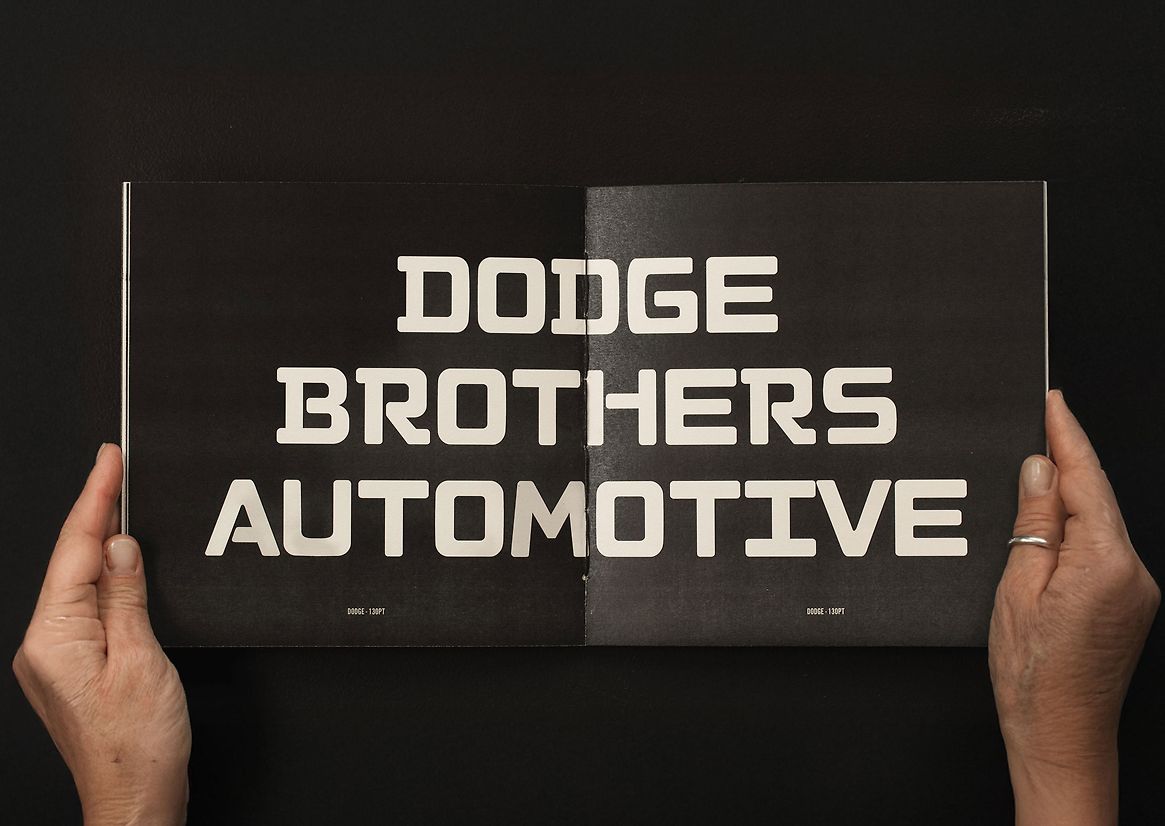
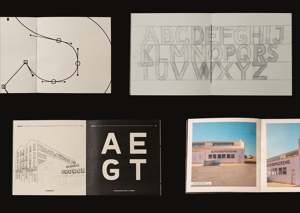
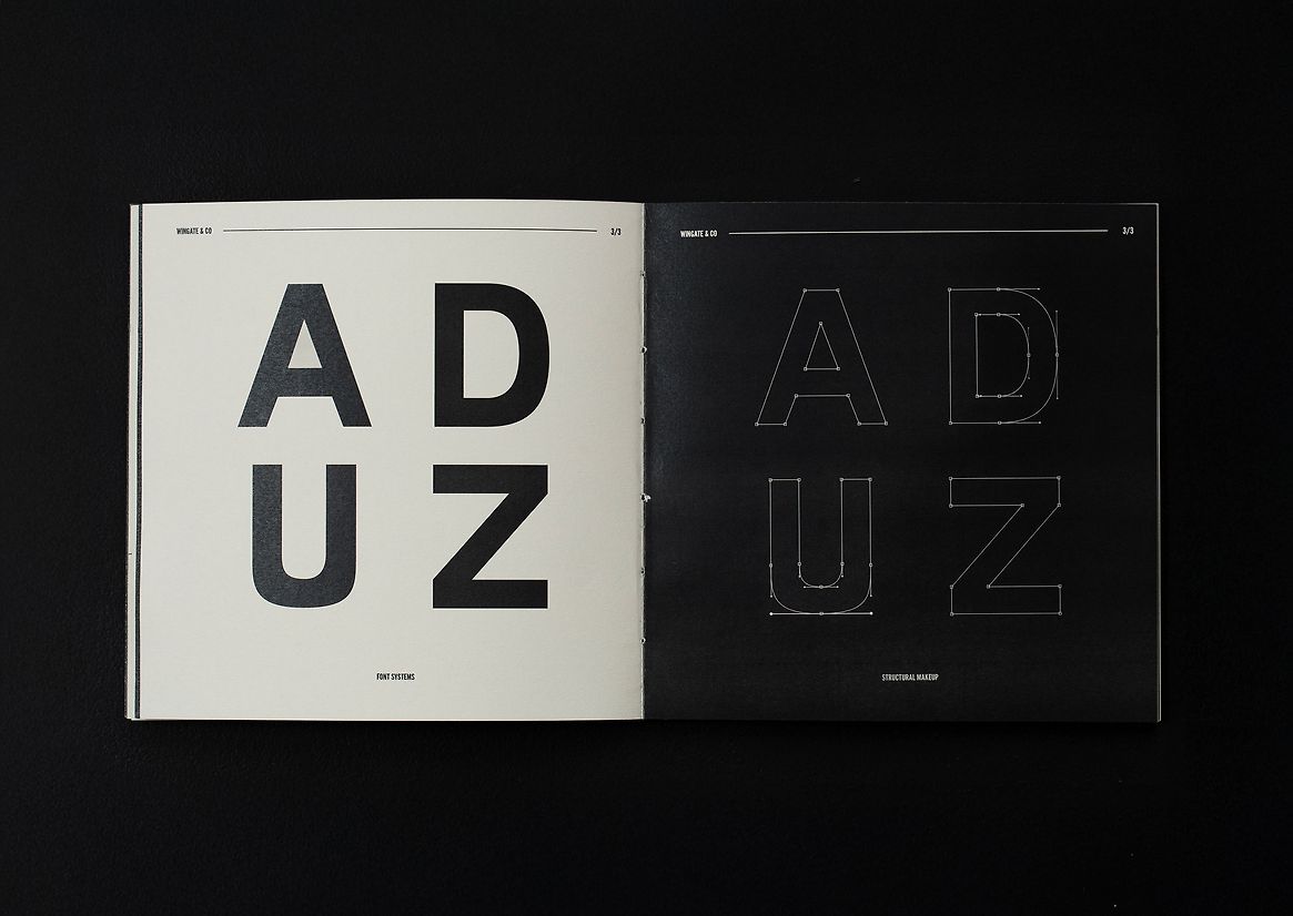
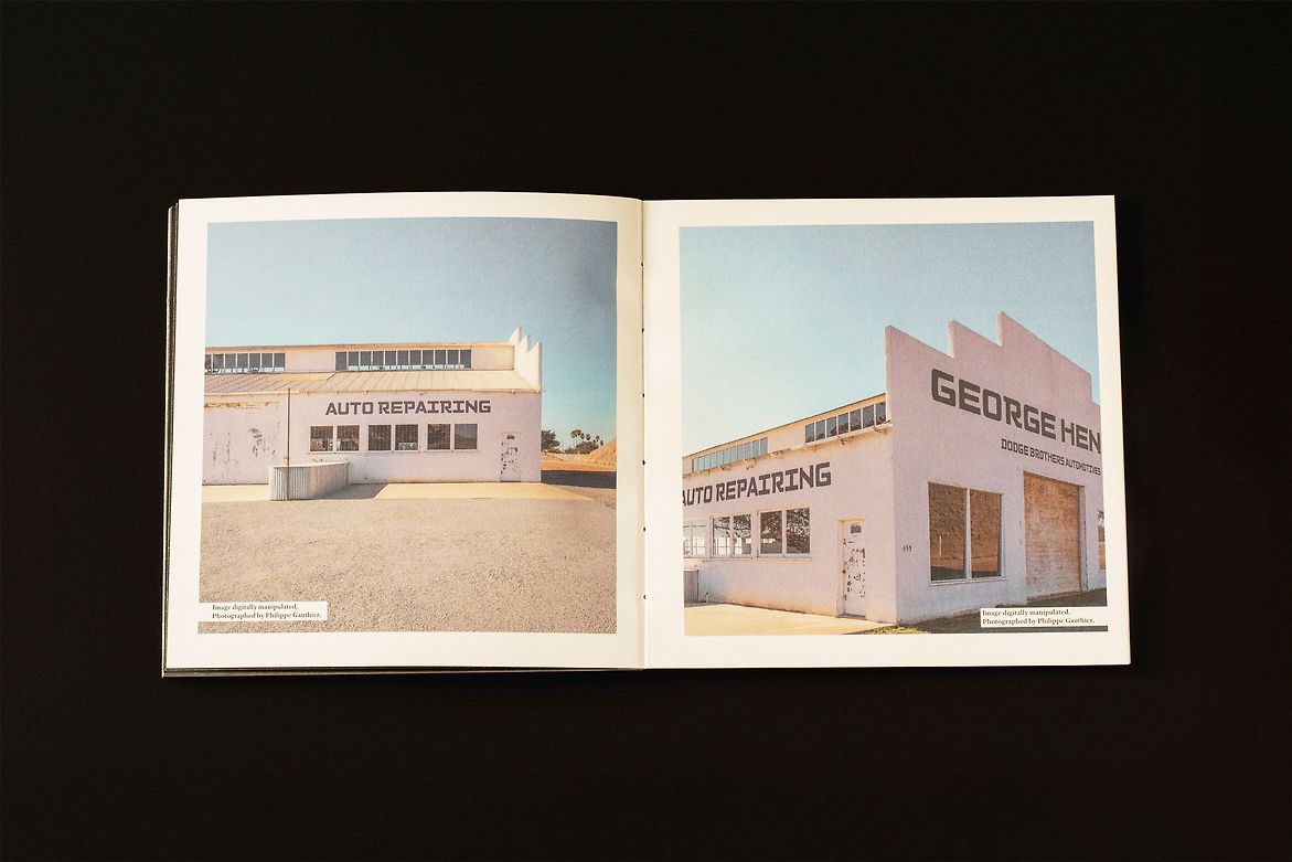
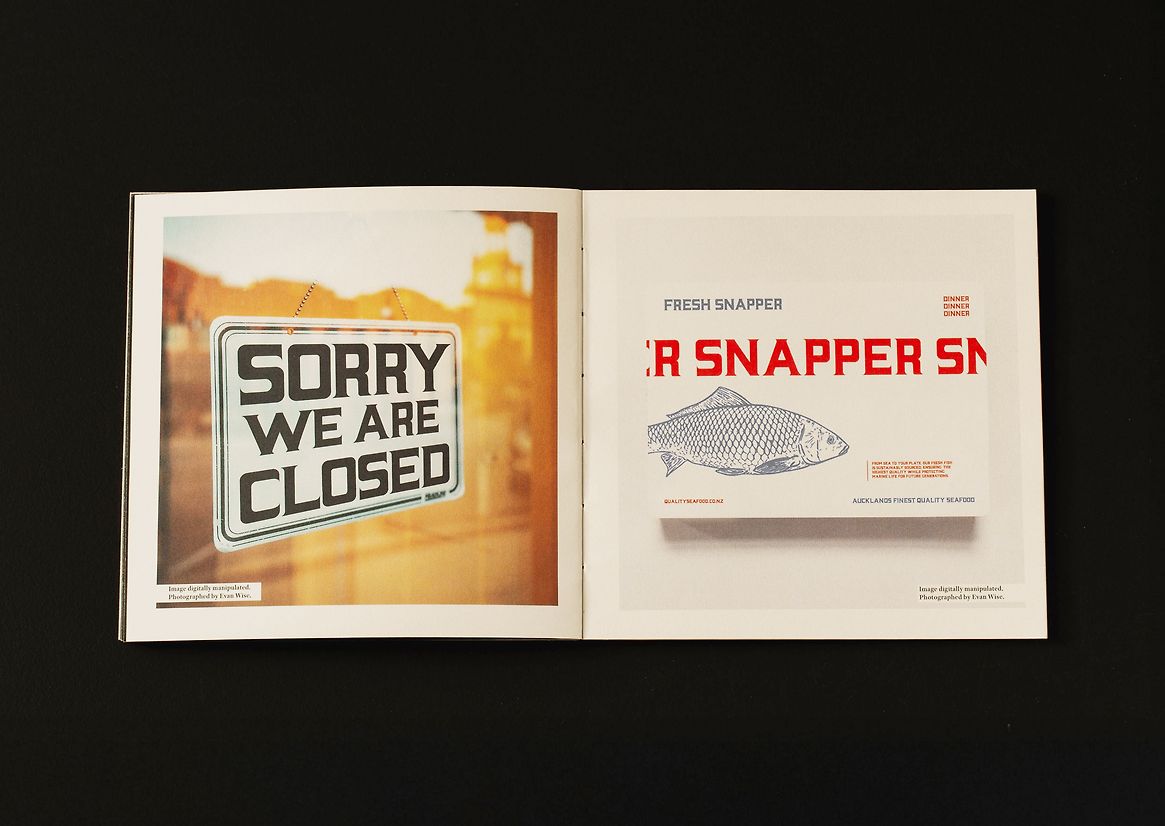
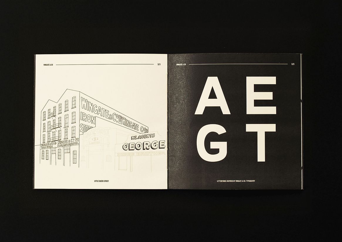
The project began with the discovery of ghost signs and remnants of hand-painted lettering on historic buildings across the city. This led to an in-depth exploration of archival imagery, revealing a rich visual language that has nearly vanished. Little Queen Street emerged as a focal point, where sign-painted typography from businesses like Sanford, Wingate, and George Dodge Brothers offered a glimpse into the craftsmanship and character of the era. These letterforms, shaped by skilled sign painters, reflected not just commercial identities but also the aesthetic and social fabric of the time.
With much of this visual legacy deteriorating or lost, the project set out to recover and revive it through design. The aim was to bridge past and present by creating functional, historically informed typefaces that breathe new life into these overlooked forms.
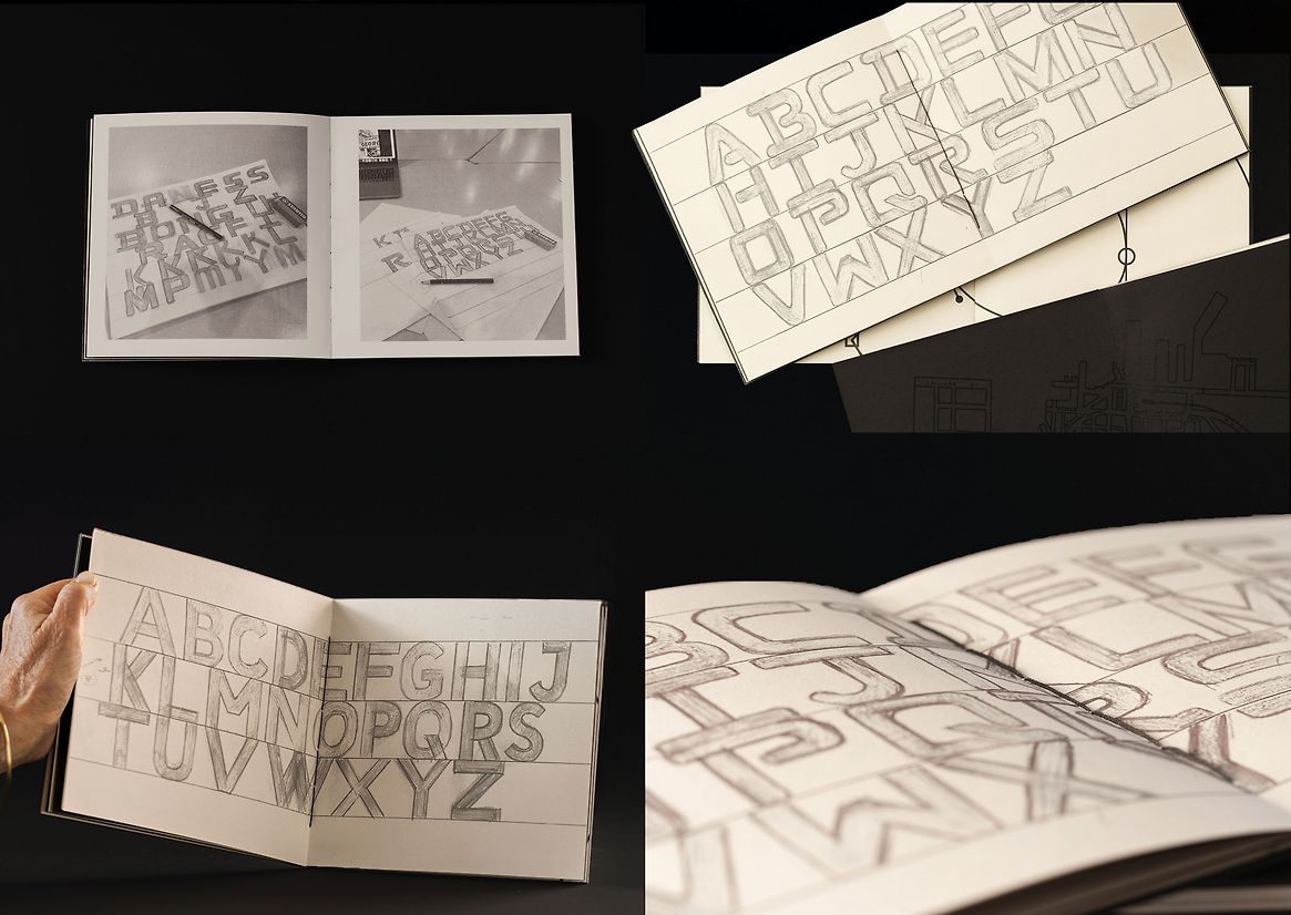
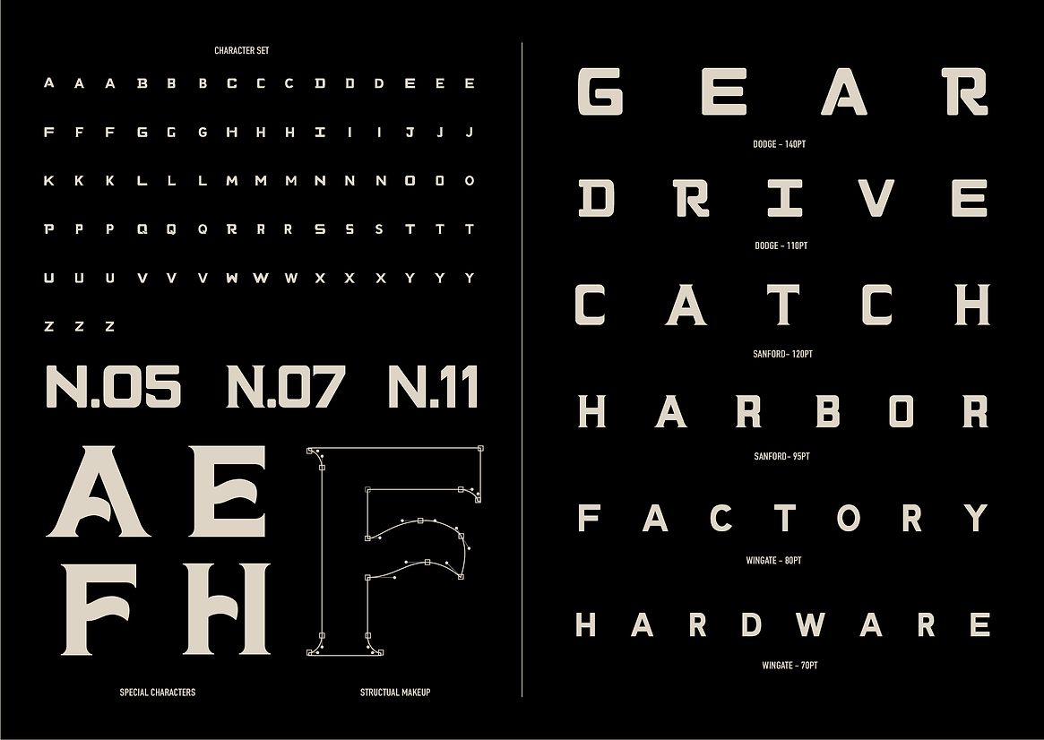
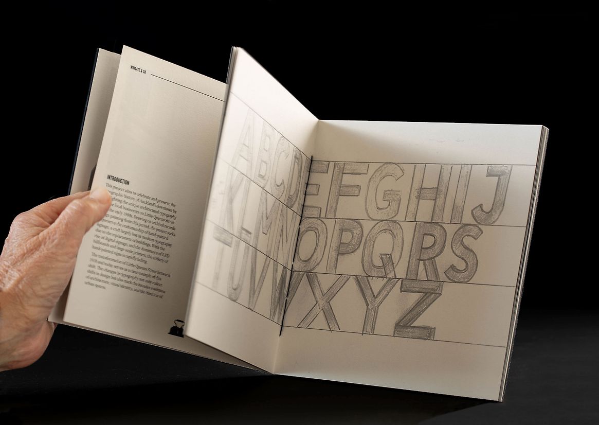
The process combined archival research, visual documentation, and hands-on typographic craft. Historical references guided the reconstruction of letterforms, starting with hand-drawn sketches and progressing to digital refinements. Throughout, the design remained faithful to the quirks and contextual adaptations that gave the originals their charm. Embracing the imperfections of early sign painting, the project prioritised authenticity while adapting these forms for contemporary use.
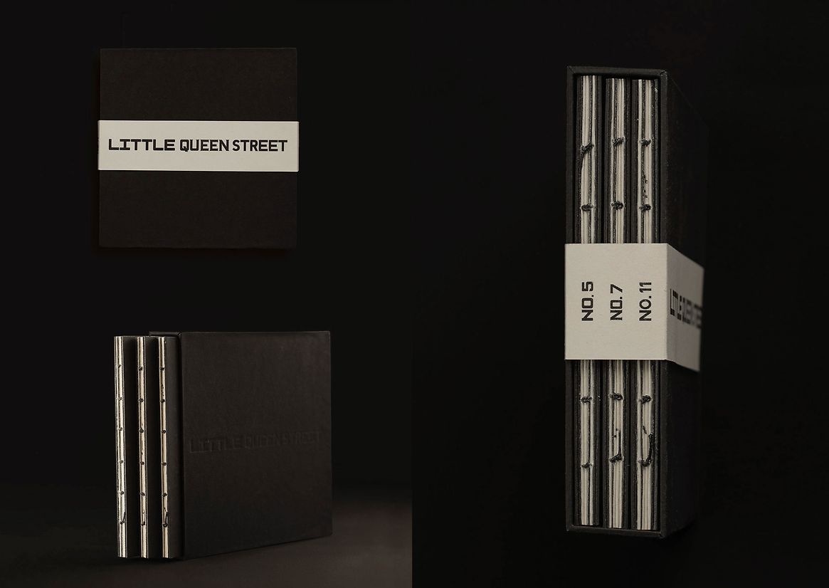
The final outcomes include a series of custom-designed typefaces and a set of type specimen booklets that trace the journey from initial discovery to completed design. These booklets function as both practical design tools and narrative artefacts, preserving the essence of a fading craft while reintroducing it to contemporary audiences. The work is executed with strong technical precision, balancing visual impact with storytelling clarity.
This project invites renewed appreciation for the artistry of early sign painters and celebrates the typographic character of Auckland’s built environment. It positions typography not just as a visual medium, but as a cultural bridge, one that honours the past, enriches the present, and inspires future generations to rediscover the city’s typographic legacy.