As we plunge deeper into environmental crisis, consumers towards more sustainable alternatives for their everyday needs. The FMCG Drinks industry wields a hefty print on the environment, imparting a significant dosage of greenhouse gas emissions. The industry makes up about 3.8% of global CO2e emissions and all facets of production contribute to the industries huge carbon footprint. Corporate entities also serve as major contributors to global plastic waste.
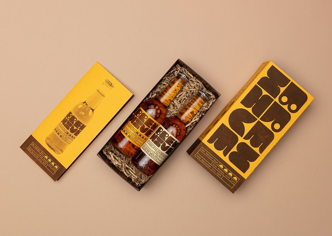
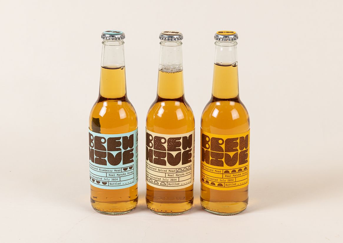
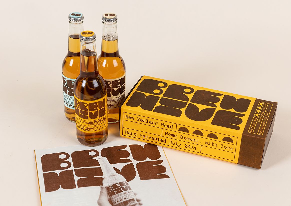
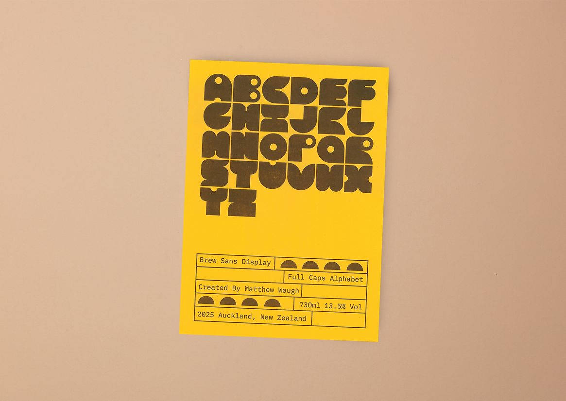
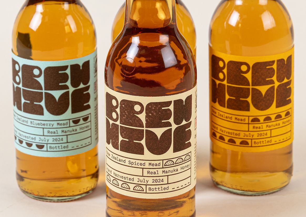
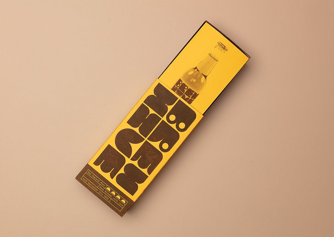
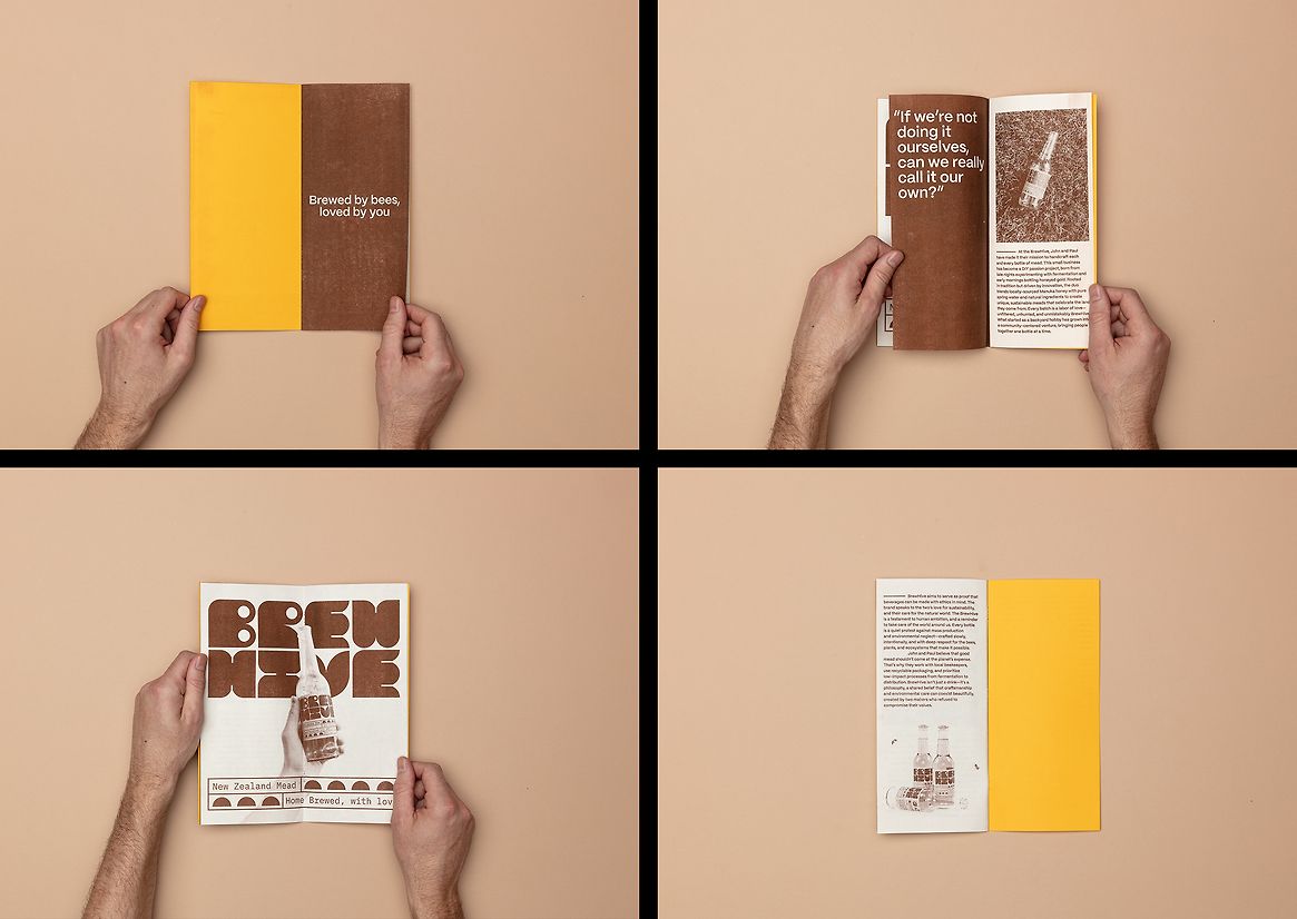
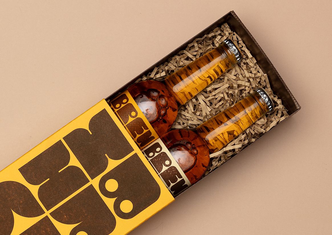
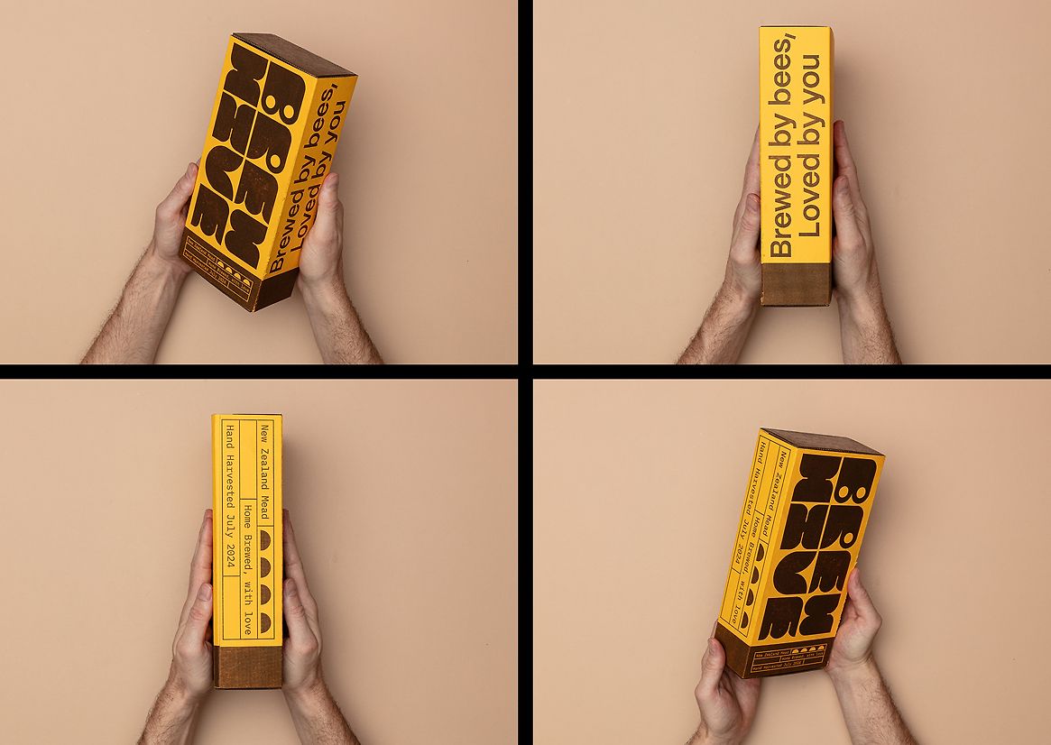
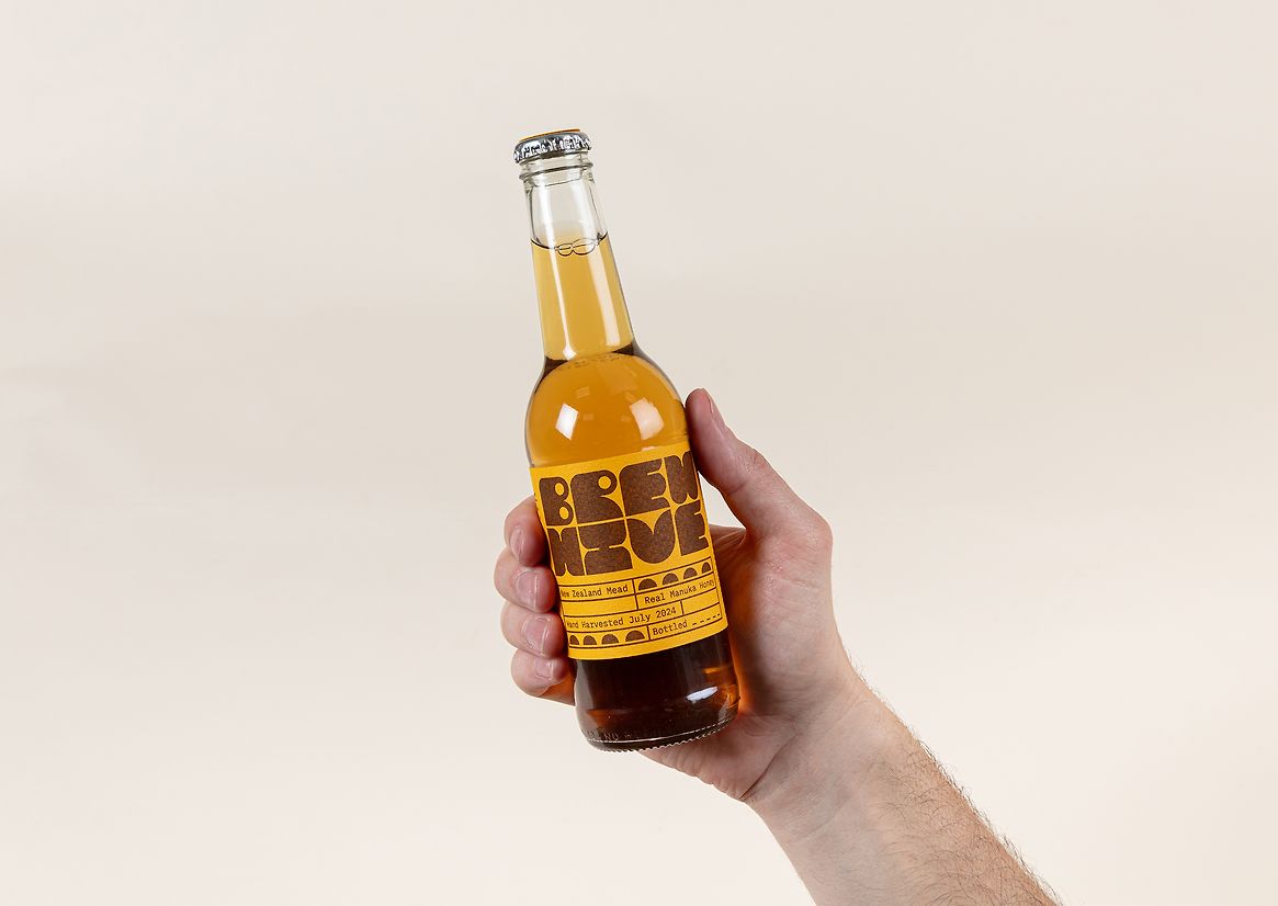
The BrewHive Mead’s branding aims to serve as a visual testament to the brand’s sustainable values, and DIY attitude – putting authenticity and environmental wellbeing at the forefront. The BrewHive’s identity is largely centred around risograph printing and its custom typeface ‘Brewsans’ – a full caps alphabet display face that serves as the embodiment of the brand’s values and persona. It is a geometric face constructed using a modular grid system, in which each letterform within the face is constructed by half circle forms – the most rudimentary graphic representation of a beehive. The brown and sunflower yellow colourway is both evocative of typical honey bee colours, but also vintage 70’s colourways – capturing the ethos of BrewHive mead itself: a modern take on a classic. Each label, box and poster is printed on Riso brown. Riso uses a soy based non-toxic ink, one which proves to be more sustainable than other printing methods such as laser printers, which have higher CO2 emissions. Risograph printing is characterised by its textural look, derived from ink inconsistencies and it’s screen covered & grain touched printing styles. The risograph gives the BrewHive’s branding this analogue and tactile feeling, as if everything were constructed by hand.
Description:
As we plunge deeper into environmental crisis, consumers towards more sustainable
alternatives for their everyday needs. The FMCG Drinks industry wields a hefty print on the environment, imparting a significant dosage of greenhouse gas emissions. The industry makes up about 3.8% of global CO2e emissions and all facets of production contribute to the industries huge carbon footprint. Corporate entities also serve as major contributors to global plastic waste.
The BrewHive Mead’s branding aims to serve as a visual testament to the brand’s sustainable values, and DIY attitude – putting authenticity and environmental wellbeing at the forefront. The BrewHive’s identity is largely centred around risograph printing and its custom typeface ‘Brewsans’ – a full caps alphabet display face that serves as the embodiment of the brand’s values and persona. It is a geometric face constructed using a modular grid system, in which each letterform within the face is constructed by half circle forms – the most rudimentary graphic representation of a beehive. The brown and sunflower yellow colourway is both evocative of typical honey bee colours, but also vintage 70’s colourways – capturing the ethos of BrewHive mead itself: a modern take on a classic. Each label, box and poster is printed on Riso brown. Riso uses a soy based non-toxic ink, one which proves to be more sustainable than other printing methods such as laser printers, which have higher CO2 emissions. Risograph printing is characterised by its textural look, derived from ink inconsistencies and it’s screen covered & grain touched printing styles. The risograph gives the BrewHive’s branding this analogue and tactile feeling, as if everything were constructed by hand.