Justin Crook, Blair Johnston, Amy Phillips, Divya Purushotham, Olivia Wong
Client
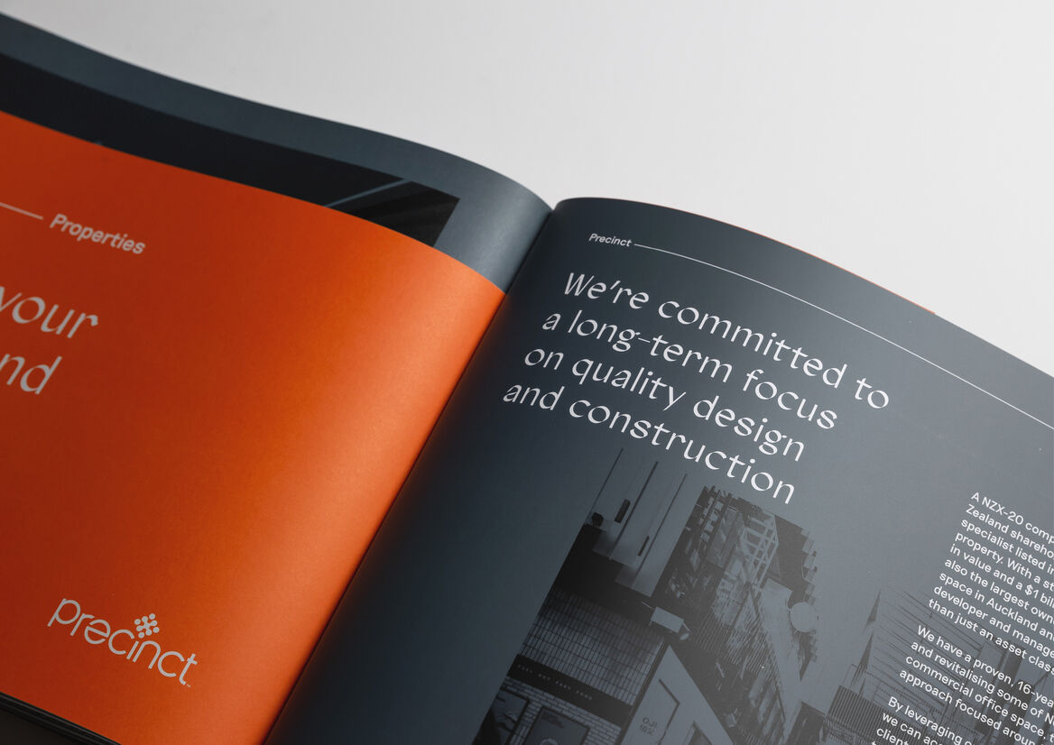
Precinct Properties
Description:
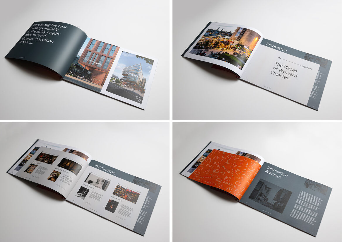
Developed design for the final buildings of the sought-after Wynyard Quarter Innovation Precinct have been completed, and our client seeks tenants to lease available office floors, welcoming them to be a part of the community. The brand identity for Innovation Precinct was developed through an immediate requirement for bespoke marketing collateral that defined the precinct’s unique story and sales proposition. Through the exercise of curating and developing the content in collaboration with our client, a brand identity was crafted, tailored for a corporate audience seeking an ingenious workplace environment.
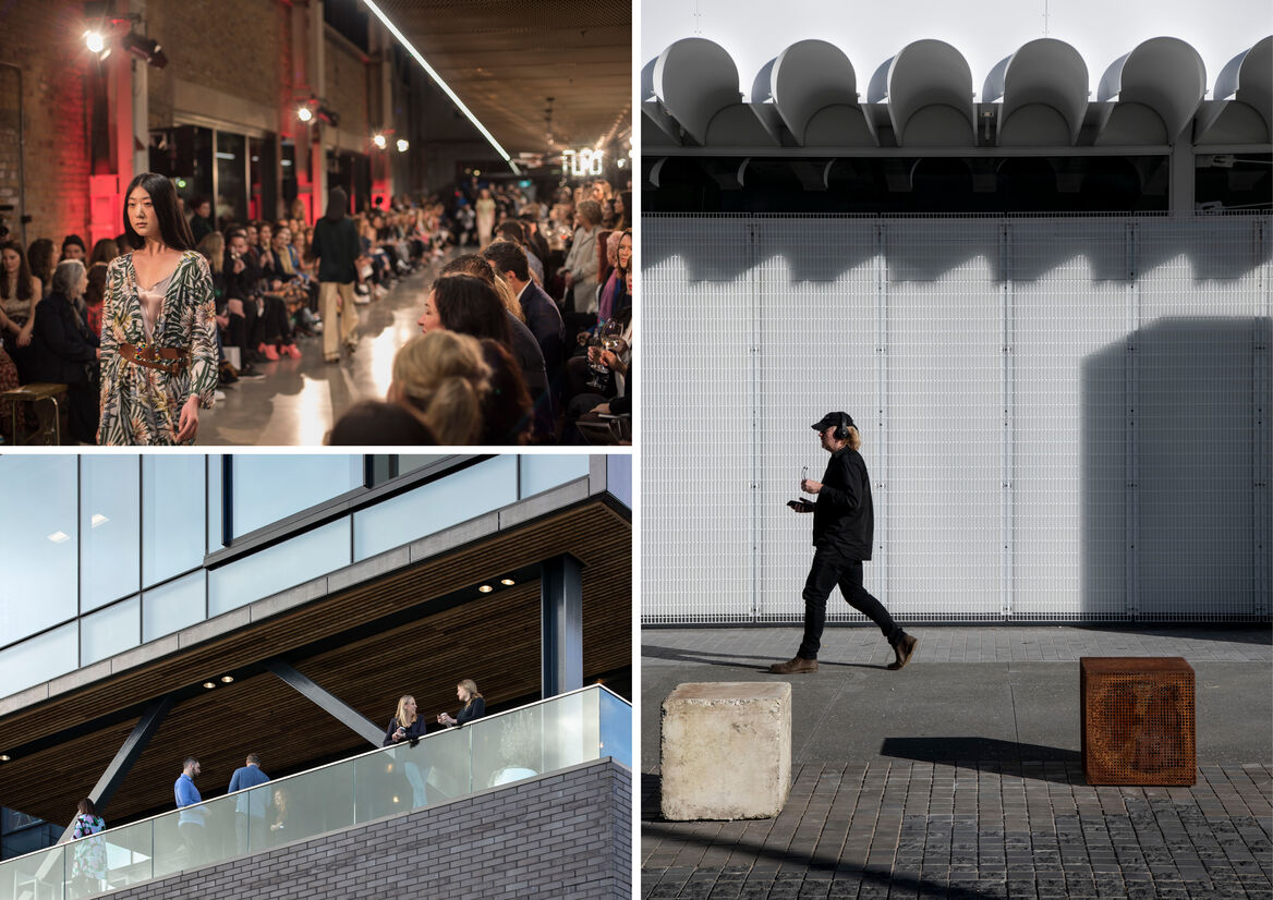
The success of Wynyard Quarter is in the balancing of its industrial heritage and commercial purpose. Home to a variety of large, medium, and small innovative brands, it is a place that stimulates the hearts and minds of its community and visitors. This is reflected through a brand identity that stitches together an ambitious yet humble attitude, and a dynamic yet approachable character. It blends the energy of its people, the craft of its maritime heritage and the forward-looking enterprises that call it home.
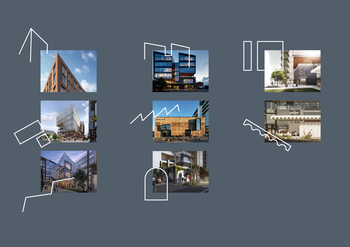
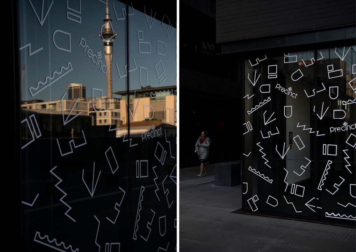
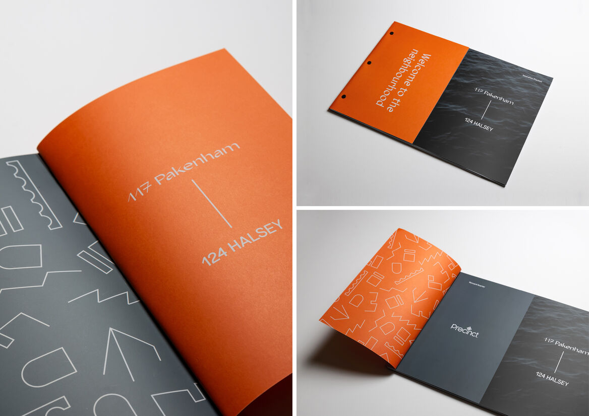
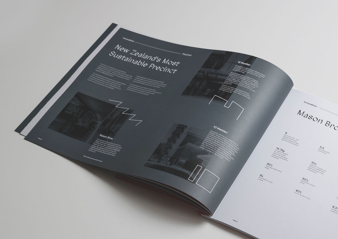
An identity for each building is defined through a unique mark that references its independent built form and function. The integration of these marks in the form of a dynamic pattern device represents the network of innovation and collision of ideas that occurs within the precinct. A tangible example of this is experienced through the vinyl application on the building’s glazing, used to embed the identity within the built environment. Amongst the industrial material palette, this treatment appears to float and move, while enabling natural light to fill the space.
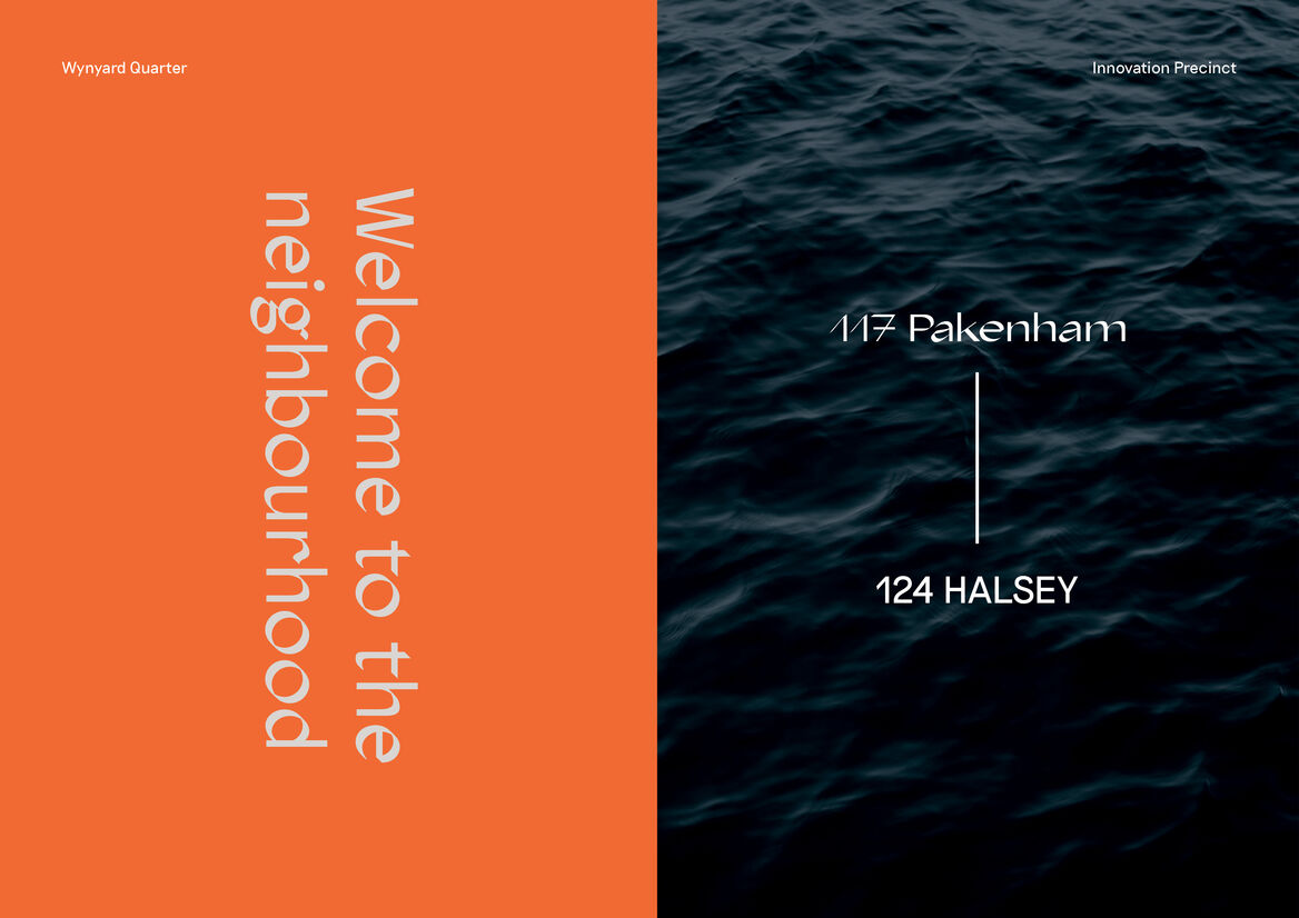
Typographic styles were carefully considered in relation to the final two buildings of the Innovation Precinct. 117 Pakenham acts as a beacon for the precinct, inspired by the craft of the location’s boat building heritage, while elevating complex design and engineering. The calligraphic typeface Agentur embodies this, referencing the chiselled and angular forms of the building, as well as the sawtooth rooflines of its neighbours. Riposte is a complimentary typeface that injects a more contemporary, geometric texture to the identity. It references 124 Halsey’s strong rectangular forms and gridded structures that are consistent with its more corporate, view-orientated setting and neighbours.
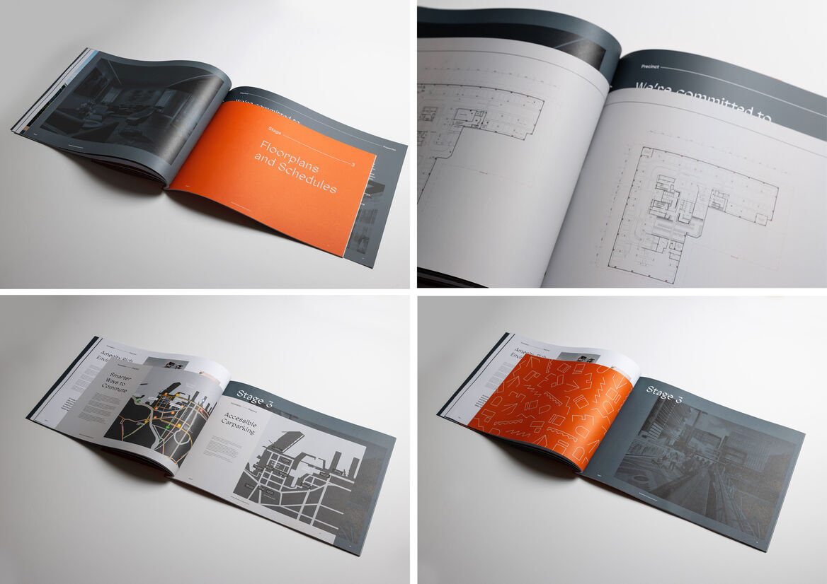
Dynamism is reflected through the confident brand colour palette and activated image style. The gunmetal blue references the precinct’s harbour location and maritime heritage, the soft grey its industrial roots, and the injection of electric orange reflects creativity, activity, and energy of its place. Combining these colours enables functional wayfinding devices. Orange frames transitions, with gunmetal blue identifying overviews and introductions, and soft grey functional information. This hierarchy is aligned to an interplay of changing scales and formats seen in print, tightly held together by a rigid grid and consistent set of formatting rules.
These systems combine to highlight both the craft and commercial excellence of the precinct, enabling a unique identity that can be applied to the surrounding buildings in conjunction with their distinct architectural style.

Description:
Developed design for the final buildings of the sought-after Wynyard Quarter Innovation Precinct have been completed, and our client seeks tenants to lease available office floors, welcoming them to be a part of the community. The brand identity for Innovation Precinct was developed through an immediate requirement for bespoke marketing collateral that defined the precinct’s unique story and sales proposition. Through the exercise of curating and developing the content in collaboration with our client, a brand identity was crafted, tailored for a corporate audience seeking an ingenious workplace environment.
The success of Wynyard Quarter is in the balancing of its industrial heritage and commercial purpose. Home to a variety of large, medium, and small innovative brands, it is a place that stimulates the hearts and minds of its community and visitors. This is reflected through a brand identity that stitches together an ambitious yet humble attitude, and a dynamic yet approachable character. It blends the energy of its people, the craft of its maritime heritage and the forward-looking enterprises that call it home.
An identity for each building is defined through a unique mark that references its independent built form and function. The integration of these marks in the form of a dynamic pattern device represents the network of innovation and collision of ideas that occurs within the precinct. A tangible example of this is experienced through the vinyl application on the building’s glazing, used to embed the identity within the built environment. Amongst the industrial material palette, this treatment appears to float and move, while enabling natural light to fill the space.
Typographic styles were carefully considered in relation to the final two buildings of the Innovation Precinct. 117 Pakenham acts as a beacon for the precinct, inspired by the craft of the location’s boat building heritage, while elevating complex design and engineering. The calligraphic typeface Agentur embodies this, referencing the chiselled and angular forms of the building, as well as the sawtooth rooflines of its neighbours. Riposte is a complimentary typeface that injects a more contemporary, geometric texture to the identity. It references 124 Halsey’s strong rectangular forms and gridded structures that are consistent with its more corporate, view-orientated setting and neighbours.
Dynamism is reflected through the confident brand colour palette and activated image style. The gunmetal blue references the precinct’s harbour location and maritime heritage, the soft grey its industrial roots, and the injection of electric orange reflects creativity, activity, and energy of its place. Combining these colours enables functional wayfinding devices. Orange frames transitions, with gunmetal blue identifying overviews and introductions, and soft grey functional information. This hierarchy is aligned to an interplay of changing scales and formats seen in print, tightly held together by a rigid grid and consistent set of formatting rules.
These systems combine to highlight both the craft and commercial excellence of the precinct, enabling a unique identity that can be applied to the surrounding buildings in conjunction with their distinct architectural style.