Graphic
Universal Favourite 35 Future Super
-
Pou Auaha / Creative Directors
Dari Israelstam, Ali Ozden
-
Ringatoi Matua / Design Director
Ali Ozden
-
Ngā Kaimahi / Team Members
Kristen Walsh (Client Service Director), Laura Brown (Account Manager) -
Kaitautoko / Contributors
Cat Wall (brand writer), Jake Landa (brand writer), Nick Fontaine (motion design), Alex Barnet (motion design), Oliver Bussel (motion design) -
Client
Future Super
Description:
Though relatively young in Australia’s superannuation space, Future Super have been making ripples from the beginning. With their no-apologies approach to putting the planet first, they pride themselves on not just investing responsibly and sustainably, but investing for impact. And they’re transparent about it too — they put potential investments through a strict screening process, which means Future Super can promise its customers that their super isn’t invested in things like gambling, child labour, tobacco, or contributing to the carbon footprint.
Putting their belief in people-power into play, Future Super asked us to not only push beyond what a superannuation company can look and sound like, but to reframe super from a means to save for the future to a way to actively save the future in the process.
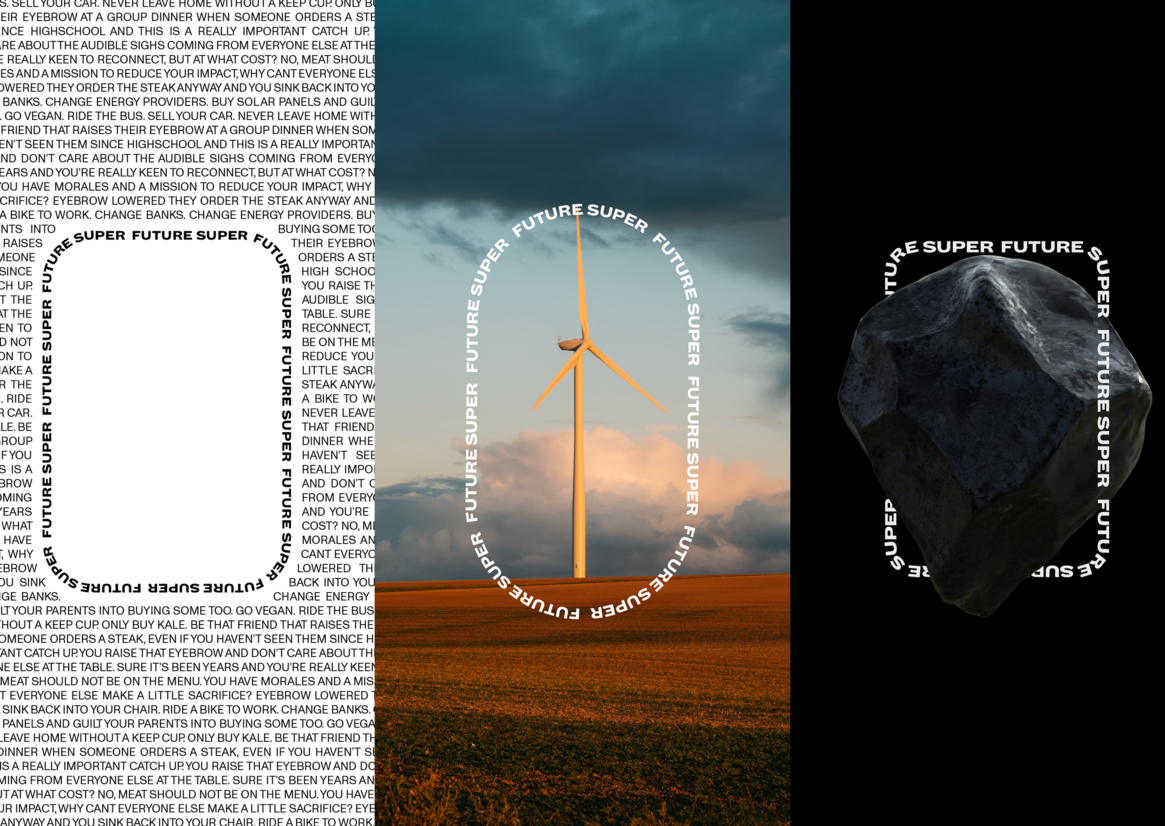
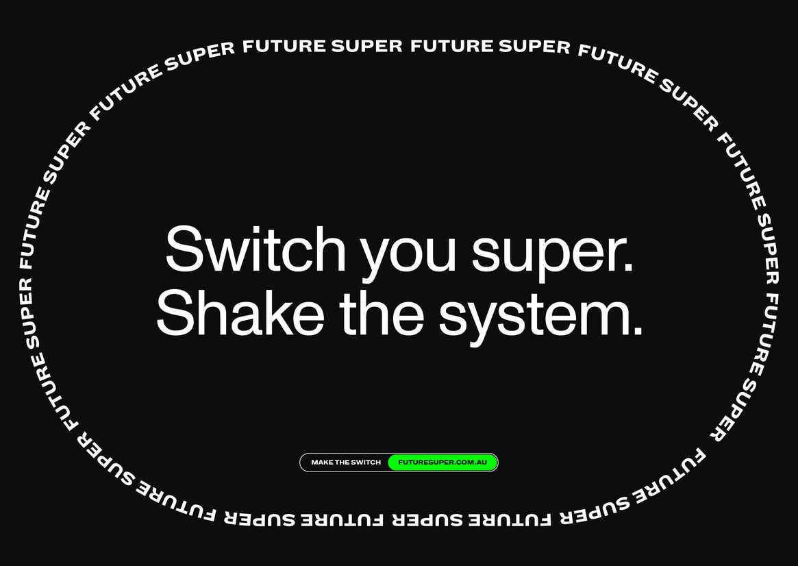
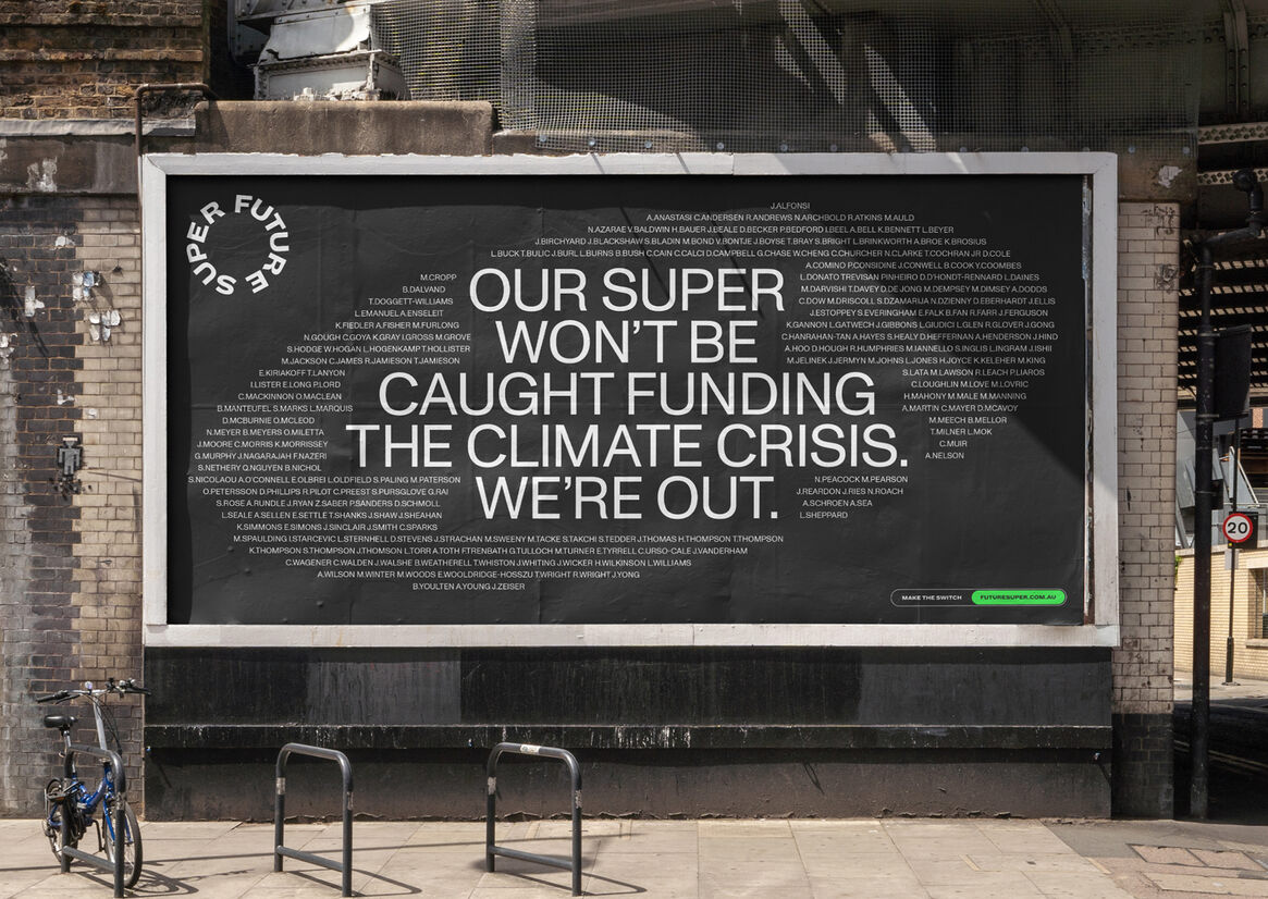
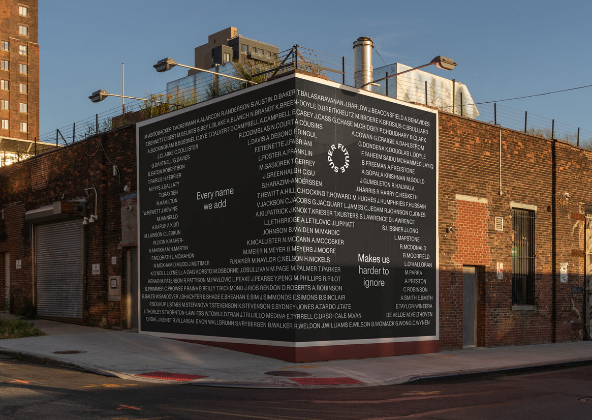
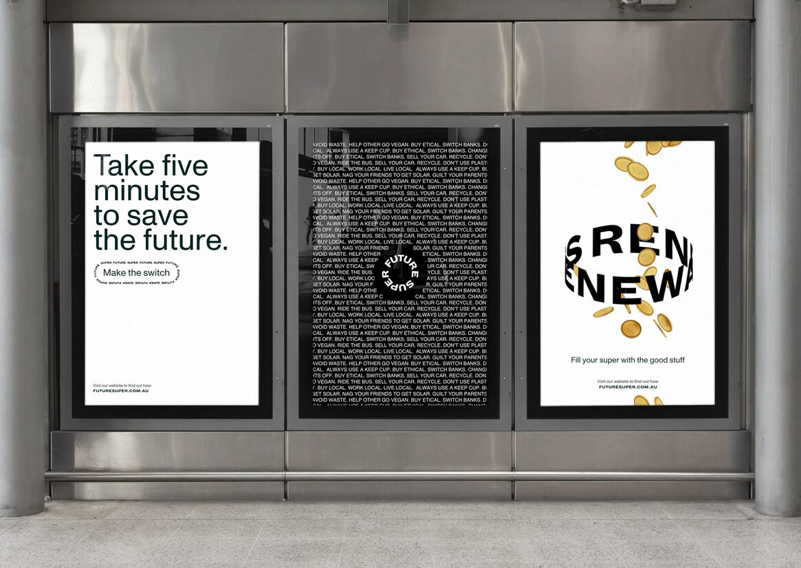
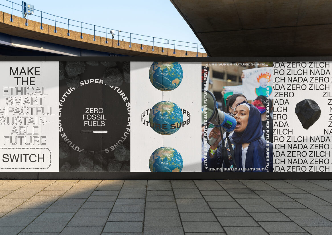
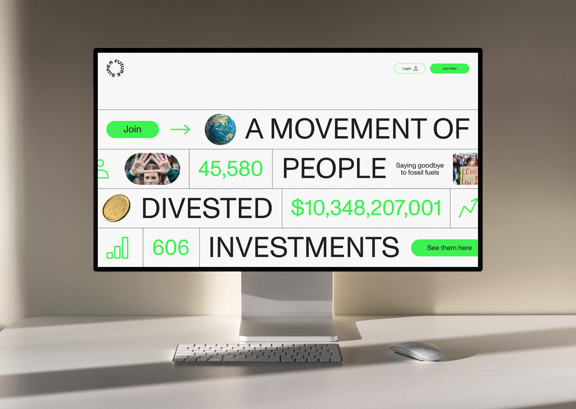
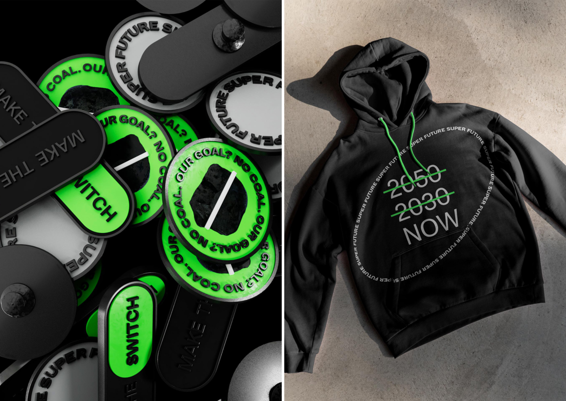
In a traditionally murky industry, Future Super strives for transparency. Using this idea of shining a spotlight on both the (deliberate) lack of clarity, we began with a logo. Well, many logos. Designed for motion and interaction, the mark is responsive — there’s no limit to its iterations. It adapts and flexes, shifting size and shape to suit where it sits and do what it needs to, from small format digital to expansive billboards to the 3D space.
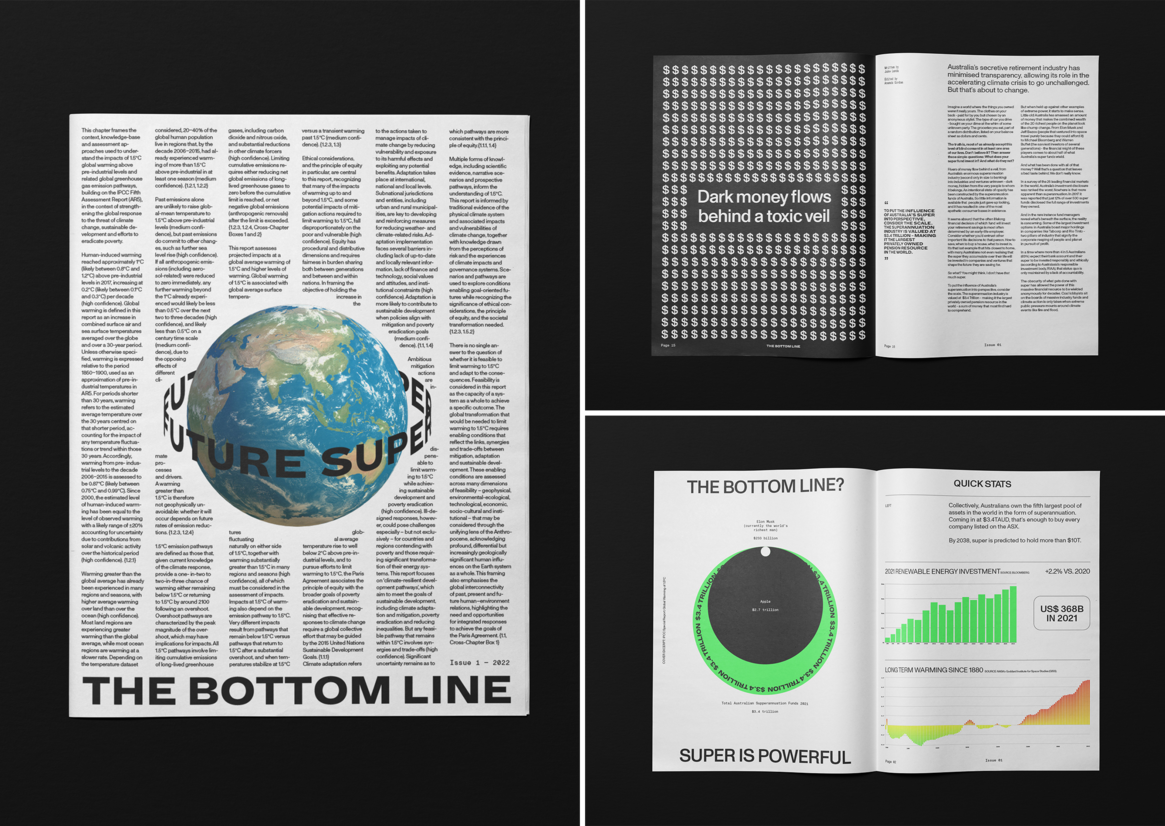
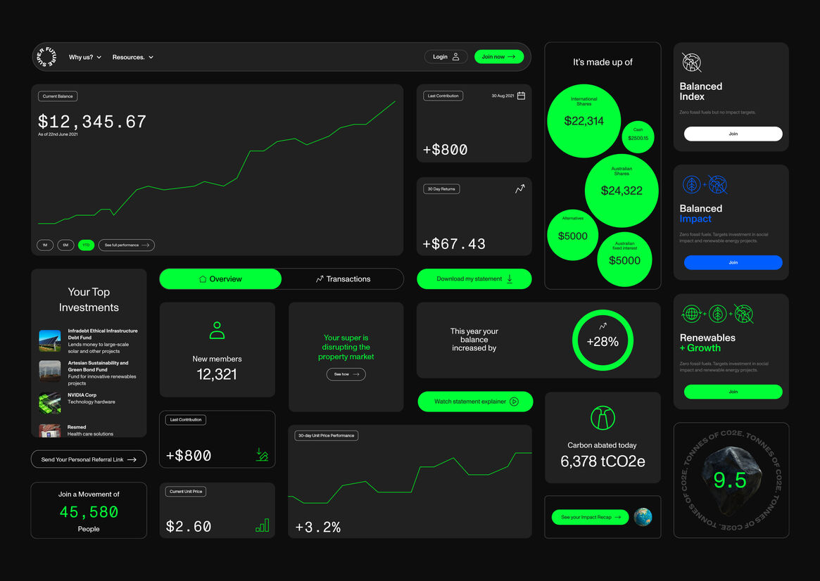
In much the same way, the design system as a whole takes flexibility and responsiveness beyond just the logo. Building on the idea of bringing light to communications, we created a set of layout and motion principles to guide the brand. It can push, uncover, frame and give perspective to the content and works seamlessly across every pillar of brand communications. As an antidote to the stock-saturated world of super, images are only ever used to support messages — never as filler.
In fact, the design system is almost entirely type-based. While competitors have customers wading through information that’s almost impossible to decipher, Future Super champions clear communication and focuses on delivering a message. We established a verbal identity that cuts through jargon to help customers understand how super works. It’s unapologetically honest and unafraid to state the facts on fossil fuels, carbon emissions and superannuation funds.
Though intentionally minimally used throughout the brand, photography and illustration are still an essential tool. While 3D illustrations give additional flexibility, every photo is real — mostly editorial, with no retouching or adjustments. This is particularly important as it allows Future Super to keep communications and campaigns timely and relevant, responding quickly to current affairs and harnessing them to effectively further their fight against the climate crisis.
Future Super believes in the power of people and the collaborative process — this project was testament to that. They brought together a team of people wanting to use design to shake the system and shine a light on dishonesty and deceit. Working side-by-side, we built a bold, robust brand that not only stands out in a stale industry but helps to make a genuinely positive impact on the future. For both people and the planet.