Graphic
True 9 Moves 2 Octave 7 FletcherTech
-
Pou Auaha / Creative Director
Matt Heays
-
Ringatoi Matua / Design Directors
Stacey Purdon, Shiv Narandas, Brendon O'Dwyer -
Kaituhi Matua / Copywriter Lead
Jane Langley
-
Ngā Kaimahi / Team Members
Debbie Currie, Emily Clapcott, Jacqueline Smart, Tash Vranjes, Celine Giovanni, Harry Taylor, Cameron Lloyd, Jake Siddall -
Kaitautoko / Contributors
Kyle Stoffberg, Taylor Pritchard, Arvid Eriksson -
Client
Fletcher Tech


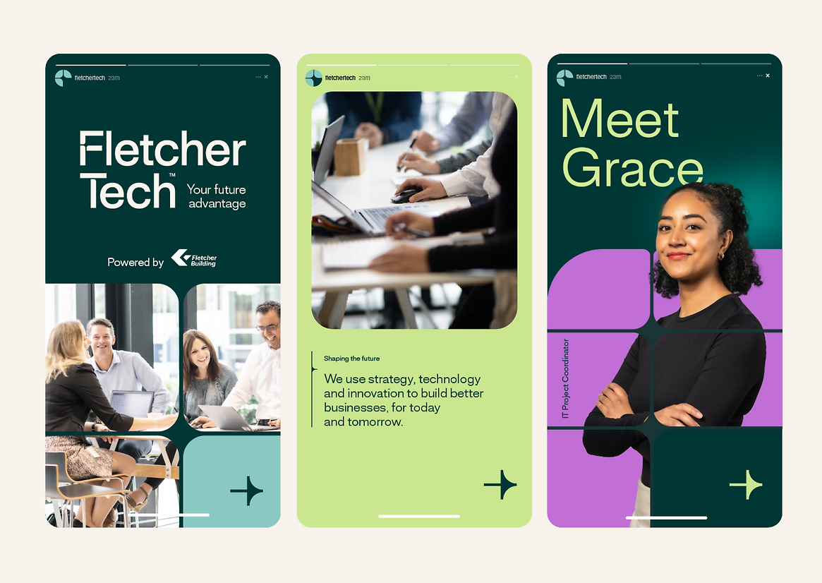



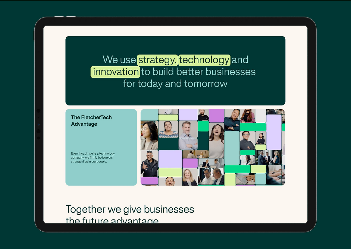

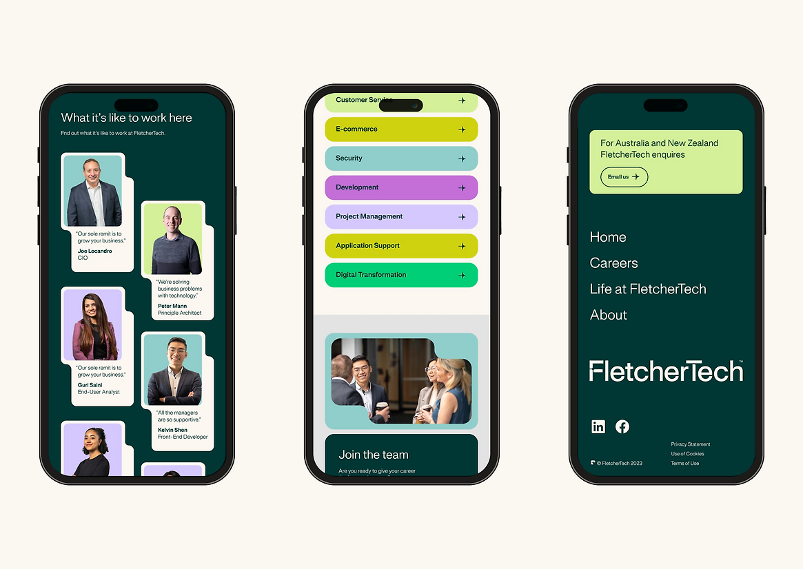

Description:
Fletcher Building’s Group Technology Team is the engine room that drives digital innovation across more than 30 businesses in New Zealand, Australia, and the South Pacific. They’re innovative and future-focussed.
But their brand didn’t reflect that. Our task was to help them overcome internal perceptions that they were just the "IT helpdesk”, positioning them in market as one of the largest IT shops in Australasia. We developed a new name – FletcherTech – and a clear positioning line: Your Future Advantage.
Our brand design system symbolises the connected advantage of working together. At the core of this is the Advantage Point – the point where two lines meet. People and technology, minds and ideas, different businesses. The Advantage Point begins in the negative space of the F in the logo, and anchors everything from navigation to gridded design.
FletcherTech deals with a wide range of different businesses, each of which require different tech solutions. This inspired the modular design system, which can flex and change for any format.
The brand shows up in internal corporate environments, but also in comms to young grads looking to break into tech. So we developed a colour suite that can be serious and professional – leaning more on dark greens and muted colours – to poppy and exciting, with bold purples and more vibrant greens. We deliberately avoided conventional “tech tropes” in favour of outside-the-category design elements. Lively clashing colours, curvy framing devices, and vintage-like textures helped the brand feel futuristic but human.
Because people are at the heart of FletcherTech, so we took a naturalistic approach to photography. Staff were photographed at their workplaces rather than a studio, with minimal makeup and directed to be themselves.
Modularity, Adaptability, and Responsiveness became fundamental principles of this design system, to allow the brand to push forward into the future.