Graphic
The Colour Club 10 GellaFrenda
-
Pou Auaha / Creative Director
Nick Mitchell
-
Ringatoi Matua / Design Director
Tom Fethers
-
Ngā Kaimahi / Team Members
James Miller, Mark Blackler -
Kaitautoko / Contributor
Jiwon Kim -
Client
GellaFrenda
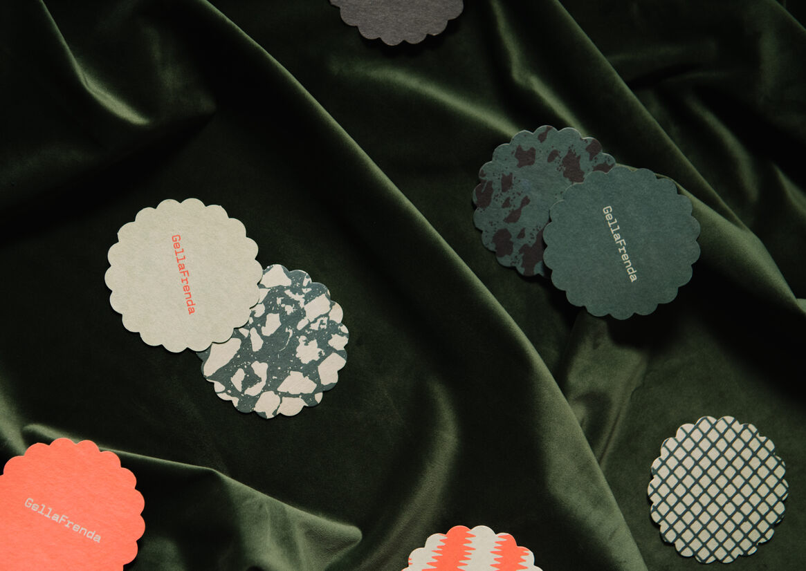
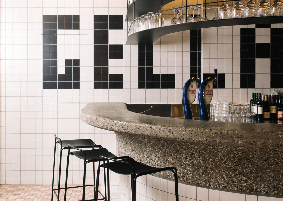
Description:
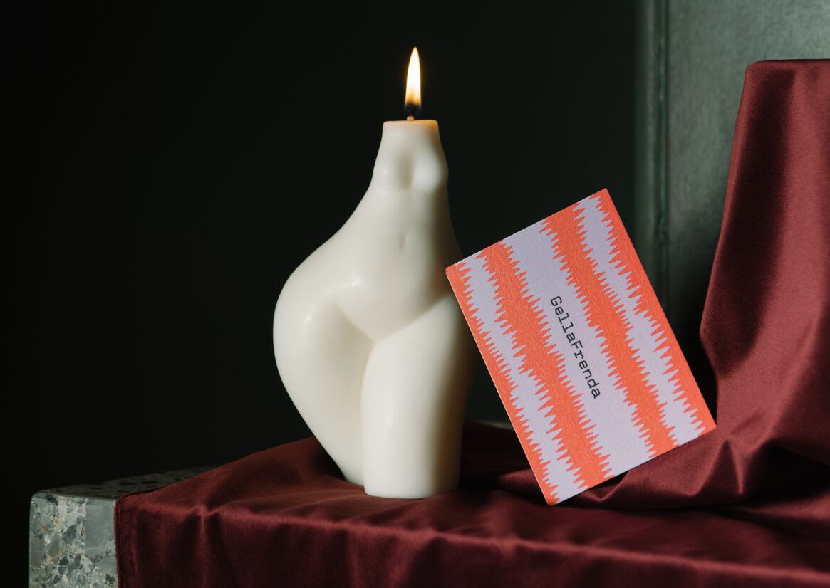
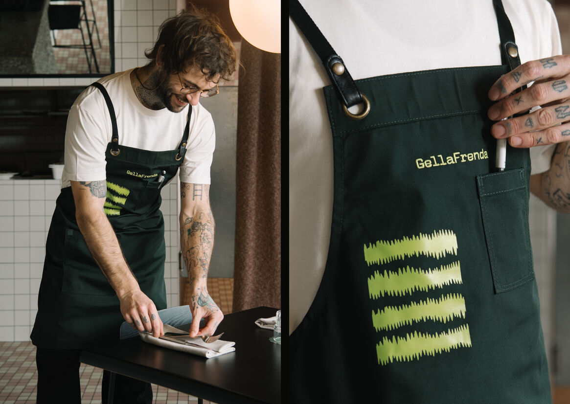
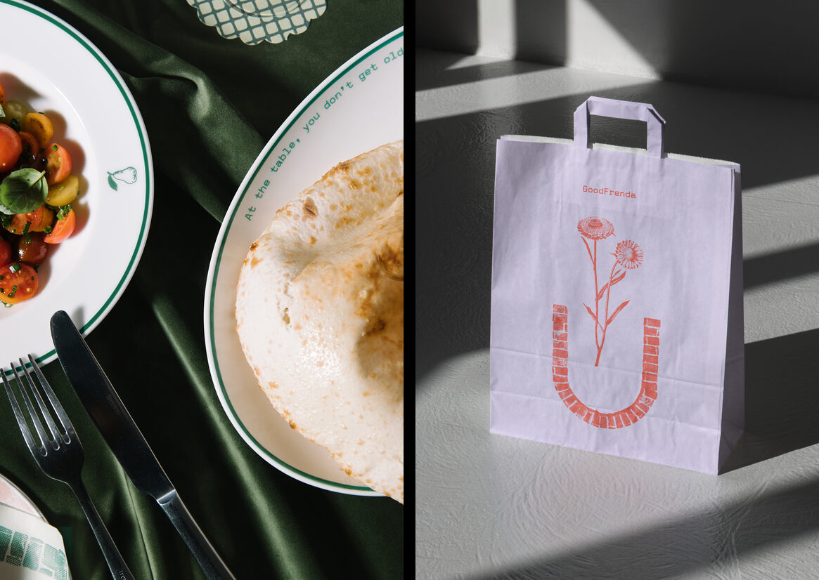
GellaFrenda is a contemporary Italian eatery, gelateria and wine bar (GellaFrenda Nextdoor) with a commitment to bringing authentic quality food to Penrith NSW.
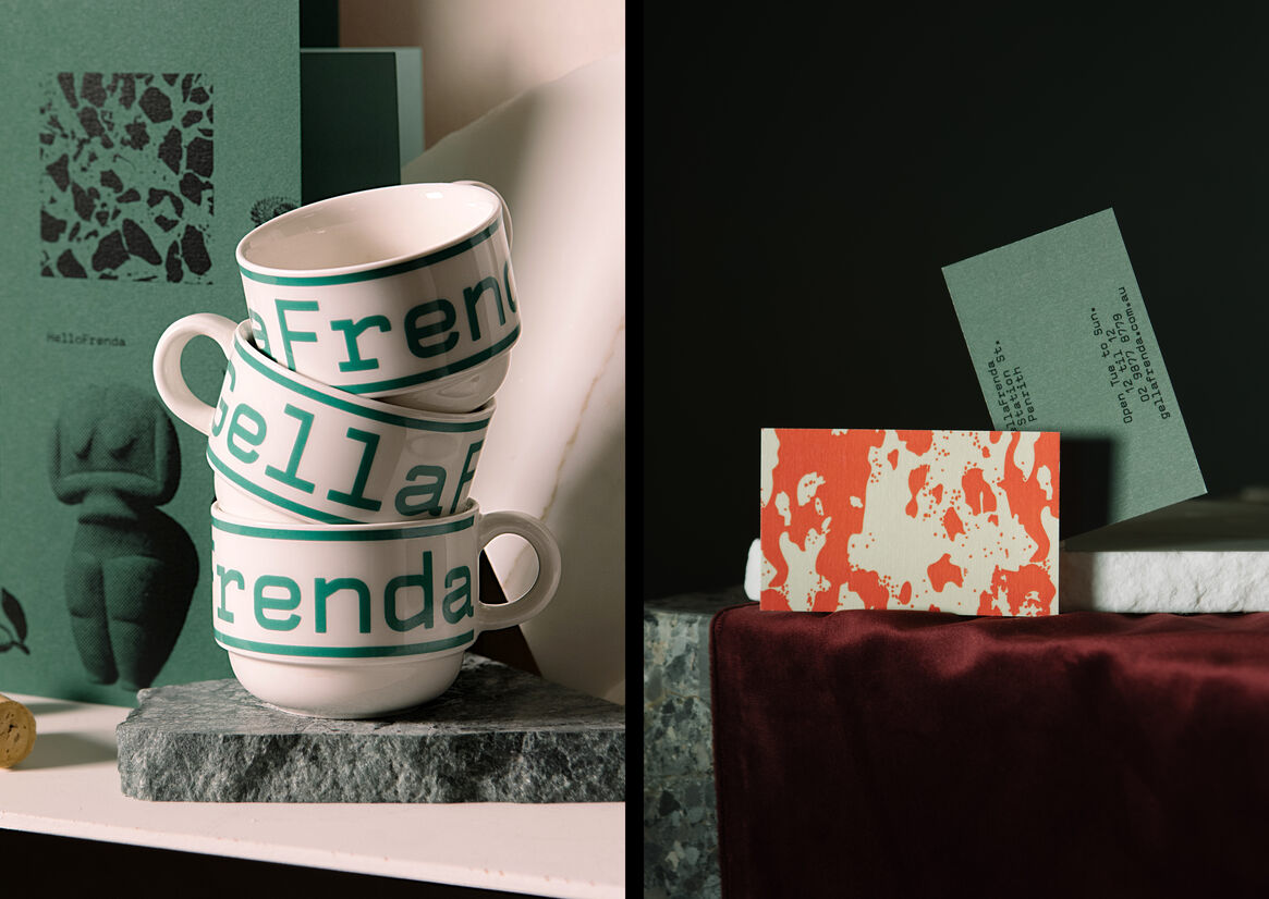
The name GellaFrenda (Girlfriend)originates from the Italo-Australian dialect, which is developed with modern Italian words being influenced by the vocabulary of the English language to create Italian/English words.
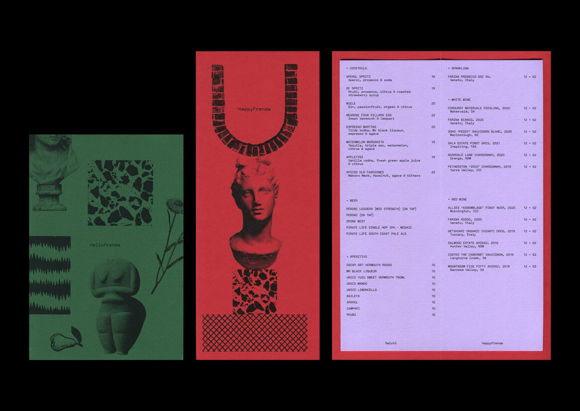
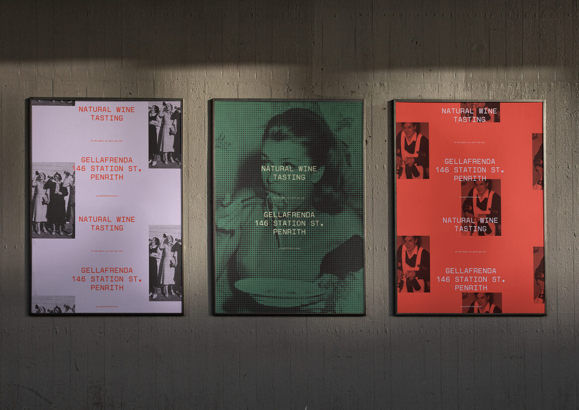
This clashing of cultures informed the concept of “Eclecticism”, composed of symbols and textures drawn from Australian and Italian cultures to underpin the old-world traditions and contemporary ideals.
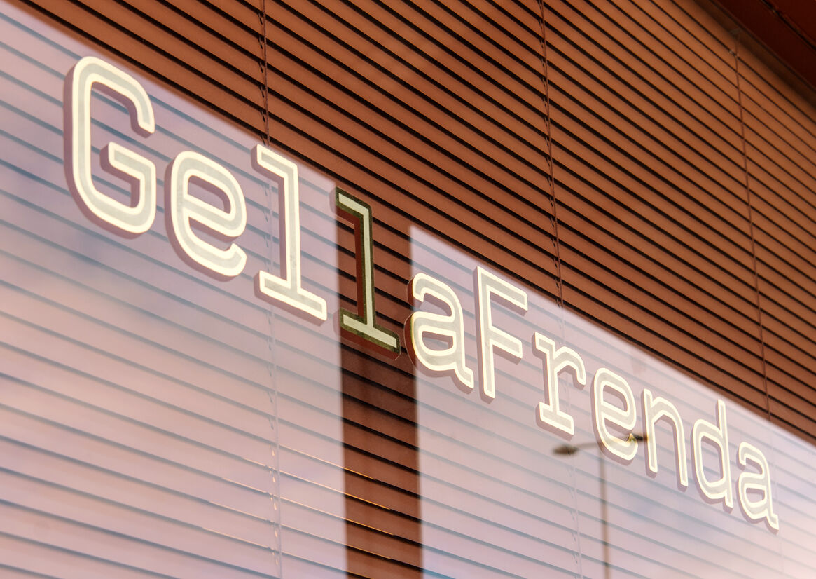
Italians are known for their exuberance, confidence, and style, leading us to Linetos’ typeface Valentine for its romantic Italian heritage. Valentine is a careful reconstruction of the original type of the Valentine typewriter, which isn’t just an icon of Italian design but a symbol of the historical moment it was created.
The colours green and red embody the essence of GellaFrenda and bring the classic Italian flavour into the brand.
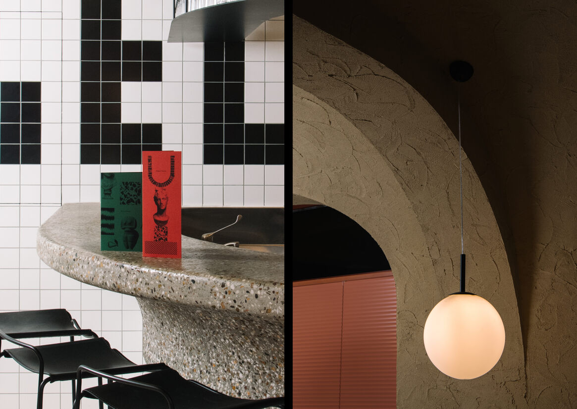
Matt Woods created an interior that captured a blend of Australian and Italian design, creating a contemporary and timeless space. GellaFrenda provides a memorable brand experience that rejects expectations and welcomes spontaneous contradictions.