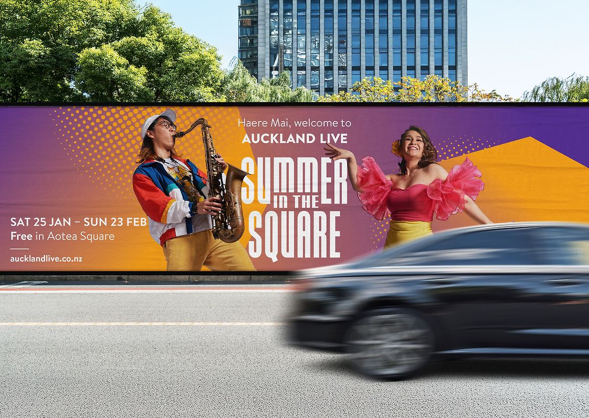
Summer in the Square is Auckland Live’s annual free performing arts and cultural festival, transforming Aotea Square into a vibrant, welcoming space in the heart of the city. As part of a broader city-wide summer activation, the project aims to celebrate local talent across diverse art forms, invite participation from Auckland’s communities and visitors, and reinforce Aotea Square’s role as a cultural anchor for the Aotea Arts Precinct. It also drives foot traffic and sustainable summer revenue opportunities — especially through food and beverage — while creating an inclusive, family-friendly space for shared cultural and artistic experiences. By connecting people through performance, the festival plays a strategic role in positioning the precinct as a lively, diverse cultural hub, fostering deeper engagement between audiences and the performing arts. The design concept is grounded in a simple but powerful idea: capture the collective energy of summer, performance, and people “in the square,” without being boxed in by a literal interpretation of space. The identity is anchored typographically, with the prepositional phrase “IN THE” framed by the festival title, visually centring the public space within the larger narrative. Rather than defaulting to square grids or frames, we stepped “outside the box” to reflect the festival’s inclusive, open-access spirit. A modular visual system allows each performance and artist to have their own unique presence while staying part of a cohesive whole — an evolving expression of a shared summer experience. The visual identity is built around an octagonal cut-out — referencing both a lens flare and a contrast to rigid square forms — layered with bold gradients, dynamic textures, and bespoke performer photography. Ben-Day dots and drop shadows lend depth, creating a sense of motion and vibrancy. The result is a visual language as dynamic and multifaceted as the event itself. A versatile colour palette shifts across genres and cultures represented in the festival, allowing each performance its own visual signature. This modularity enables the identity to flex seamlessly across touchpoints: digital screens, outdoor posters, social media, street campaigns, and wayfinding. The design language also extends into the physical environment — stage design, lighting, and signage — seamlessly unifying digital and real-world experiences while enhancing the immersive atmosphere of the square. Summer in the Square goes beyond design as decoration — it’s a cultural and community connector. The visual identity became a vehicle for inclusion, creativity, and representation, elevating the work through its celebration of Auckland’s diverse communities, its free access to the arts in a central public space, its sustainable growth opportunities for artists and vendors, and its joyful, high-quality design experience that reflects the festival’s transformational energy. In a time where connection is more important than ever, this project created space — both literally and visually — for everyone to belong.

Description:
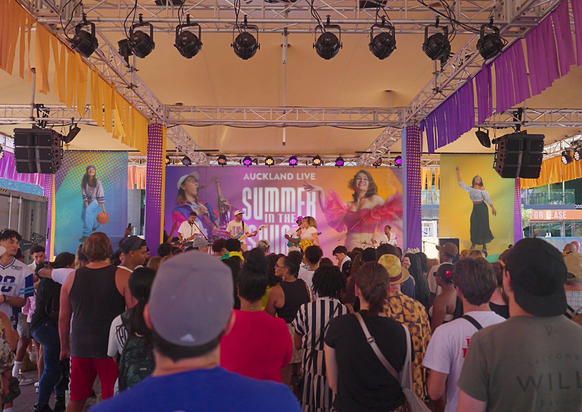
Summer in the Square is Auckland Live’s annual free performing arts and cultural festival, transforming Aotea Square into a vibrant, welcoming space in the heart of the city. As part of a broader city-wide summer activation, the project aims to celebrate local talent across diverse art forms, invite participation from Auckland’s communities and visitors, and reinforce Aotea Square’s role as a cultural anchor for the Aotea Arts Precinct. It also drives foot traffic and sustainable summer revenue opportunities — especially through food and beverage — while creating an inclusive, family-friendly space for shared cultural and artistic experiences. By connecting people through performance, the festival plays a strategic role in positioning the precinct as a lively, diverse cultural hub, fostering deeper engagement between audiences and the performing arts.
The design concept is grounded in a simple but powerful idea: capture the collective energy of summer, performance, and people “in the square,” without being boxed in by a literal interpretation of space. The identity is anchored typographically, with the prepositional phrase “IN THE” framed by the festival title, visually centring the public space within the larger narrative.
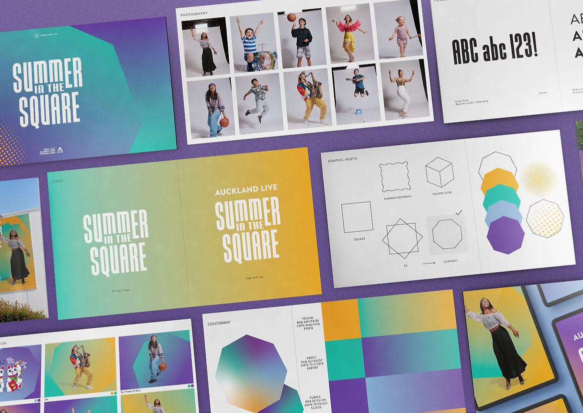
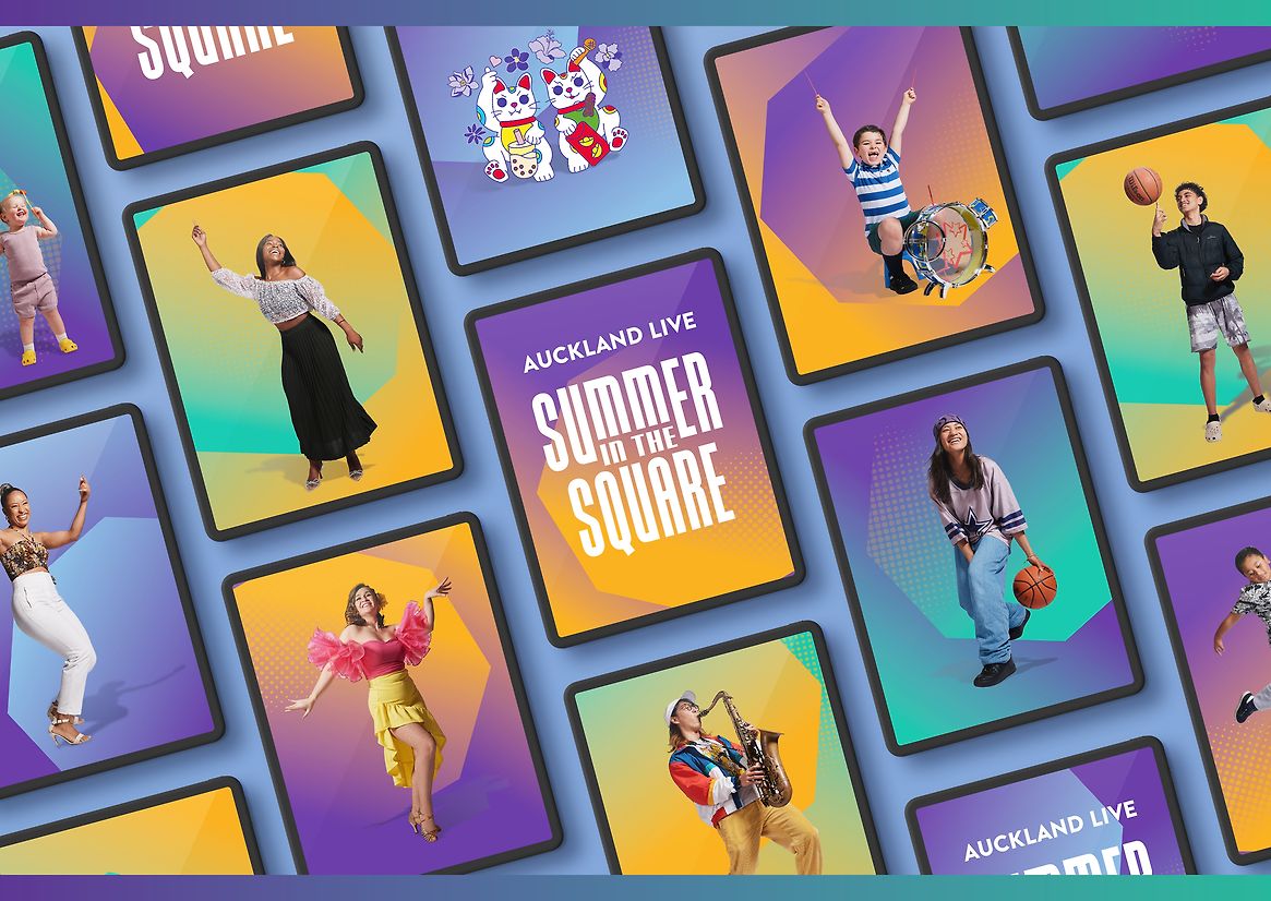
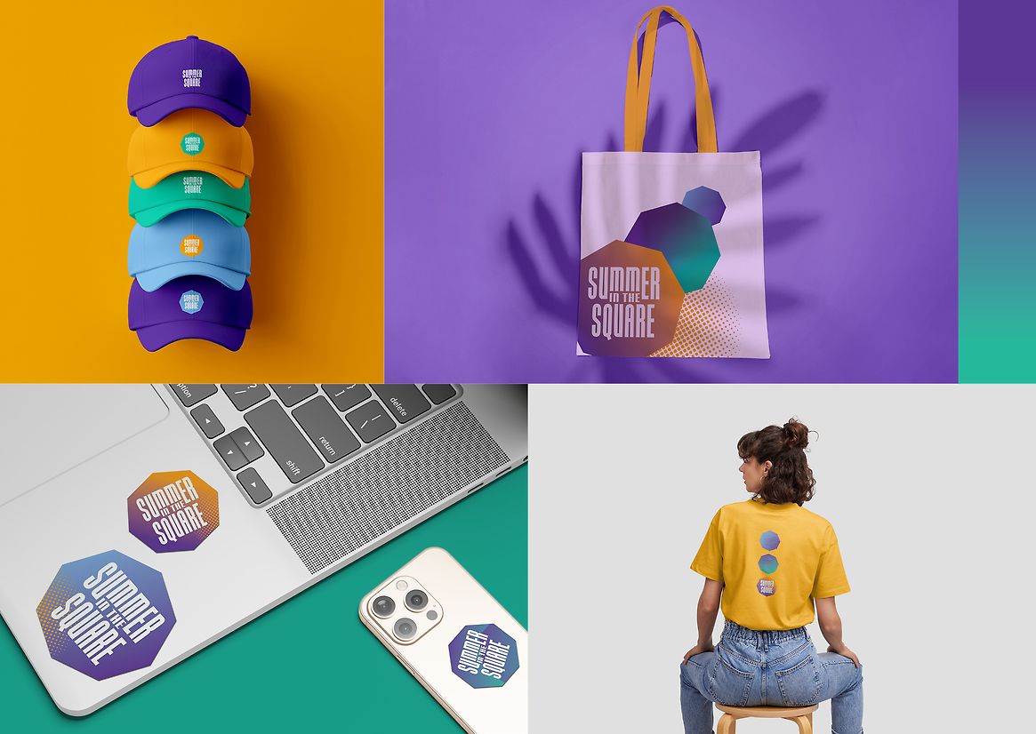
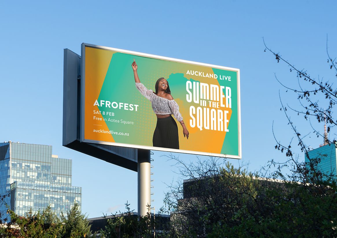
Rather than defaulting to square grids or frames, we stepped “outside the box” to reflect the festival’s inclusive, open-access spirit. A modular visual system allows each performance and artist to have their own unique presence while staying part of a cohesive whole — an evolving expression of a shared summer experience. The visual identity is built around an octagonal cut-out — referencing both a lens flare and a contrast to rigid square forms — layered with bold gradients, dynamic textures, and bespoke performer photography. Ben-Day dots and drop shadows lend depth, creating a sense of motion and vibrancy. The result is a visual language as dynamic and multifaceted as the event itself.
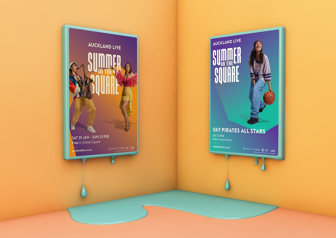
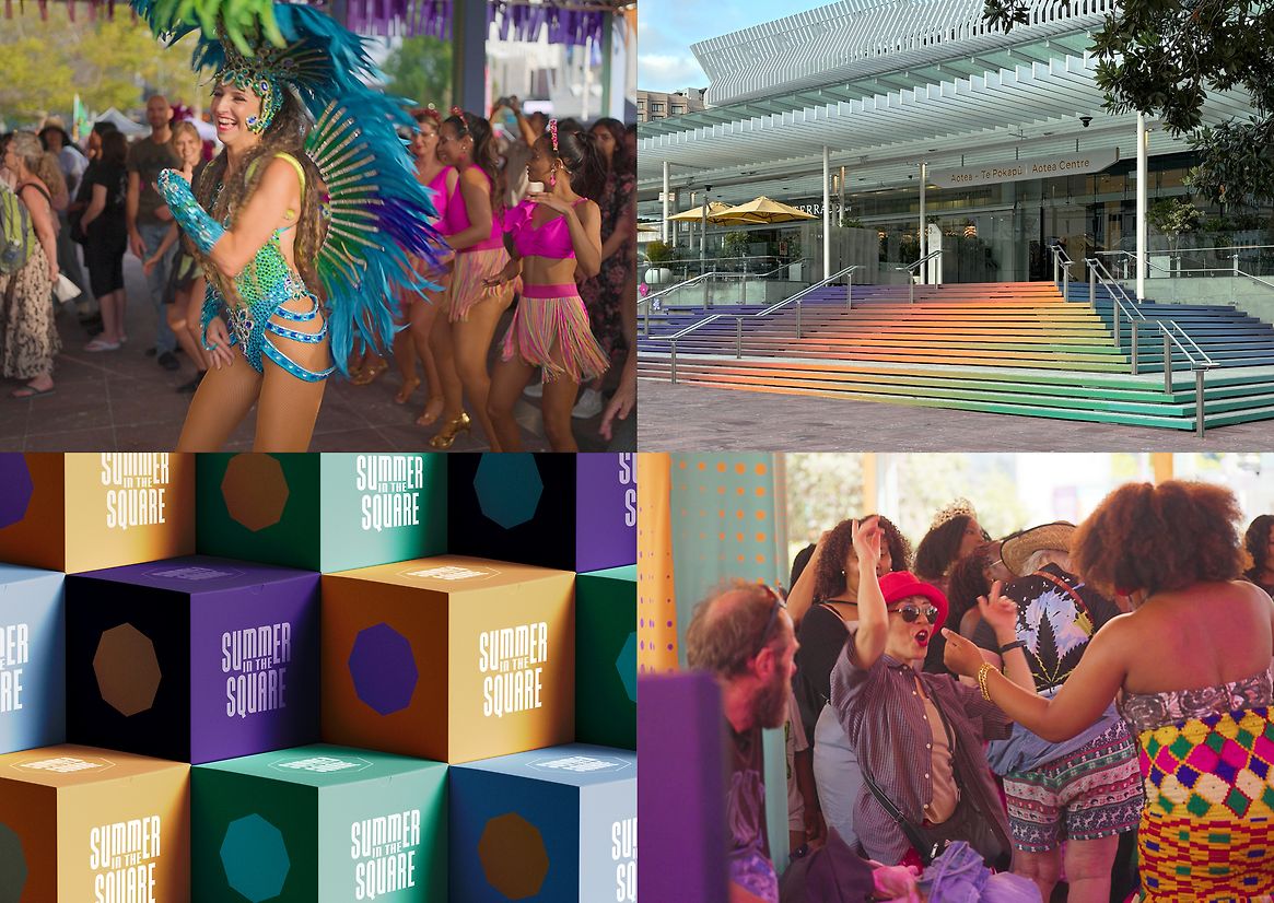
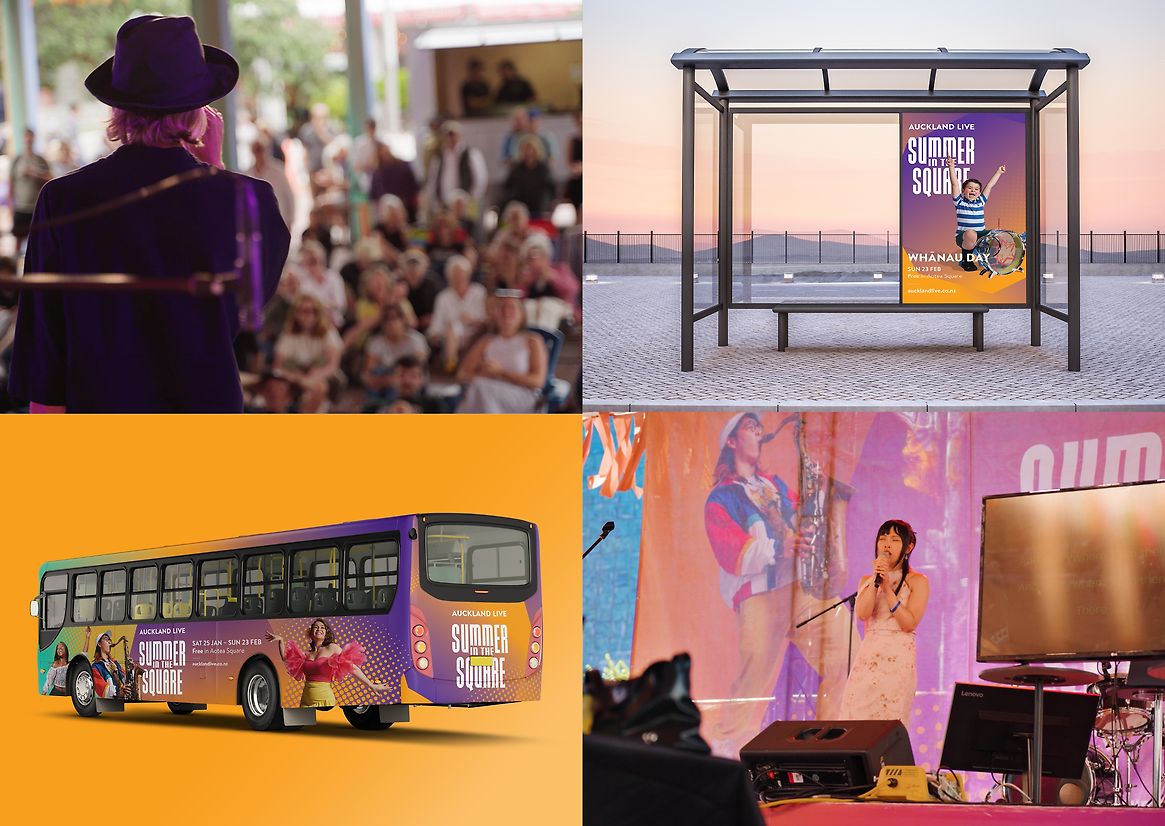
A versatile colour palette shifts across genres and cultures represented in the festival, allowing each performance its own visual signature. This modularity enables the identity to flex seamlessly across touchpoints: digital screens, outdoor posters, social media, street campaigns, and wayfinding. The design language also extends into the physical environment — stage design, lighting, and signage — seamlessly unifying digital and real-world experiences while enhancing the immersive atmosphere of the square.
Summer in the Square goes beyond design as decoration — it’s a cultural and community connector. The visual identity became a vehicle for inclusion, creativity, and representation, elevating the work through its celebration of Auckland’s diverse communities, its free access to the arts in a central public space, its sustainable growth opportunities for artists and vendors, and its joyful, high-quality design experience that reflects the festival’s transformational energy. In a time where connection is more important than ever, this project created space — both literally and visually — for everyone to belong.