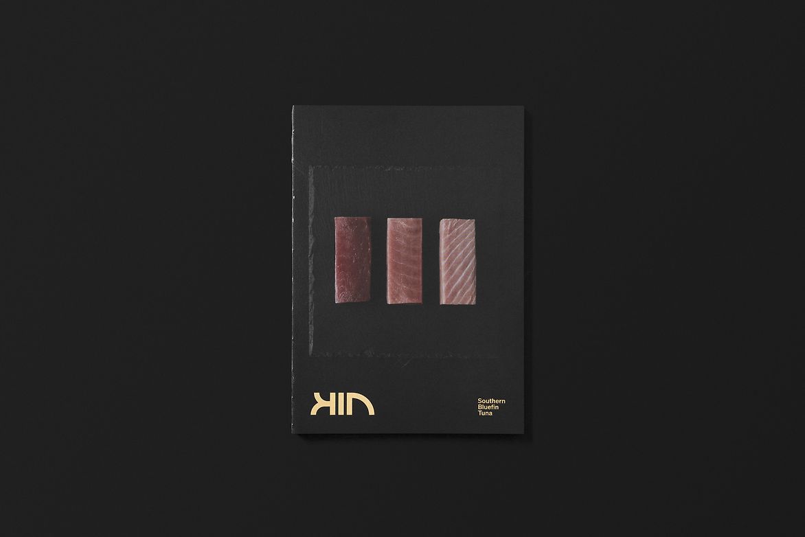
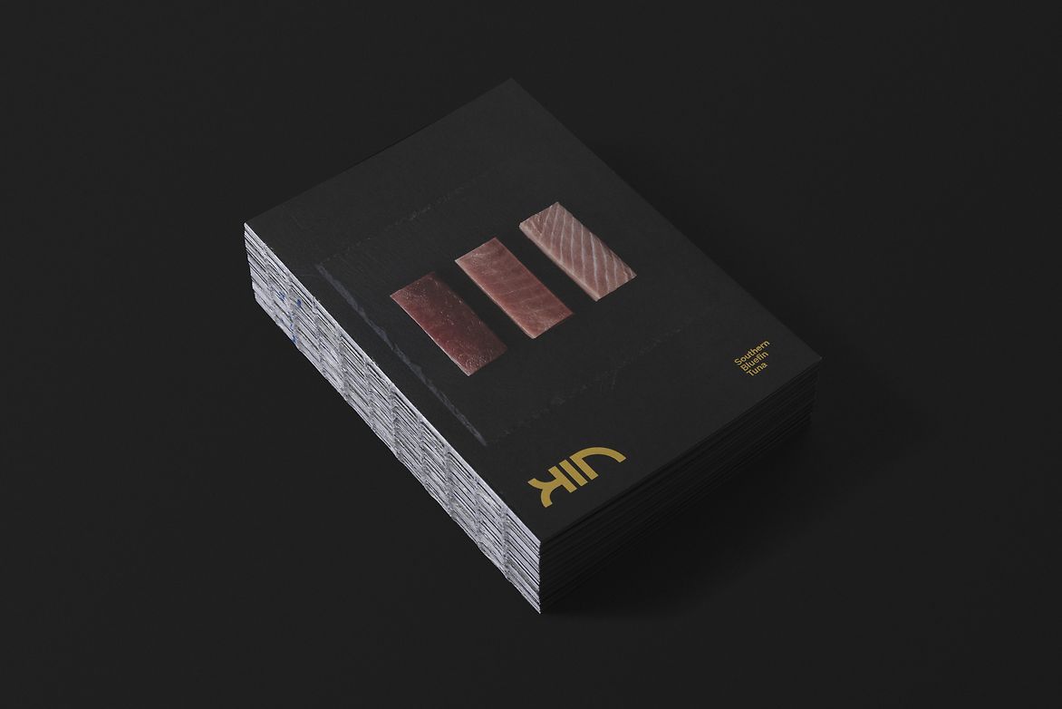
Kin Seafood is an Australian direct to consumer seafood brand that was created to introduce premium quality Southern Bluefin Tuna to the domestic and international markets.
Three fishing families in South Australia combined their knowledge of sustainable fishing practices along with their ability to supply the best tuna on the market, and together created Kin.
Tuna has long been perceived as a canned product in the western world. Lacking the premium feel that reflected the prized Southern Ocean delicacy.
We were approached with the challenge to create a brand that shifted this perception and elevated the offering in order to build on its value proposition of supplying the best quality tuna to the world.
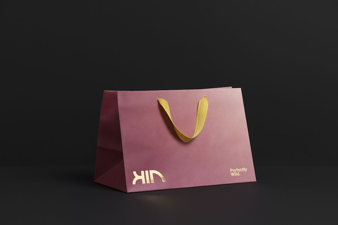
The solution was to create a distinct brand identity supported by a brand system and verbal brand that reflected the premium quality of the product.
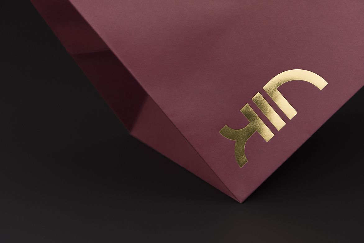
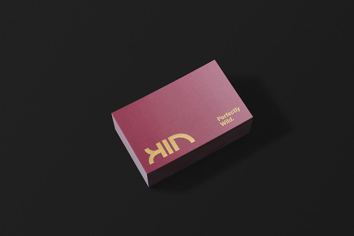
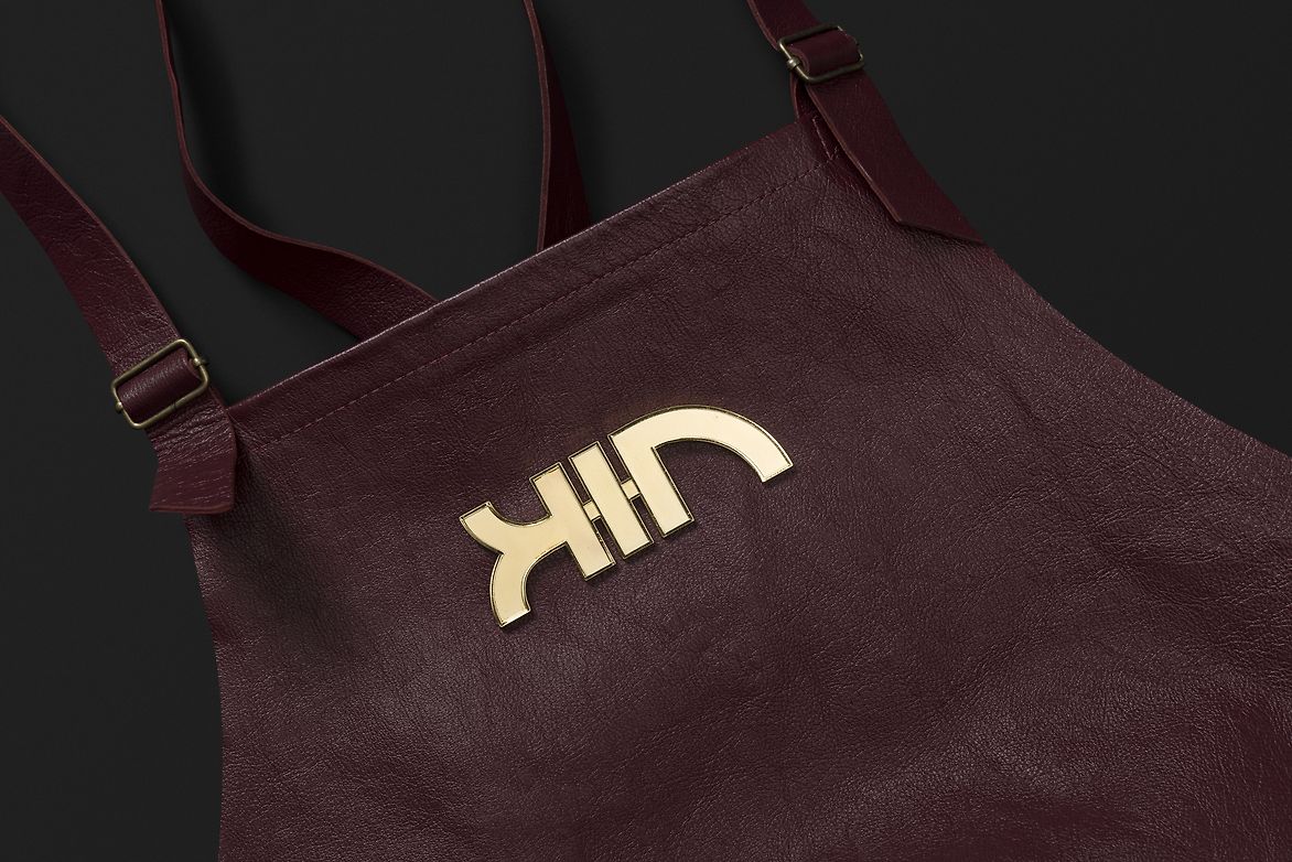
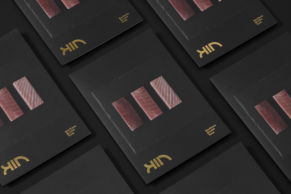
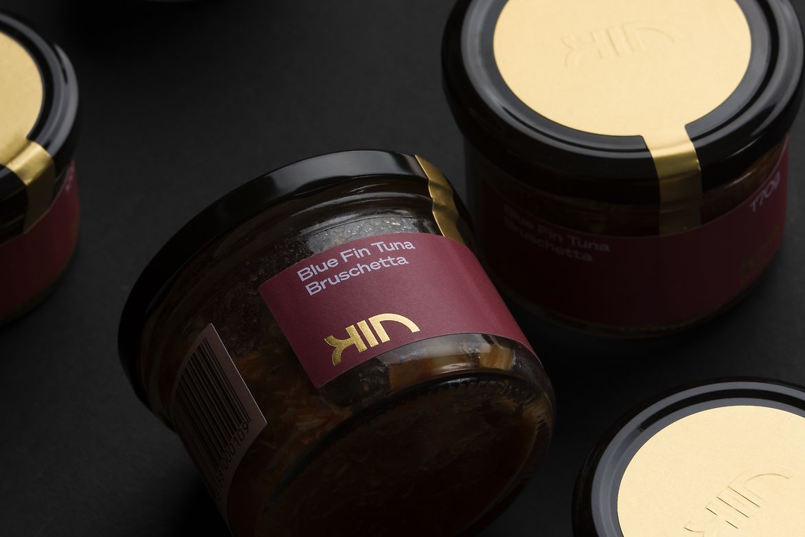
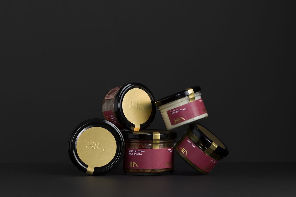
The brand line, Perfectly Wild, encapsulates the essence of Kin. The logo, created using the golden ratio, is a typographic representation of one of the ocean’s most prized delicacies. Gold foiling, subtle gradients, and dramatic imagery create a premium and distinct brand.
The logo took it's form and shape from the golden ratio to create a typographic representation of one of the oceans most prized delicacies, Southern Bluefin Tuna. Often referred to as the divine proportion, the geometry forms the basis of the logo.

Description:
Kin Seafood is an Australian direct to consumer seafood brand that was created to introduce premium quality Southern Bluefin Tuna to the domestic and international markets.
Three fishing families in South Australia combined their knowledge of sustainable fishing practices along with their ability to supply the best tuna on the market, and together created Kin.
Tuna has long been perceived as a canned product in the western world. Lacking the premium feel that reflected the prized Southern Ocean delicacy.
We were approached with the challenge to create a brand that shifted this perception and elevated the offering in order to build on its value proposition of supplying the best quality tuna to the world.
The solution was to create a distinct brand identity supported by a brand system and verbal brand that reflected the premium quality of the product.
The brand line, Perfectly Wild, encapsulates the essence of Kin. The logo, created using the golden ratio, is a typographic representation of one of the ocean’s most prized delicacies. Gold foiling, subtle gradients, and dramatic imagery create a premium and distinct brand.
The logo took it's form and shape from the golden ratio to create a typographic representation of one of the oceans most prized delicacies, Southern Bluefin Tuna. Often referred to as the divine proportion, the geometry forms the basis of the logo.