CUB uses their digital and AI expertise to help modernise businesses, vastly improving their speed and success. They have a straight-talking, uncomplicated, and personal approach that really sets them apart. They had outgrown their limited brand and wanted something more disruptive, more inspired, and more them. The challenge was creating a brand that could achieve this whilst capturing CUB's direct and playful character.
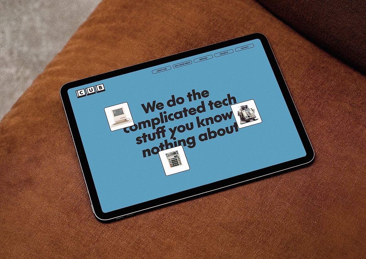
The majority of CUB’s clients are middle-aged CEOs who grew up in a time when phones were for calls, calculators were scientific, and computers computed... Technology was simpler. This inspired a nostalgic approach to the visual identity to help convey CUB's ability to simplify tech.
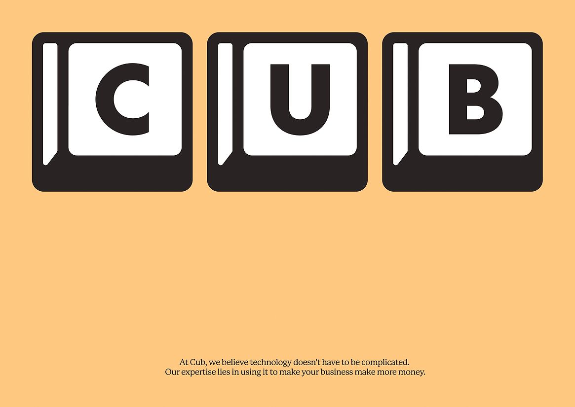
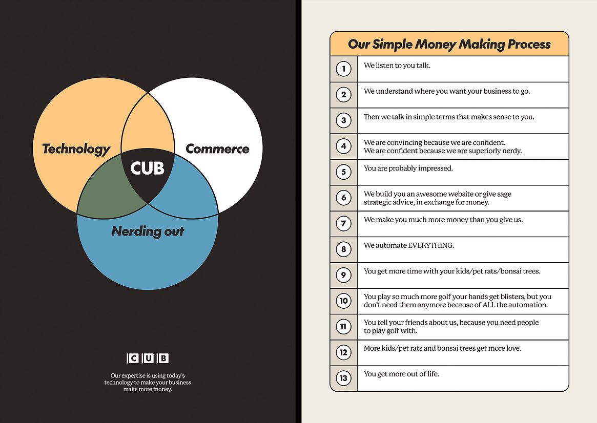
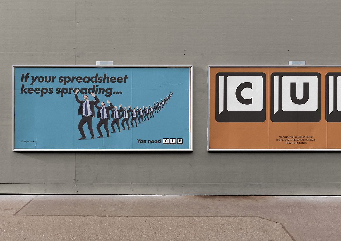
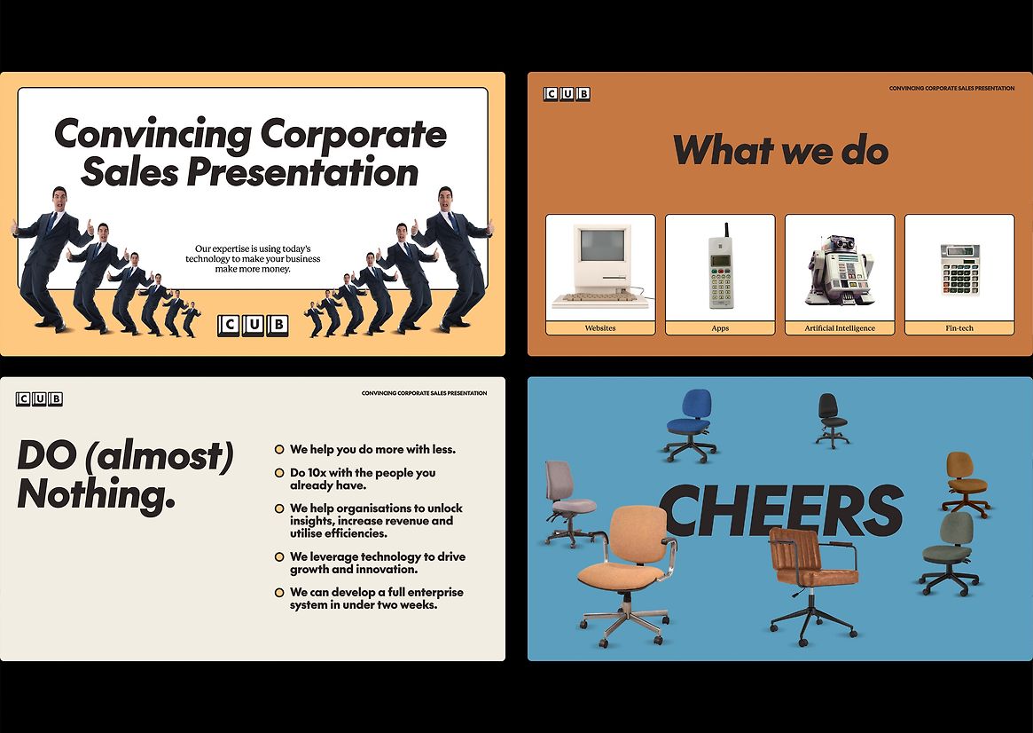
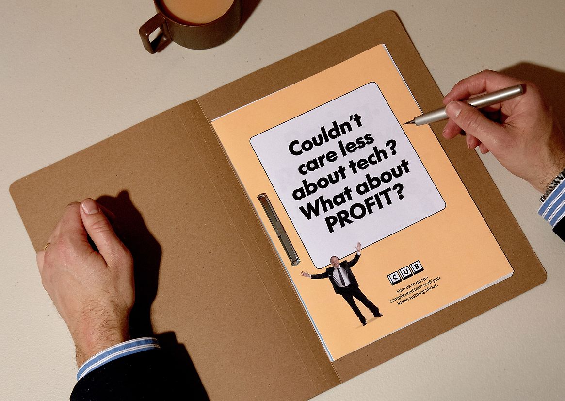
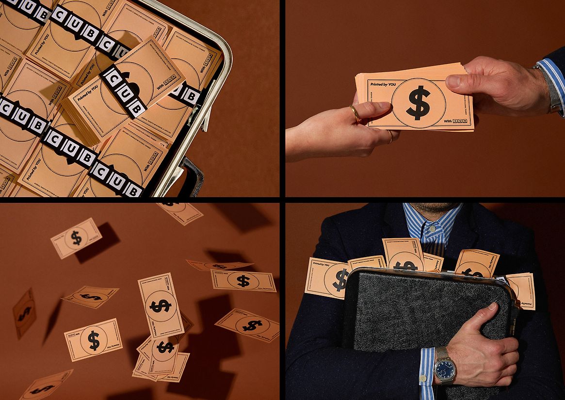
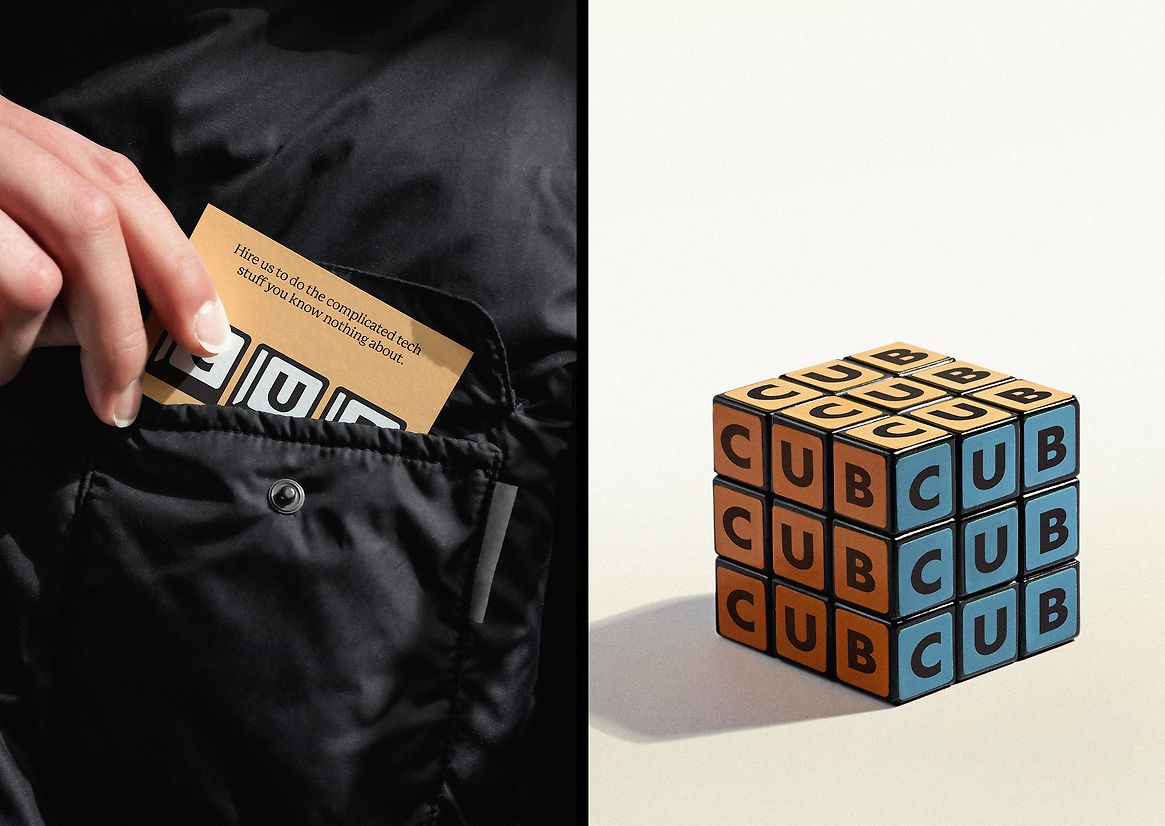
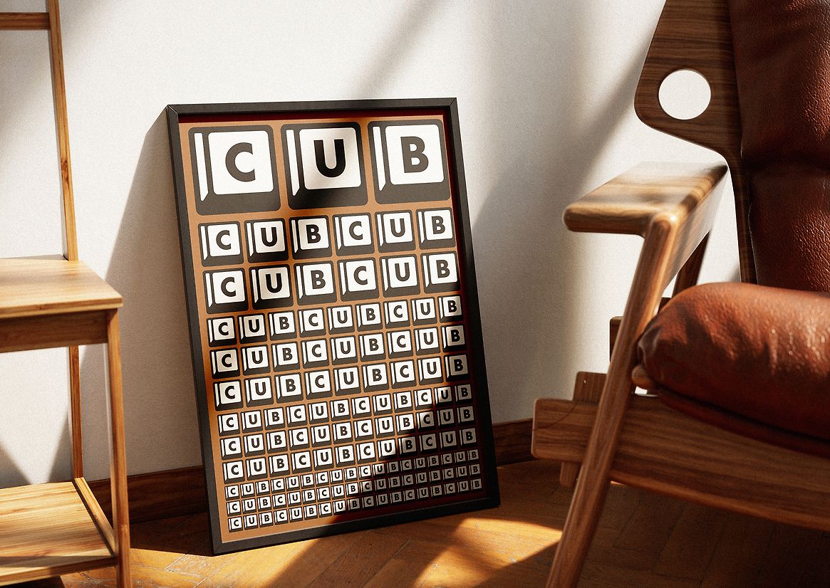
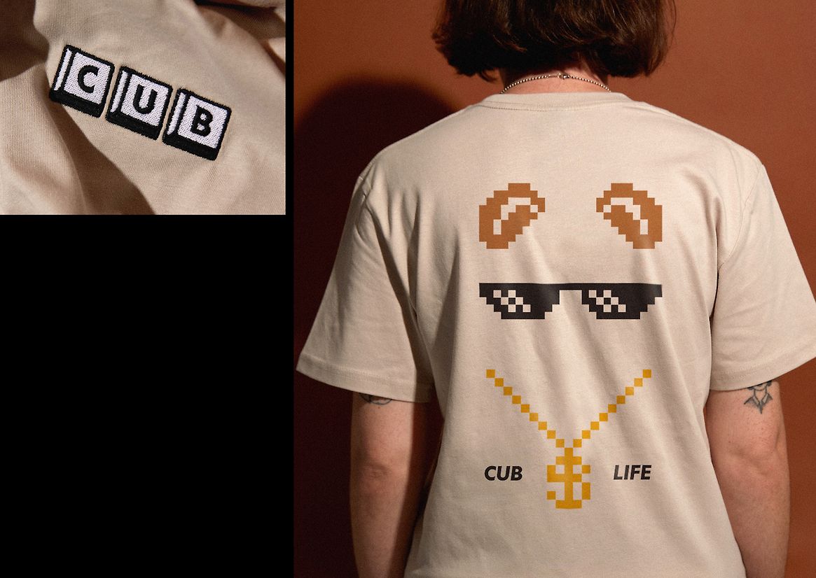
The logo is made of retro keyboard keys – with help from CUB just a click away. A deadpan, playful, and human tone of voice drives the brand experience, with all messaging set in ‘The Future’ typeface – a modern take on the classic ‘Futura’. This is supported by a suite of low-fi, hilarious corporate stock characters that keep the tone light. Business graphs and charts that plot success, are reappropriated for entertaining and direct communication.
Overall CUB’s new brand bucks all the usual tech tropes, positioning them miles away from their competitors – firmly at the top of the food chain.
Description:
CUB uses their digital and AI expertise to help modernise businesses, vastly improving their speed and success. They have a straight-talking, uncomplicated, and personal approach that really sets them apart. They had outgrown their limited brand and wanted something more disruptive, more inspired, and more them. The challenge was creating a brand that could achieve this whilst capturing CUB's direct and playful character.
The majority of CUB’s clients are middle-aged CEOs who grew up in a time when phones were for calls, calculators were scientific, and computers computed... Technology was simpler. This inspired a nostalgic approach to the visual identity to help convey CUB's ability to simplify tech.
The logo is made of retro keyboard keys – with help from CUB just a click away. A deadpan, playful, and human tone of voice drives the brand experience, with all messaging set in ‘The Future’ typeface – a modern take on the classic ‘Futura’. This is supported by a suite of low-fi, hilarious corporate stock characters that keep the tone light. Business graphs and charts that plot success, are reappropriated for entertaining and direct communication.
Overall CUB’s new brand bucks all the usual tech tropes, positioning them miles away from their competitors – firmly at the top of the food chain.