Graphic
McCarthy 114 Te Ūaka
-
Pou Auaha / Creative Directors
Matt Kitto, Stephen McCarthy
-
Ringatoi Matua / Design Directors
Joel Kitto, Richard M. Burson
-
Ngā Kaimahi / Team Member
Stefan Downs -
Client
The Lyttelton Museum
Description:
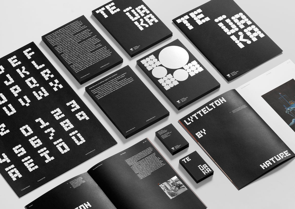
The Lyttelton Museum asked us to develop a new brand identity, bringing to life their newly gifted name – Te Ūaka, meaning a place of landing, or a place of arrival. This name tells the story of tangata whenua and European settlers who both arrived at Lyttelton following long journeys on water, and subsequently began new journeys on land. The Lyttelton Museum is the representation of this story – the destination of Lyttelton’s history, and the origin of its future. The story of a place where the ocean meets the land. A place of arrival and departure. A place of past and present significance for both Māori and Europeans. Lyttelton is the middle point, the meeting place, the manifestation of duality.
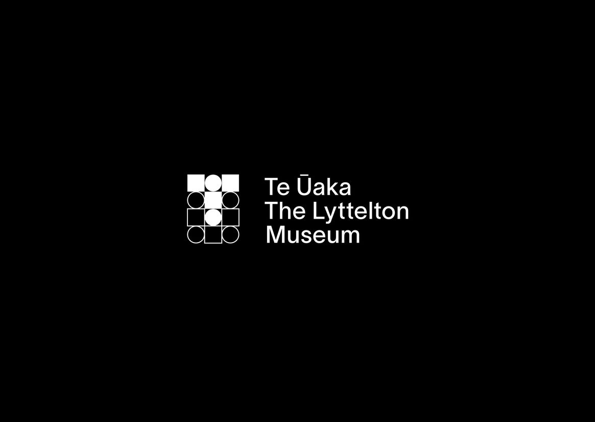
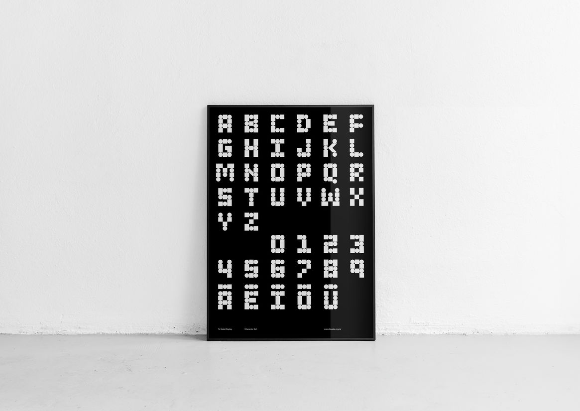
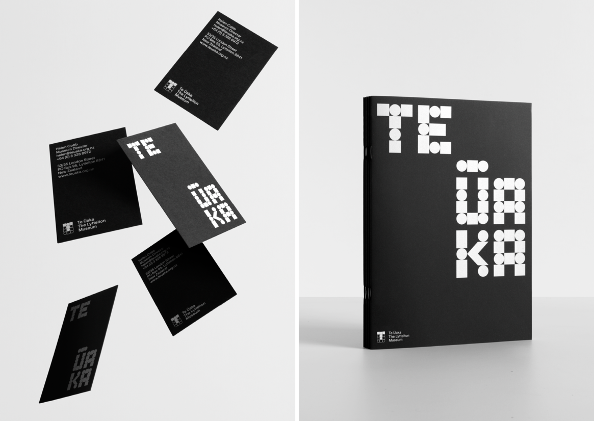
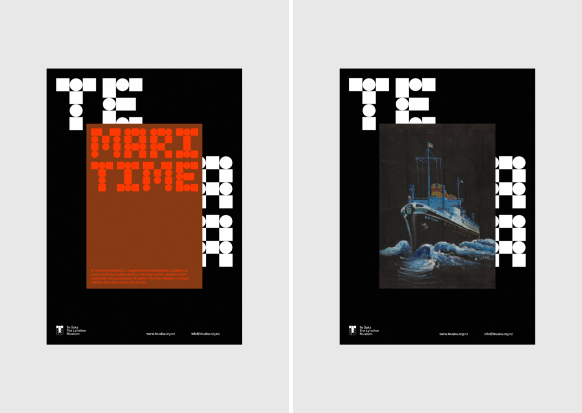
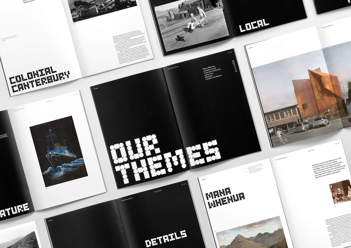
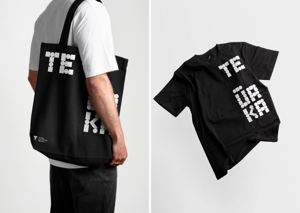
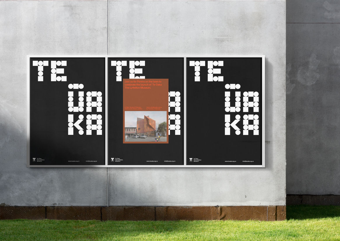
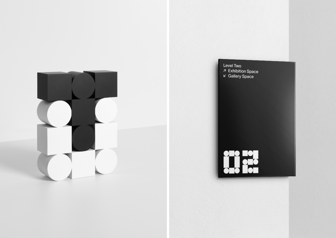
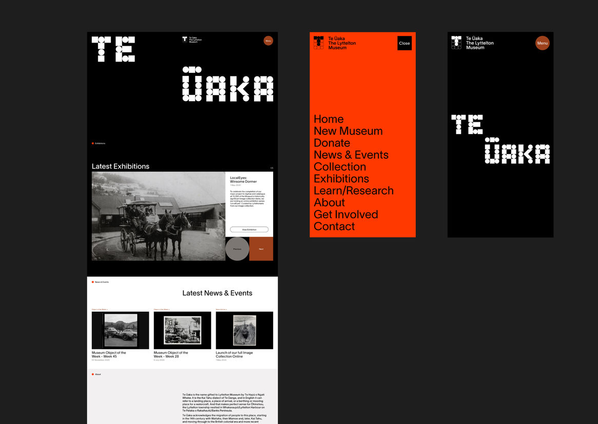
Exploring this idea of duality, we presented the concept as simple contrasting shapes – a circle and square. In developing the logomark, we created a structure in which these shapes were pieced together in an alternating fashion. This was applied to the initials, where the ‘T’ shape represents the traditional Māori waka and the ‘U’ shape, the harbour and port. Coming together, this further communicates the idea of duality. In addition, we developed a display typeface in which the name, Te Ūaka, is applied. This was used as a graphic device across collateral placing importance and greater emphasis to the new name.
Communication relies heavily on imagery from the museums collection and exhibitions where the display typeface does much of the heavy lifting. A predominantly black and white colour palette includes a pop of neon orange and rust, whilst a selection of patterns, subtly reference nautical flags.
Judge's comments:
A timeless design system for Lyttelton Museum, with great core idea.