Graphic
Stanley St 19 Tātou Safer Gambling Aotearoa
-
Pou Auaha / Creative Director
Brad Collett
-
Ringatoi Matua / Design Directors
Phila Lagaluga, Graham Tipene
-
Ngā Kaimahi / Team Members
Skye Kimura, Kent Briggs, Sam Cox, Emily Ostrowska, Darryl Roycroft, Misty Kimura -
Client
Te Hiringa Hauora
Description:
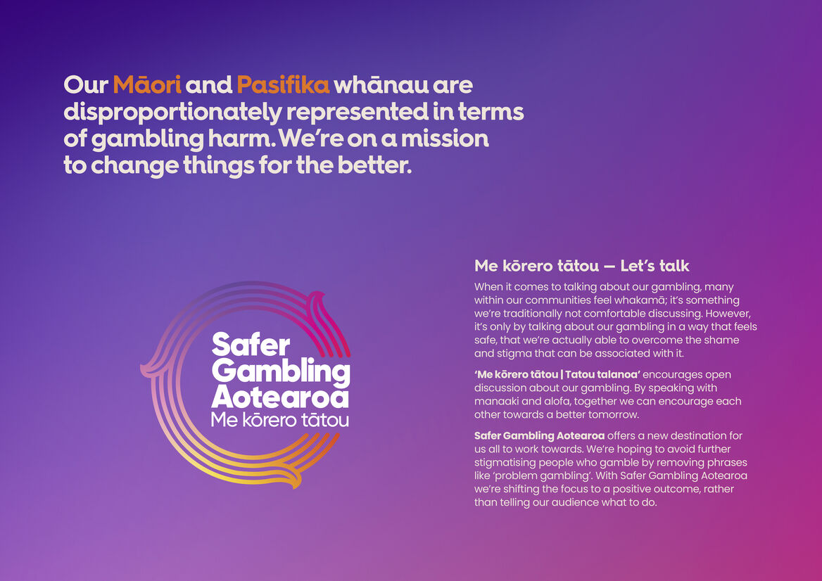
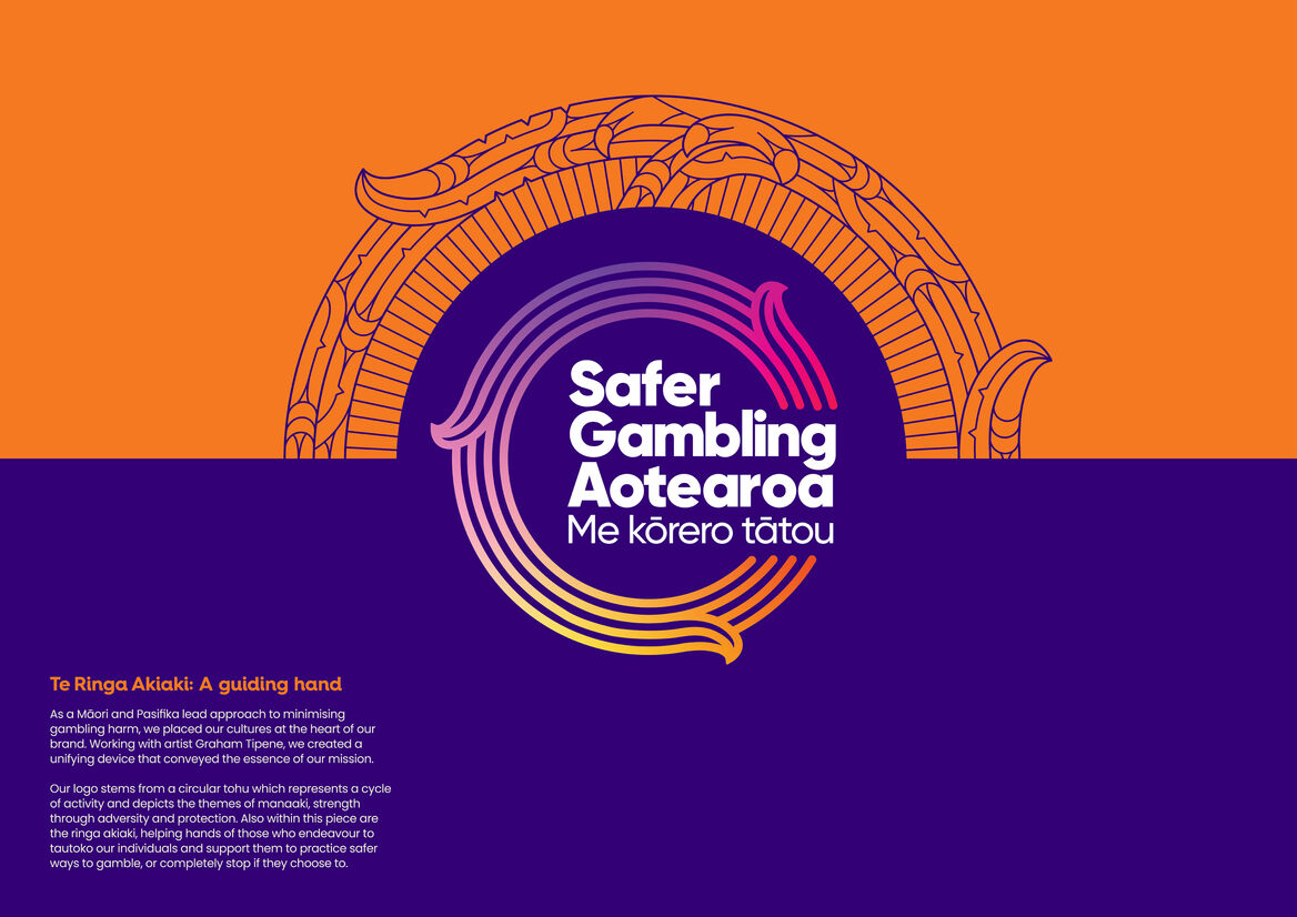
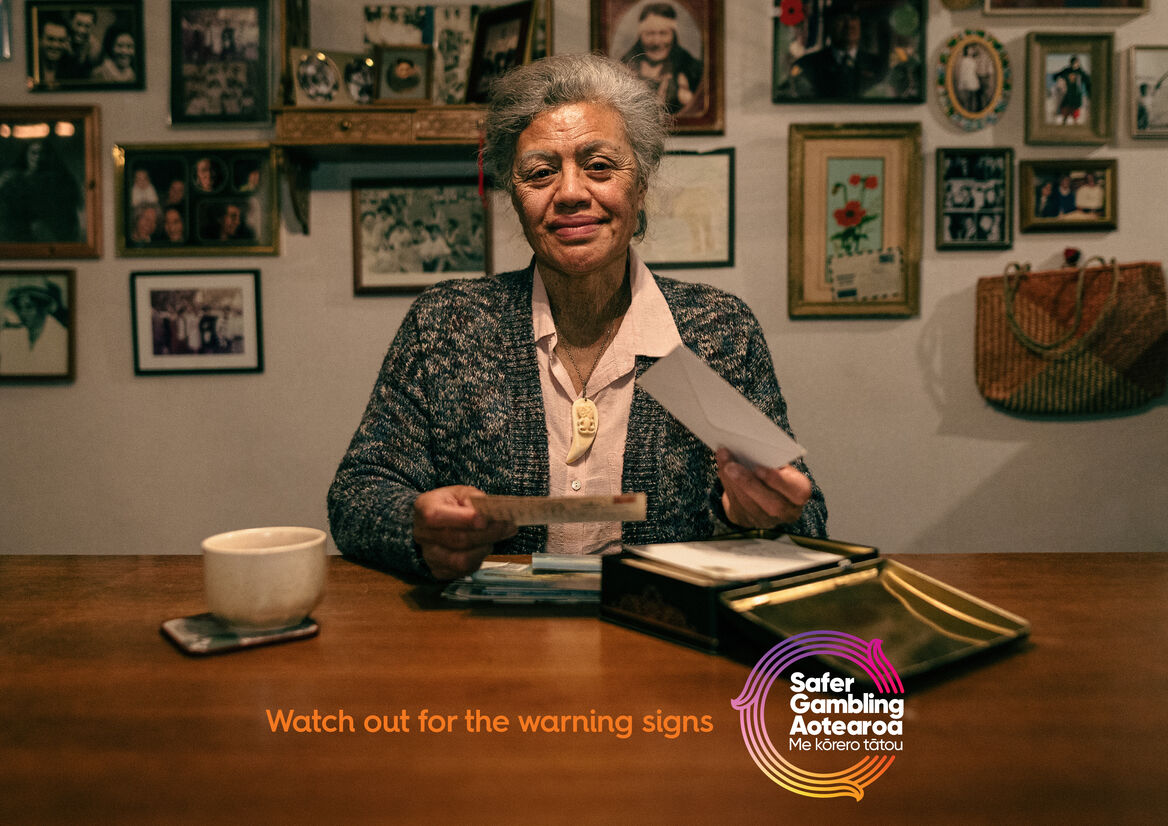
Māori and Pacific Islanders are over-represented when it comes to gambling harm. We are on a mission to create lasting change. For a Māori and Pasifika-led approach to minimising gambling harm, these cultures needed to be at the heart of our brand identity. So in partnership with artist Graham Tipene, we created a culturally relevant logo device that speaks to addiction, acknowledgement, acceptance and help.
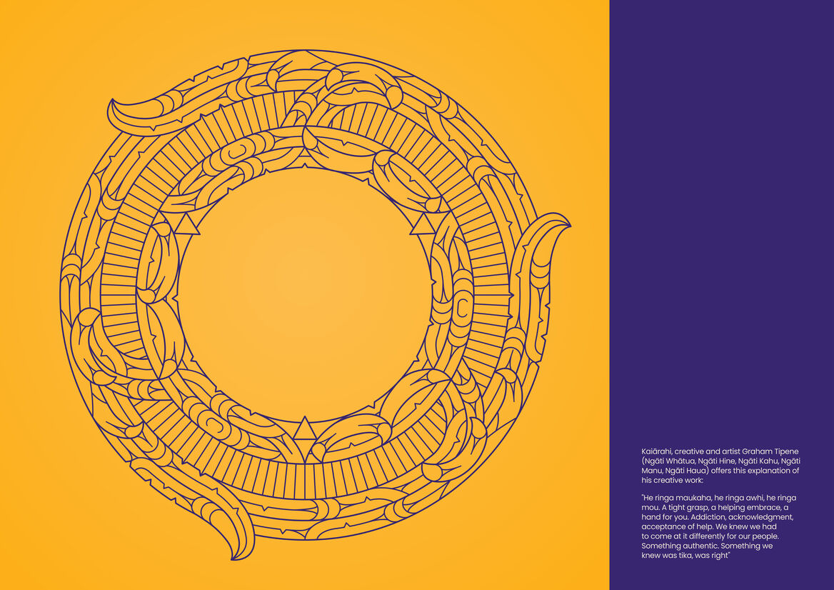
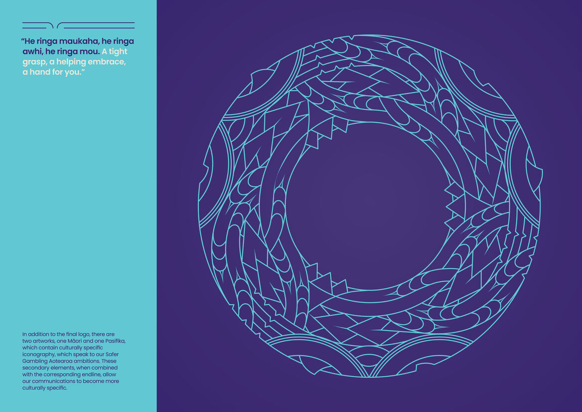
"He ringa maukaha, he ringa awhi, he ringa mou. A tight grasp, a helping embrace, a hand for you. Addiction, acknowledgment, acceptance of help. We knew we had to come at it differently for our people. Something authentic. Something we knew was tika, was right"
– Graham Tipene.
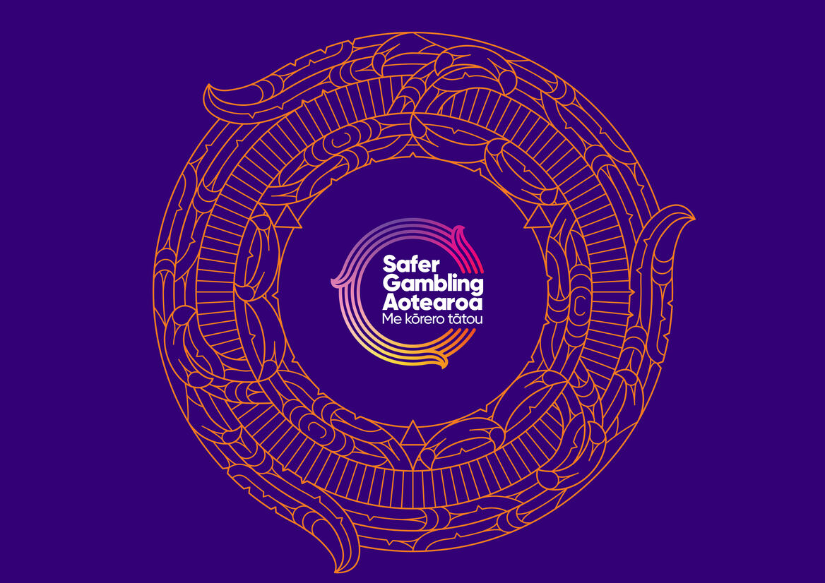
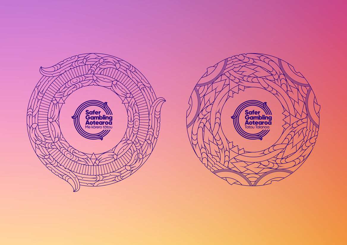
The logo is the centrepiece of the identity and stems from a circular tohu, representing a cycle of activity and the themes of manaaki, strength through adversity, and protection. It also features Te Ringa Akiaki, the helping hands of those who tautoko / support individuals to practise safer ways to gamble – or to completely stop if they choose to. The outer rings with the curved ringa symbolises the continuous mahi of Safer Gambling Aotearoa. The inner rings represent the people we hope to inspire.
We also created two artworks (one Māori and one Pasifika), that contain culturally specific iconography, these guided the development of the logo and brand. Rather than dwelling on the sober reality of problem gambling, the Safer Gambling Aotearoa brand identity is designed to express energy and vibrancy – to lift the ‘mauri’. Other design considerations tie into the central themes; the choice of typeface mirrors the curves in the central tohu, whilst the gradients represent the diverse people of Aotearoa. The bright vibrant colour palette reflects the world of enticing lights, colour and graphics associated with gaming, but shifts the focus to a positive outcome for all.
Ultimately, this is a small seed of brand, at the start of its life and will grow, maturing as the mahi and campaigns progress — towards a positive outcome for our communities and Aotearoa- he ringa akiaki mo te motu whānui.