Graphic
Satellites 4 Satellites
-
Pou Auaha / Creative Director
Son La Pham
-
Ngā Kaimahi / Team Members
Rosabel Tan, Emma Ng -
Kaitautoko / Contributors
Daniel Farò, Ashley Young, Greta Billstein, Dilohana Lekamge, Melanie Kung, Janhavi Gosavi, Tim Wong, Jennifer Cheuk, Marc Conaco, Jing Cheng Zhao -
Client
Satellites


Description:
Satellites is a platform connecting the past, present and future of Aotearoa Asian art.
From the beginning of the project, it was clear that the idea of creating a ‘universal’ visual language that encompasses the diverse range of cultural identities, practices and types of knowledge that Satellites represents was not possible nor desirable. Self-stereotyping, or ‘making it look Asian’ seemed like the wrong approach.
The idea of a monolithic Asian identity is something Satellites deliberately challenges, instead splitting and stretching this label into a larger, more expansive view of what it means to be ‘Asian’ in Aotearoa. Our aim was to see this act as a generative process that helps us understand ourselves better.
Following this, we aimed to develop the Satellites branding to work *with* rather than against this stretching of the boundaries of identity.
The simple visual motif of the expiry date — usually stamped onto cans and other food products — allows us to speak to a few of these ideas at once (as well as a being a subtle reference to an iconic piece of Asian cinema, Wong Kar Wai’s ‘Chungking Express’):
— It is a marker of a specific point in time that hints at the storage and archival of cultural memory.
— A unique label that stretches and warps: one that is never the same twice, reflecting the distortion and acts of translation/mistranslation that take place in migrant cultures.
— Something that adorns every can of pineapple juice or preserved lychees… a nod to the dairies and convenience stores that are a cornerstone of migrant businesses.
Typography leads the visual identity, with the distinctive warped ‘expiry date’ lettering providing a way for the identity to be encoded across the entire suite of communications material. Even simple typographic layouts become unique with programmatically random distortion, allowing for highly expressive typography. This live typography brings the brand to life on the website, allowing for each user’s visit to be unique by randomising typographic variables on each page load.
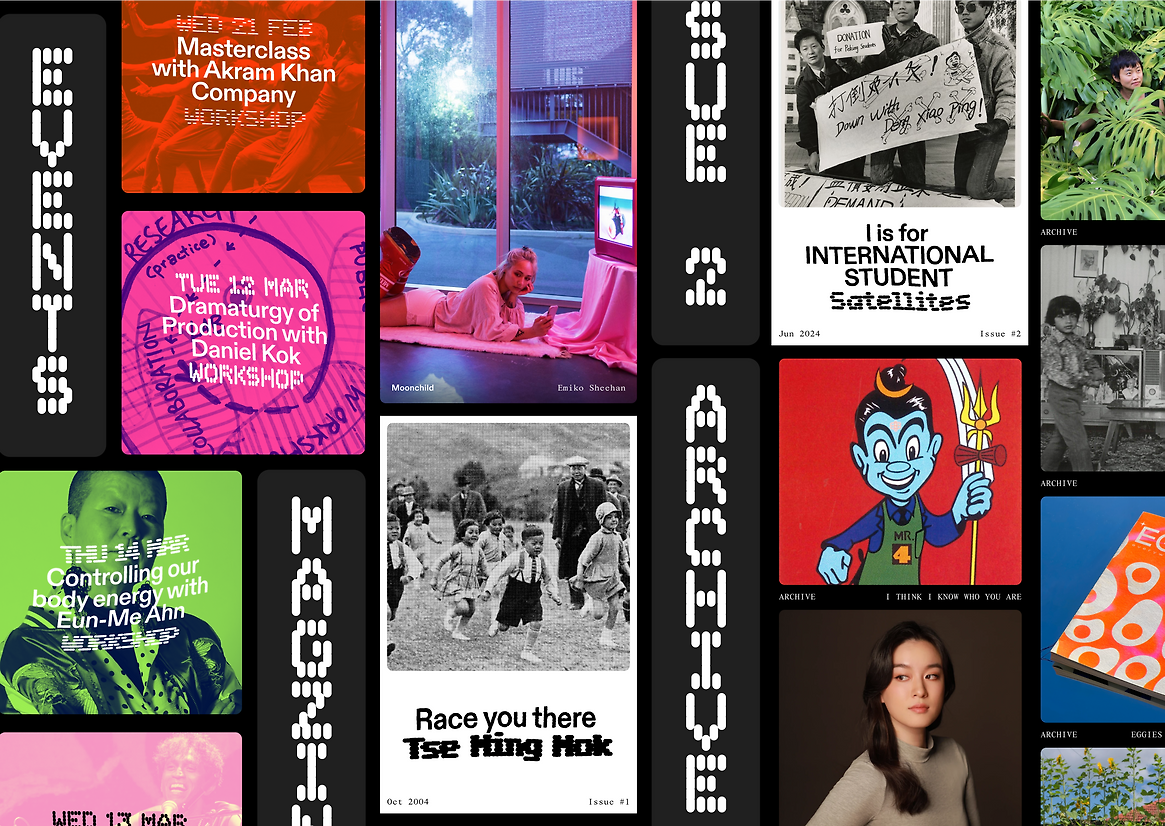
The Satellites branding and website has to encompass the three pillars of the project – magazine, archive and public programme. A modular approach allows for a core graphic element — a rounded frame within a square frame — to adapt and resize to fit each of these different contexts.
To supplement the editorial, public programme and archive content, new visual assets were created — part maximalist bouquet of Asian flowers and part minimalist fruit and vegetable stand. Our resulting ikebana links together dragonfruits and birds of paradise, orchids and lychees. These fruits and flowers are not native to a single country, but rather a menagerie of expected pan-Asian items woven together in a surprising way.
The expiry date combines with other signature design elements to create the relaunched Satellites visual identity. Together, they provide a unifying thread that meets the varied content contained in different parts of the project — archive, editorial, public programme — so that each responds to its context while still making a distinct and confident statement.
Judge's comments:
Avoiding cliches and challenging the status quo of Asian visual aesthetics. Successfully represents a large demographic with a rigourous system for framing and housing artists and artist work. Technically accomplished with smart, impressive and innovative tech.