Graphic
Richards Partners 34 The Village Square
-
Ringatoi Matua / Design Director
Caroline Konarkowska
-
Ngā Kaimahi / Team Member
Brya Taylor -
Kaitautoko / Contributors
Brian Richards, Scott Wallace, Tommy Chin, Toaki Okano, Jessica Gernat -
Client
The Village Square

Description:
The Village Square Trust is a not-for-profit community services provider based in Parnell with a more than 30 year history in bringing people together. Previously named the “Parnell Trust”, we were asked to refresh their brand, including a rename and an overhaul of their visual identity.
The client indicated that they needed a name change due to the stigma that the suburb of Parnell carries, stunting their ability to branch out. Meanwhile, their old visual identity was dated and lacked consistency, didn’t reflect the heart of what they did, and ultimately diluted the strength of their brand in the community.
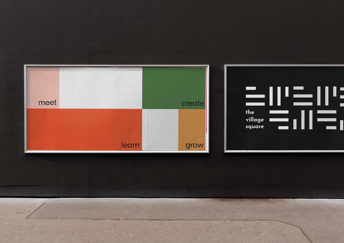
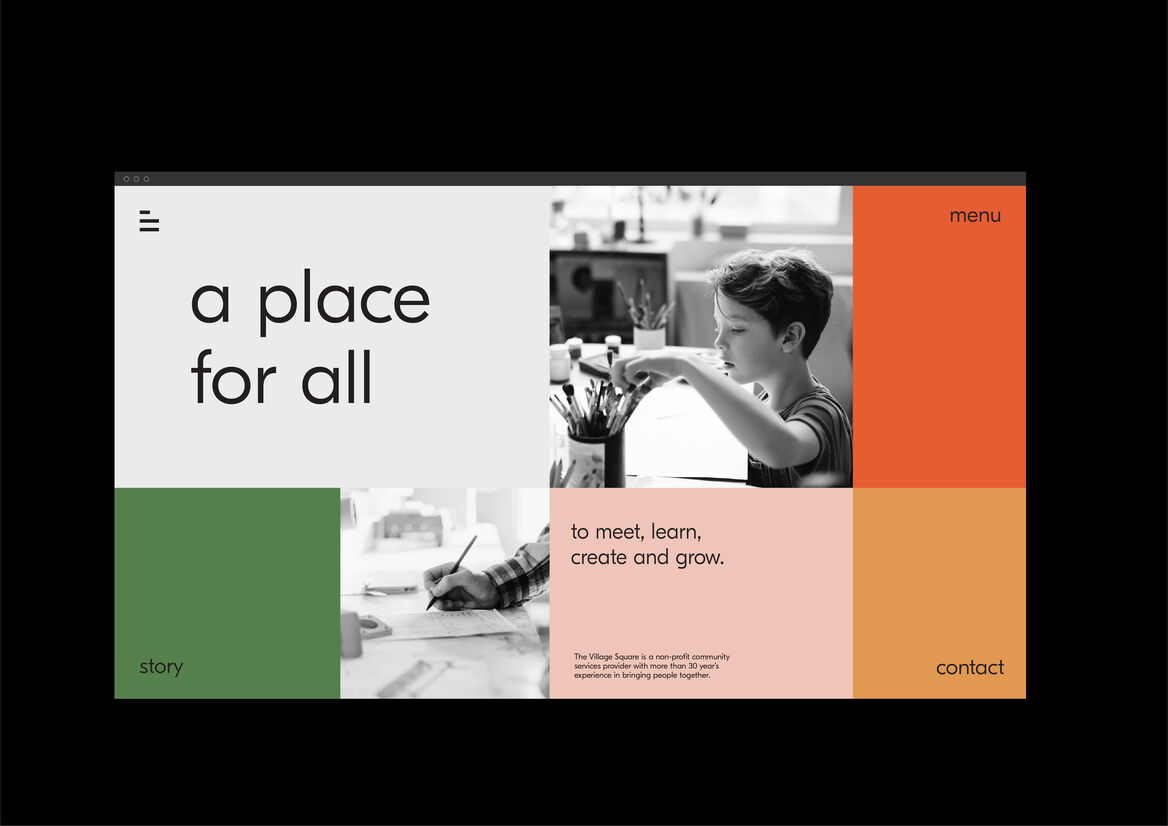
Their new name, “The Village Square”, is inspired by the space that was traditionally found in the centre of small towns that was used for community gatherings. It was the beating heart of a community, where all walks of life intersected in a shared space that promoted exchange, discourse and trade. The new brand essence we developed was “connecting energies”, connecting people in a place for all; a place to meet, learn, create and grow.
Representing inclusivity and community, The Village Square’s new strategically-led visual identity is informed by the foundations of connection; a point where all walks of life come together, and all pathways intersect. A place where creativity, relationships and community are woven together to create something beautiful.
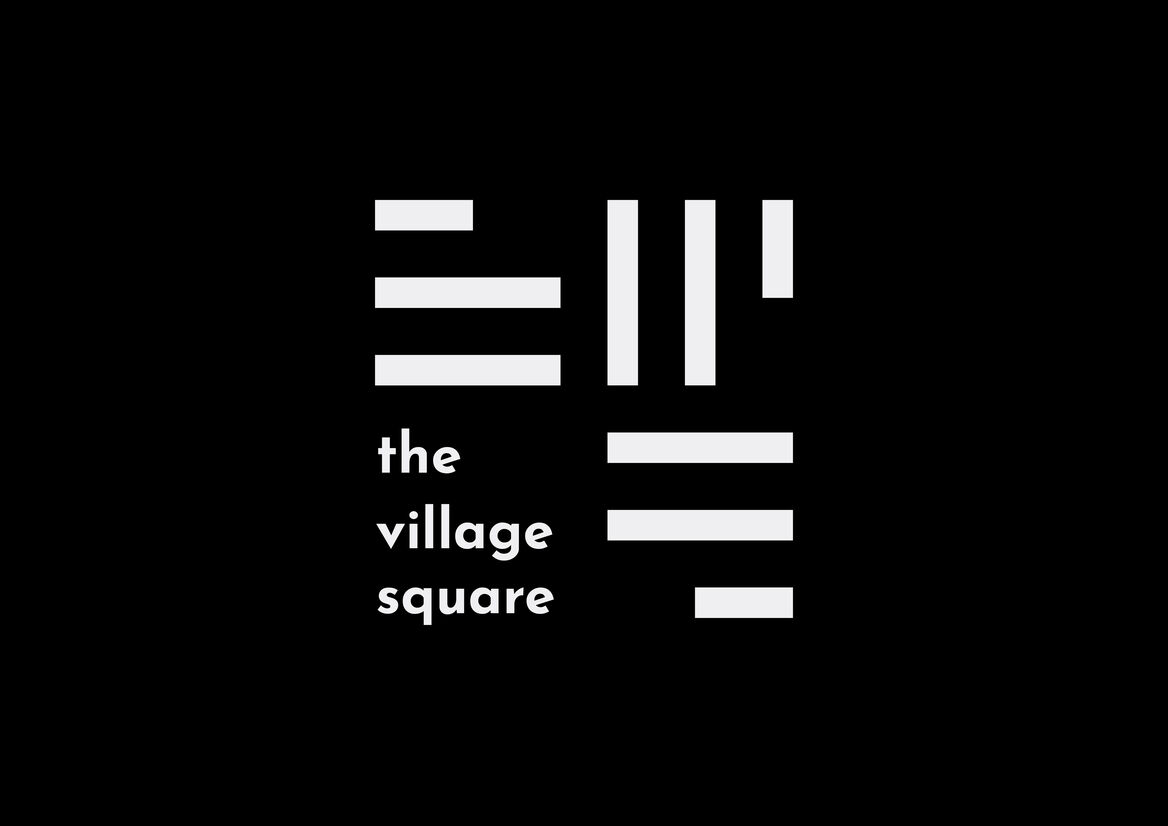
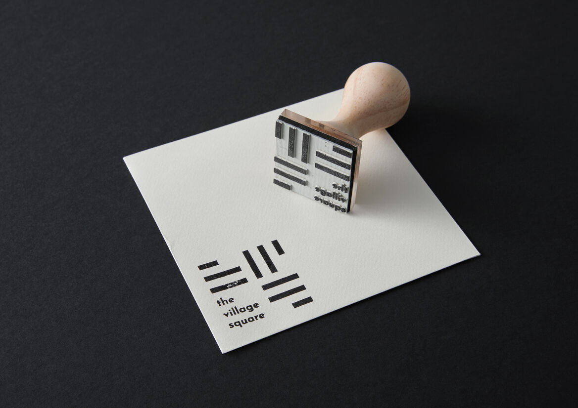
The visual identity was crafted to articulate the “parts of the sum that make the whole”. The brand logo is built with squares, with the lines and pathways laid out to guide the eye towards the centerpoint. The logo embodies three central guiding concepts; the interconnection of pathways, the centre point of connection, and the weaving together of communities. Further playing with the metaphor of a village “square”, the brand’s grid systems are constructed from squares, giving the brand identity a distinctive approach to the layout of their collateral.
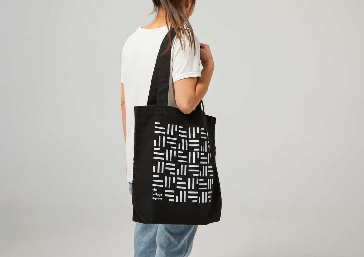
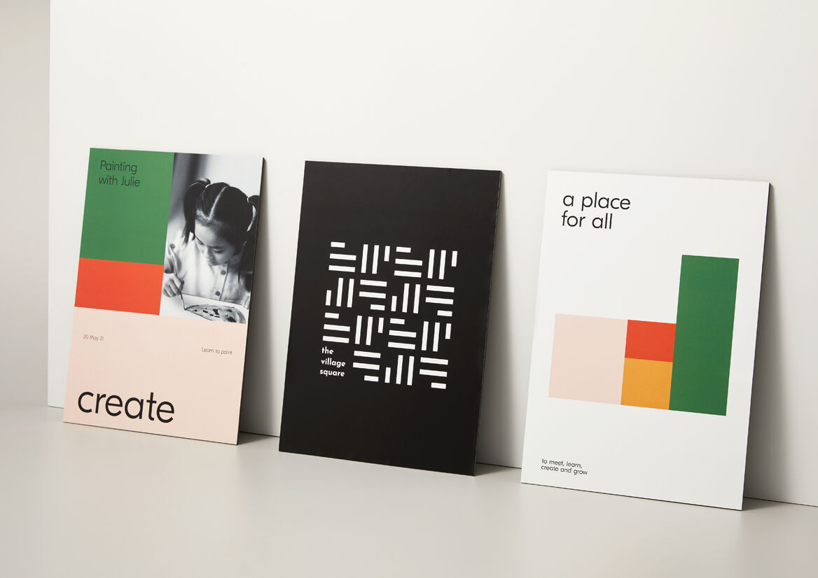
Building from this, the brand pattern represents people and the spaces in which they congregate, repeating to create a weave-like pattern, hinting at the fabrics of their lives coming together to create something new and beautiful.
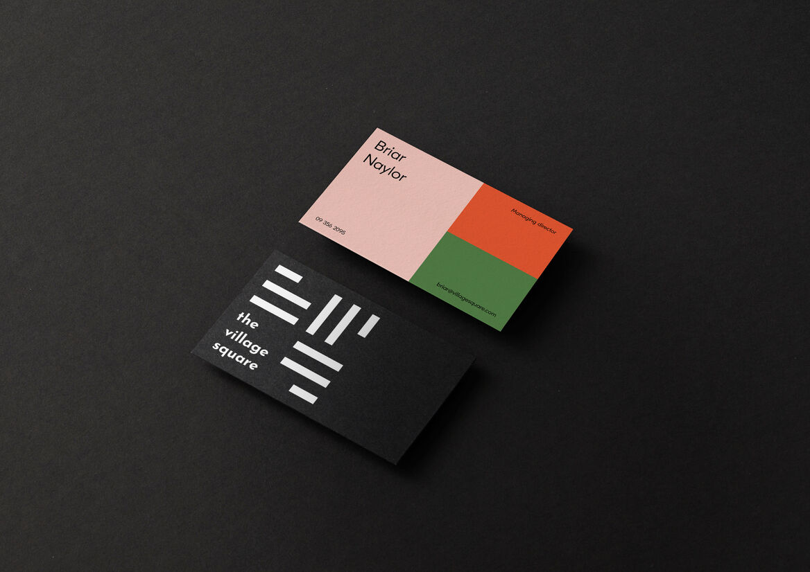
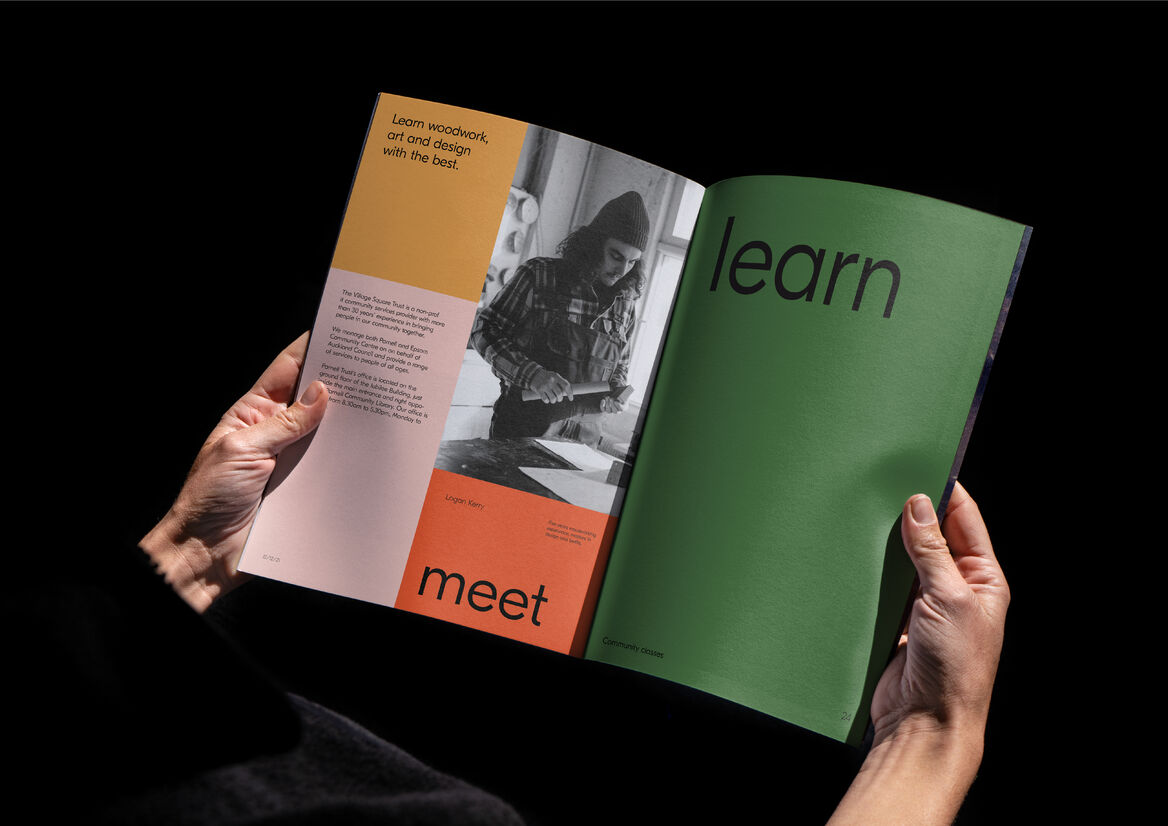
Finally, The Village Square brand colours have been carefully selected to represent the concept of connection in the community. Hues have been subtly muted to feel more approachable, all the while maintaining a playfulness and convivial energy intentionally designed to appeal to all ages. Meanwhile, black and white grounds the colour palette, functioning as an elegant backdrop that provides structure and consistency to the brand’s use of colour.
The end result is a new name and visual identity that articulates a celebration of spirit and life, community and togetherness. It signals the true scope of The Village Square’s work and ambitions, going beyond just the suburb of Parnell to invite people of all walks and ages to be a part of the fabric of the community.