Graphic
Redfire Design 5 Lords + Angels
-
Pou Auaha / Creative Director
Colin Downing
-
Ringatoi Matua / Design Director
Lans Jiang
-
Ngā Kaimahi / Team Member
Donna -
Kaitautoko / Contributors
Bryce Carleton (Photography), Klim Type Foundry (Typography) -
Client
New Zealand Care Skin Co. Ltd.
Description:
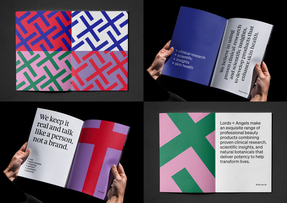
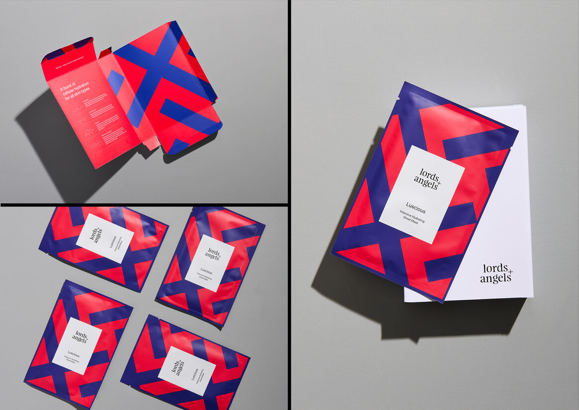
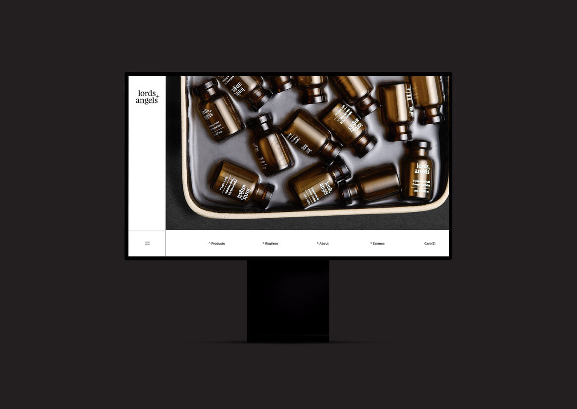
Lords + Angels is a premium unisex skincare brand combining clinical research, scientific insights and natural botanicals.
Our brief for this start-up included developing the brand strategy, positioning, naming, brand identity and packaging design. We pretty much had a free hand to create the brand, with our only directive - to incorporate science-backed research and develop a unisex brand name.
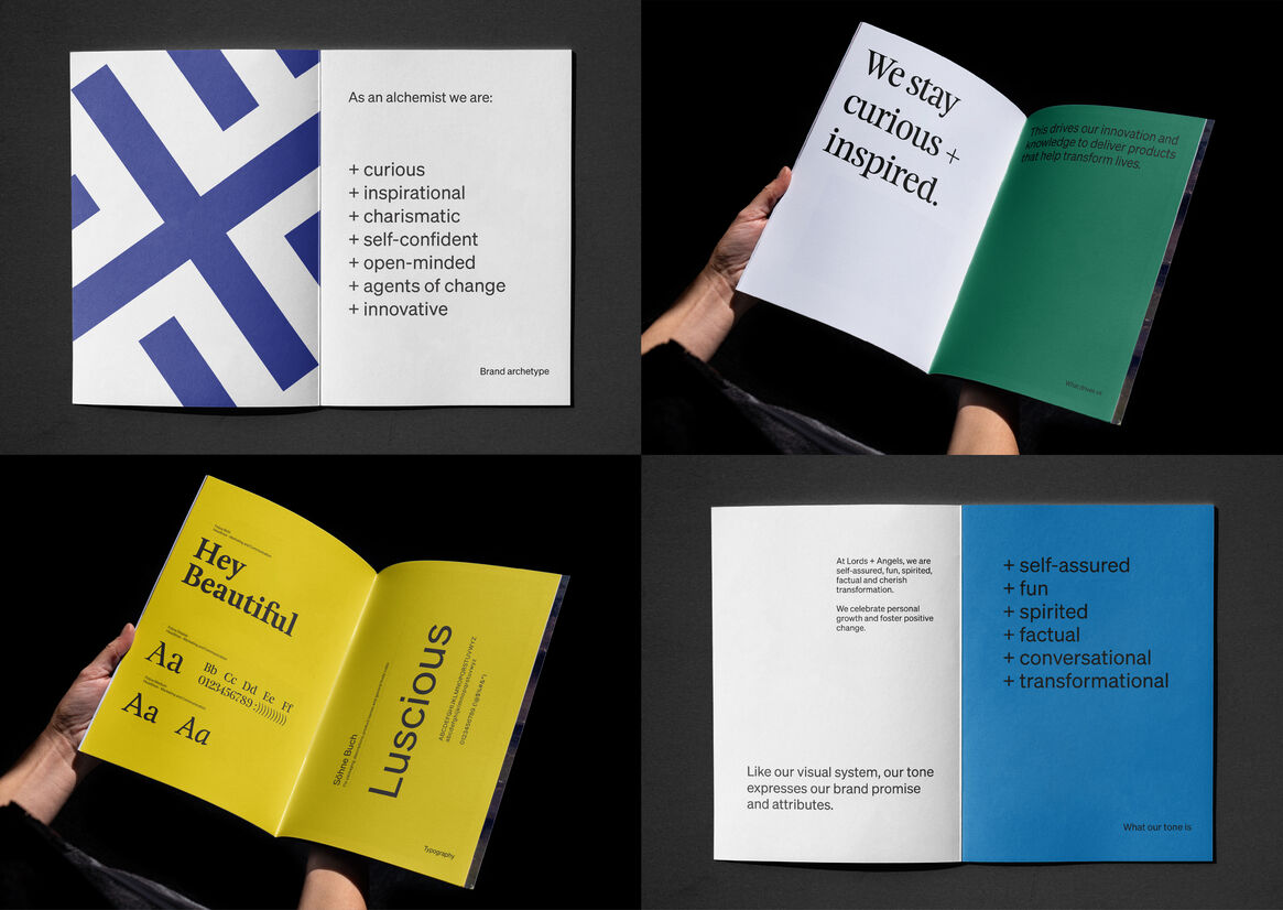
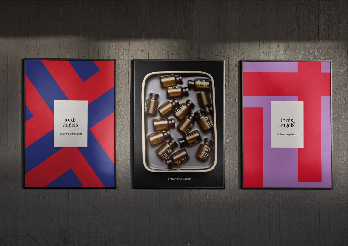
We positioned Lords + Angels as an Alchemist archetype, blending science and spiritual empowerment. We drew inspiration from the Notre-Dame and an architectural concept for rebuilding the old cathedral after the fire in 2019. This blend of old and new was a catalyst for our overarching brand identity and design.
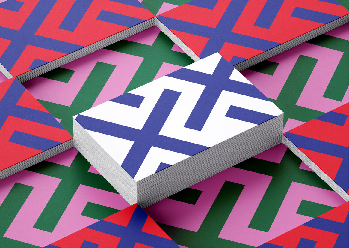
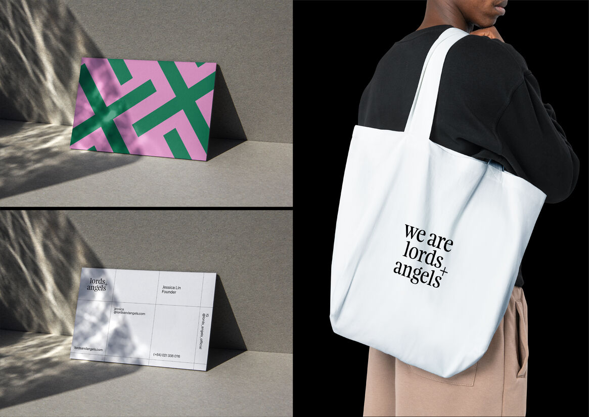
The Lords + Angels brand identity blends old-style Feijoa typography, with sans-serif Söhne ( by Klim Type Foundry) representing science. The random cross hatch pattern derived from the + in the identity and bold colour system inspired by stained glass windows is used across all brand touchpoints.
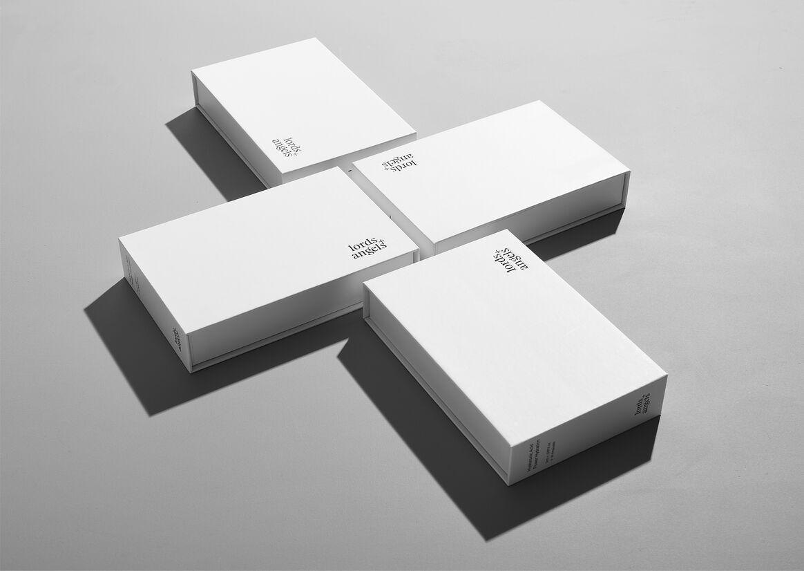
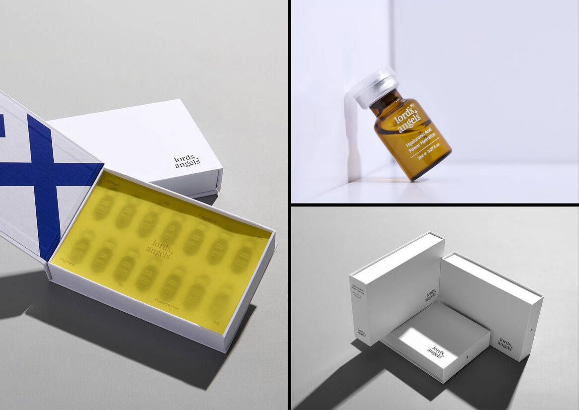
Premium packaging provides a sensory experience and delight when opened.
The outer packaging is clinical white and supported with scientific narrative but delivered conversationally with confidence and sincerity. The inner pack brings surprise through bursts of colour and represents the inner beauty within us all.
Charisma and personality shine through the minimalism design, and colour creates an enjoyable brand experience with style, personality and purpose.