Graphic
Principals 28 Poronui
-
Pou Auaha / Creative Director
Jodine Bell -
Pou Rautaki / Strategic Lead
Nick Sampson -
Pou Taketake / Cultural Lead
Tom Loughlin
-
Ringatoi Matua / Design Director
Stephen Kane -
Kaituhi Matua / Copywriter Lead
Mark Easterbrook
-
Ngā Kaimahi / Team Members
Natalie Fabrin, Etana Zaguri, Will Pickering, Federica Pala, Ben Harrison -
Kaitautoko / Contributor
Calibrate -
Client
Poronui
Description:
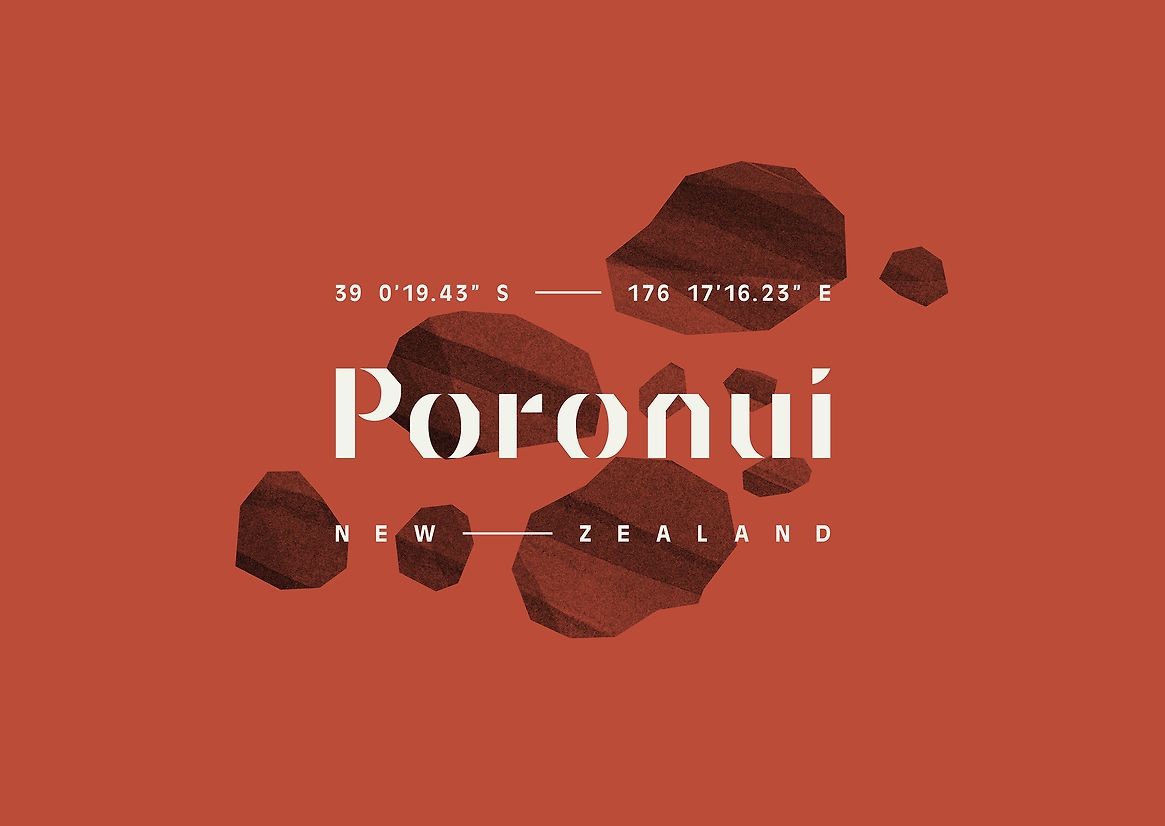
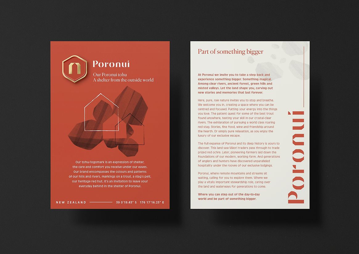
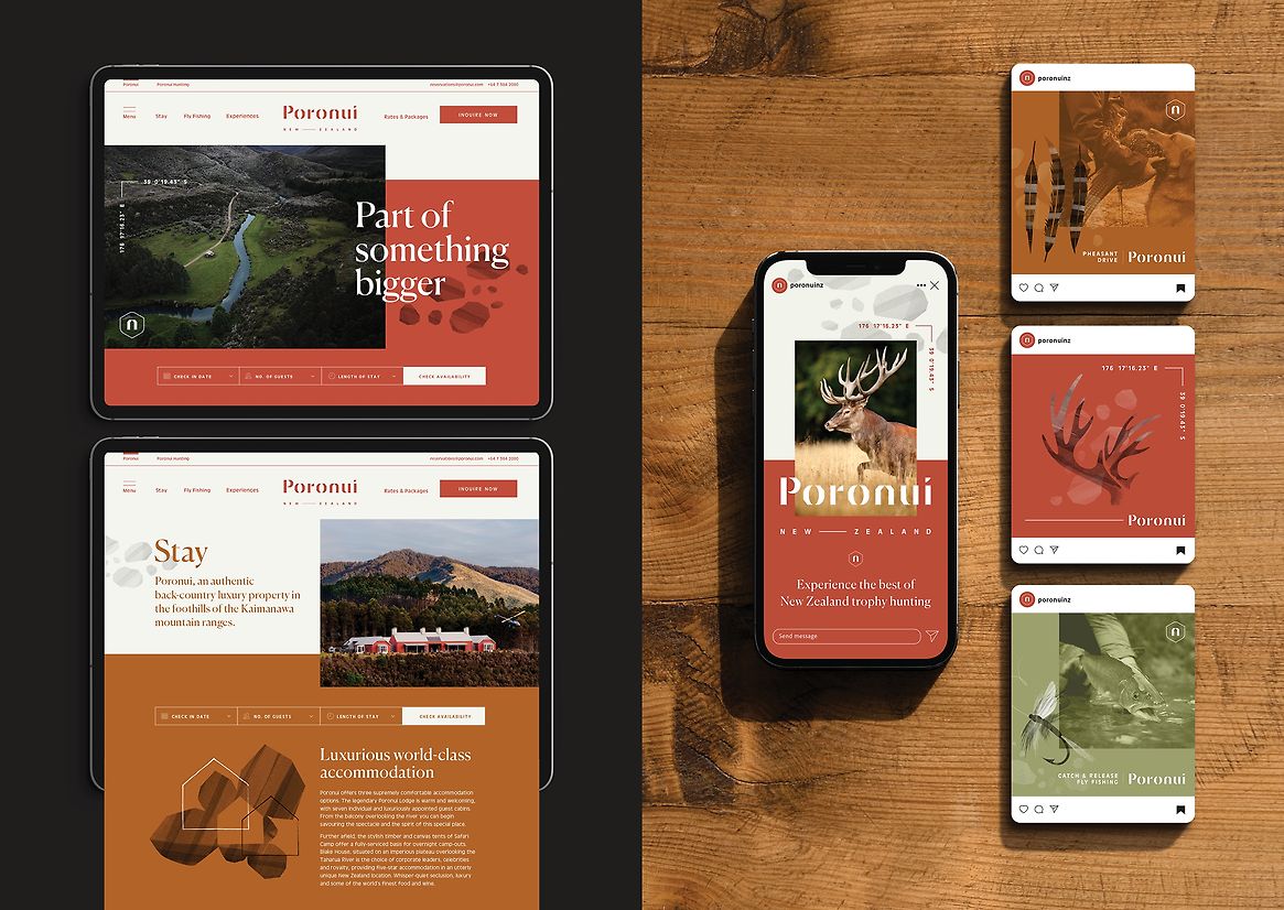
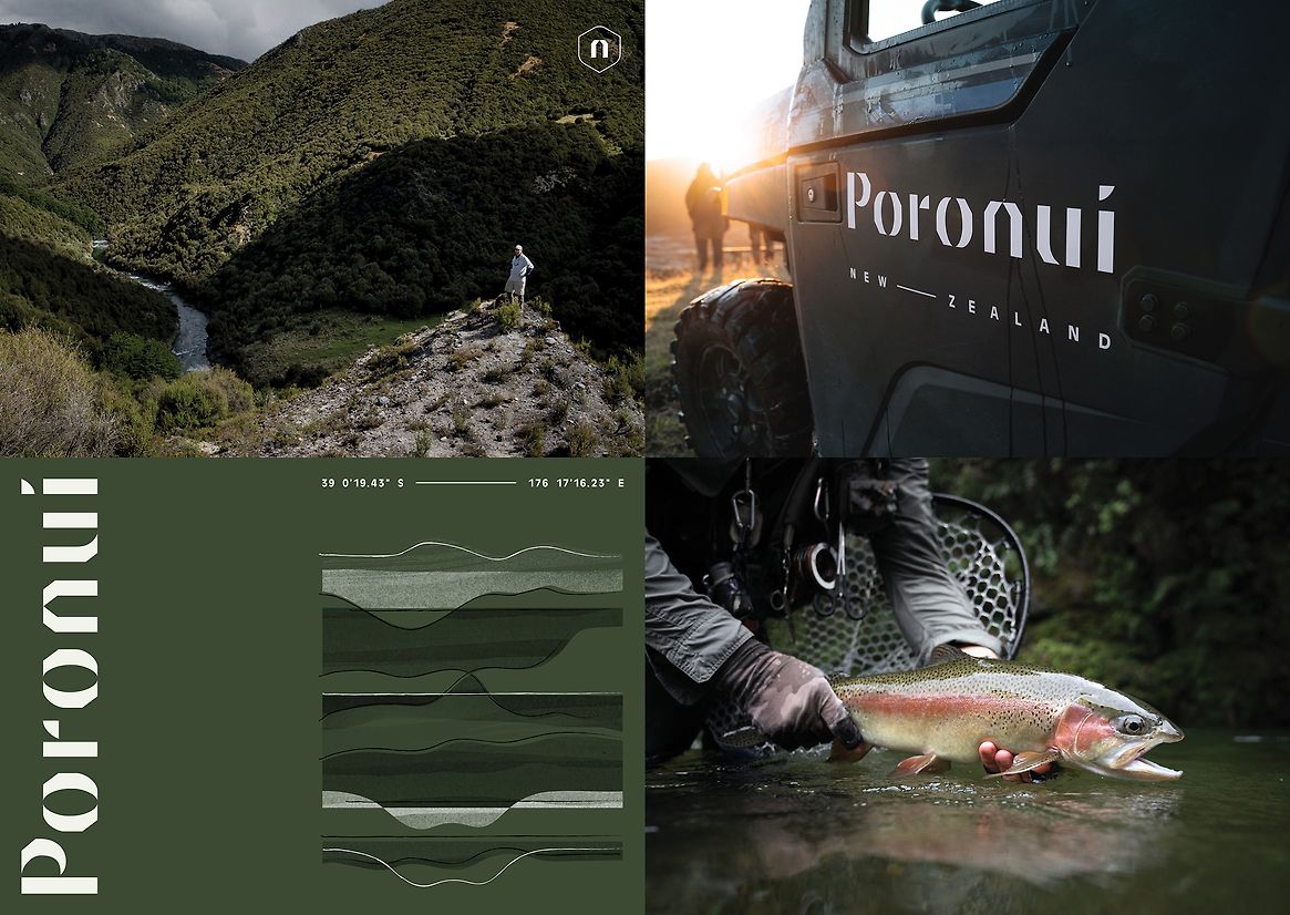
Poronui is a secluded luxury sporting lodge, sustainable working farm and forestry station in back-country Taharua Valley, Taupō. One of the few luxury lodges in Aotearoa with a Māori name, our strategy aimed to deeply embed the brand in the cultural heritage and significance of its name. ‘Poro’ means ‘part of’, and ‘nui’ translates to ‘the biggest part, great, abundant, important’. The Poronui name reflects its location as the largest part of the Taharua Valley, its relationship with the wider community, and its commitment to kaitiakitanga of the property and resources.
‘Part of something bigger’ became the new brand idea and tagline, highlighting the significance of the name Poronui and the property's operational philosophy and extending to the experience, where guests can indulge their passions while truly being part of something bigger. Developed in collaboration with local Māori cultural partner, this strategy firmly roots Poronui in its authentic cultural and natural heritage.
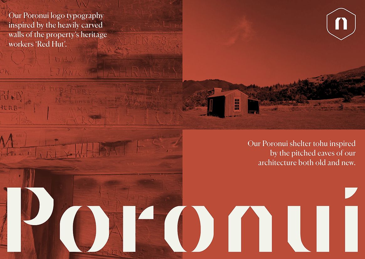
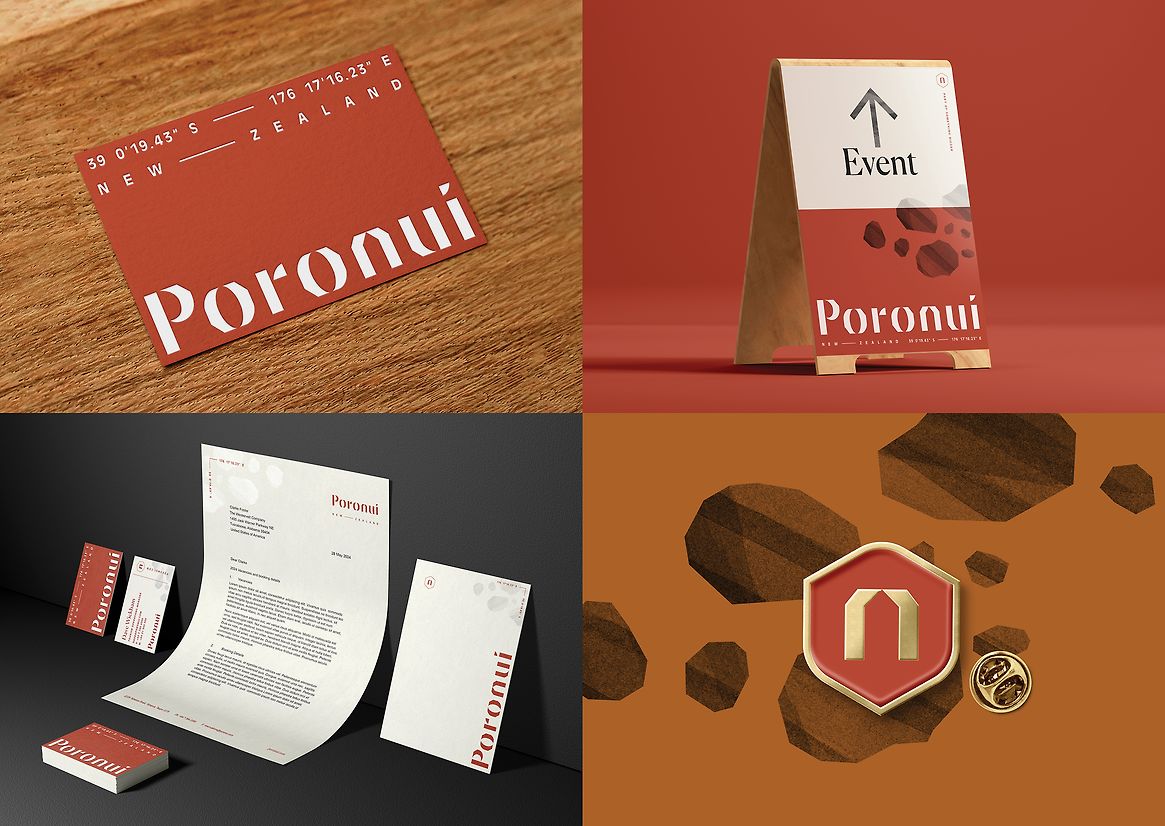
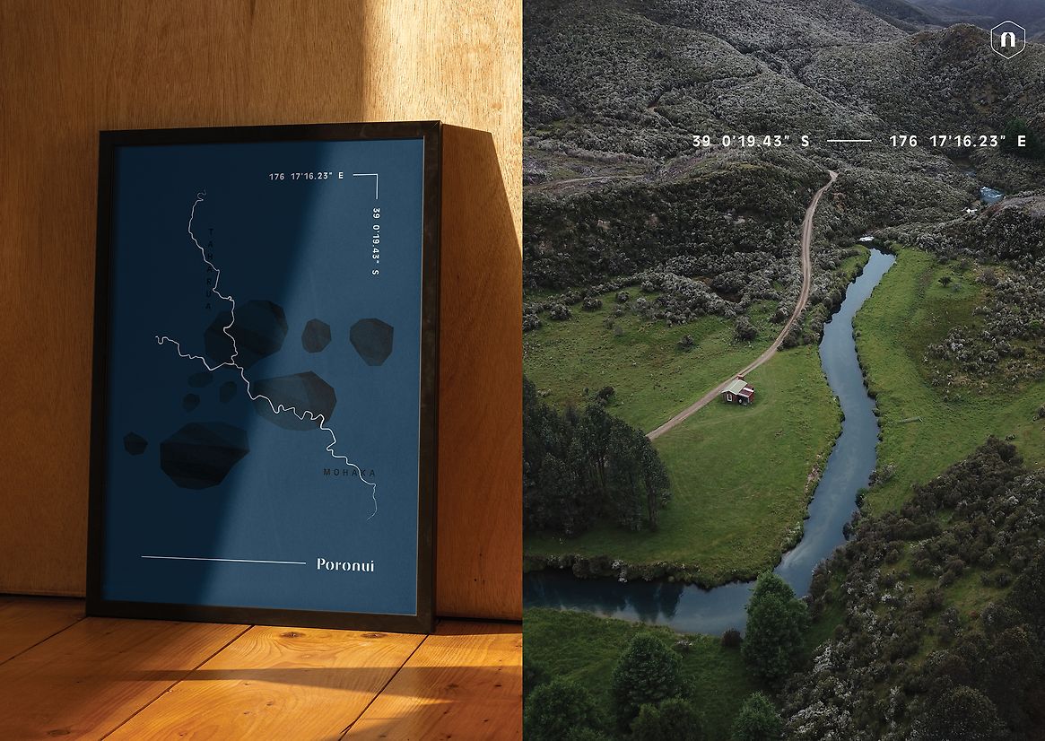
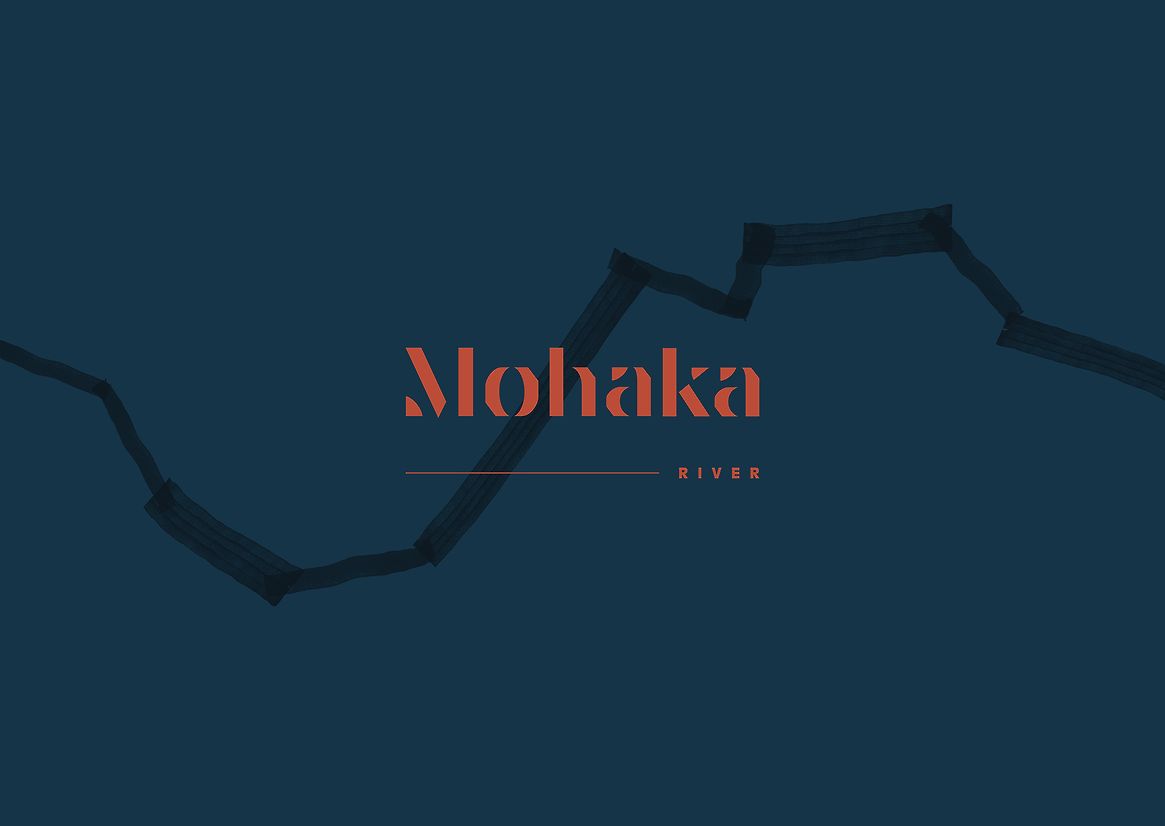
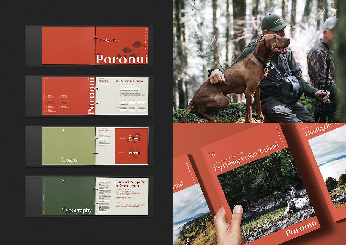
The new brand brings 'Part of something bigger' to life by weaving together heritage and culture into a compelling story, appealing to the values of a new generation of guests. These elements are evident from the 'Shelter' house symbol contained within the logo. Inspired by the property’s dominant pitched rooflines, this symbol embodies the care, shelter, and sanctuary of Poronui’s 'relaxed luxury.' The typography is inspired by the carvings in the heritage ‘Red Hut,’ grounding the brand historically, while location coordinates highlight its unique geographical position and helicopter accessibility.
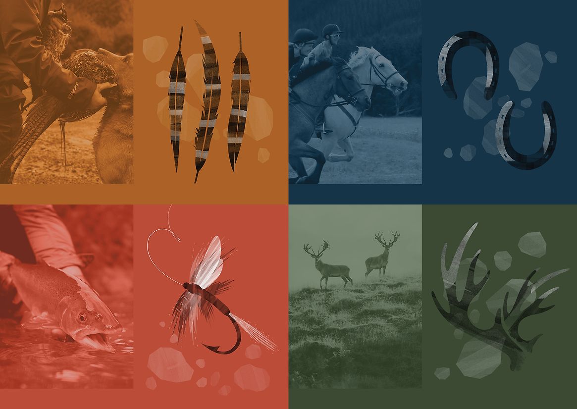
The brand brings together textural patterns and a rich kokowai/red ochre colour, underscoring Poronui’s natural, historic and cultural heritage as Poronui’s rivers were important traditional Māori trading routes for the precious kokowai. It’s the dominant colour found on the architecture both old and new, the colour of its deer, the sides of the trout in the same rivers. Illustrations borrow from the same natural environment, pumice stones, spotted hides and speckled trout, with hand-drawn textures that evoke the raw yet luxurious atmosphere.
Today, every aspect of Poronui's brand reflects a deep commitment to luxury, heritage and sustainability. As a guardian of natural resources, Poronui plays a crucial role in enhancing the Aotearoa New Zealand brand. By attracting a younger, affluent demographic interested in culturally rich and sustainable experiences, Poronui boosts the regional economy and ensures sustainable benefits for the wider community.