Graphic
Previously Unavailable 18 Taxi
-
Pou Auaha / Creative Directors
Phoebe Devine, Simon Pound
-
Ringatoi Matua / Design Directors
Hannah Small, Harry Burt
-
Ngā Kaimahi / Team Members
Nicola Taylor, Josh Taylor, Dan Faris, Vikesh Patel, Frankie Middleton -
Kaitautoko / Contributors
Ralph Mathews, ByPlatform, Ryan Bird, Matto Jennings, James Gibb -
Client
Taxi
Description:
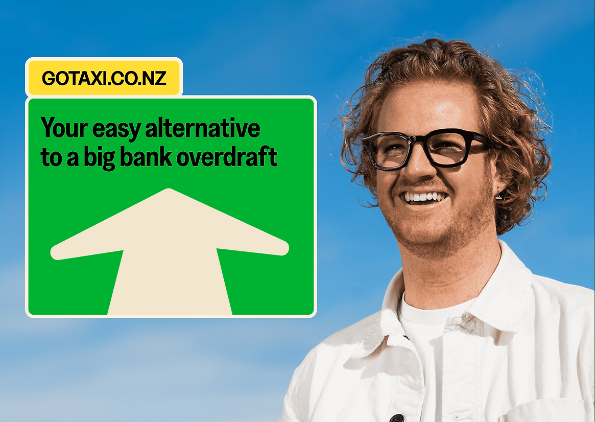
Taxi came to us as a product concept without a name, brand idea or identity.
Tax Traders were bringing a new form of business working capital to market, using a company’s provisional tax payments as security for lending at rates less than half that of a big bank overdraft.
This idea needed a brand that could generate attention and engagement as tax is a category where it’s very hard to capture interest and spur action.
Our goal was to appeal to business decision makers and to gatekeepers like accountants and advisors. We had no existing market awareness to work with, and highly ambitious goals for adoption. Something with energy, likeability and unexpected optimism was required.
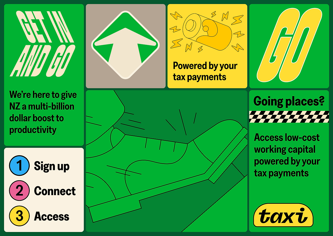
The business strategy was to help keep Kiwi business moving. Paying provisional tax puts pressure on business working capital. Being able to borrow against tax and pay less interest can make a huge impact to businesses and the wider economy, as more money stays in Aotearoa and doesn’t go to Australian banks as interest payments.
The brand idea was to make tax payments a positive. This is differentiating as pretty much no-one today is happy to pay tax - but with this product tax payments unlock big benefits.
This unexpected optimism around tax, led the design, brand idea and naming.
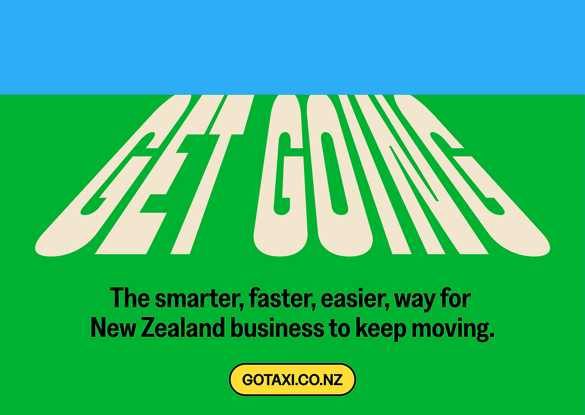
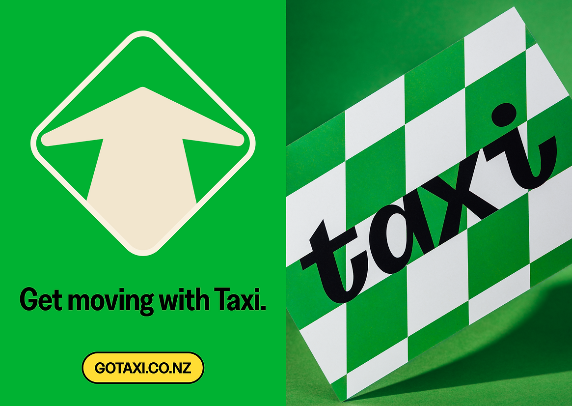
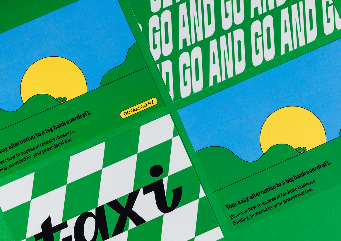
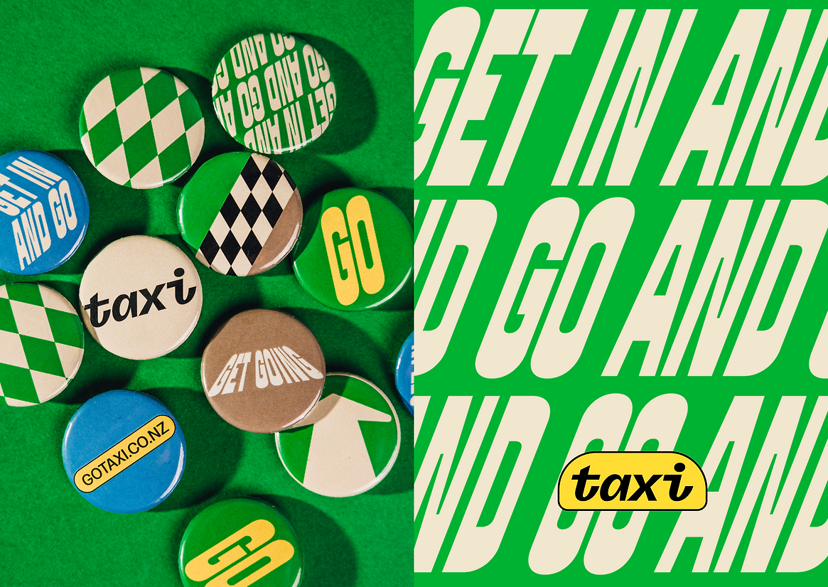
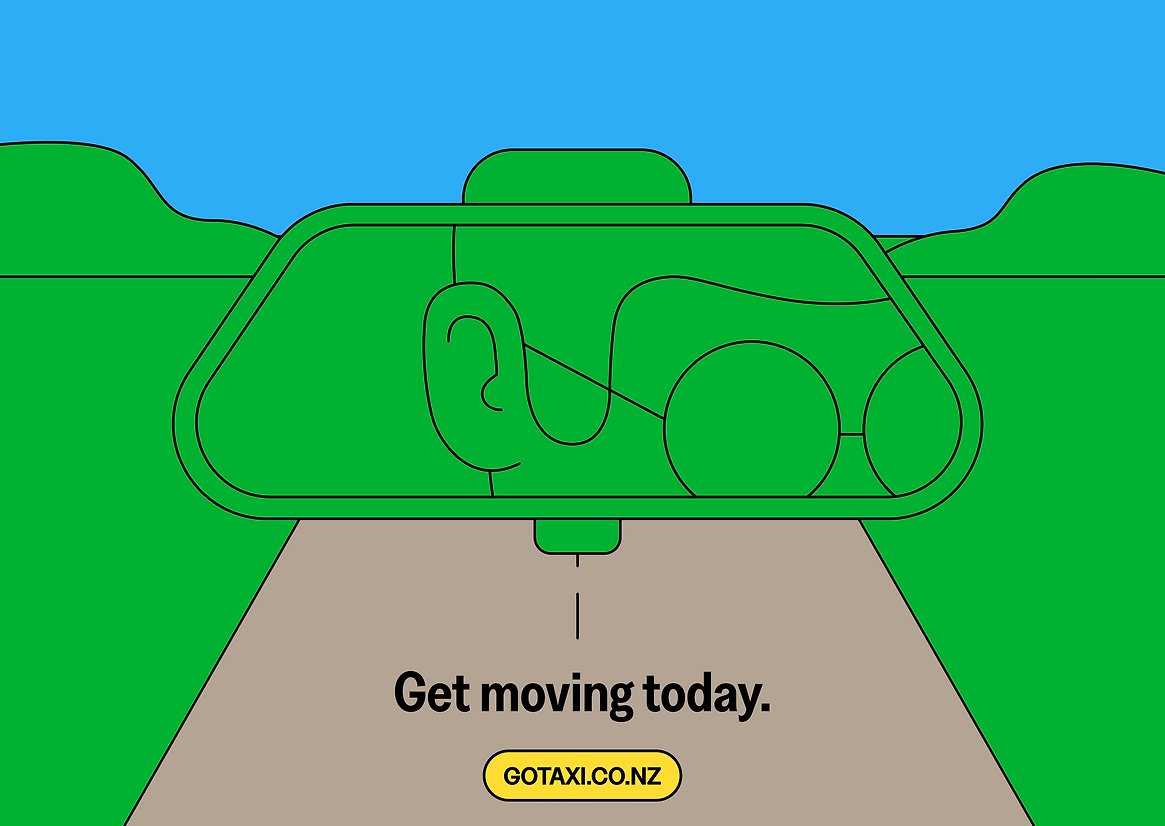
With a financial services product lacking natural storytelling devices, it can be helpful to land an organising idea and motif to use as a storytelling vehicle. Our answer was to name the venture Taxi, here to help keep Kiwi business moving. We used this theme to create iconic brand assets in a low energy, unplayful category.
We aimed to create a dynamic brand centred around movement. Drawing inspiration from New Zealand road signs, the Subway and the chequered cabs of New York, the brand is accessible, engaging, and always on the move.
The expressive type cues painted road lettering. This is skewed and shifted to create a sense of optimism and propelling forward. The typography and graphic system work together to bring positive energy not found in the world of tax payments.
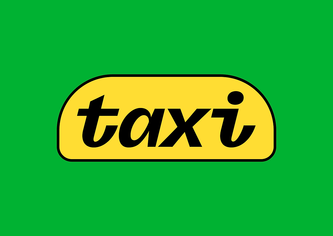
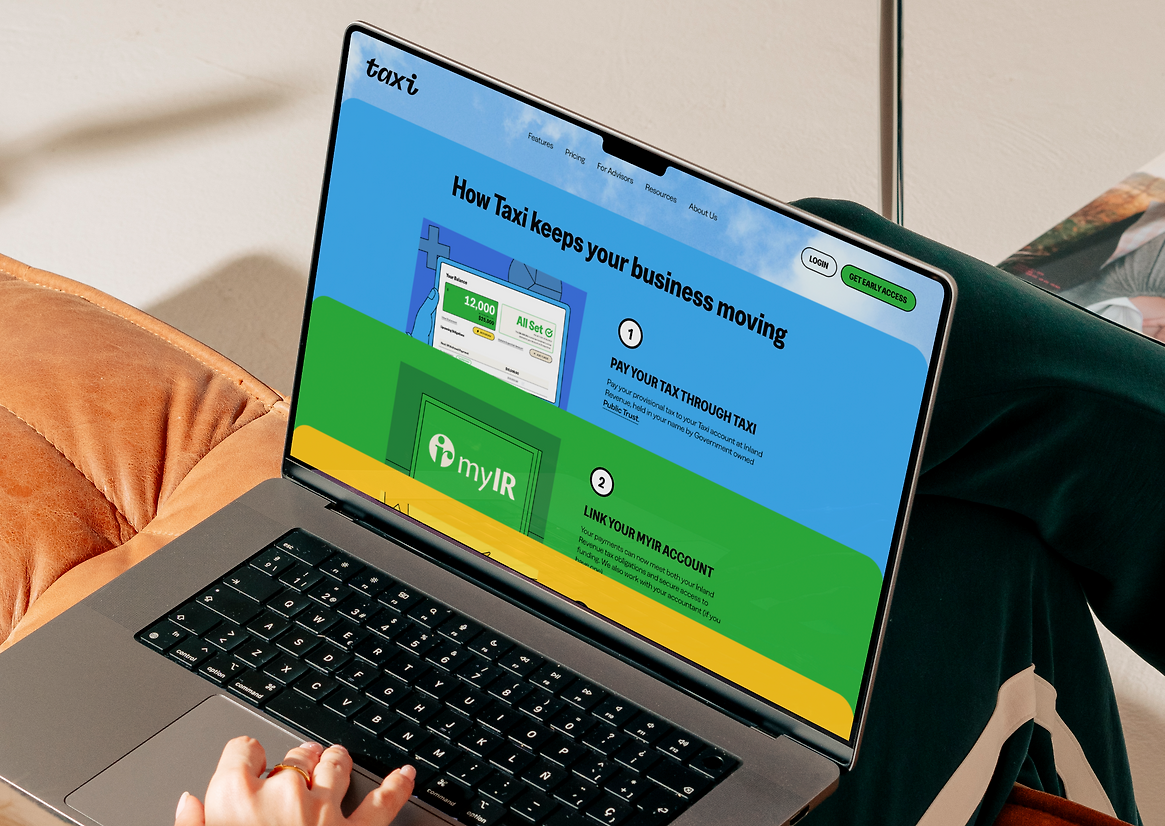
The Taxi logomark references the metal emblems found on classic cars. Motion was a vital part of this project. We set a motion style so the web experience and social presence of the brand drove engagement and a sense of forward movement.
High production values deliver reassurance in a category all about trust. With the motif of the Taxi we needed to be careful to reference elements in a way that creates longevity for the brand. We set guidelines around how taxicabs were to be avoided, but the visual language of the world of taxis and movement were to be embraced.
Taxi has research from NZIER that shows that just 10,000 businesses moving $50,000 each to their service could equate to a $1bn boost to the economy. Cutting through and driving adoption will help increase NZ’s GDP and standard of living. This playful brand can have serious impact.