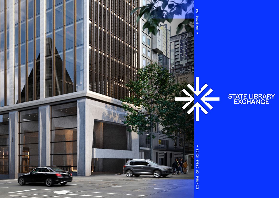
State Library Exchange is soon to be Melbourne CBD’s new bustling heart, home to premium-grade commercial space for the businesses of tomorrow. Designed to leave a legacy, the State Library Exchange will be a zero-carbon landmark destination that celebrates Melbourne's culture on one of the city’s most active corners. Intended to be a space that means something to Melbourne, the State Library Exchange is where people will meet, connect, discover and exchange ideas. We were briefed to create a name and brand worthy of the building's status and location, uplift Melbourne’s unique character, and speak to specific audiences, while maintaining broad appeal.
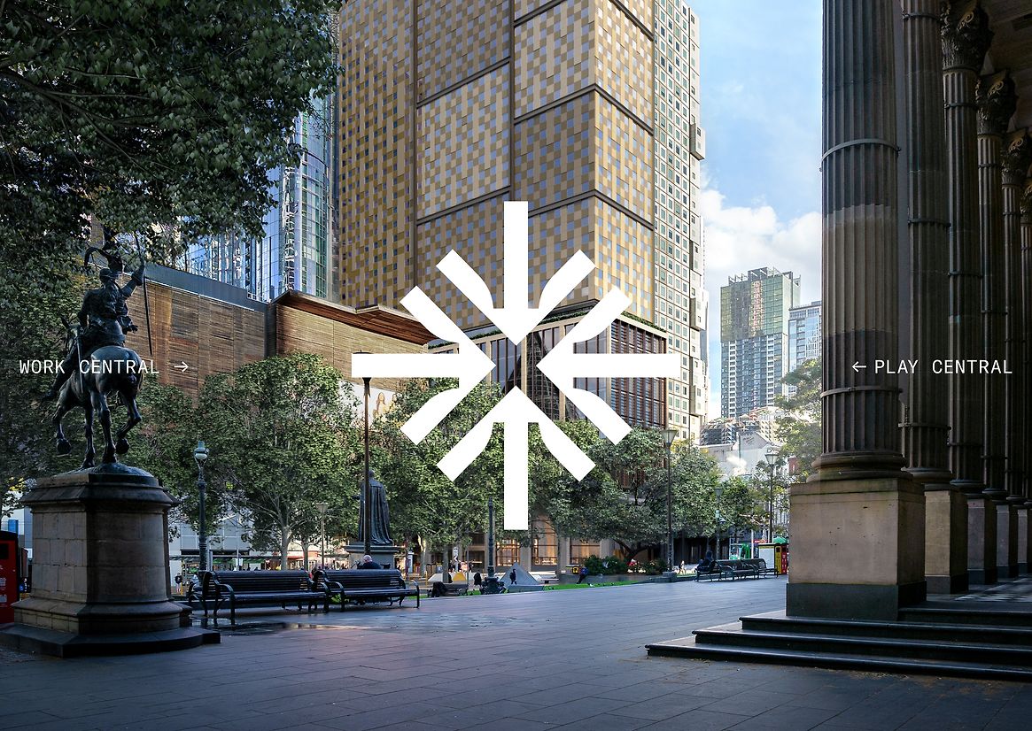
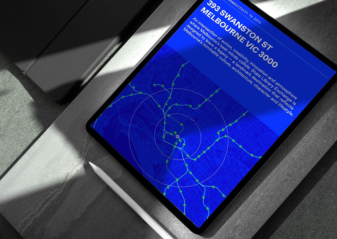
The State Library Exchange will hold a unique position. Centrally located in the heart of the city’s vibrant education precinct, it is the epitome of connectivity. It was vital that we communicated this central message in the name, hence ‘State Library Exchange’ – dynamic, destinational, and imbued with a sense of pace and connection. Leveraging the site’s landmark location as a transport junction, State Library Exchange is contemporary and ownable, epitomising Melbourne’s sky-high standards of connection, culture and lifestyle. The State Library Exchange’s macro function as a commercial centre collides with the micro need to appeal and inspire on an individual level. Zeroing in on the space’s fundamental essence as a meeting place, we chose to bring the visual identity to life with a unique brand mark. Multiple, centre-pointing arrows take visual cues from the State Library’s iconic layout, commanding attention and positions the State Library Exchange as a literal meeting place where ideas, collaboration and success are shared. To address the diverse audiences, we implemented varied photography and art direction, selecting three distinct styles to effectively communicate the people, place, and commercial aspects. A bold colour palette and strong sans-serif typography subtly references the curve of an open book, completing the brand’s visual identity and creating a look and feel that resonates broadly. The brand itself is clean, contemporary, dynamic and charged with refined energy. Warm and peppered with personality, it reflects the lively pedestrians and patrons who will frequent the space and encourages fast-paced interactions as well as long, unrushed visits. Homing in on what the CBD is missing, the State Library Exchange buzzes with electric energy, fuelled by constant connections. People-oriented, fresh, and vibrant, the brand evokes feelings of excitement and sets up the State Library Exchange as a place that truly brings people together, forever changing the way Melbourne moves. By showcasing exceptional facilities, smart technology, and flexible work environments, the brand is poised to attract future-focused, innovative businesses. In turn, it will create a community hub that serves as the intersection of action, creativity, and atmosphere.

Description:
State Library Exchange is soon to be Melbourne CBD’s new bustling heart, home to premium-grade commercial space for the businesses of tomorrow. Designed to leave a legacy, the State Library Exchange will be a zero-carbon landmark destination that celebrates Melbourne's culture on one of the city’s most active corners. Intended to be a space that means something to Melbourne, the State Library Exchange is where people will meet, connect, discover and exchange ideas. We were briefed to create a name and brand worthy of the building's status and location, uplift Melbourne’s unique character, and speak to specific audiences, while maintaining broad appeal.
The State Library Exchange will hold a unique position. Centrally located in the heart of the city’s vibrant education precinct, it is the epitome of connectivity. It was vital that we communicated this central message in the name, hence ‘State Library Exchange’ – dynamic, destinational, and imbued with a sense of pace and connection. Leveraging the site’s landmark location as a transport junction, State Library Exchange is contemporary and ownable, epitomising Melbourne’s sky-high standards of connection, culture and lifestyle.
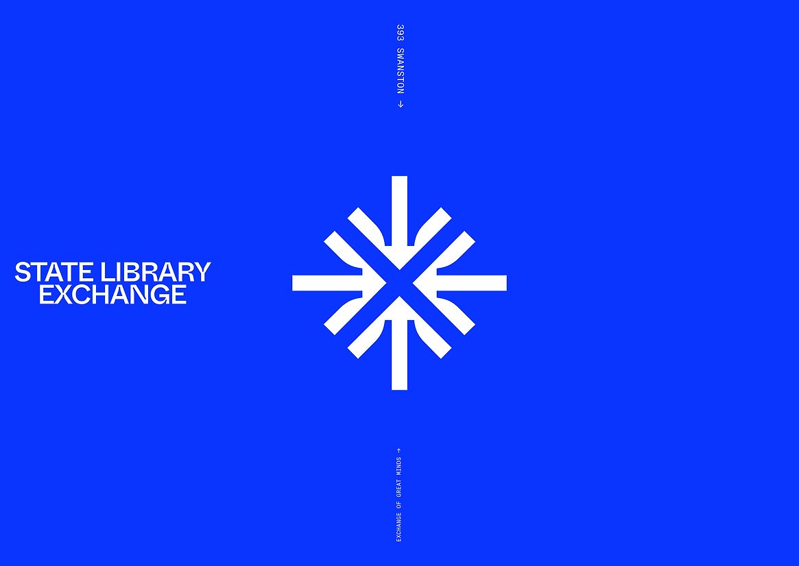
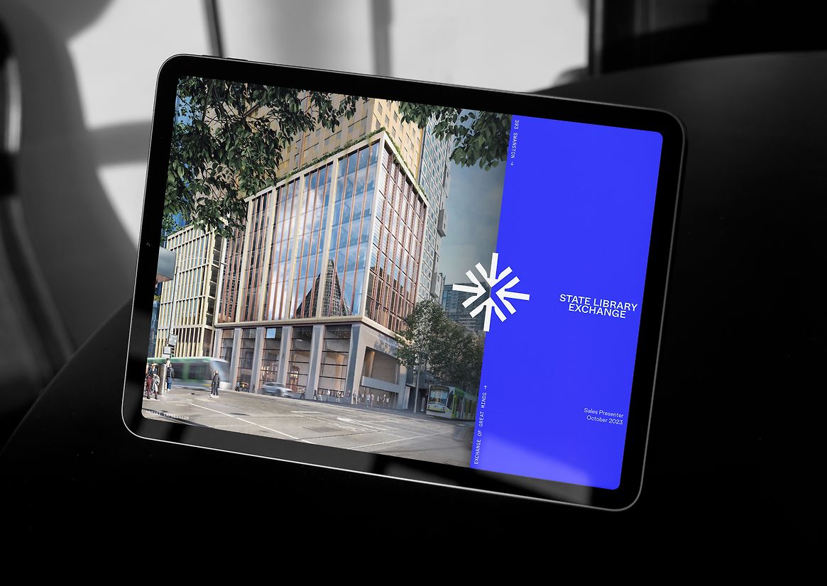
The State Library Exchange’s macro function as a commercial centre collides with the micro need to appeal and inspire on an individual level. Zeroing in on the space’s fundamental essence as a meeting place, we chose to bring the visual identity to life with a unique brand mark. Multiple, centre-pointing arrows take visual cues from the State Library’s iconic layout, commanding attention and positions the State Library Exchange as a literal meeting place where ideas, collaboration and success are shared.
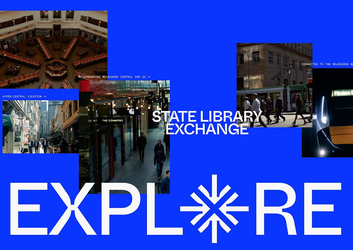
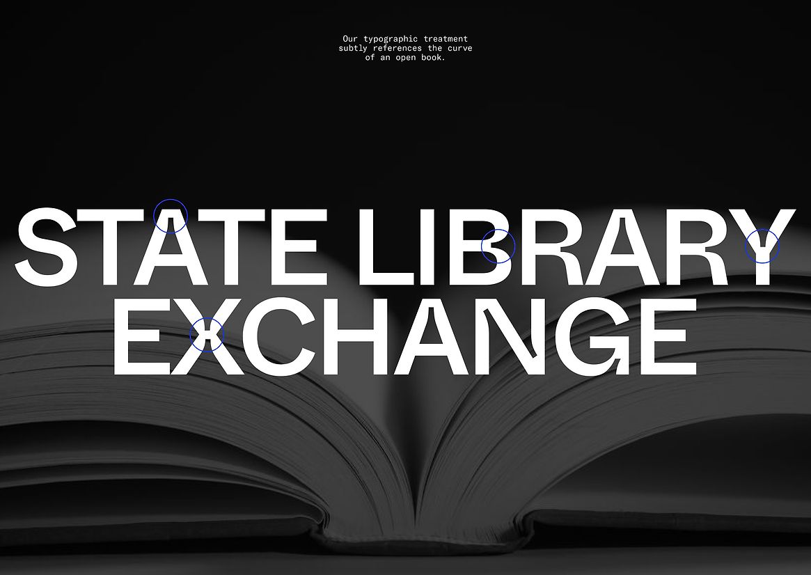
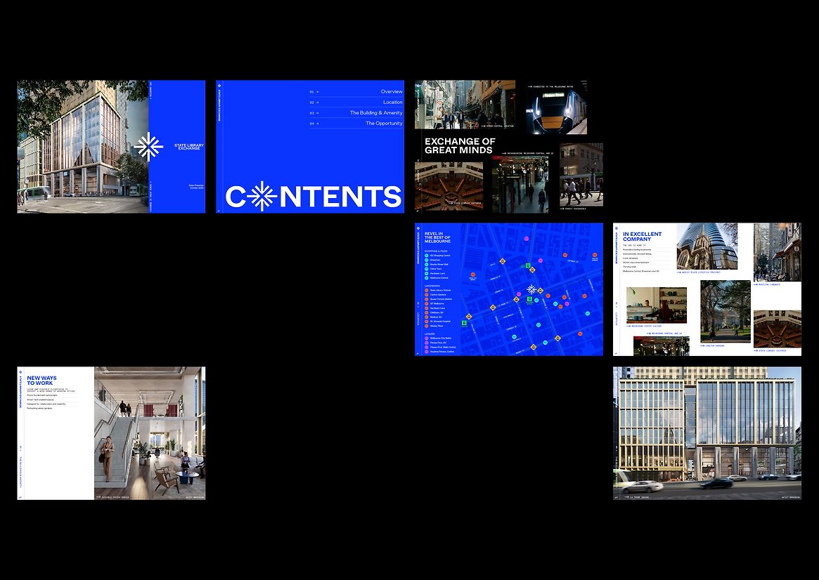
To address the diverse audiences, we implemented varied photography and art direction, selecting three distinct styles to effectively communicate the people, place, and commercial aspects. A bold colour palette and strong sans-serif typography subtly references the curve of an open book, completing the brand’s visual identity and creating a look and feel that resonates broadly.
The brand itself is clean, contemporary, dynamic and charged with refined energy. Warm and peppered with personality, it reflects the lively pedestrians and patrons who will frequent the space and encourages fast-paced interactions as well as long, unrushed visits.
Homing in on what the CBD is missing, the State Library Exchange buzzes with electric energy, fuelled by constant connections. People-oriented, fresh, and vibrant, the brand evokes feelings of excitement and sets up the State Library Exchange as a place that truly brings people together, forever changing the way Melbourne moves. By showcasing exceptional facilities, smart technology, and flexible work environments, the brand is poised to attract future-focused, innovative businesses. In turn, it will create a community hub that serves as the intersection of action, creativity, and atmosphere.