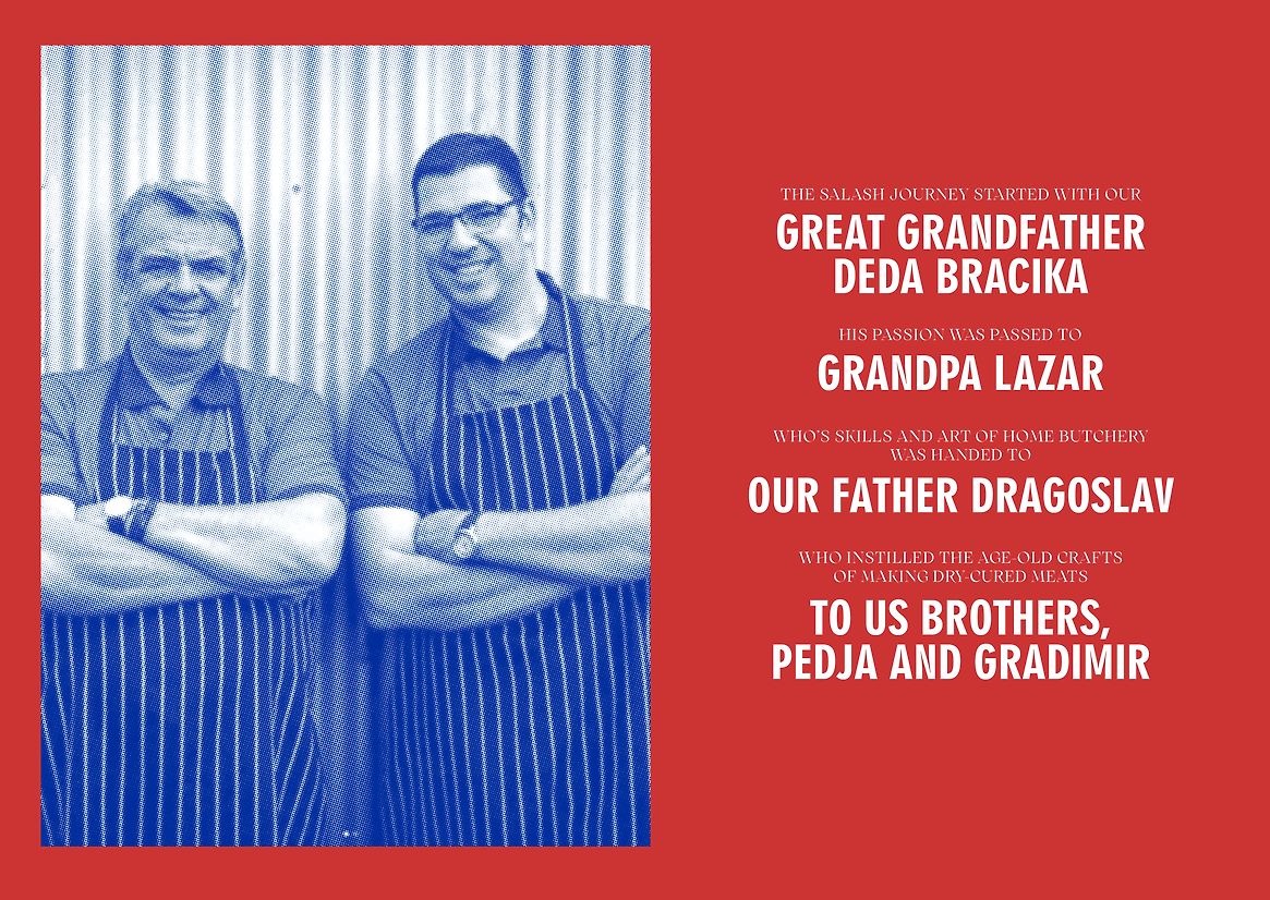
Salash Delicatessen is uniquely positioned as a small artisan food business in the New Zealand market. While there is a wide range of brands, both large and small, producing smallgood meats, they all offer a similar range of cuts, flavours and styles which cater to the wider New Zealand consumer. Salash's point of difference is their family history and geographic origins. Hailing from Northern Serbia, the family have been refining how they make and produce dry-cured meats in the Northern Serbian way for four generations. This imbues the meats with unique flavours and textures.
Since their immigration to New Zealand in 2009, the family has continued their meat-making tradition and fostered a sense of community. They introduced New Zealand to this unique style of meat, building a loyal following of dry-cured meat fans. This community has steadily grown through its market stalls and destination shop in Kumeū.
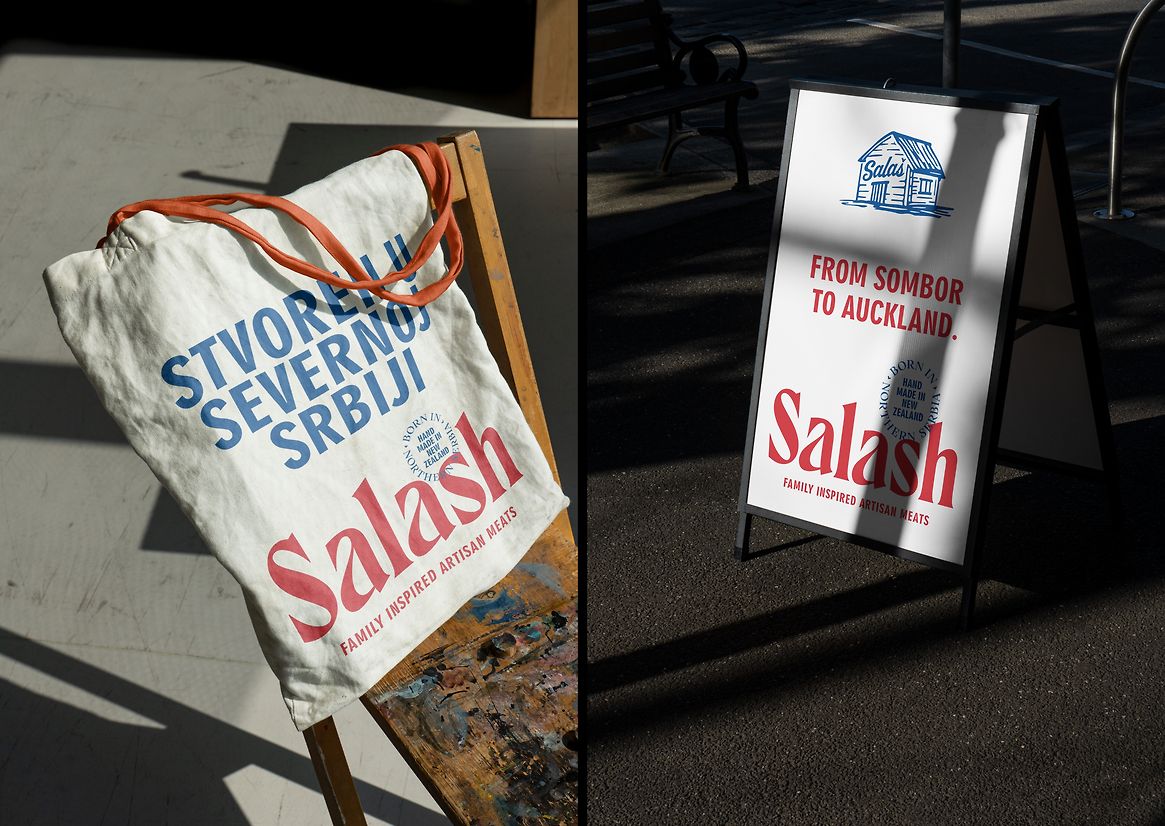
In 2023, the family developed a new business growth strategy which would take them from their current sales channels to becoming a premium supermarket brand and taking the brand nationwide, rather than restricted to the Auckland region. Discussions with supermarket brands highlighted the need to invest in their existing brand and packaging, enabling the brand to stand out in chiller aisles and speak to a premium point and discerning 'foodie' consumer.
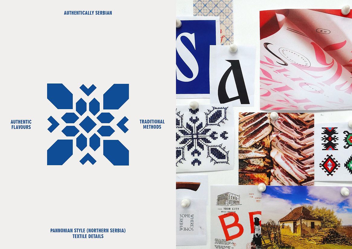
The design process explored this Eastern European region's visual styles, patterns and culture, taking historical cues and reinterpreting them for the modern foodie consumer.
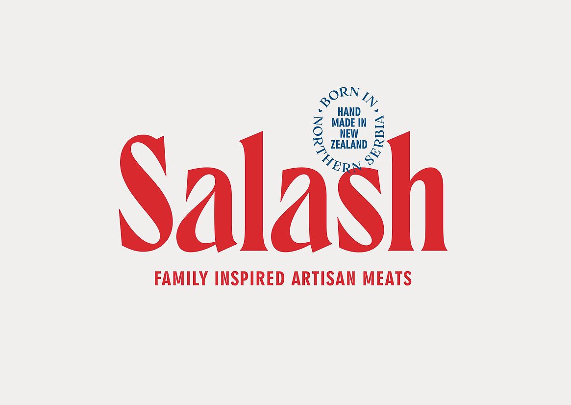
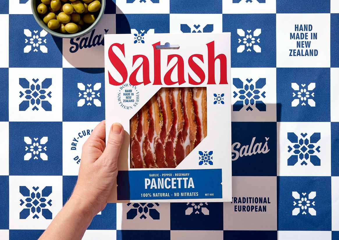
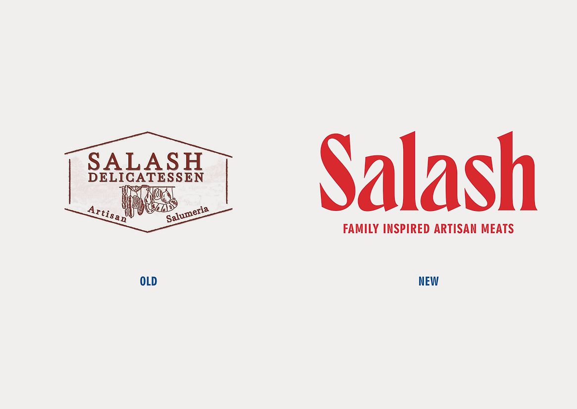
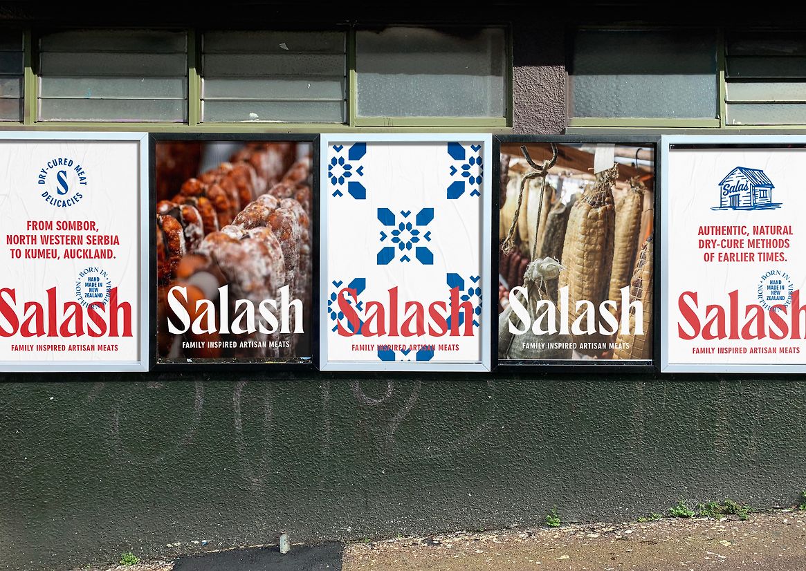
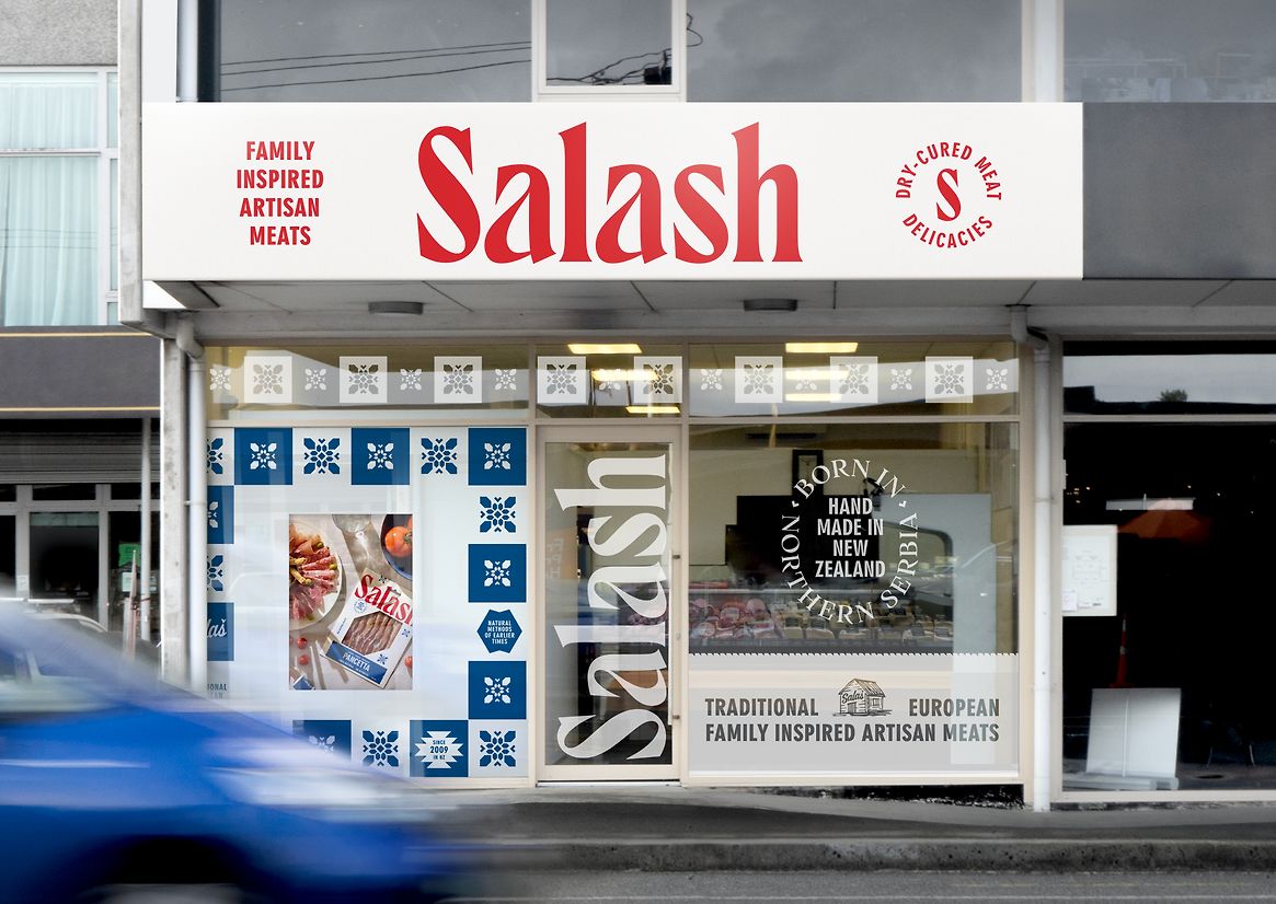
The brand wordmark is bespoke. Elements of which draw inspiration from the Cyrillic alphabet, most notably the shapes and curves of the lowercase 'a'. While the sharp serifs of the letterforms and the shape of the 'S' speaks to butchery, knives and hooks that are used to hang meat cuts up during drying. Secondary brand elements, icons and patterns are modernised and simplified interpretations of historical regional costumes and textiles. These are used to key messages and brand propositions. The hero icon is a simplified graphic of the literal meaning of 'Salash', a humble out-house on farmsteads where meats are dry-cured. This icon also shows the word's original spelling (Salas).
The colour palette is directly inspired by the Serbian national flag. The simple blue, white and red starkly contrast with the earthy tones used by competitor brands in this category.
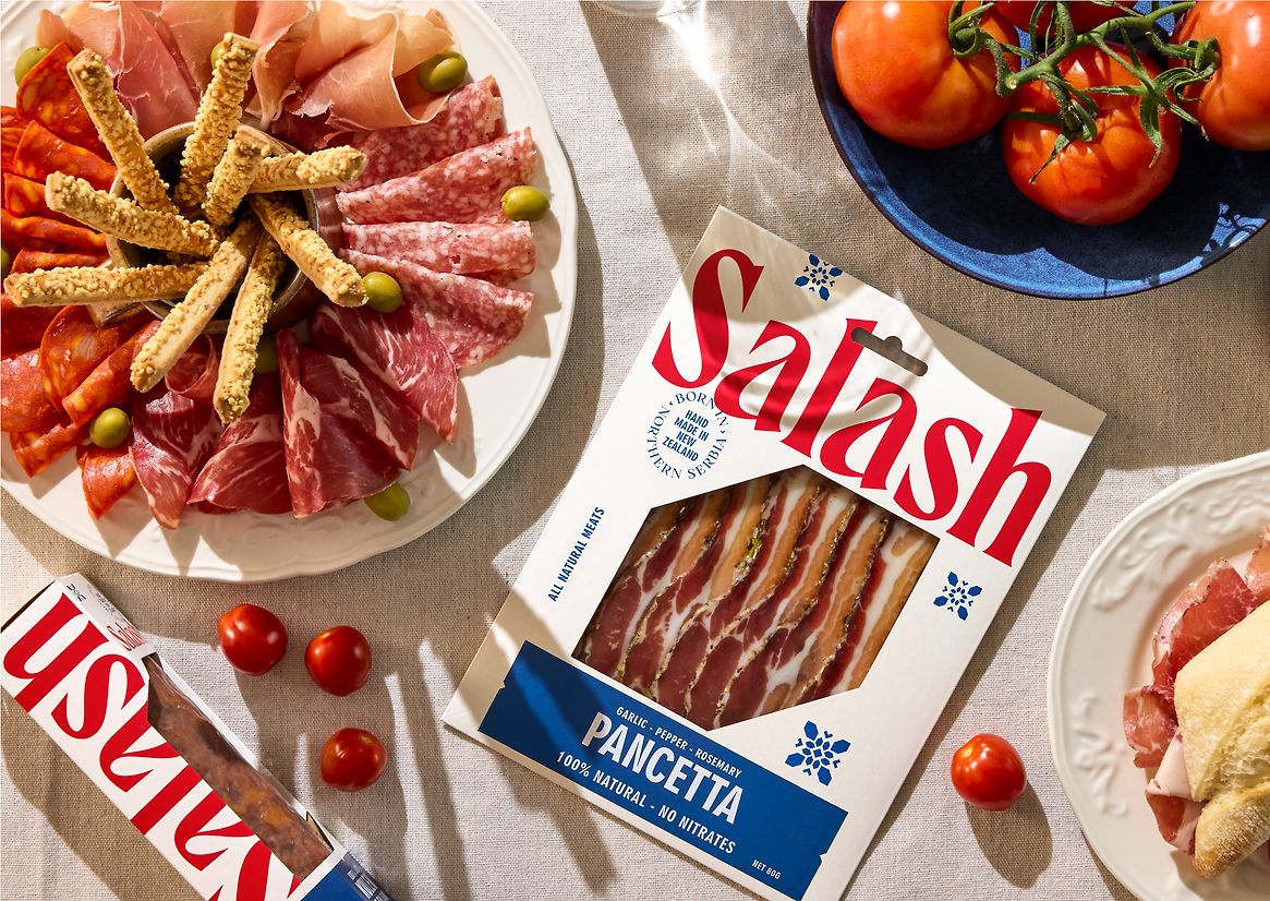
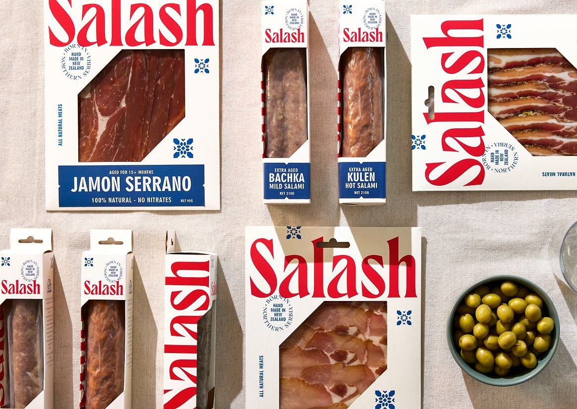
Two new pack formats were created for the first stage of the relaunch. A slim, oversized cardboard wallet format is used for all sliced meats, with creasing on the back panel to be flexible enough to hold slim salami sticks. A rigid box format is used for bigger salami meats. Each of these formats is printed with generic information. Variant-specific information is stickered. The typography is bolder and more utilitarian, contrasting the refined wordmark and speaking to the nature of butchery.
Description:
Salash Delicatessen is uniquely positioned as a small artisan food business in the New Zealand market. While there is a wide range of brands, both large and small, producing smallgood meats, they all offer a similar range of cuts, flavours and styles which cater to the wider New Zealand consumer. Salash's point of difference is their family history and geographic origins. Hailing from Northern Serbia, the family have been refining how they make and produce dry-cured meats in the Northern Serbian way for four generations. This imbues the meats with unique flavours and textures.
Since their immigration to New Zealand in 2009, the family has continued their meat-making tradition and fostered a sense of community. They introduced New Zealand to this unique style of meat, building a loyal following of dry-cured meat fans. This community has steadily grown through its market stalls and destination shop in Kumeū.
In 2023, the family developed a new business growth strategy which would take them from their current sales channels to becoming a premium supermarket brand and taking the brand nationwide, rather than restricted to the Auckland region. Discussions with supermarket brands highlighted the need to invest in their existing brand and packaging, enabling the brand to stand out in chiller aisles and speak to a premium point and discerning 'foodie' consumer.
The design process explored this Eastern European region's visual styles, patterns and culture, taking historical cues and reinterpreting them for the modern foodie consumer.
The brand wordmark is bespoke. Elements of which draw inspiration from the Cyrillic alphabet, most notably the shapes and curves of the lowercase 'a'. While the sharp serifs of the letterforms and the shape of the 'S' speaks to butchery, knives and hooks that are used to hang meat cuts up during drying. Secondary brand elements, icons and patterns are modernised and simplified interpretations of historical regional costumes and textiles. These are used to key messages and brand propositions. The hero icon is a simplified graphic of the literal meaning of 'Salash', a humble out-house on farmsteads where meats are dry-cured. This icon also shows the word's original spelling (Salas).
The colour palette is directly inspired by the Serbian national flag. The simple blue, white and red starkly contrast with the earthy tones used by competitor brands in this category.
Two new pack formats were created for the first stage of the relaunch. A slim, oversized cardboard wallet format is used for all sliced meats, with creasing on the back panel to be flexible enough to hold slim salami sticks. A rigid box format is used for bigger salami meats. Each of these formats is printed with generic information. Variant-specific information is stickered. The typography is bolder and more utilitarian, contrasting the refined wordmark and speaking to the nature of butchery.