Graphic
Onfire Design Ltd 19 Hidden Honey
-
Pou Auaha / Creative Director
Matt Grantham
-
Kaituhi Matua / Copywriter Lead
Bronwyn Williams
-
Ngā Kaimahi / Team Members
Matt Grantham, VJ Patel, Kendal Dunlop, Lisa Capel -
Kaitautoko / Contributors
Yuki Sato, Jalal Asgher -
Client
Haroon Uddin
Description:
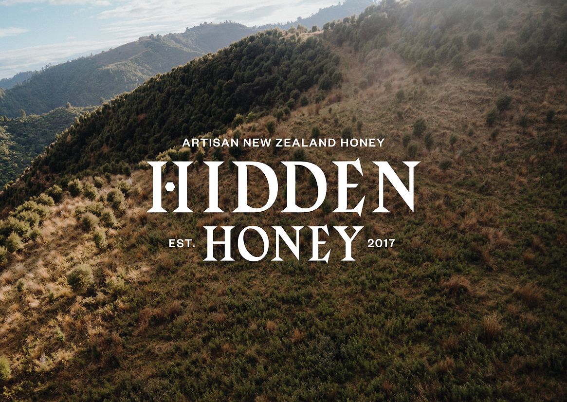
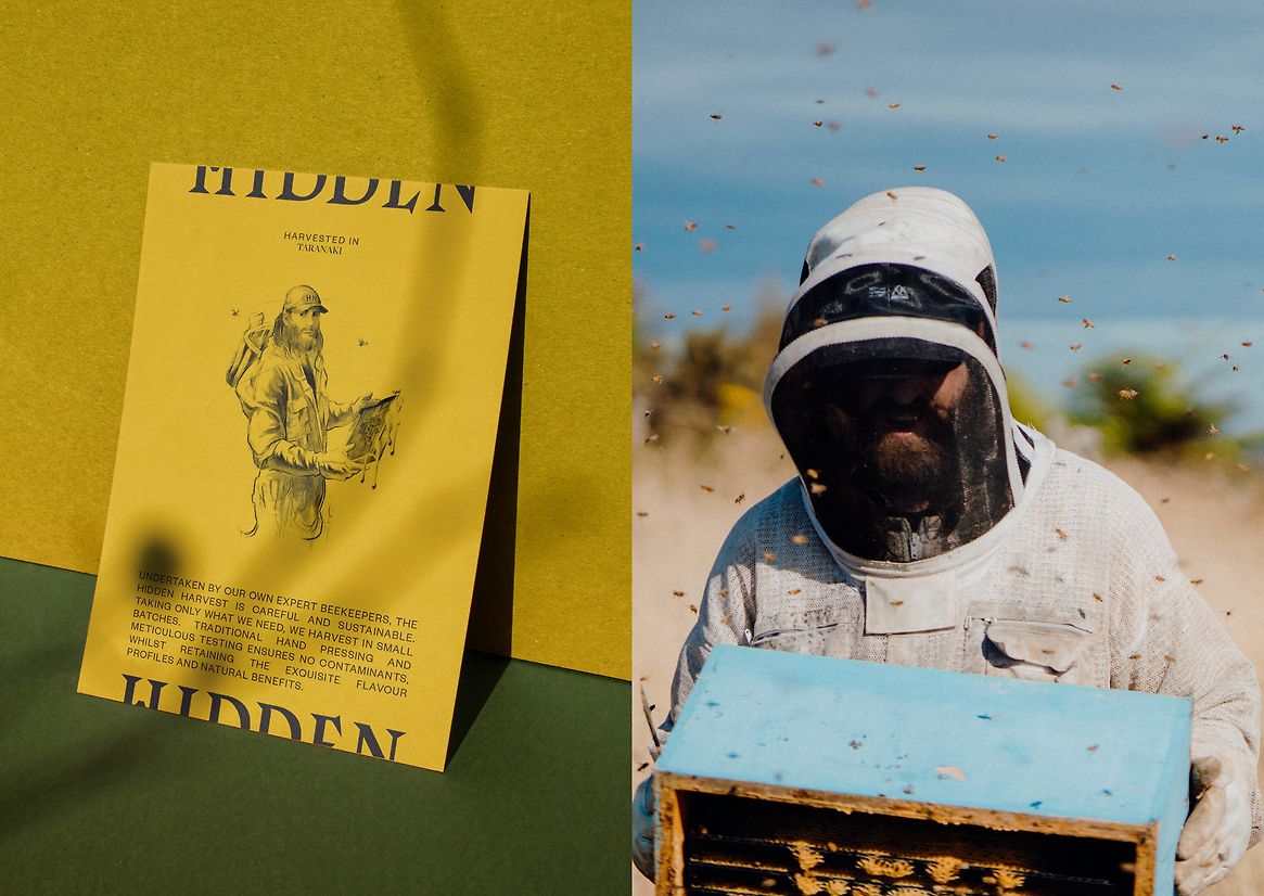
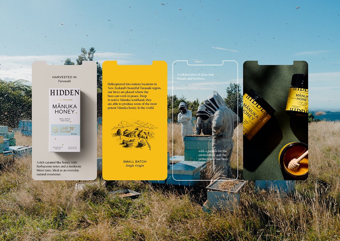
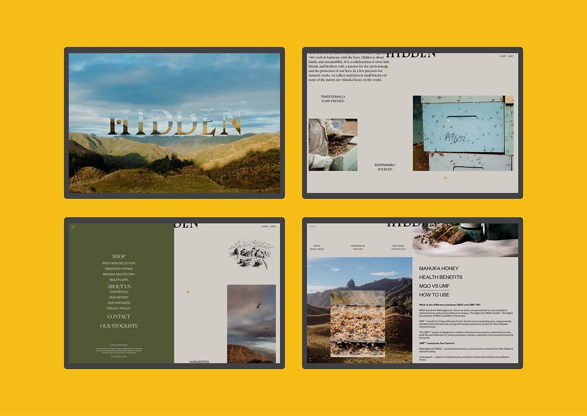
In a remote location of New Zealand’s North Island – away from the pesticides and modern agriculture – beekeepers work in harmony with their bees. As a collaboration of close-knit friends and brothers, Hidden is about family and sustainability. In a few precious hot summer weeks, the purest raw Mānuka honey in the world is harvested in small batches. This is the premise of Hidden Honey. A family run business who eschew the mass-commoditisation of New Zealand Honey by only taking what is harvested, never blending Manuka Honey from various regions to make bigger yields. At times this means very small harvests, but for them, they are staying true to what the bees do.
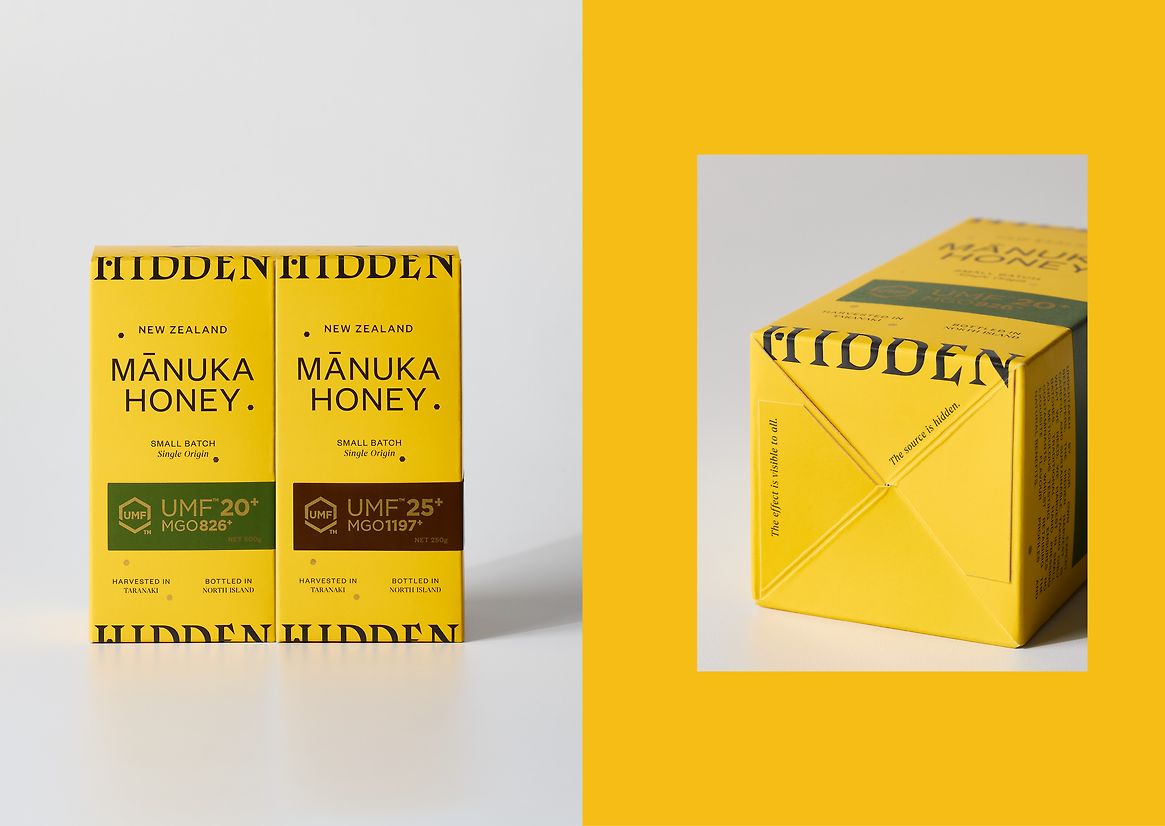
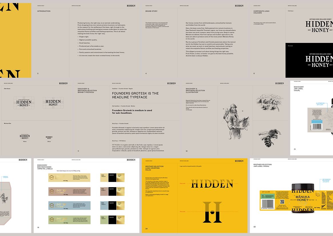
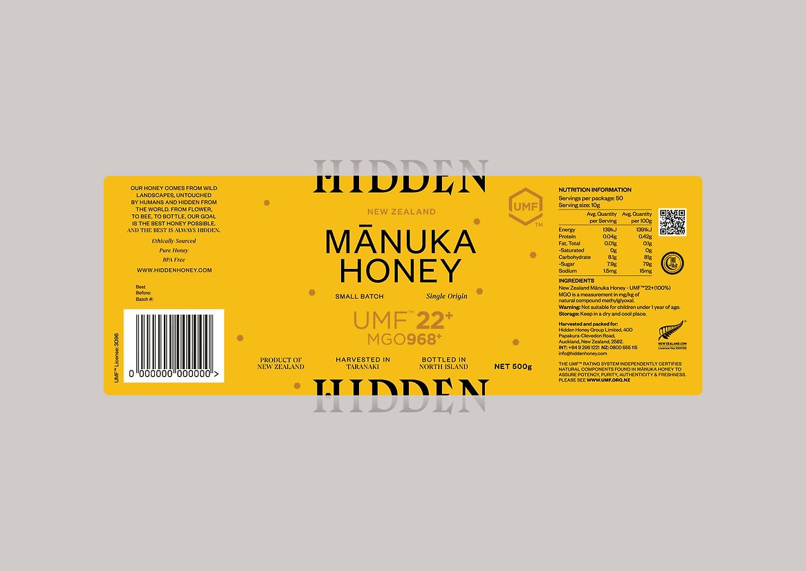
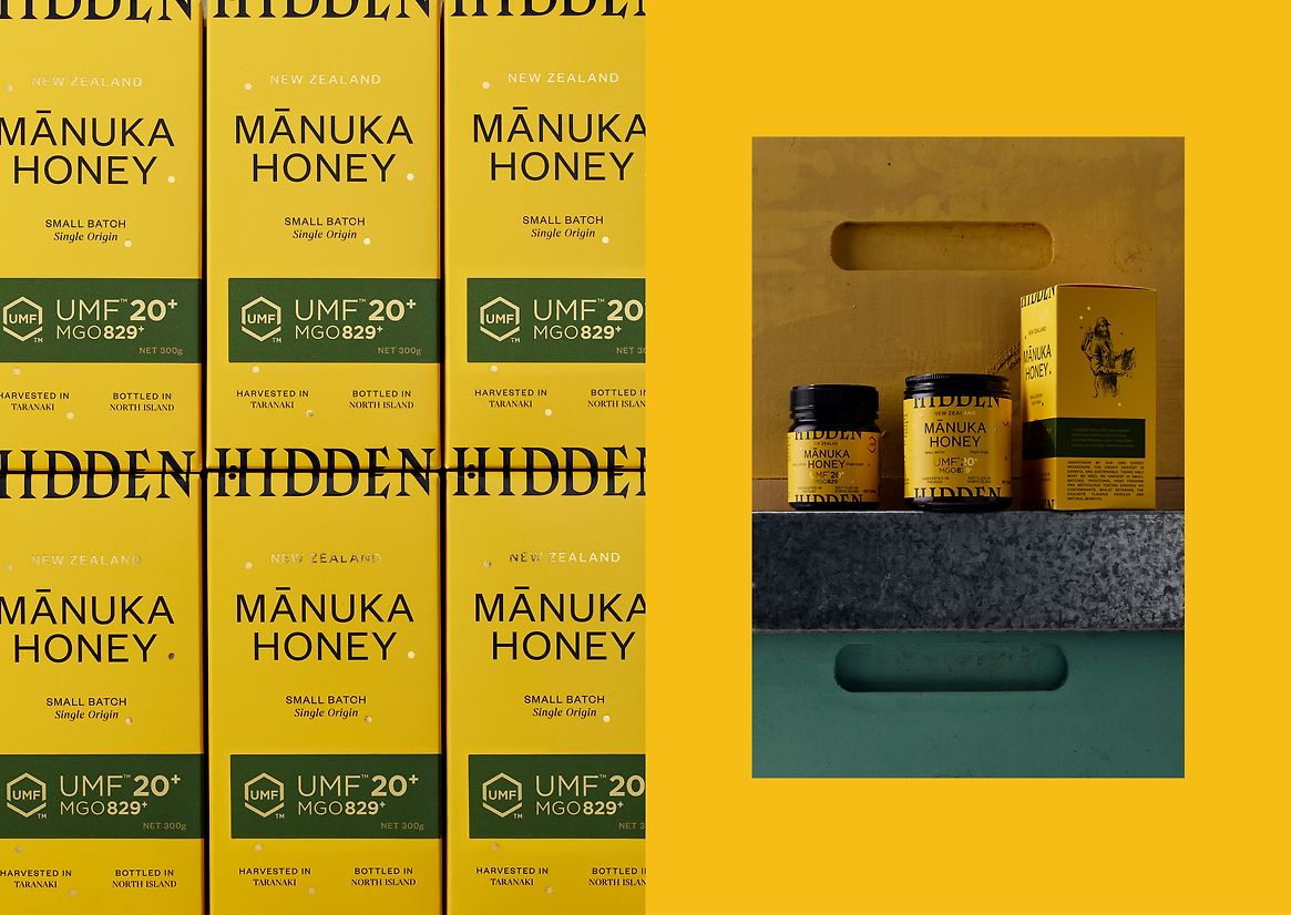
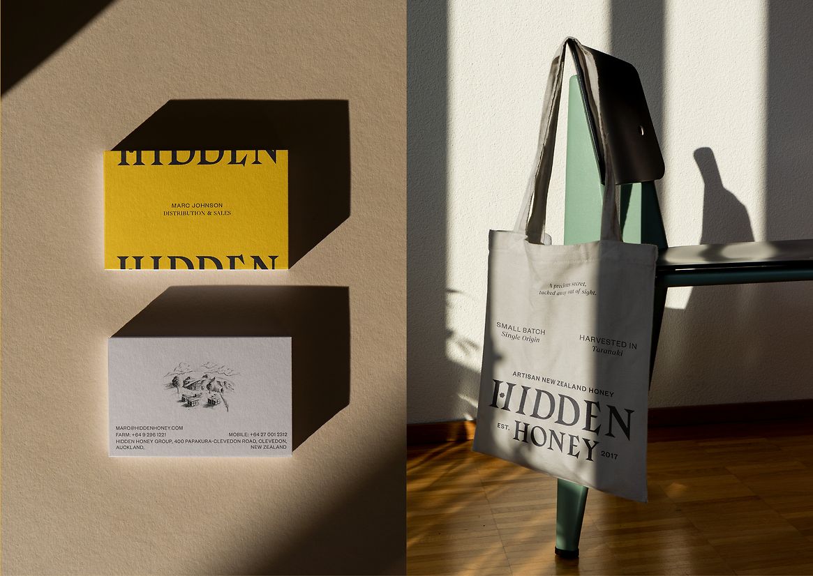
Our naming for the brand was inspired by the teams insistence on doing things right and going the extra-mile to find and forage what was previously Hidden. Typographically traditional yet edgy with sharp oversized serifs, the wordmark reflects the young family doing the work and the age-old methods they use to care for the bees and extract the honey. The wordmark is also flexible, in a subtle playful manner. Targeting two price points and two distinct sales environments, the logo is cropped for use in packaging in super premium boutiques where carefully managed POS can be done. Packs on their own show half the logo, only when two are stacked together the logo reveals itself. A simple and memorable visual trick for the consumer.
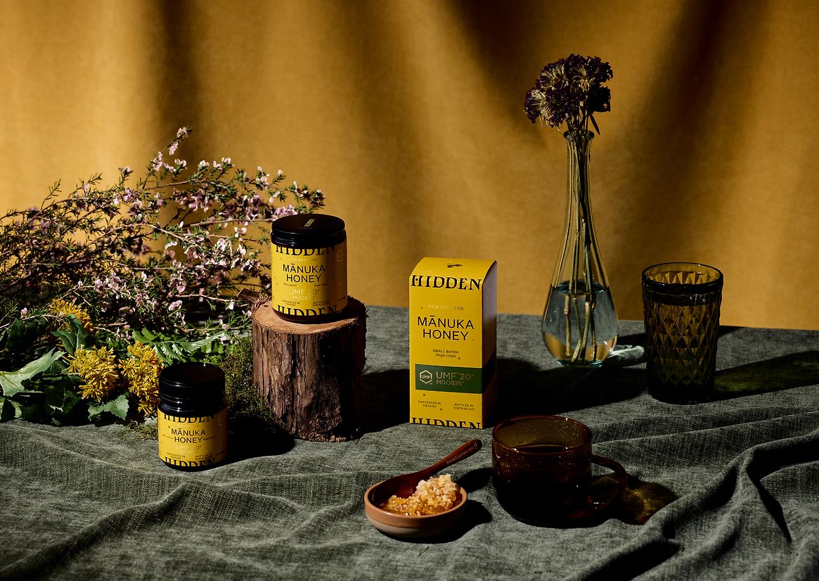
This playfulness is carefully utilised off pack on comms and digital channels. Secondary fonts alternate between a refined serif and simplified sans serif font, often combined together to create unique tension in layouts. Across all touchpoints a grid layout is employed to create a cohesiveness that is utilitarian in nature, mirroring the nature of the business. Soft pencil sketches of key brand story elements - bee husbandry, location and the bees - are used to add a soft humanistic touch and contrast to the sharpness of the grid layouts.
Colour plays an important role. The two price points of the products are separated by warm yellow and beige colours. These are heavily used thoughout the concise layout system. MGO factors are denoted by hand applied labels inspired by premium liquor brands. Rich and dark colours for higher factors, lighter pastels for the lower ratings.