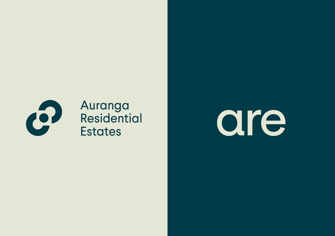
Auranga Residential Estates (ARE) is a boutique real estate agency operating exclusively for, and within the extensive, masterplanned community of Auranga in Drury.
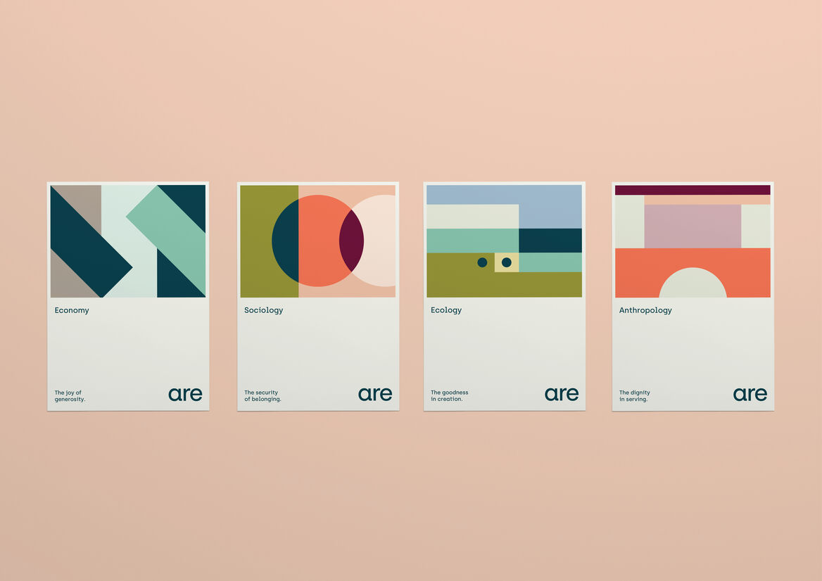
Auranga was founded on our client’s four ‘pillars for a better city’: Economy (the joy of generosity); Sociology (the security of belonging); Ecology (the goodness in creation); and Anthropology (the dignity in serving). These foundations allow a place to become so much more than a development or subdivision; they seed a better way of living.
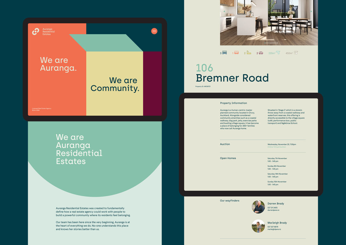
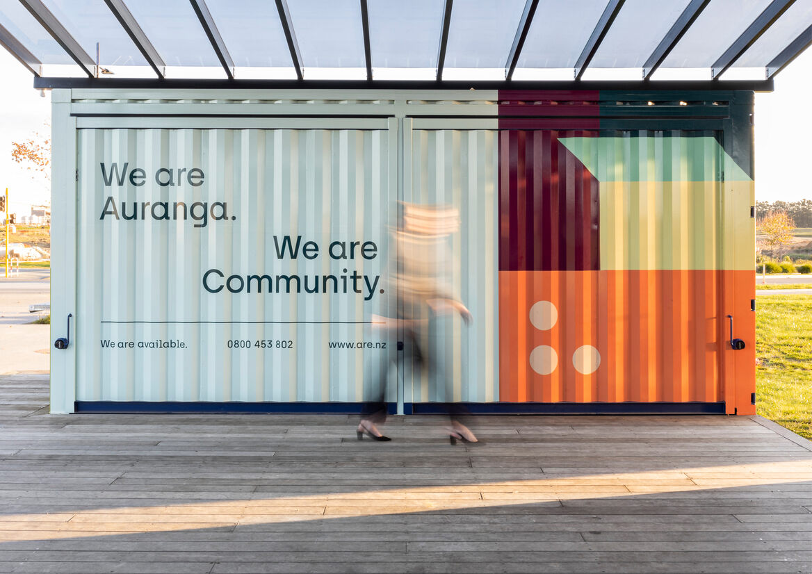
Our clients – the developers of Auranga – set us the challenge to deliver a brand strategy and visual identity that would align ARE with Auranga’s own carefully crafted brand DNA, while also reframing the typical transactional real estate experience to put people over profit. Together, we envisioned ARE to be the navigator, concierge, custodian and storyteller of Auranga - captured by our strapline: ‘We are Auranga. We are Community.’
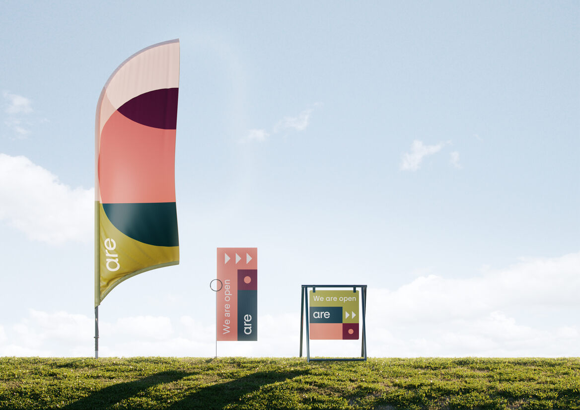
The brand utilises three logo variations including an acronym wordmark, allowing us to create on-brand messaging such as ‘We are available’ and ‘We are open’. It also comprises of a master pattern and four sub-patterns, each of which represents a pillar: Economy, where opposing shapes represent a positive tension in coming together to transact; Sociology, where shapes intersecting represent communities forming something greater than the sum of its parts; Ecology, where horizontal layers represent the relationship of earth, sky and water; and Anthropology, where a bridge celebrates connection and foundation.
A bold, visual identity featuring an interplay of unorthodox colours and geometric patterns help to position ARE as a disruptor in an otherwise corporate and impersonal real estate landscape. The ARE brand is an antithesis to this; it is innately human – visuals are imbued with a sense of playfulness whilst reflecting the diversity of the Auranga community. By creating an extensive palette paired with playful geometry – which have an implicit familiarity and humility to their form - the resulting visual language is flexible and adaptive.
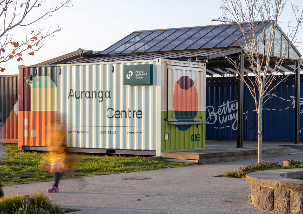
The Auranga Centre is the local base for ARE and the embodiment of the brand: friendly, eccentric, humble. Wrapped in the brand patterns, it gives new dimensions – both literally and figuratively – to the ARE brand which comes to life on the large, corrugated walls of the 20FT container.
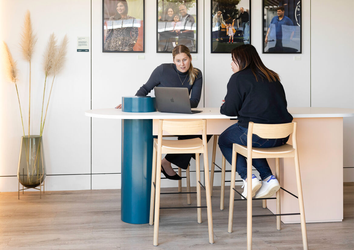
Inside, the bold exterior is juxtaposed with a simple, gallery-style room where each element in this compact space has been carefully selected to represent a pillar. As the functional hub of the centre, the bespoke, pill-shaped table represents Anthropology. Its design is a balance of form and function – a spatial interpretation of the brand patterns. The toetoe - which is refreshed regularly from the coastal planting - in a beautiful Echasse vase represents Ecology; the touchscreen – which is used for sales presentations - represents Economy; and the framed ‘Champions of Auranga’, Sociology.
Symbolically located in the heart of Village Square, the Auranga Centre is a billboard, workplace, display suite and layered symbol for how ARE is intrinsically linked with this special community.


Description:
Auranga Residential Estates (ARE) is a boutique real estate agency operating exclusively for, and within the extensive, masterplanned community of Auranga in Drury.
Auranga was founded on our client’s four ‘pillars for a better city’: Economy (the joy of generosity); Sociology (the security of belonging); Ecology (the goodness in creation); and Anthropology (the dignity in serving). These foundations allow a place to become so much more than a development or subdivision; they seed a better way of living.
Our clients – the developers of Auranga – set us the challenge to deliver a brand strategy and visual identity that would align ARE with Auranga’s own carefully crafted brand DNA, while also reframing the typical transactional real estate experience to put people over profit. Together, we envisioned ARE to be the navigator, concierge, custodian and storyteller of Auranga - captured by our strapline: ‘We are Auranga. We are Community.’
The brand utilises three logo variations including an acronym wordmark, allowing us to create on-brand messaging such as ‘We are available’ and ‘We are open’. It also comprises of a master pattern and four sub-patterns, each of which represents a pillar: Economy, where opposing shapes represent a positive tension in coming together to transact; Sociology, where shapes intersecting represent communities forming something greater than the sum of its parts; Ecology, where horizontal layers represent the relationship of earth, sky and water; and Anthropology, where a bridge celebrates connection and foundation.
A bold, visual identity featuring an interplay of unorthodox colours and geometric patterns help to position ARE as a disruptor in an otherwise corporate and impersonal real estate landscape. The ARE brand is an antithesis to this; it is innately human – visuals are imbued with a sense of playfulness whilst reflecting the diversity of the Auranga community. By creating an extensive palette paired with playful geometry – which have an implicit familiarity and humility to their form - the resulting visual language is flexible and adaptive.
The Auranga Centre is the local base for ARE and the embodiment of the brand: friendly, eccentric, humble. Wrapped in the brand patterns, it gives new dimensions – both literally and figuratively – to the ARE brand which comes to life on the large, corrugated walls of the 20FT container.
Inside, the bold exterior is juxtaposed with a simple, gallery-style room where each element in this compact space has been carefully selected to represent a pillar. As the functional hub of the centre, the bespoke, pill-shaped table represents Anthropology. Its design is a balance of form and function – a spatial interpretation of the brand patterns. The toetoe - which is refreshed regularly from the coastal planting - in a beautiful Echasse vase represents Ecology; the touchscreen – which is used for sales presentations - represents Economy; and the framed ‘Champions of Auranga’, Sociology.
Symbolically located in the heart of Village Square, the Auranga Centre is a billboard, workplace, display suite and layered symbol for how ARE is intrinsically linked with this special community.