Graphic
Nonfiction 3 Te Kaahu
-
Pou Auaha / Creative Director
Nick Riley -
Pou Rautaki / Strategic Lead
Michael Crampin -
Pou Taketake / Cultural Leads
Sonya Haggie, Renata Ti Wiata, Rahui Papa
-
Ngā Kaimahi / Team Member
David Kaho -
Kaitautoko / Contributor
Samuel Sakaria -
Client
Auckland Airport & Tainui Group Holdings
Description:
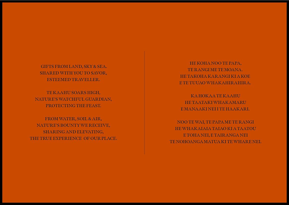
Te Kaahu — Elevating the True Experience of Our Place
In 2020, construction began on Te Arikinui Pullman Auckland Airport - a landmark 5-star hotel and key feature of Auckland Airport’s once-in-a-generation transformation. A joint venture between Tainui Group Holdings and Auckland Airport, the hotel was designed to reflect both modern Aotearoa hospitality and the deep ancestral stories of the Tainui people.
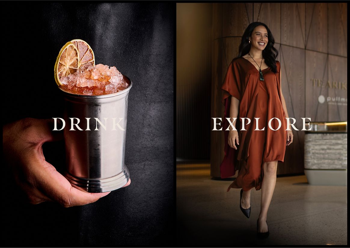
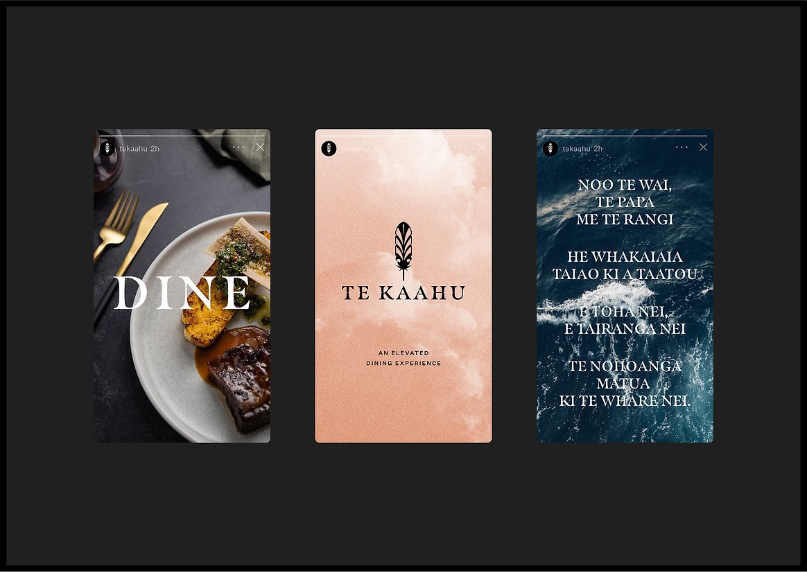
At the very top of this prestigious property, perched on the 9th floor, sits Te Kaahu - a fine dining experience unlike any other in Aotearoa. Helmed by acclaimed Executive Chef Nancye Pirini (Te Whaanau-aa-Apanui, Te Rarawa), Te Kaahu offers a modern expression of traditional New Zealand cuisine, celebrating indigenous ingredients and stories in every dish.
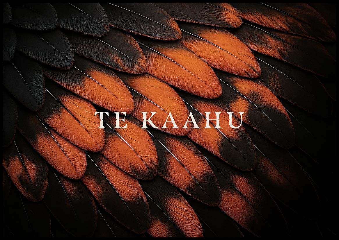
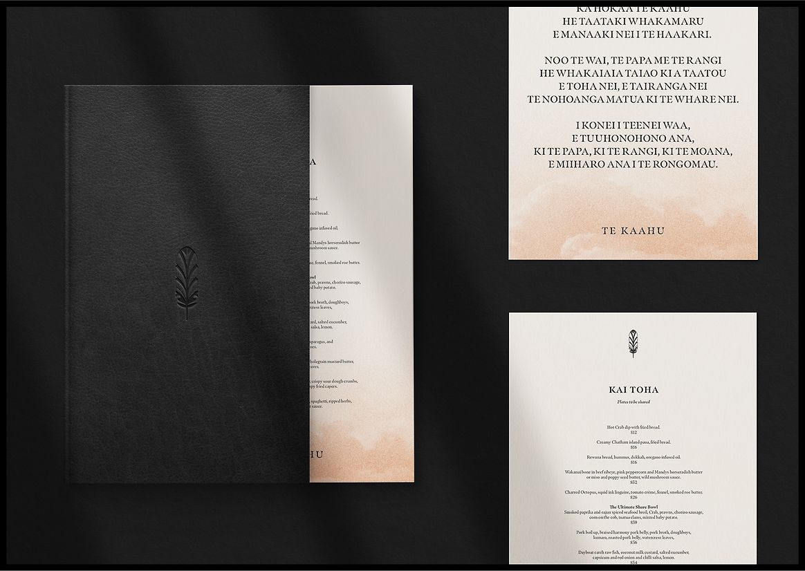
The name Te Kaahu, gifted by Kiingi Tuheitia Pootatau Te Wherowhero VII, honours his late mother, Te Arikinui Te Atairangikaahu, the Māori Queen. Symbolising the hawk of the morning sky, Te Kaahu was chosen not only for its spiritual connection, but for its symbolic position - elevated, purposeful, and deeply connected to the land and sky.
The creative brief called for a brand identity that would:
• Represent modern Aotearoa culinary culture for both local and international audiences
• Seamlessly align with the hotel’s overarching “Sea to Sky” design narrative
• Embed the rich cultural legacy of the Tainui people
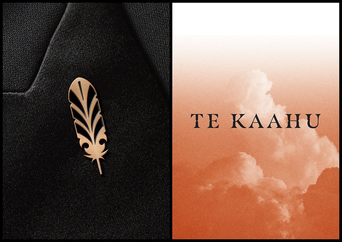
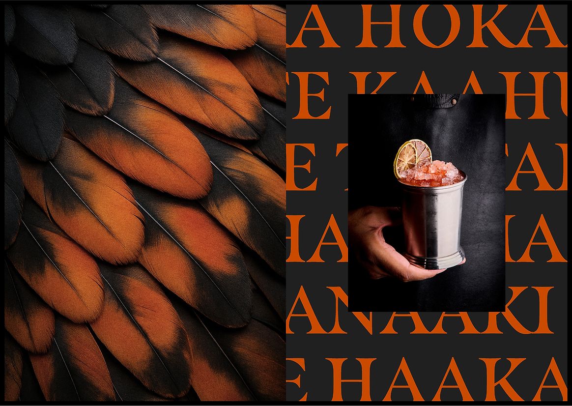
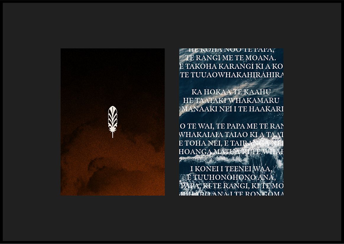
The result is a deeply considered identity rooted in story and significance. At its heart sits the Kaahu feather icon - inspired by the ceremonial feather headdress worn by figures of chiefly status, and symbolic of grace, mana, and elevation. This icon not only references the native harrier hawk but also the regal legacy of Te Arikinui Te Atairangikaahu.
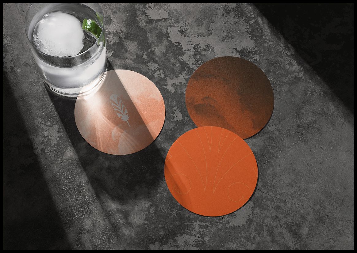
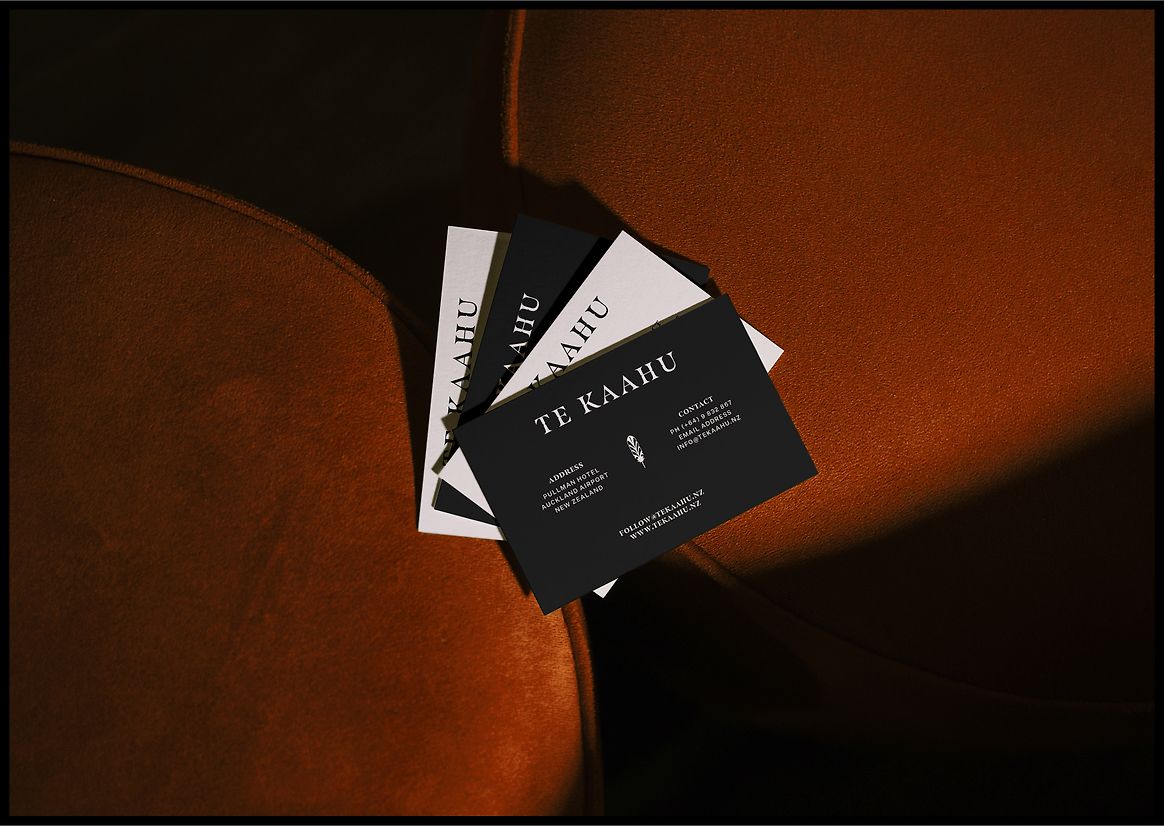
The bespoke wordmark features subtle notching, drawing from Kupu Whakairo (carved text), to echo the permanence and authority of Tainui heritage. The colour palette is drawn directly from Kaahu plumage - rich charcoals, golden ochres, and burnt oranges - and paired with cloud-inspired textures that reflect the restaurant’s sky-high setting.
Every detail was treated with reverence - from minimalist, locally focused food photography to the purposeful inclusion of te reo Māori throughout the brand expression. The depth of meaning behind the brand has resonated far beyond the restaurant itself: the Kaahu feather has since been embraced as the unofficial symbol of the hotel, worn proudly by senior staff as a gold-plated brooch - a subtle but powerful signifier of pride, honour, and connection.
Above all, Te Kaahu elevates more than just cuisine - it lifts the stories, values, and traditions of Tainui, inviting every guest to engage with the manaakitanga, quality, and cultural depth of this place.
In a single word, what elevates the work is meaning - a rich, living narrative woven into every touchpoint, keeping history alive through every plate, every gesture, and every feather.