Graphic
Neil Pardington Design 7 Kotahi Rau Pukapuka
-
Pou Auaha / Creative Director
Neil Pardington
-
Ngā Kaimahi / Team Member
Tina Delceg -
Kaitautoko / Contributors
Xoe Hall, Hiwirori Maynard, Dr Seuss, Huriana Kopeke-Te Aho, Munro Te Whata, Kawariki Morgan -
Client
Auckland University Press & Kotahi Rau Pukapuka Trust


Description:
BACKGROUND
In October 2019, the Prime Minister launched Kotahi Rau Pukapuka Trust with its mission to publish 100 Books in te reo Māori. The Trust is building a whare pukapuka, a great library of books in te reo Māori, that every home and school will be proud to own: from Harry Potter and the Philosopher’s Stone to Dr. Seuss, from Te Puea to The Alchemist.
RESPONSE
The challenge was to develop a tohu – together with a templated design system for the 100 books – that reflected this inspired initiative. The tohu would appear on the covers and spine of every book with the aim of becoming a recognisable publishing imprint.
KŌRERO
The story of the god Tāne retrieving the baskets of knowledge from the heavens was chosen to reflect the distribution of knowledge and inspiration through the pukapuka, and to form the centre of the design response.
Human life and knowledge originate in the realm of Ranginui, the sky father. In one tradition, the god Tāne climbed to the citadel Te Tihi-o-Manono, in the highest of the 12 heavens, known as Te Toi-o-ngā-rangi. There he retrieved three baskets of knowledge: te kete-tuatea (basket of light), te kete-tuauri (basket of darkness) and te kete-aronui (basket of pursuit). Reverend Māori Marsden has suggested that the basket of light is present knowledge, the basket of darkness things unknown, and the basket of pursuit is the knowledge humans currently seek.
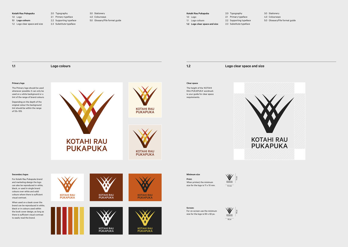
The tohu reflects this story, with harakeke leaves shaping an open pukapuka and simultaneously a kete – ‘te kete pukapuka’.
COLOURWAYS
While the tohu is drawn as one kete/pukapuka, the three distinct colourway pairs – hāurauri/kōkōwai (dark), kōura/kōwhai (light), whero/karaka (active) – allude to the three baskets.
TYPOGRAPHY
The typography is simple and contemporary – as it will be primarily used at very small sizes on paperback book covers and in social media.
PUKAPUKA TEMPLATE
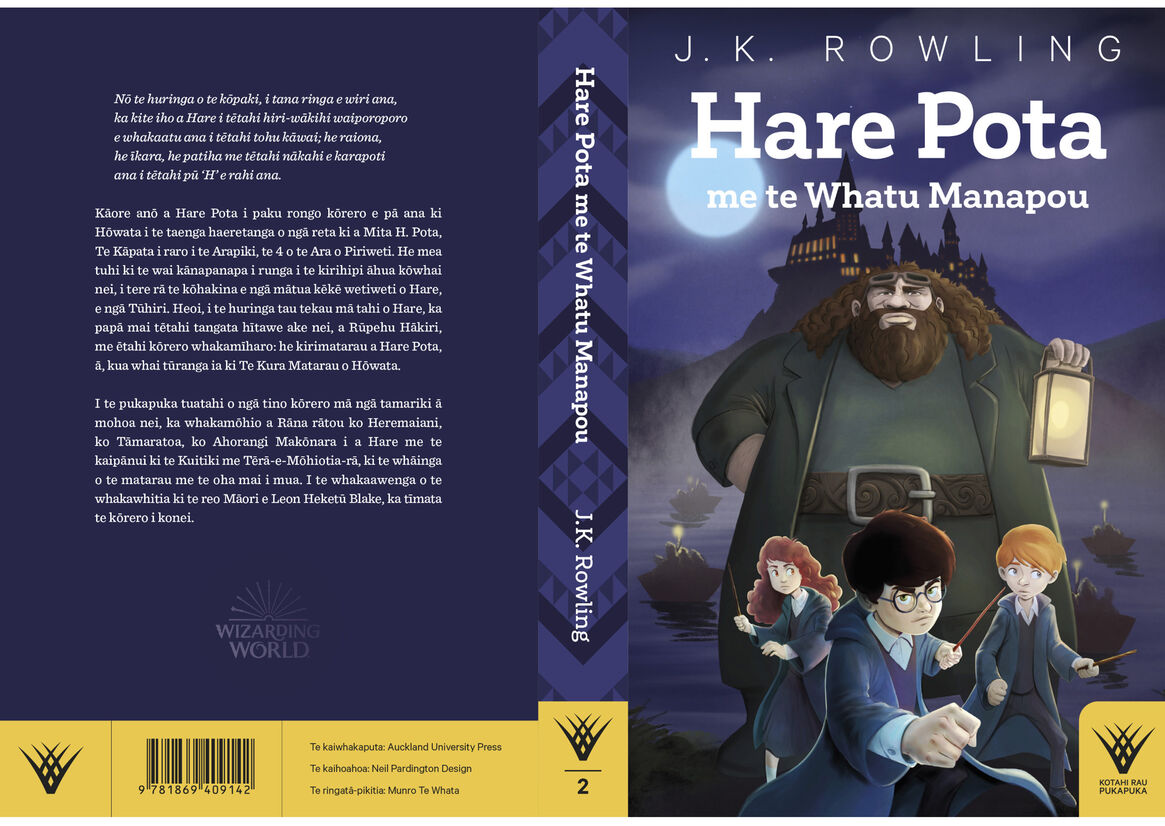
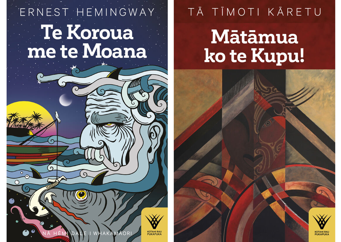
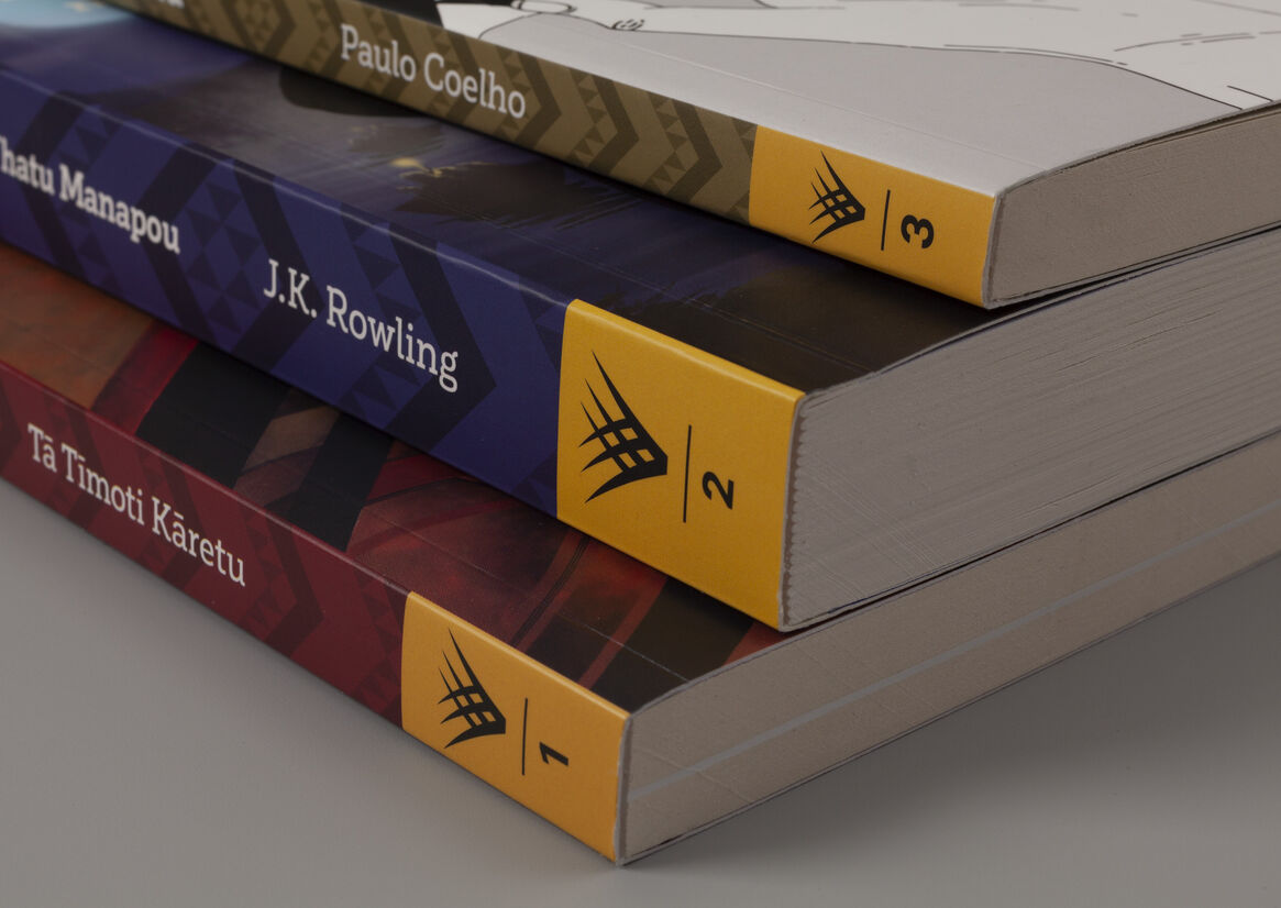
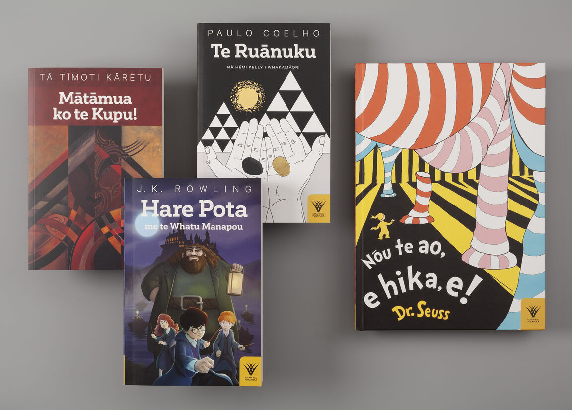
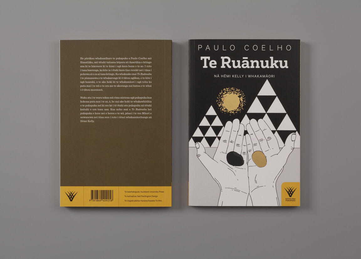
The primary use of the tohu is in the pukapuka cover designs where it is reproduced in pango over kōwhai. It appears in a tab on the front cover, on the spine with the series number and on the back cover.
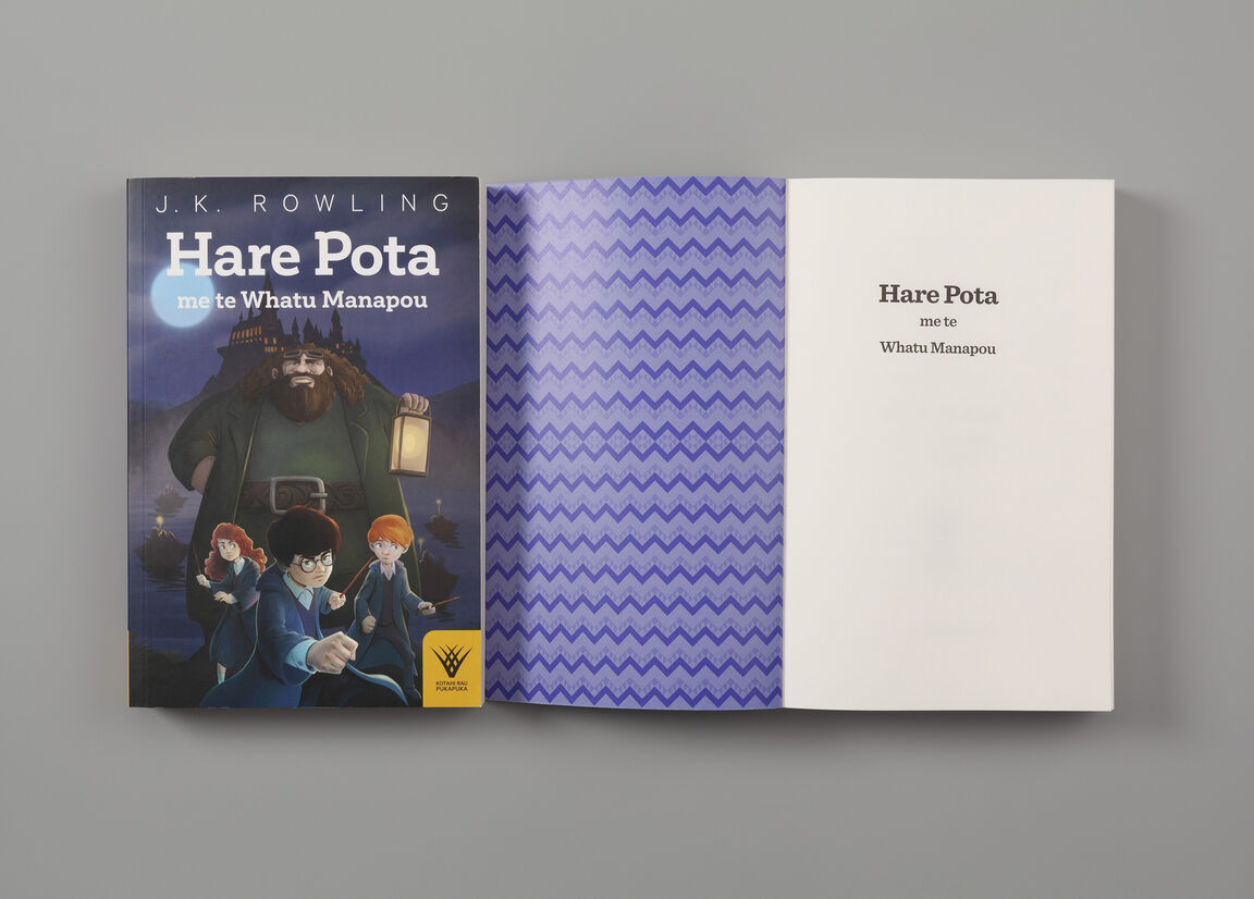
The pukapuka covers use consistent typography that is scaled to best present each title. The author names and info block type are set in the tohu font – Calibre. The titles are set in a warm, lively, bold slab serif – Corporative Slab. Inside, the body copy is set in the Clarendon-inspired Sentinel – very readable in the small text of paperback novels, but also great at scale in children’s books.
A tāniko design inspired by the kaupapa of Kotahi Rau Pukapuka is on every spine and inside cover – symbolically functioning like the tāhuhu in a wharenui.
The cover illustrations are commissioned from Māori artists to showcase their talents, although children’s story books and graphic novels retain their original artwork.