ServiceNow is a global cloud computing platform that helps enterprise-scale companies manage digital workflows. Their platform provides a vast, complex array of software op-tions. Finding and optimising the right solution for your specific business can therefore be a significant challenge – introducing Red Moki.
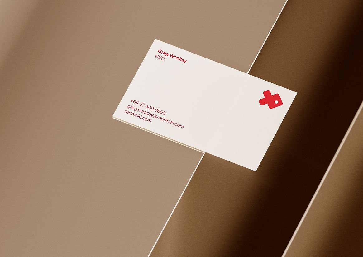
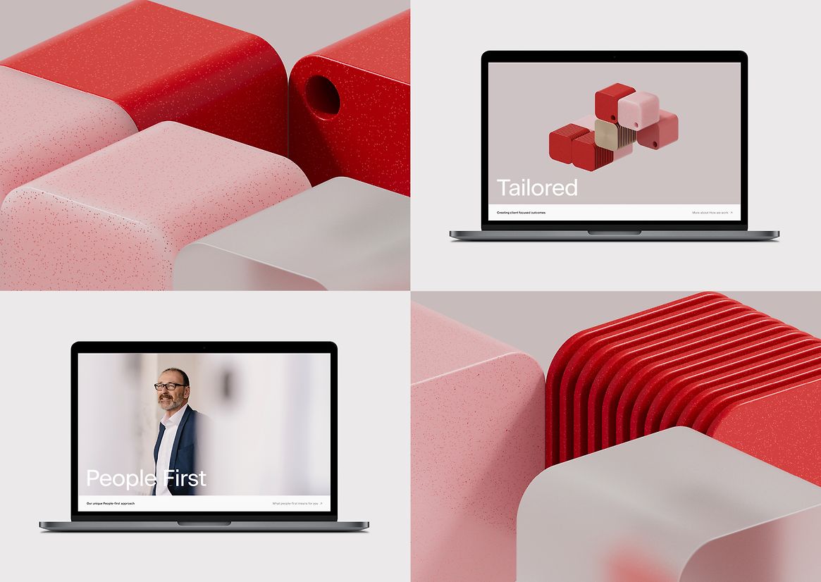
Red Moki is not your typical technology services provider. They are an elite ServiceNow technology specialist creating tailored, flexible, people-first solutions that drive business transformation. They partner with businesses to ensure their software needs continue to evolve at the same speed their businesses do.
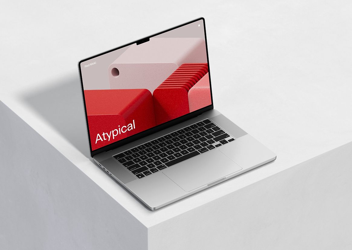
The challenge with complex software services is making them understandable, tangible and human, while avoiding traditional metaphoric business photography or illustration – something that is almost ubiquitous across this industry. Red Moki wanted to avoid these pitfalls, create a premium proposition, and stand out in the Australasian market.
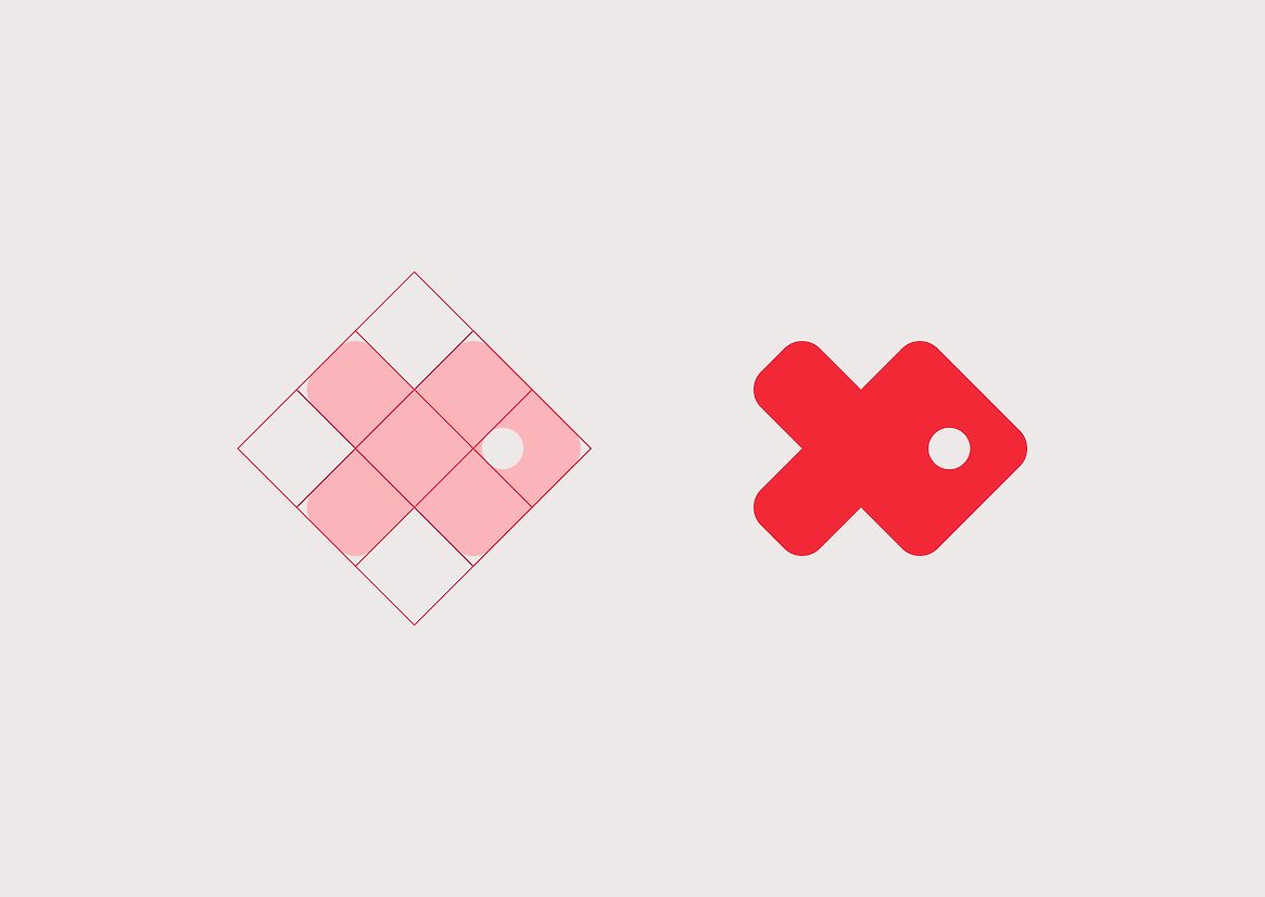
The inspiration for the brand name, logo and colour palette comes from a fish called a Red Moki, found only off New Zealand’s North Island and Southern Australia. Their Red Moki is a digital fish, traversing a vast ocean of technology.
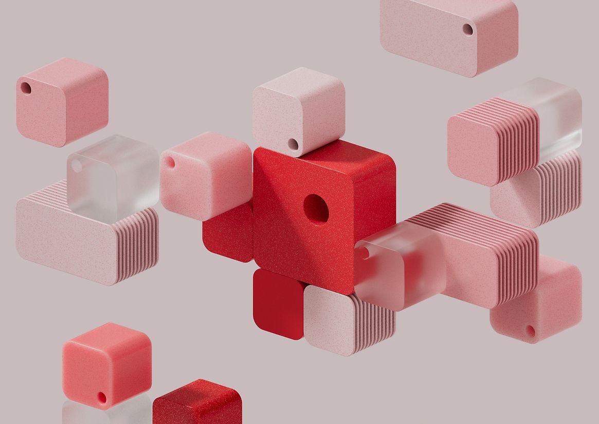
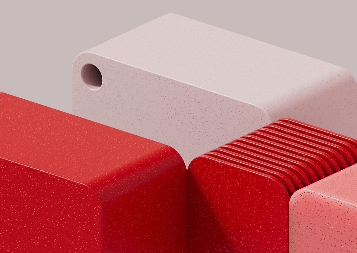
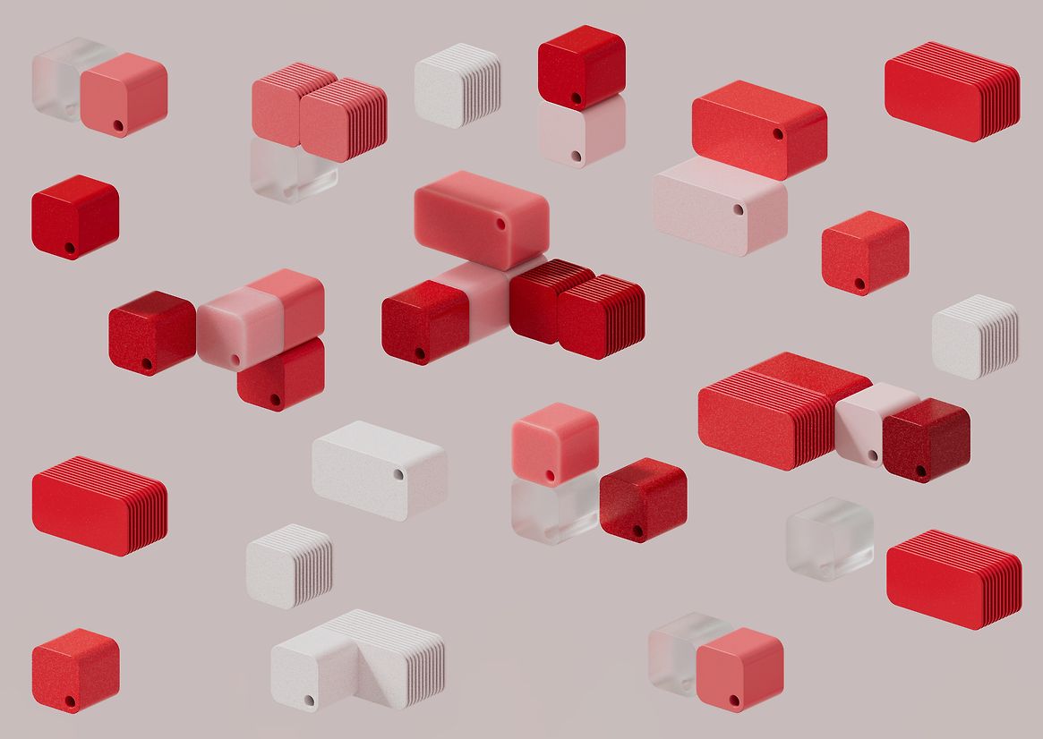
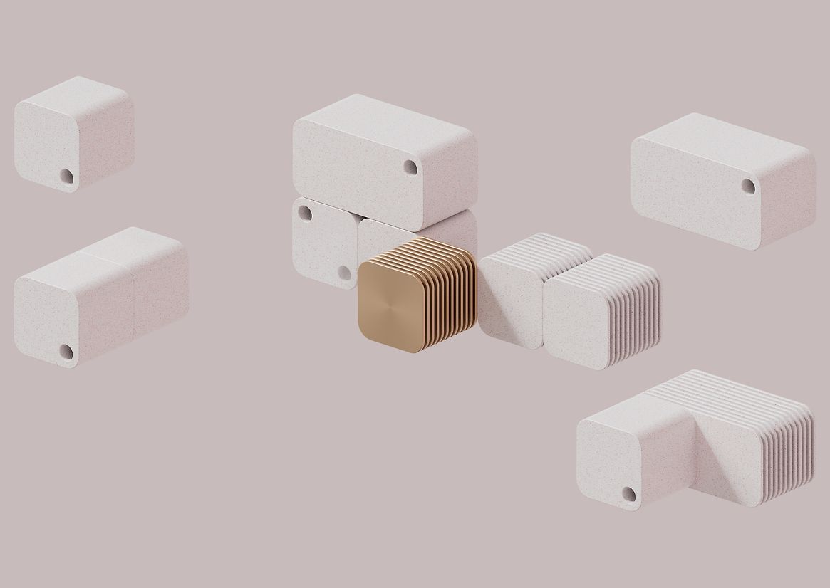
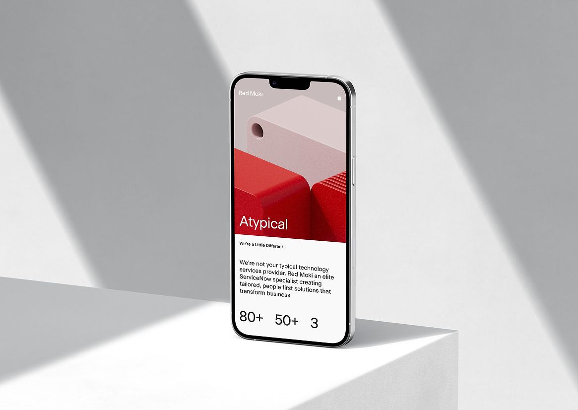
The visual metaphor selected to communicate their business benefit is the modular block – ServiceNow is an ocean of digital software blocks, and Red Moki is the curator, seek-ing, selecting, and tailoring the blocks you specifically need. The blocks provide a simple, unifying visual and verbal language for the brand, and a flexible graphic system in both static and animation across all touchpoints.

Description:
ServiceNow is a global cloud computing platform that helps enterprise-scale companies manage digital workflows. Their platform provides a vast, complex array of software op-tions. Finding and optimising the right solution for your specific business can therefore be a significant challenge – introducing Red Moki.
Red Moki is not your typical technology services provider. They are an elite ServiceNow technology specialist creating tailored, flexible, people-first solutions that drive business transformation. They partner with businesses to ensure their software needs continue to evolve at the same speed their businesses do.
The challenge with complex software services is making them understandable, tangible and human, while avoiding traditional metaphoric business photography or illustration – something that is almost ubiquitous across this industry. Red Moki wanted to avoid these pitfalls, create a premium proposition, and stand out in the Australasian market.
The inspiration for the brand name, logo and colour palette comes from a fish called a Red Moki, found only off New Zealand’s North Island and Southern Australia. Their Red Moki is a digital fish, traversing a vast ocean of technology.
The visual metaphor selected to communicate their business benefit is the modular block – ServiceNow is an ocean of digital software blocks, and Red Moki is the curator, seek-ing, selecting, and tailoring the blocks you specifically need. The blocks provide a simple, unifying visual and verbal language for the brand, and a flexible graphic system in both static and animation across all touchpoints.