Graphic
Milk 68 Resolv
-
Pou Auaha / Creative Director
Sarah Melrose
-
Ringatoi Matua / Design Director
Anthony Hos
-
Ngā Kaimahi / Team Members
Ben Reid, Kate Forsythe, Eden Harris, Gemma Scott, Natasha Vermuelen, Adeline Chua -
Kaitautoko / Contributors
Michael Crampin, Tom Crampin -
Client
Sims Consumer Brands
Description:
Our client had an idea for small, concentrated, soluble cleaning ‘pods’ or tablets that could replace many litres and bottles of traditional cleaning product. They asked us to help bring it to life.
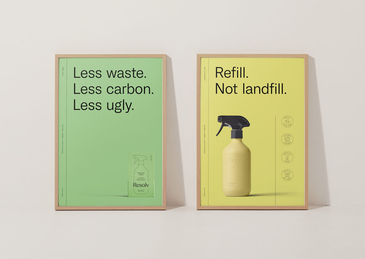
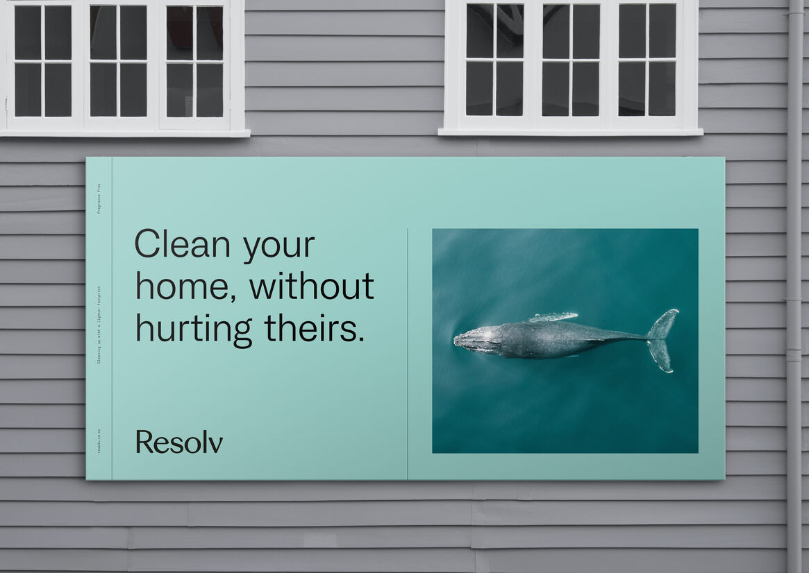
We started with the enemy: dirty. Dirty design, dirty behaviours, dirty actions. In an industry that’s supposed to be about cleaning up, there was a clear opportunity to be a real disruptor to all this ‘dirtiness’. Plastic bottles dominate the shelves, resulting in an incredible amount of single use plastic waste. But not only that, 90% of home cleaners are simply water, making it incredibly carbon heavy to ship around the world.
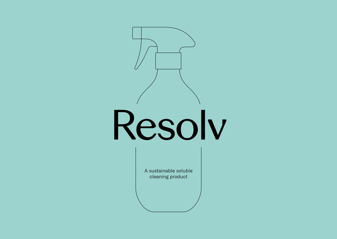
The answer was all about bringing a brighter outlook through beautiful simplicity and genuine positivity. We created a new brand name Resolv - resolving a huge problem with a dissolvable solution. Bringing a sense of care, innovation, and a touch of performance.
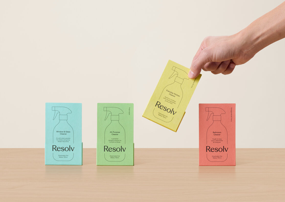
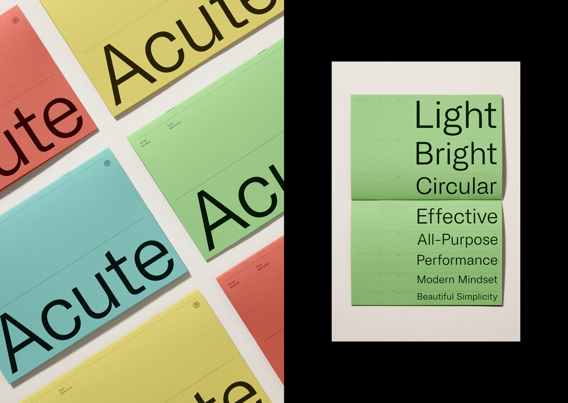
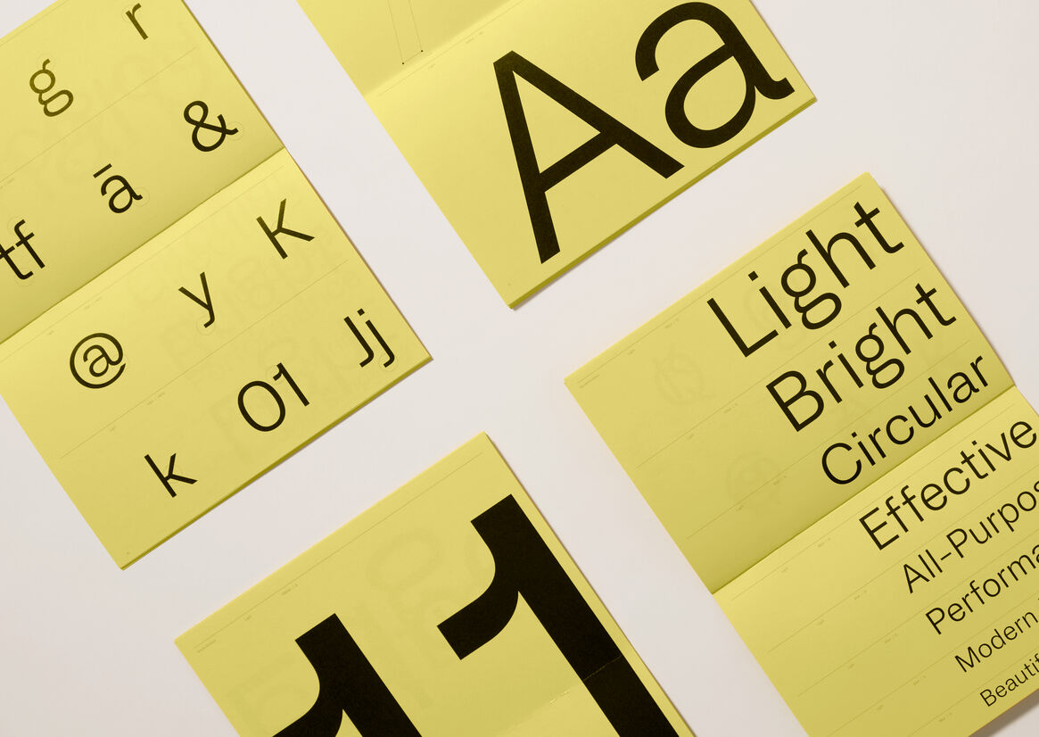
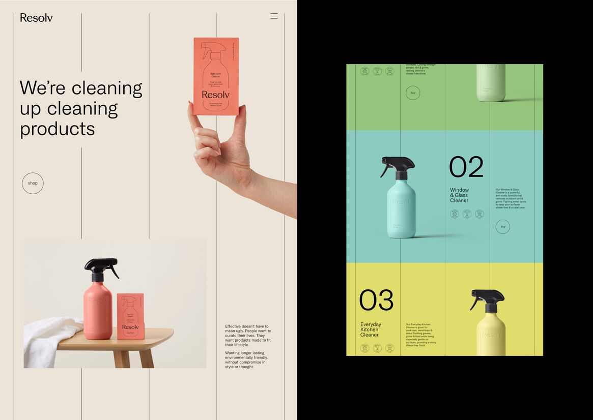
The visual identity features a progressive modern colour palette that reinforces our positive outlook and helps the product stand out on shelf. Signifying innovation, efficacy, and performance. The idea of a ‘lighter footprint’ influenced the keyline bottle shape, keyline iconography, the off-pack keyline design system and the custom typeface.
The wordmark needed to feel right at home in the home, representing beauty, efficacy, credibility and authenticity with its built-in angular cuts and forms. Derived from our wordmark, the monogram is our signature, a mark of authority and trust.
Acute Grotesk, the custom typeface was purpose built to keep it clean, light, bright and circular, just like our footprint. Purposefully designed with a sharpness and a modern mindset, it’s the perfect vehicle to help encourage people to refill, not add to landfill.
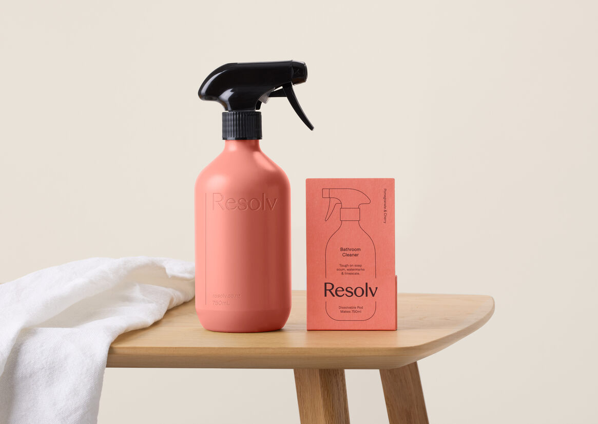
As the ‘pod’ itself is small, we needed to ensure Resolv had real shelf presence. Our research showed us that consumers associate bottles with cleaning products, so we incorporated the outline of a bottle on the front of pack. Showing consumers that this was just like a bottle of cleaning product – only better for you, your home, and the environment.
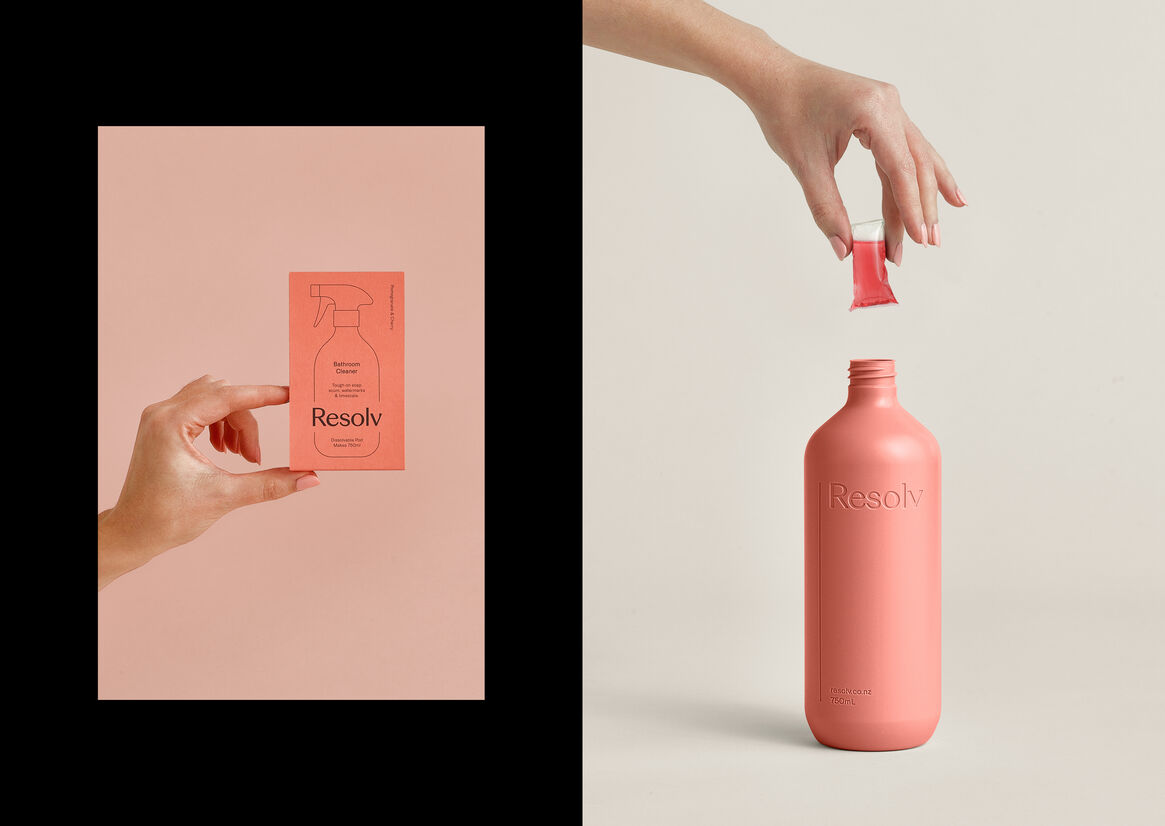
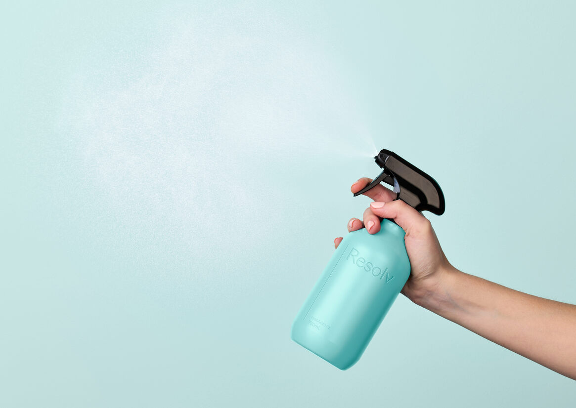
Critical to the reusable Resolv proposition was a new set of reusable bottles. We designed these sympathetic to the home environment. They needed to be lightweight, beautiful, and functional. So we kept them refined and simple with a reductive blind embossed logo that sits proudly, but respectfully in the laundry, bathroom or kitchen.
The result is a system that gives a true sense that brighter is finally here. Where everything is guilt free, waste free, harm free - and a little bit more beautiful. Where everything works better and is simply clever.