Ebb is a new contemporary neighbourhood hotel in the heart of Dunedin. Design savvy clients (father and son, Dylan and Frank) were building a modern boutique hotel and already had a great architect (Gary Todd Architecture) and interior design team (INDYK Architects). They needed a design studio to extrapolate all their ideas and develop an identity that brings together architecture, geography and contemporary design.
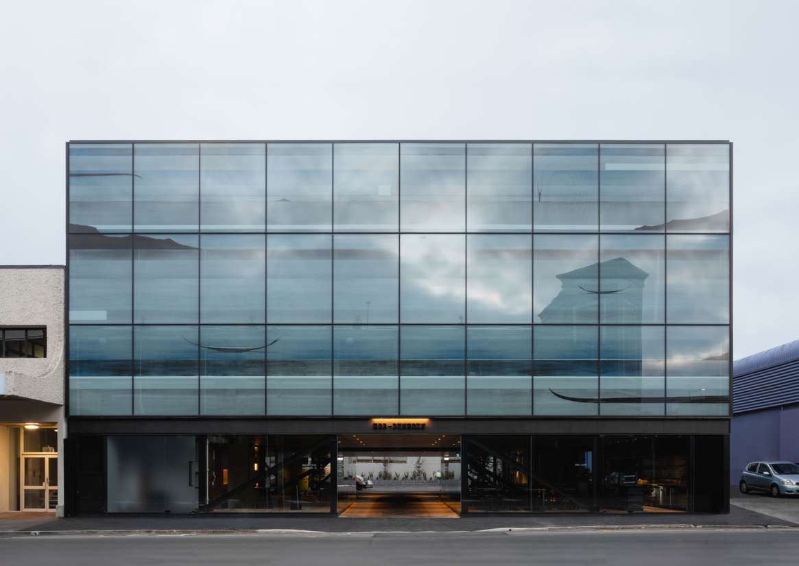
With construction underway and Dylan and Frank keen for Ebb Dunedin to showcase local artists, they commissioned Simon Kaan to create a large-scale artwork to wrap the entire facade of the building. Simon’s meditative artworks are characterised by a sense of rhythm and movement, with Dunedin’s land, sea and sky scapes dominating his work.
Our first task was to translate Simon’s 20-metre-long by three-storey high glass facade artwork into a digital print to sit across 30 glass panels to create the final artwork.
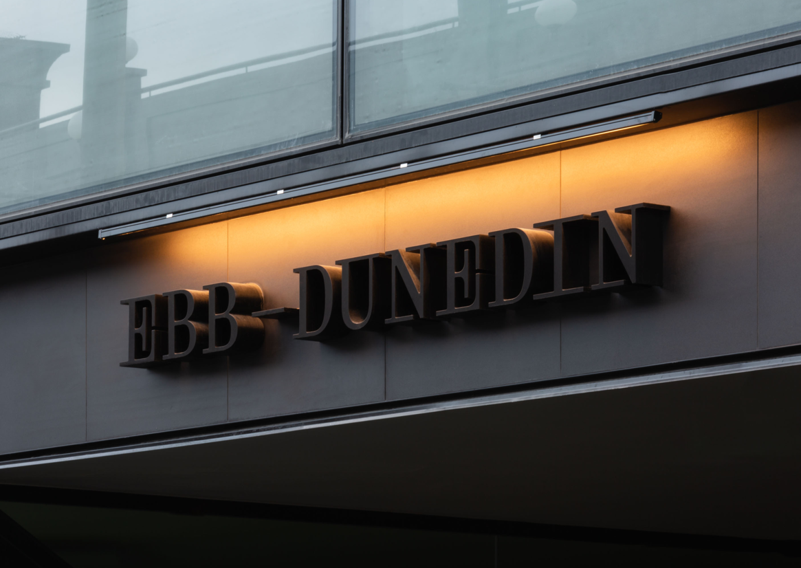
But how do you create a brand for a hotel in such a unique place in the world? We started with the name. ‘Ebb’ quickly emerged as the favourite as it directly relates to the site’s historic location on the edge of the now reclaimed Otago Harbour tidal flats. On the ebb tide, Polynesian travellers would have first landed on the exposed tidal flats before stepping foot on land.
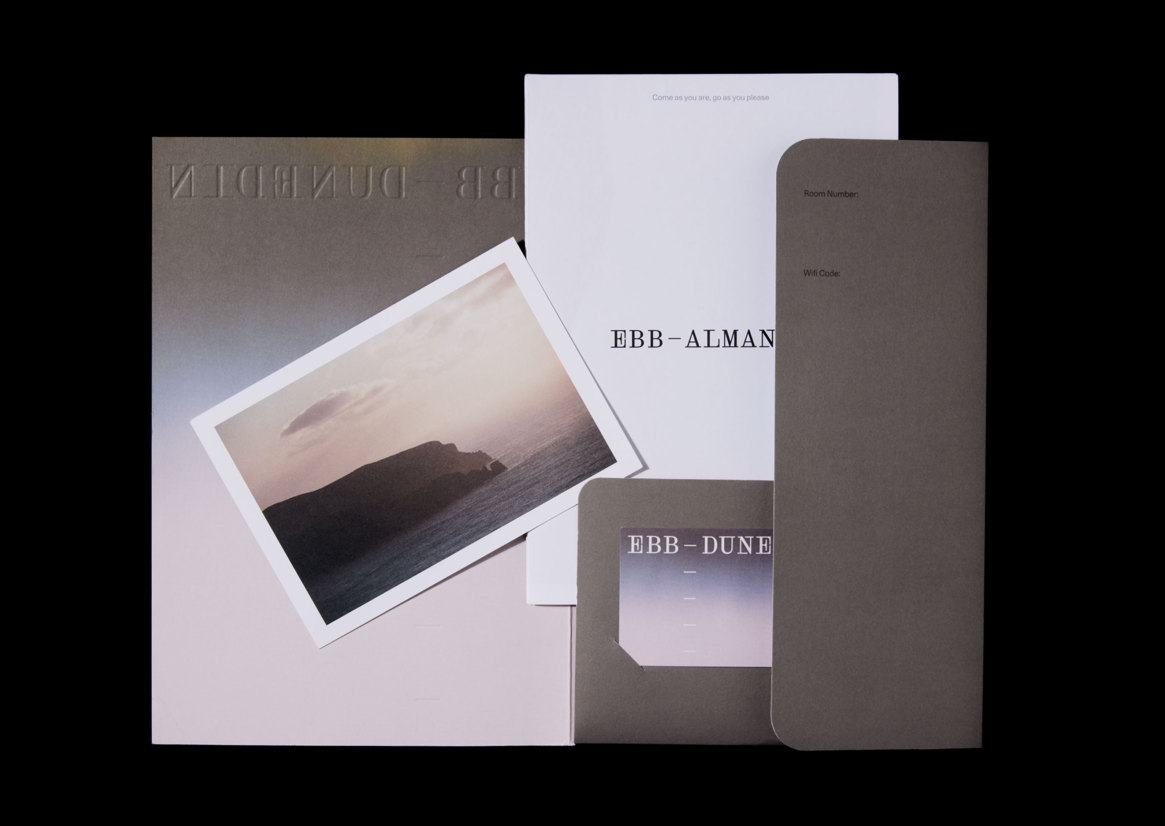
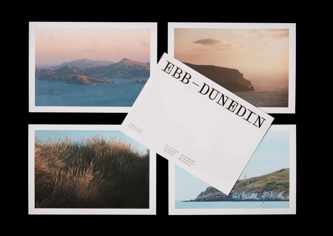
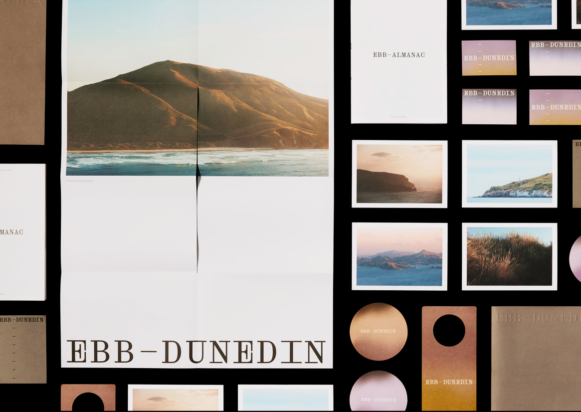
Our focus then shifted to developing a creative concept and full brand identity Ebb Dunedin, including everything from signage and wayfinding to a completely custom website that would handle guest bookings. The façade artwork unlocked our creative thinking and became the foundation of our exploration. Opening the door to a connection to the place and its history gave us an anchor beyond just good design and architecture.
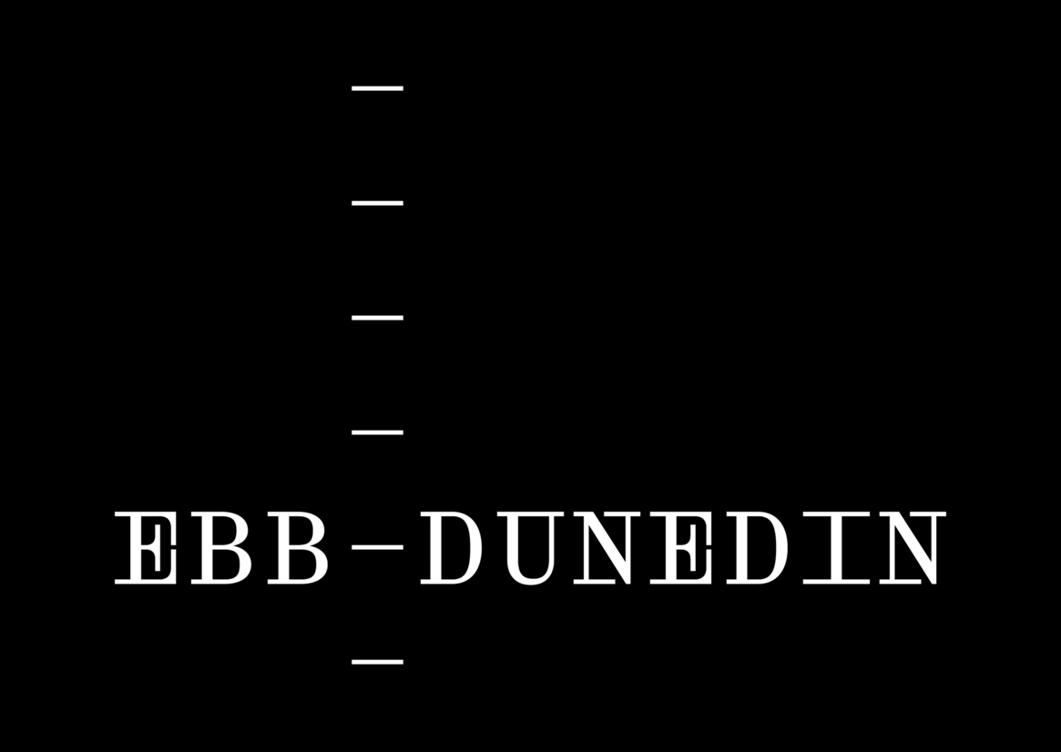
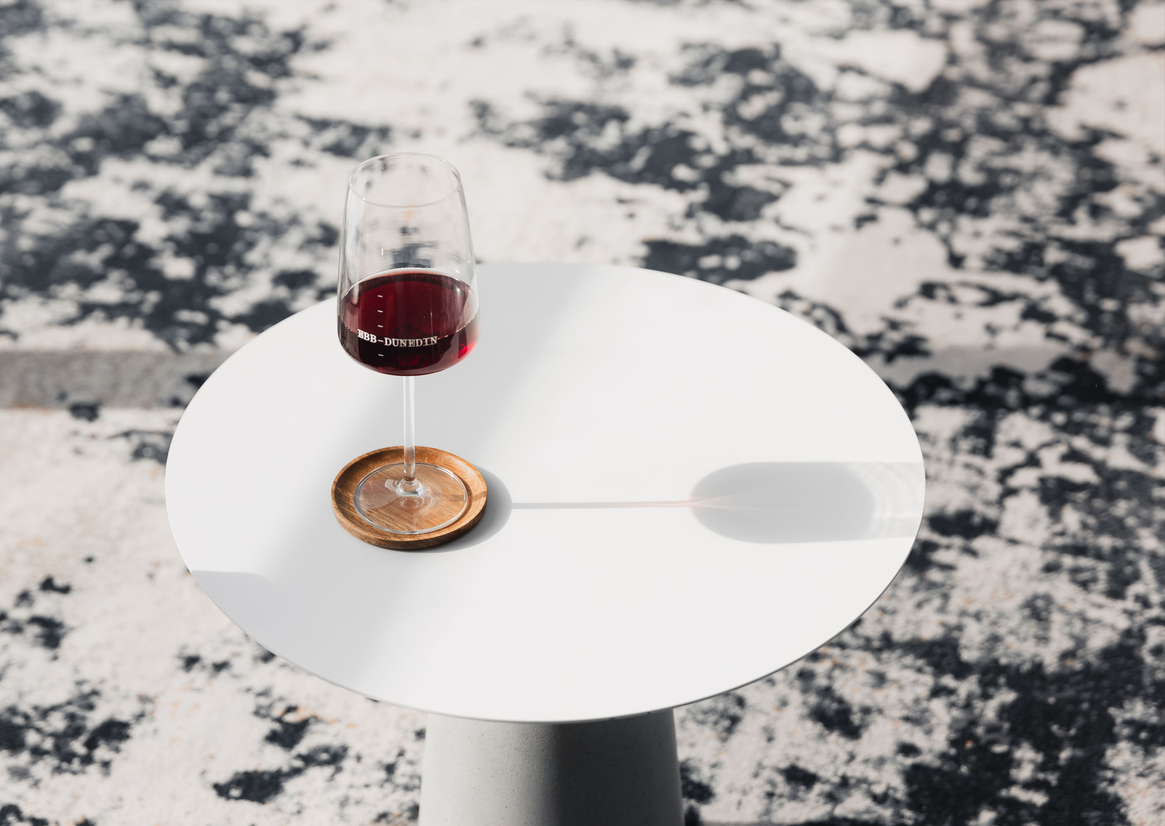
The notion of ebb and flow became the thinking behind the visual and verbal language, exploring ideas such as elements colliding, water meeting land and tidal patterns. The wordmark is inspired by sea level markers, and sits against a series of measurement lines, rising and falling according to where it’s seen. The characterful and quirky wordmark is paired with a calm, recessive typeface and used with other transcendent graphic elements such a colour palette inspired by Dunedin’s landscape.
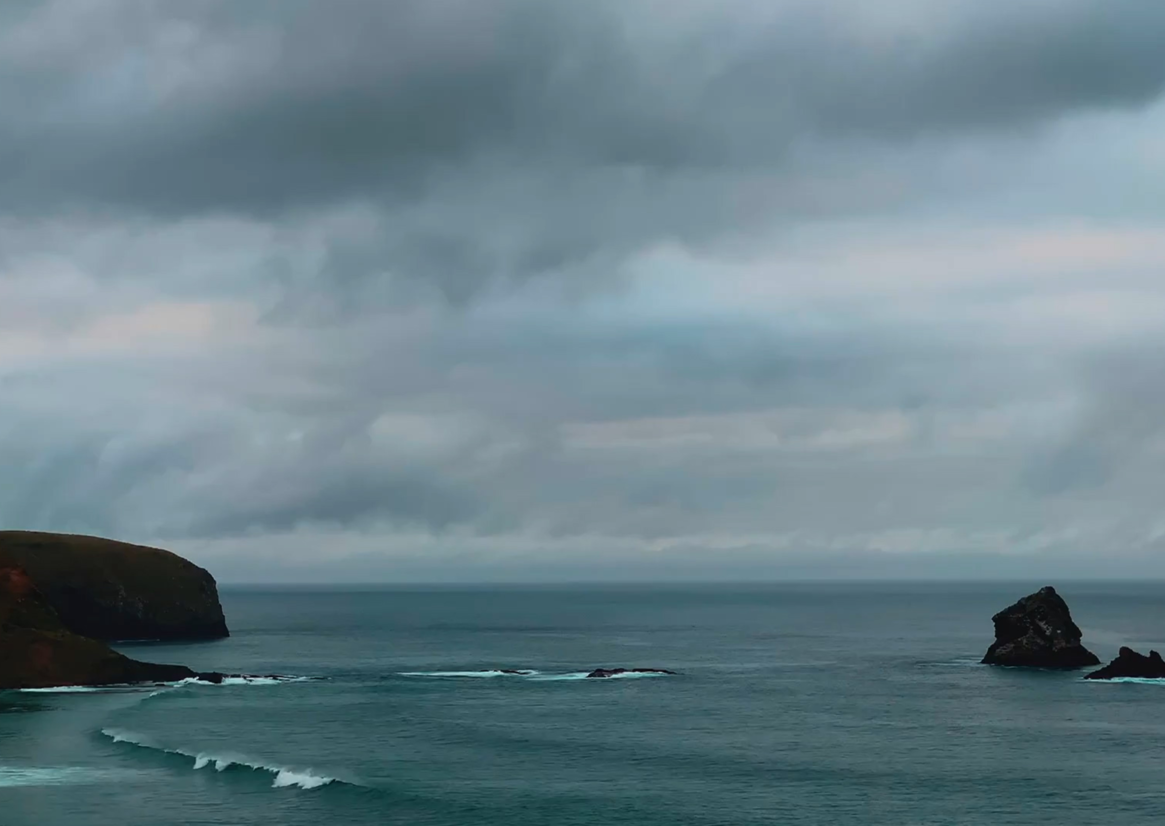
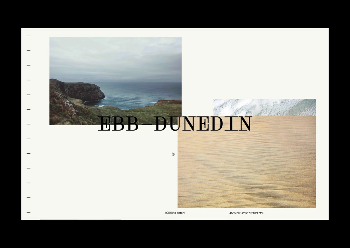
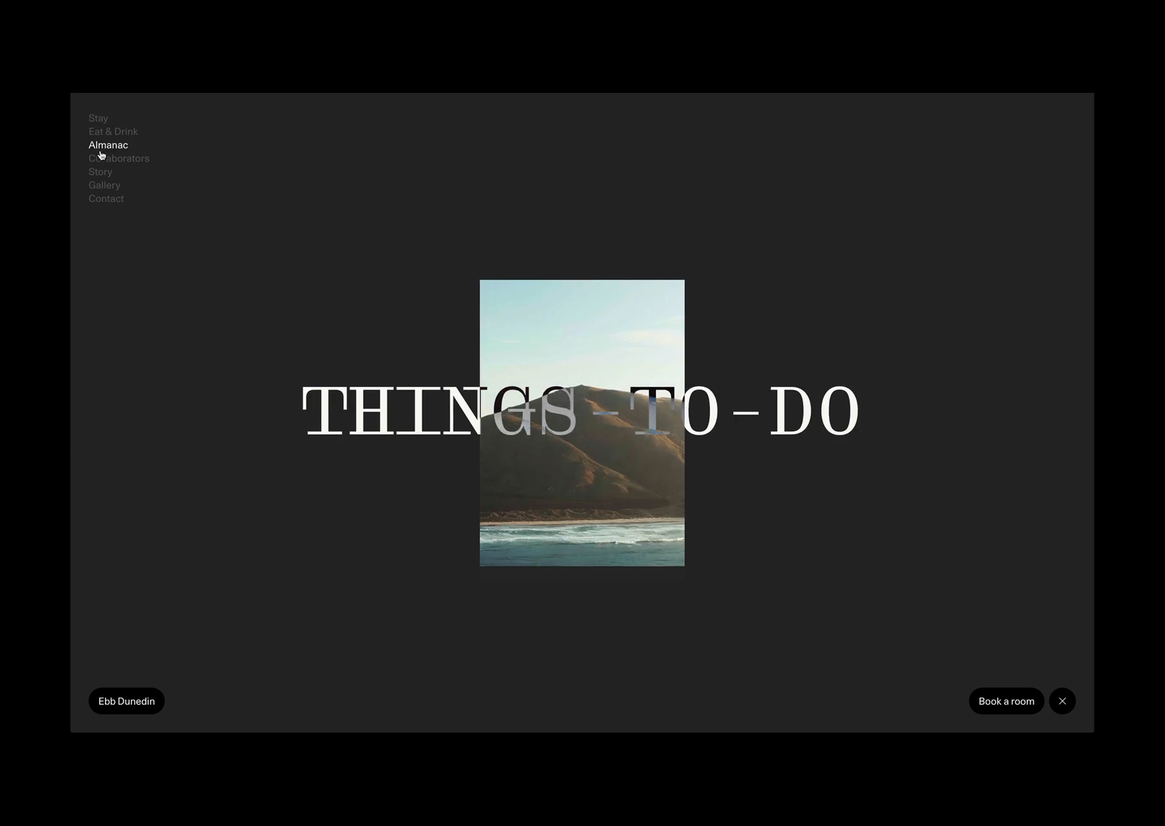
Photography played a key role. We commissioned aerial, landscape and close- up photography by photographer Irenaeus Herok, which captures Dunedin’s coastline through an ethereal lens and adds a sense of movement and wonder to the identity.
We then bought Ebb to life in the digital landscape with a digital experience that uses the identity in a seamless and engaging way, and develops and integrates a completely custom booking platform.
Description:
Ebb is a new contemporary neighbourhood hotel in the heart of Dunedin. Design savvy clients (father and son, Dylan and Frank) were building a modern boutique hotel and already had a great architect (Gary Todd Architecture) and interior design team (INDYK Architects). They needed a design studio to extrapolate all their ideas and develop an identity that brings together architecture, geography and contemporary design.
With construction underway and Dylan and Frank keen for Ebb Dunedin to showcase local artists, they commissioned Simon Kaan to create a large-scale artwork to wrap the entire facade of the building. Simon’s meditative artworks are characterised by a sense of rhythm and movement, with Dunedin’s land, sea and sky scapes dominating his work.
Our first task was to translate Simon’s 20-metre-long by three-storey high glass facade artwork into a digital print to sit across 30 glass panels to create the final artwork.
But how do you create a brand for a hotel in such a unique place in the world? We started with the name. ‘Ebb’ quickly emerged as the favourite as it directly relates to the site’s historic location on the edge of the now reclaimed Otago Harbour tidal flats. On the ebb tide, Polynesian travellers would have first landed on the exposed tidal flats before stepping foot on land.
Our focus then shifted to developing a creative concept and full brand identity Ebb Dunedin, including everything from signage and wayfinding to a completely custom website that would handle guest bookings. The façade artwork unlocked our creative thinking and became the foundation of our exploration. Opening the door to a connection to the place and its history gave us an anchor beyond just good design and architecture.
The notion of ebb and flow became the thinking behind the visual and verbal language, exploring ideas such as elements colliding, water meeting land and tidal patterns. The wordmark is inspired by sea level markers, and sits against a series of measurement lines, rising and falling according to where it’s seen. The characterful and quirky wordmark is paired with a calm, recessive typeface and used with other transcendent graphic elements such a colour palette inspired by Dunedin’s landscape.
Photography played a key role. We commissioned aerial, landscape and close- up photography by photographer Irenaeus Herok, which captures Dunedin’s coastline through an ethereal lens and adds a sense of movement and wonder to the identity.
We then bought Ebb to life in the digital landscape with a digital experience that uses the identity in a seamless and engaging way, and develops and integrates a completely custom booking platform.