Graphic
MASS 8 Melbourne Recital Centre
-
Pou Auaha / Creative Director
Tim Kotsiakos -
Pou Rautaki / Strategic Leads
Tim Kotsiakos, Ash Leech
-
Kaituhi Matua / Copywriter Lead
Cinzia Kotsiakos
-
Ngā Kaimahi / Team Members
Ben Beagley, Nicki Wright -
Kaitautoko / Contributors
Riley McLaren, Ultra Kuhl -
Client
Melbourne Recital Centre
Description:
Melbourne Recital Centre (MRC) is one of Australia’s most iconic venues, renowned for its world-class acoustics and home to a rich spectrum of performances — from classical music to bold, genre-defying contemporary acts. Despite its acclaim, MRC faced a significant challenge: while loyal patrons deeply valued its cultural legacy, the broader public — particularly younger and more diverse audiences — perceived the venue as intimidating, formal, or "too stuffy." The name itself reinforced this perception, creating a disconnect between what MRC offers and how it was seen.
To bridge this divide, we embarked on a full rebrand rooted in insight and strategy. Research revealed that the core audience was passionate but traditional, while newer attendees were often drawn by cutting-edge programming but felt alienated by the brand. The opportunity was clear: shift the narrative from genre and tradition to shared experience and bold discovery.
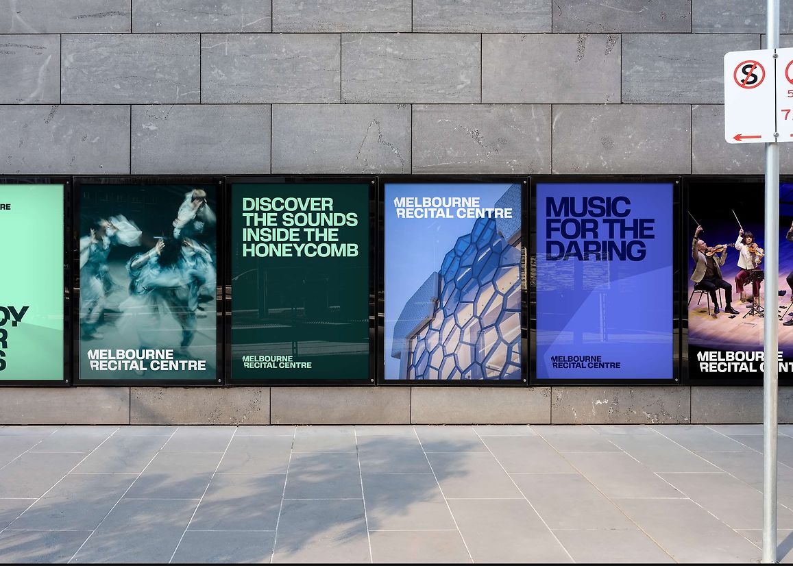
We developed the strategic narrative 'Music for the Daring' — a rallying call for those who take risks with their listening and explore new sonic territory. This message speaks equally to classical connoisseurs and curious newcomers. It empowered MRC to be more confident in its voice, more inclusive in its reach, and more contemporary in its outlook.
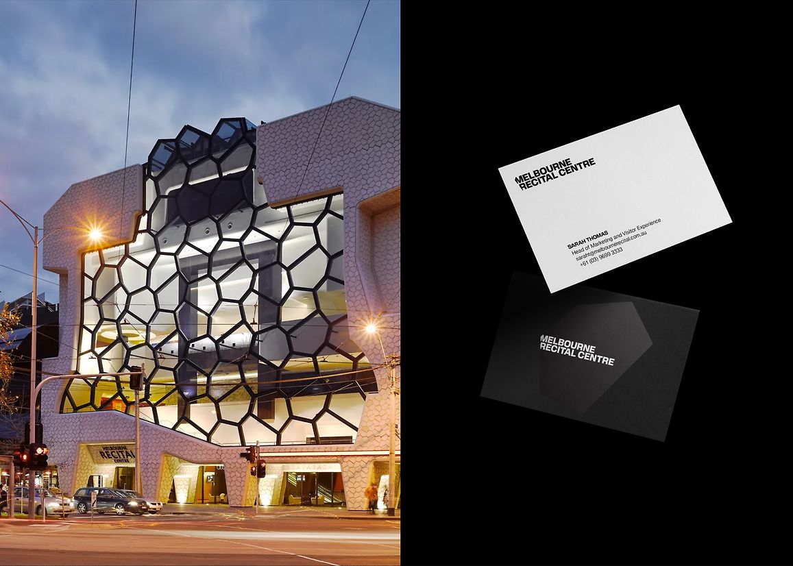
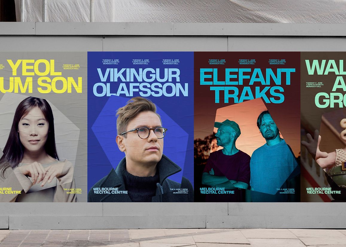
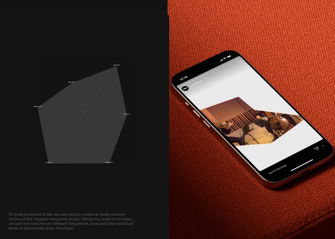
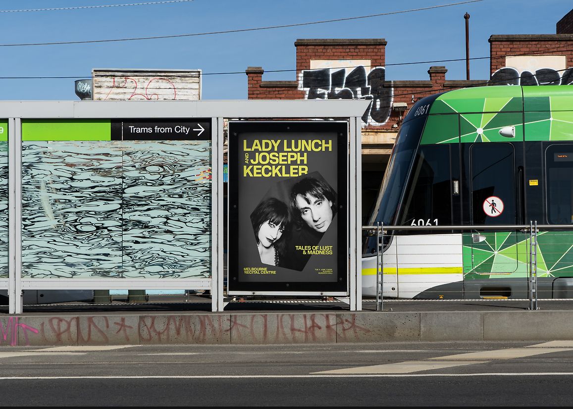
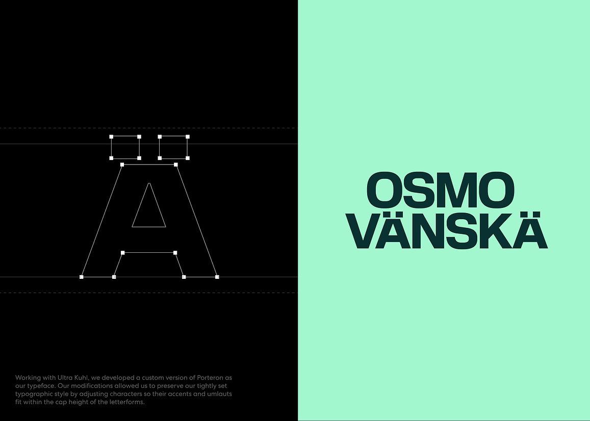
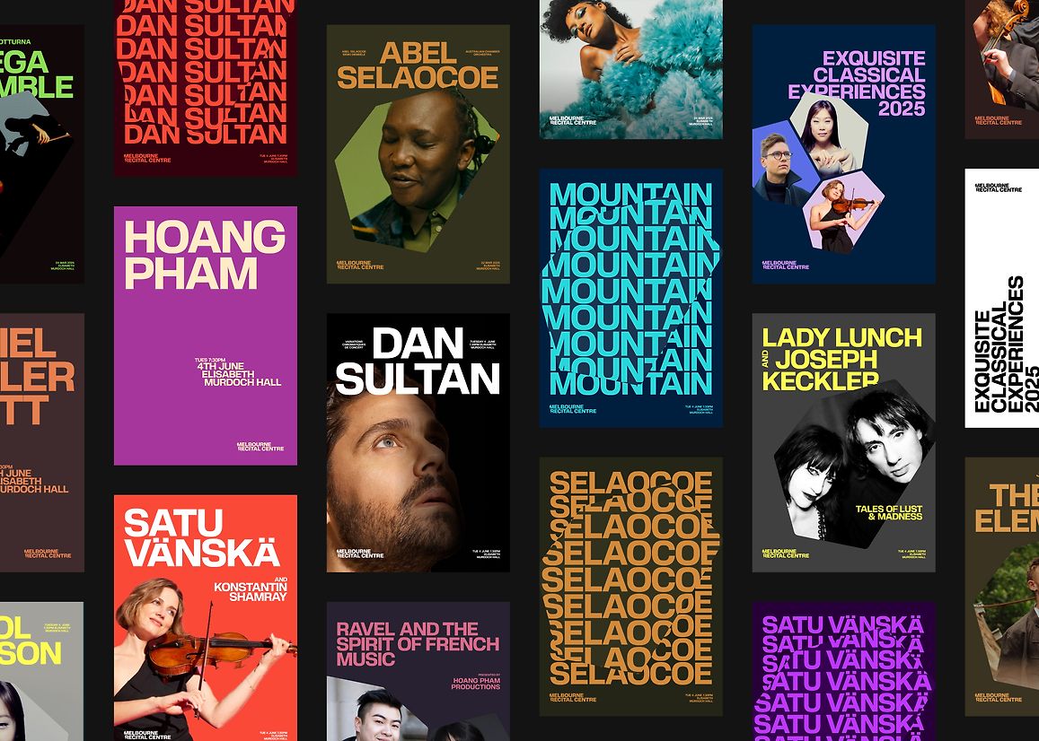
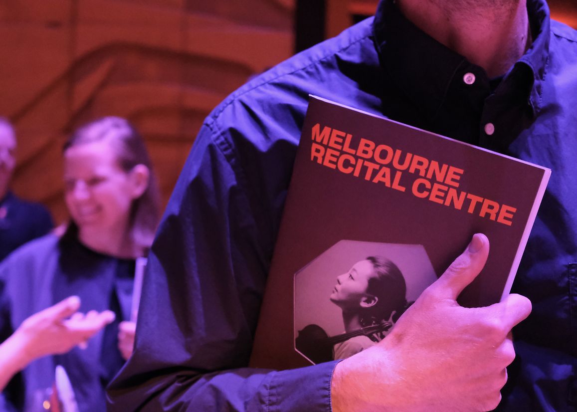
Visually, we took cues from MRC’s distinctive architecture, particularly the hexagonal cladding of the building. This geometric shape became the foundation of a flexible design system. The hexagon appears throughout the identity in fractional, rotated, and scaled forms: cropping imagery, masking type, and forming bold compositional structures. The logo itself is cropped using one of the façade’s precise angles, creating immediate architectural resonance.
Knowing that most audiences encounter the brand digitally, we prioritised motion. We created three expressive animation behaviours — 'Focus', 'Discover', and 'Immersion' — each using the hexagon in a distinct way to reflect different modes of engagement with music. This made the identity feel alive, responsive, and connected to the emotional energy of live performance.
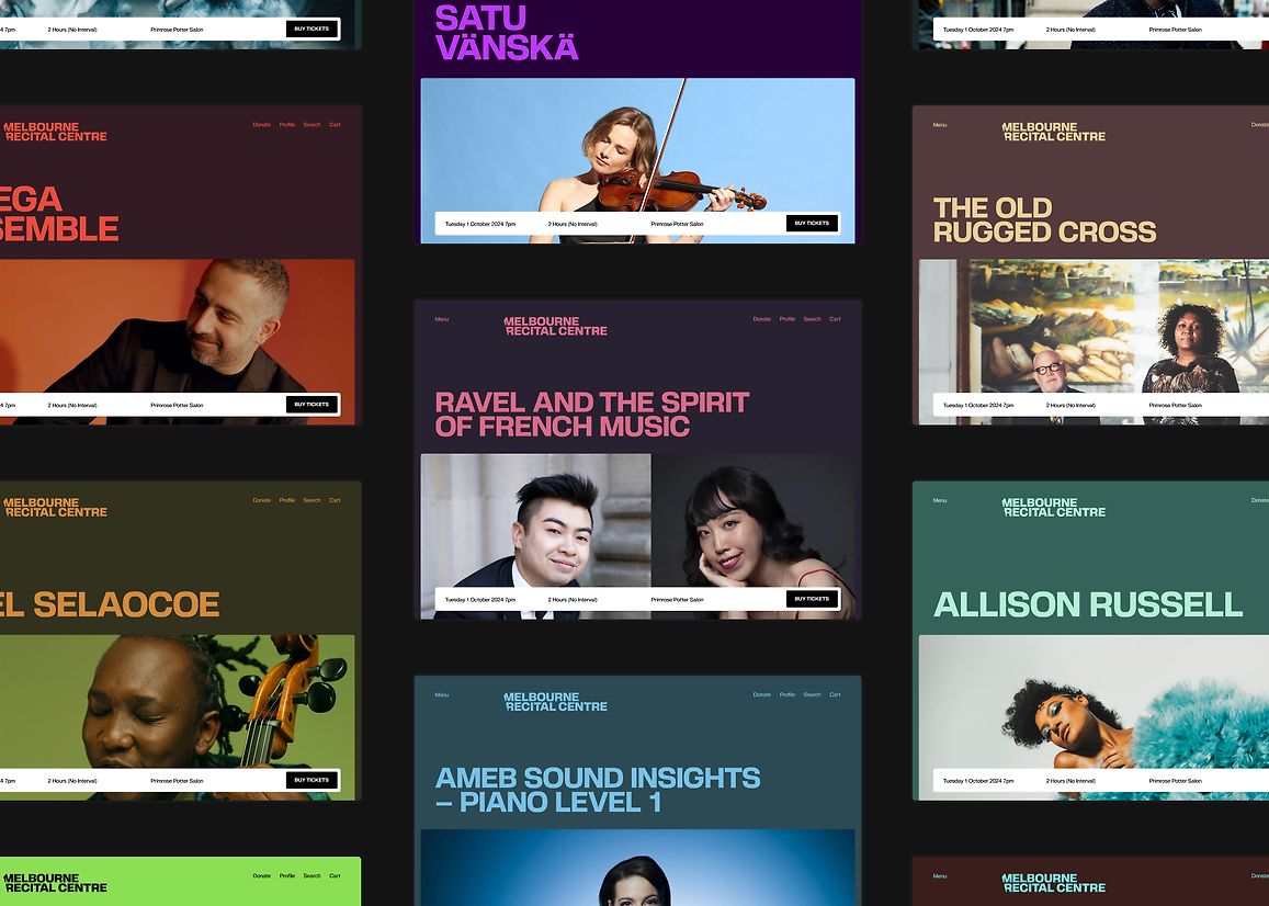
A standout innovation was a custom-built digital brand tool developed for MRC’s internal team. Staff can upload an artist image, and the tool automatically generates an accessible, high-contrast colour pairing that complements the visual. This ensures brand consistency across promotional materials, removes subjectivity, and dramatically reduces production time — a game-changer for an in-house team managing diverse events.
The new colour system also plays a strategic role. While brand colours are restrained and purposeful, promotional palettes are open and expressive, derived directly from key visual assets. Saturation levels and contrast ratios are tuned for clarity and consistency, helping create a vibrant yet cohesive brand landscape across print, digital, and outdoor.
Ultimately, the rebrand repositions Melbourne Recital Centre as an inclusive, future-facing cultural institution. It honours its architectural legacy and loyal community while making space for new audiences. 'Music for the Daring' isn't just a tagline — it's a brand philosophy that reflects the Centre’s evolving role as a beacon for live music in Melbourne.