Graphic
Marx Design 65 Tronque
-
Pou Auaha / Creative Directors
Ryan Marx, Kate Phillips
-
Ringatoi Matua / Design Directors
Manuel Payan, Tristan O'Shannessy
-
Ngā Kaimahi / Team Members
Hannah Jensen, Rachel Dredge, Janine Bickerton, Nicola Kearns, Lydia Harden Bull -
Kaitautoko / Contributors
Kate Phillips, Yuki Sato, Drew Robertson -
Client
Tronque Ltd
Description:
Tronque was born through founder Tanne’s struggle with her reproductive health. While recovering from surgery in 2019, she investigated her daily skincare regime. And was shocked to discover that her (mostly high end) products contained toxic ingredients proven to disrupt hormones and the human endocrine system.
So she set out to develop an alternative. The result is Tronque – clean skincare made from non-toxic, minimally processed, plant-based, organic ingredients, many native to New Zealand. ‘Against neck down neglect’ is the brand’s mission to create a habitual ritual of everyday luxe body care formulated specifically for the body.
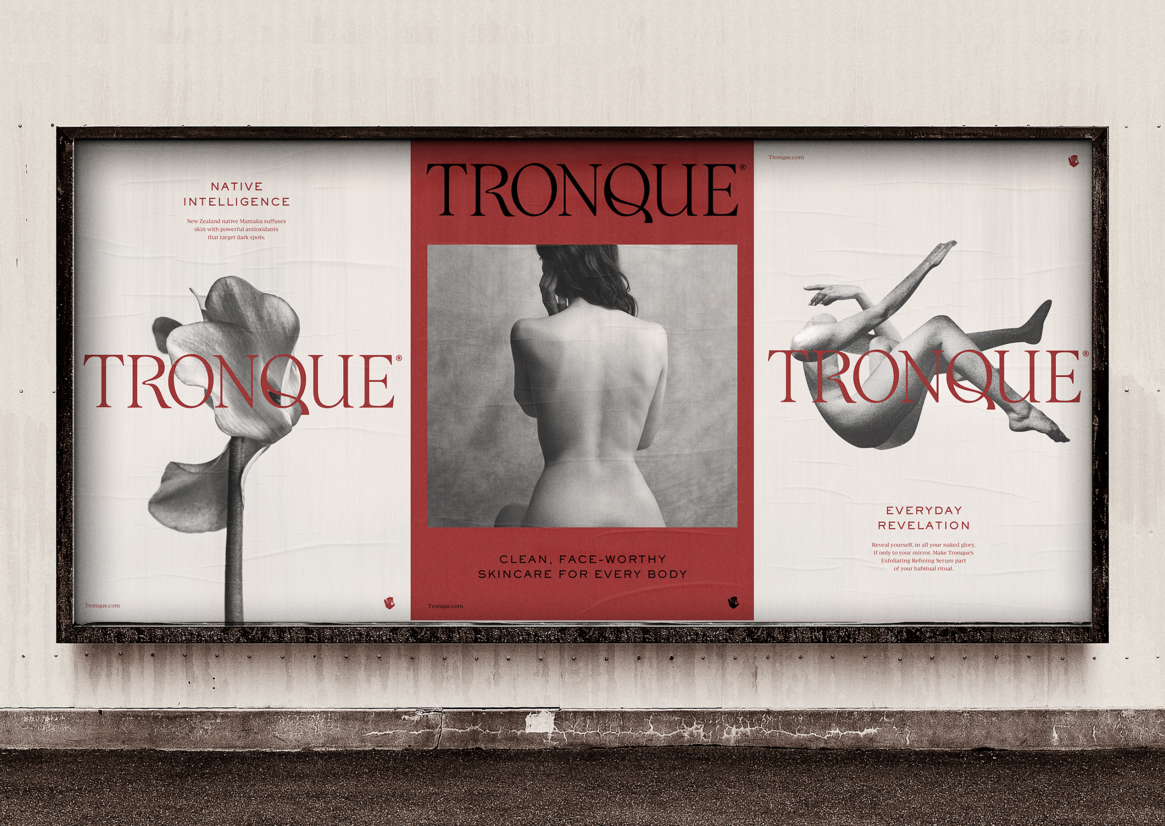
Tronque says “every body is beautiful” – head to toe beauty is for everyone – celebrating the body in its beauty and imperfections. The brand balances elegance and edge, while being inclusive of age, skin types, ethnicities and genders (although skews female in terms of its target customer).
With a strategy to capture the attention of the ‘cool girl’, the Tronque brand targets the mid-high disposable income consumer who is educated and intentional when it comes to skincare. Who seeks formulations that are intelligent, plant-based and with the same levels of active ingredients as those in the most effective facial skincare regimes.
The brand will be sold in the highly competitive environment of high end department stores and specialty retail in Europe and USA, as well as online via Tronque’s own website.
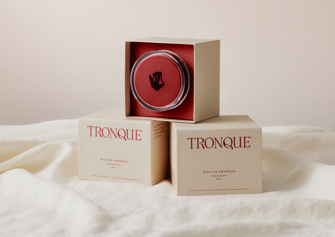
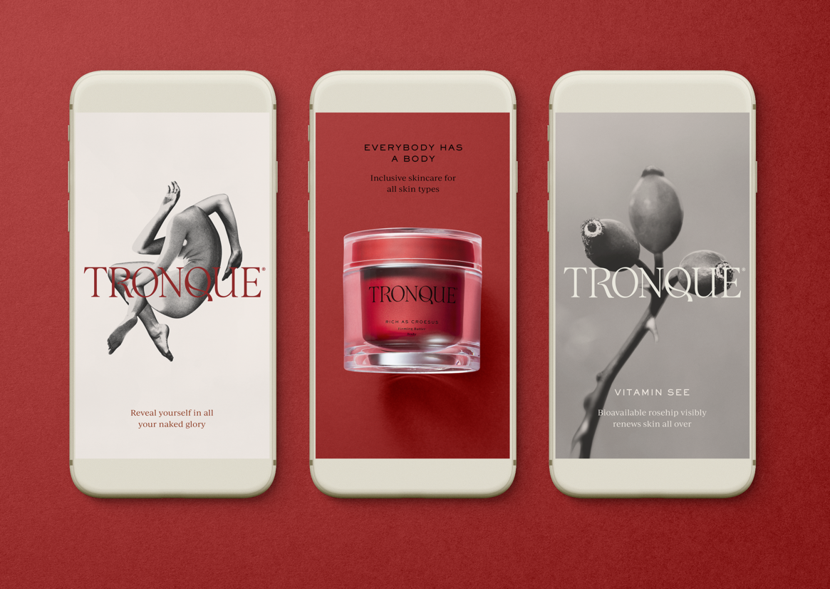
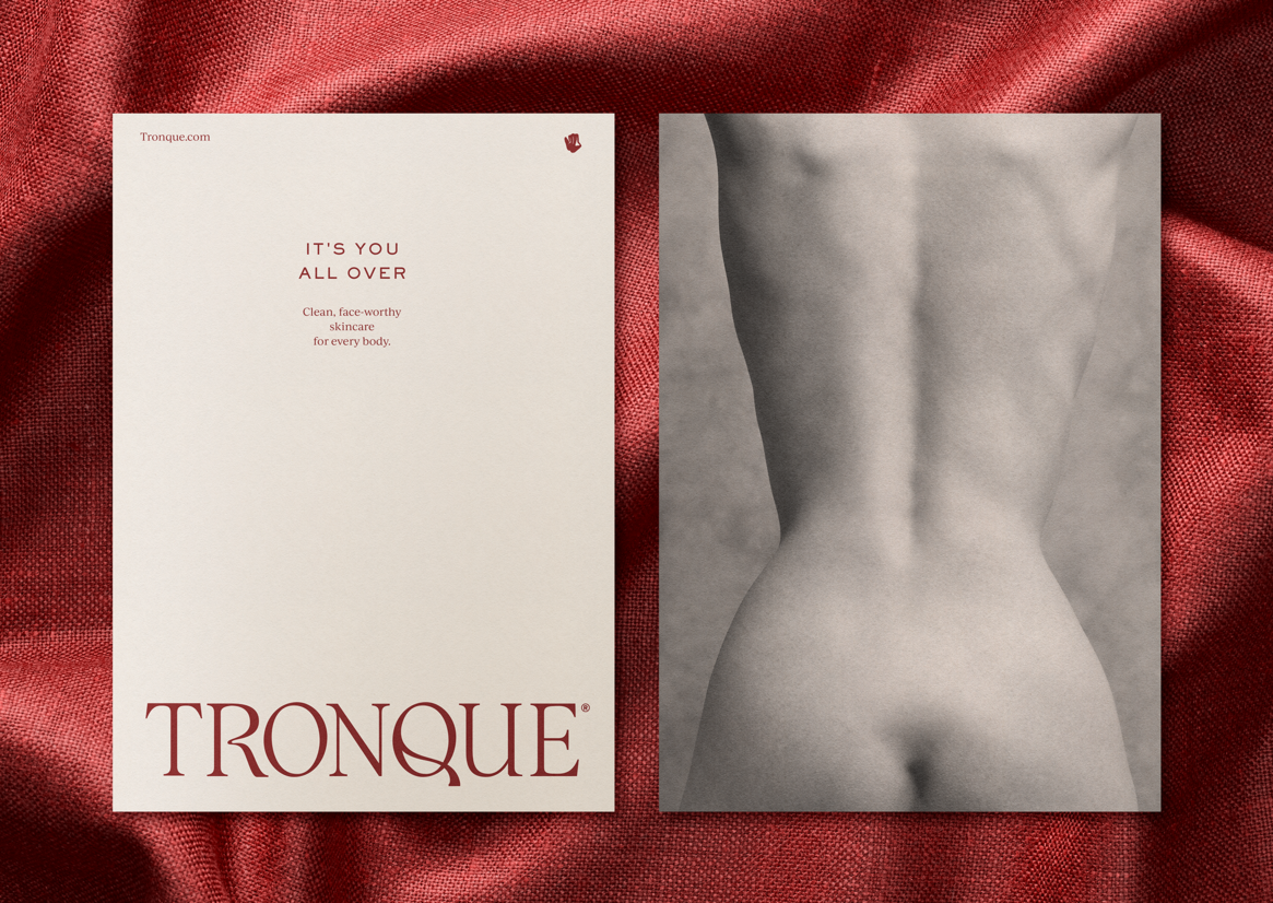
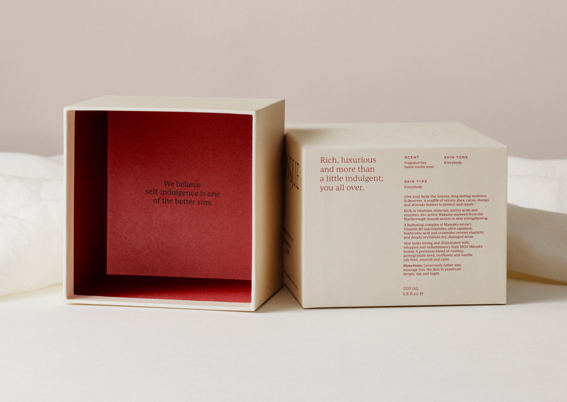
Language plays a key role in the design. Playful nomenclature and a tone of voice that is both sophisticated and subversive, set an intelligent mood. Brand copy is also used inside the packaging to create an intimate unboxing experience.
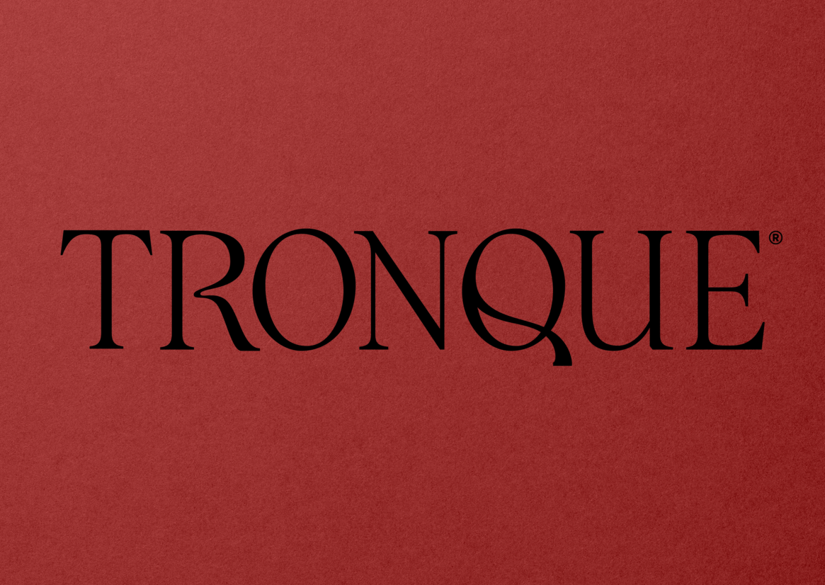
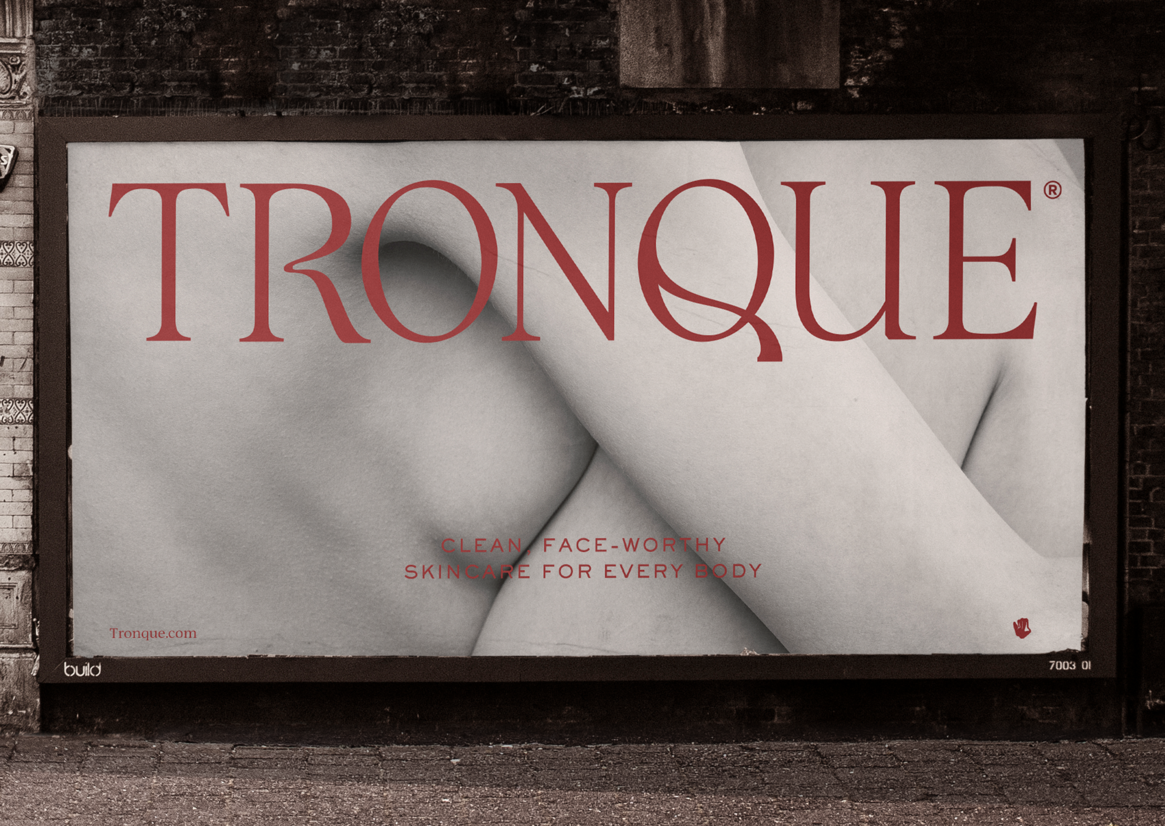
The packaging is designed to cut through a crowded luxury skincare category that is saturated with black and white brands with thick, sans serif wordmarks that get lost in a monochromatic sea on shelf. The design concept draws inspiration from the trunk and torso of the female form. A bespoke wordmark references feminine curves and is delivered as an ownable classic Roman typography.
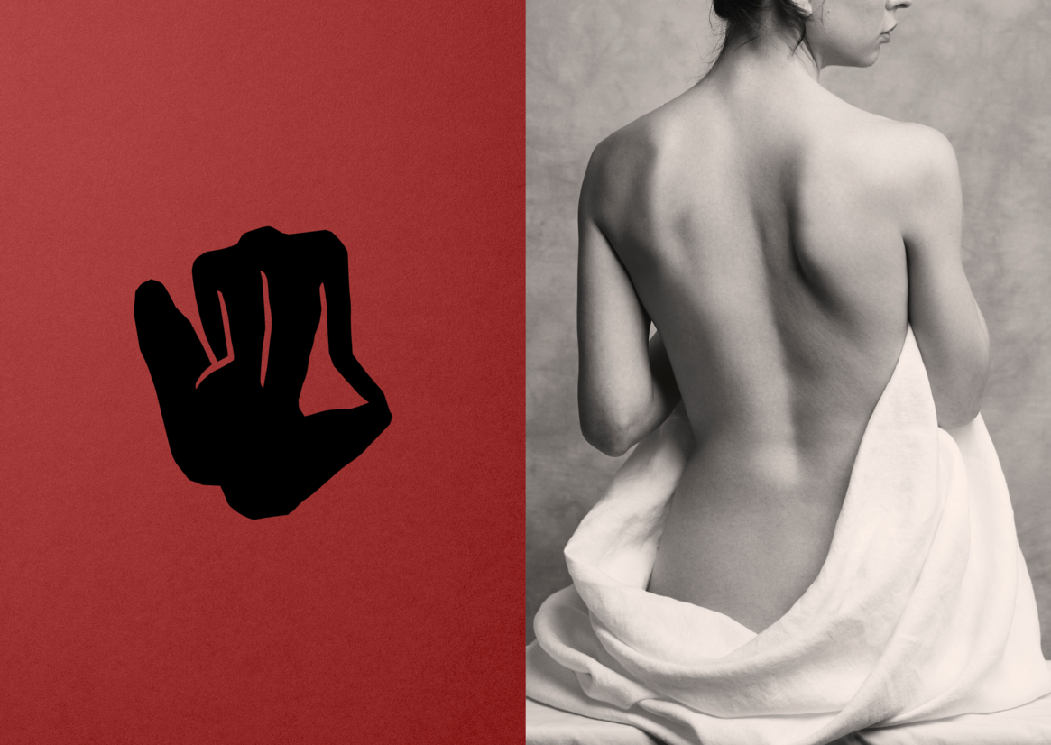
The graphic, yet painterly silhouette symbol was inspired by life drawing and collage styles popular in the 19th Century. Rather than glossy high fashion images, photography is a soft, grainy, collection that celebrates the human body – blemishes, imperfections and all.
The sophisticated, visceral blood red was chosen for making the brand ownable in the category and stands out in a sea of monochromatic brands.
The initial result of developing this covetable, ownable brand, is that even prior to launch, Tronque already has ranging agreements in place at high end department stores and speciality beauty retail in Europe and USA.
Judge's comments:
Timeless, beautiful, elegant & romantic. While being a fresh and modern at the same time. So well-crafted with the idea and feeling coming through at every touch point.