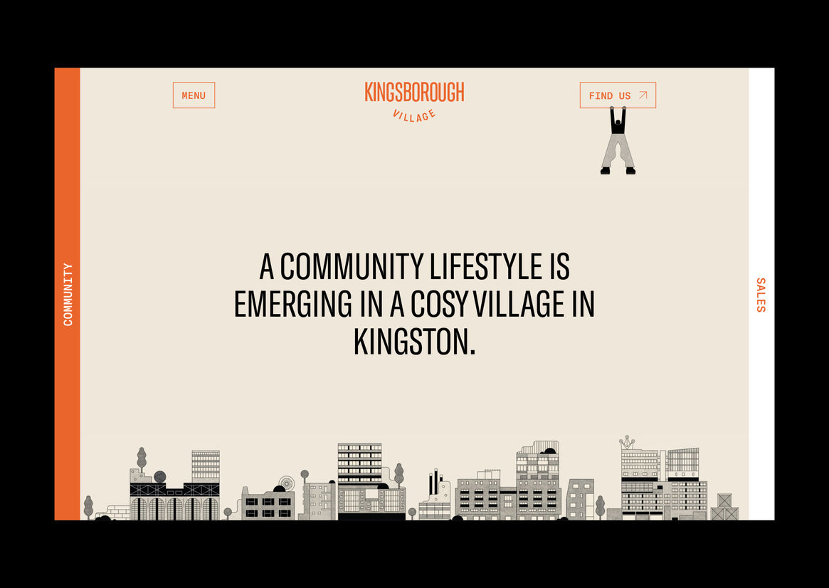
Kingsborough Village is an emerging community precinct in the eclectic suburb of Kingston. Earlier iterations of the brand, developed during the precinct’s pre-sale phase, were quickly outgrown, providing ample opportunity for repositioning. Our team developed the tagline “live the good life, love your community” to guide the new identity towards the fostering of a thriving community which extends beyond sales. The new identity reflects a community-centric approach which is inspired by the area’s unique history, architectural significance and residents’ modern lifestyles. The Kingsborough campaign was aimed at attracting like-minded people with a focus on community and local activity. An authentic, personality-rich approach engages existing locals and entices prospective members by encouraging a safe and vibrant environment for locals to interact. The project acts as a catalyst for future community-led urban living environments, empowering residents to take care of their living environment, improving their overall quality of life and inspiring a sense of belonging.
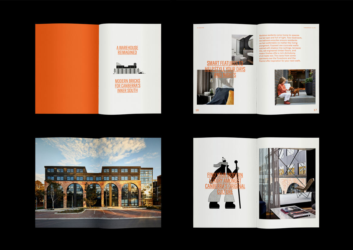
Against the tide of glossy print and sales suites, Kingsborough’s creative approach offers a slow, personalised approach which celebrates individuality and variety of personality. The design is sophisticated, gritty and raw, drawing inspiration from the area’s rich, industrial origins whilst challenging the expected landscape of the property development industry. The identity was designed to bypass real-estate channels, and be used as a tool to increase visibility and neighbourhood involvement.
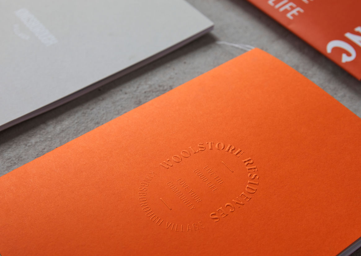
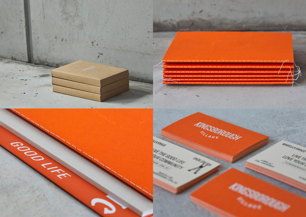
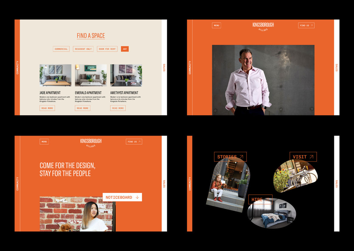
The logotype’s shape is designed to resemble a ‘smile’, representing the positive, happy community who live there. The brand has a unique personality which is brought to life through quirky illustrations and characters who represent the variety of people within the community. The diversity of the characters increases the sense of belonging as each individual resident can feel like they are included in the wider Kingsborough community. The brand’s tone of voice is bright and personable, immersing the audience in sensory language which is complemented by crisp photography. The warm burnt orange and off-white colour palette is reminiscent of Canberra’s red-brick heritage. The collaboration between the old and new, as inspired by the architecture, is extended to physical collateral which features raw uncoated paper finishes, stitching and foil printing. Brand elements are brought together to appeal to a wide demographic, offering an authentic, people-driven approach to property development.


Description:
Kingsborough Village is an emerging community precinct in the eclectic suburb of Kingston. Earlier iterations of the brand, developed during the precinct’s pre-sale phase, were quickly outgrown, providing ample opportunity for repositioning. Our team developed the tagline “live the good life, love your community” to guide the new identity towards the fostering of a thriving community which extends beyond sales. The new identity reflects a community-centric approach which is inspired by the area’s unique history, architectural significance and residents’ modern lifestyles. The Kingsborough campaign was aimed at attracting like-minded people with a focus on community and local activity. An authentic, personality-rich approach engages existing locals and entices prospective members by encouraging a safe and vibrant environment for locals to interact. The project acts as a catalyst for future community-led urban living environments, empowering residents to take care of their living environment, improving their overall quality of life and inspiring a sense of belonging.
Against the tide of glossy print and sales suites, Kingsborough’s creative approach offers a slow, personalised approach which celebrates individuality and variety of personality. The design is sophisticated, gritty and raw, drawing inspiration from the area’s rich, industrial origins whilst challenging the expected landscape of the property development industry. The identity was designed to bypass real-estate channels, and be used as a tool to increase visibility and neighbourhood involvement.
The logotype’s shape is designed to resemble a ‘smile’, representing the positive, happy community who live there. The brand has a unique personality which is brought to life through quirky illustrations and characters who represent the variety of people within the community. The diversity of the characters increases the sense of belonging as each individual resident can feel like they are included in the wider Kingsborough community. The brand’s tone of voice is bright and personable, immersing the audience in sensory language which is complemented by crisp photography. The warm burnt orange and off-white colour palette is reminiscent of Canberra’s red-brick heritage. The collaboration between the old and new, as inspired by the architecture, is extended to physical collateral which features raw uncoated paper finishes, stitching and foil printing. Brand elements are brought together to appeal to a wide demographic, offering an authentic, people-driven approach to property development.