Graphic
Inhouse 85 Gramercy
-
Pou Auaha / Creative Director
Arch MacDonnell
-
Ringatoi Matua / Design Directors
Arch MacDonnell, Toby Curnow
-
Ngā Kaimahi / Team Members
Jane MacDonnell, Dean Foster, Thomas Asche -
Kaitautoko / Contributors
Mat Bogust, Blair McGowan, Bonny Beattie -
Client
Gramercy
Description:
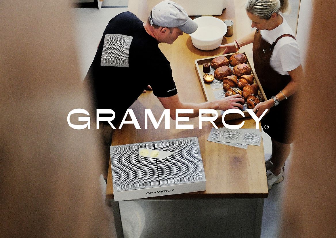
After a decade of devoted local following and near-daily queues, Gramercy has become a beloved institution in Wellington — but its identity no longer reflected its influence or ambition. With a new purpose-built space and a reputation for exceptional quality, it was time for the brand to evolve beyond the expected “artisan bakery” aesthetic. The goal was to modernise and differentiate — to create an identity as confident and refined as the product, while remaining deeply rooted in place, experience, and daily ritual.
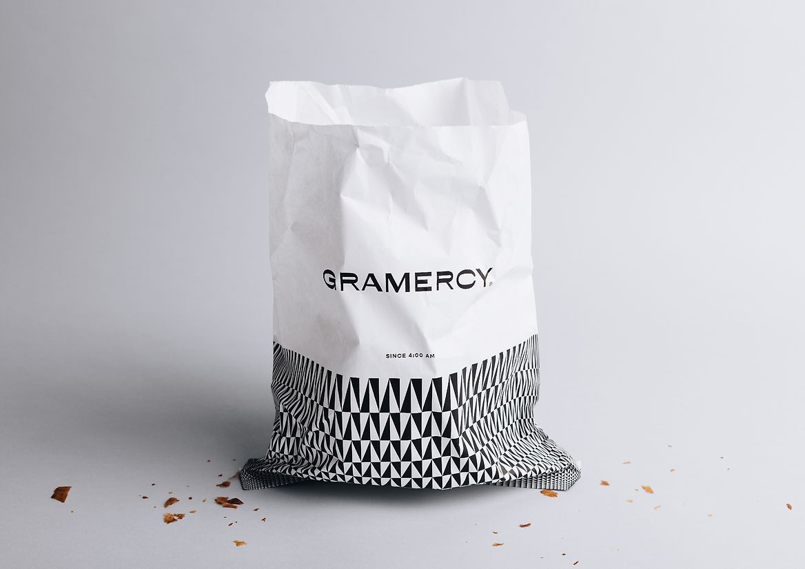
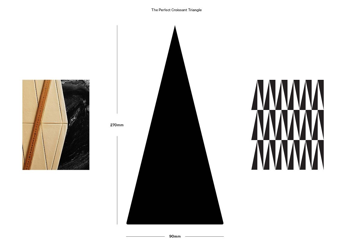
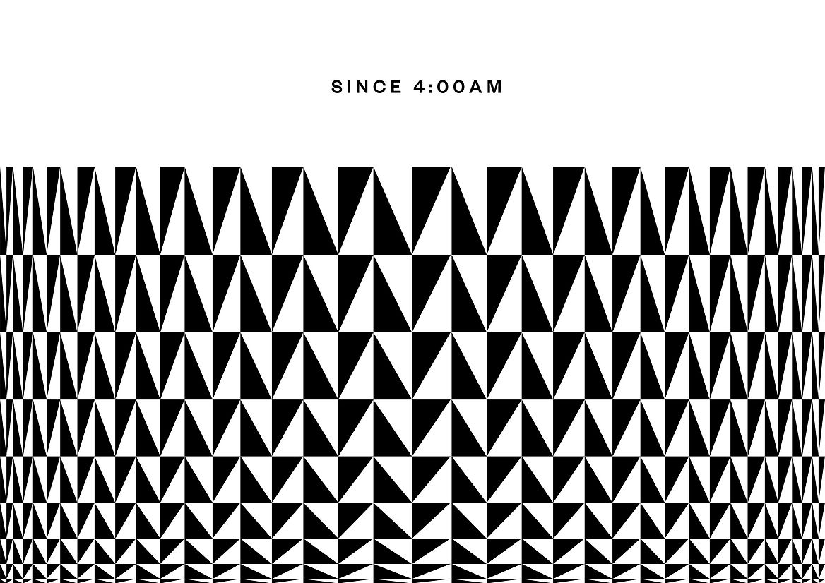
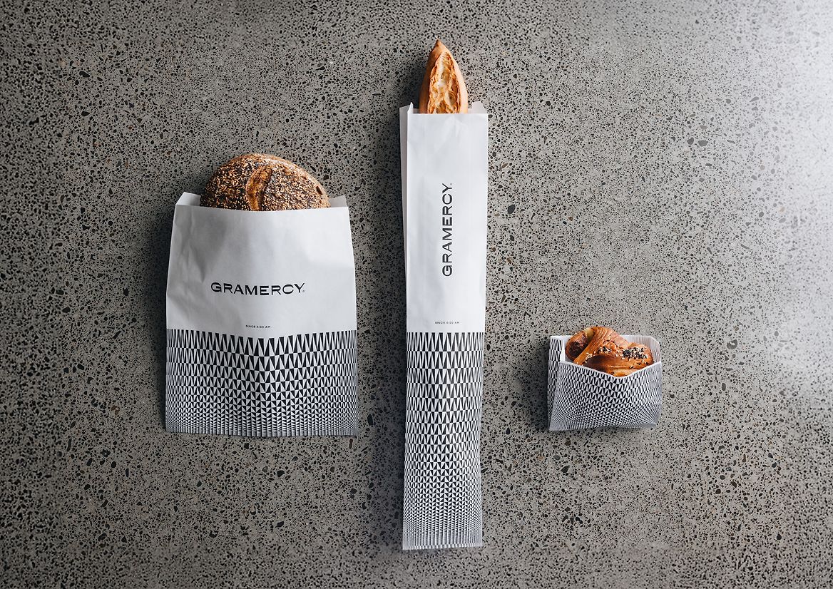
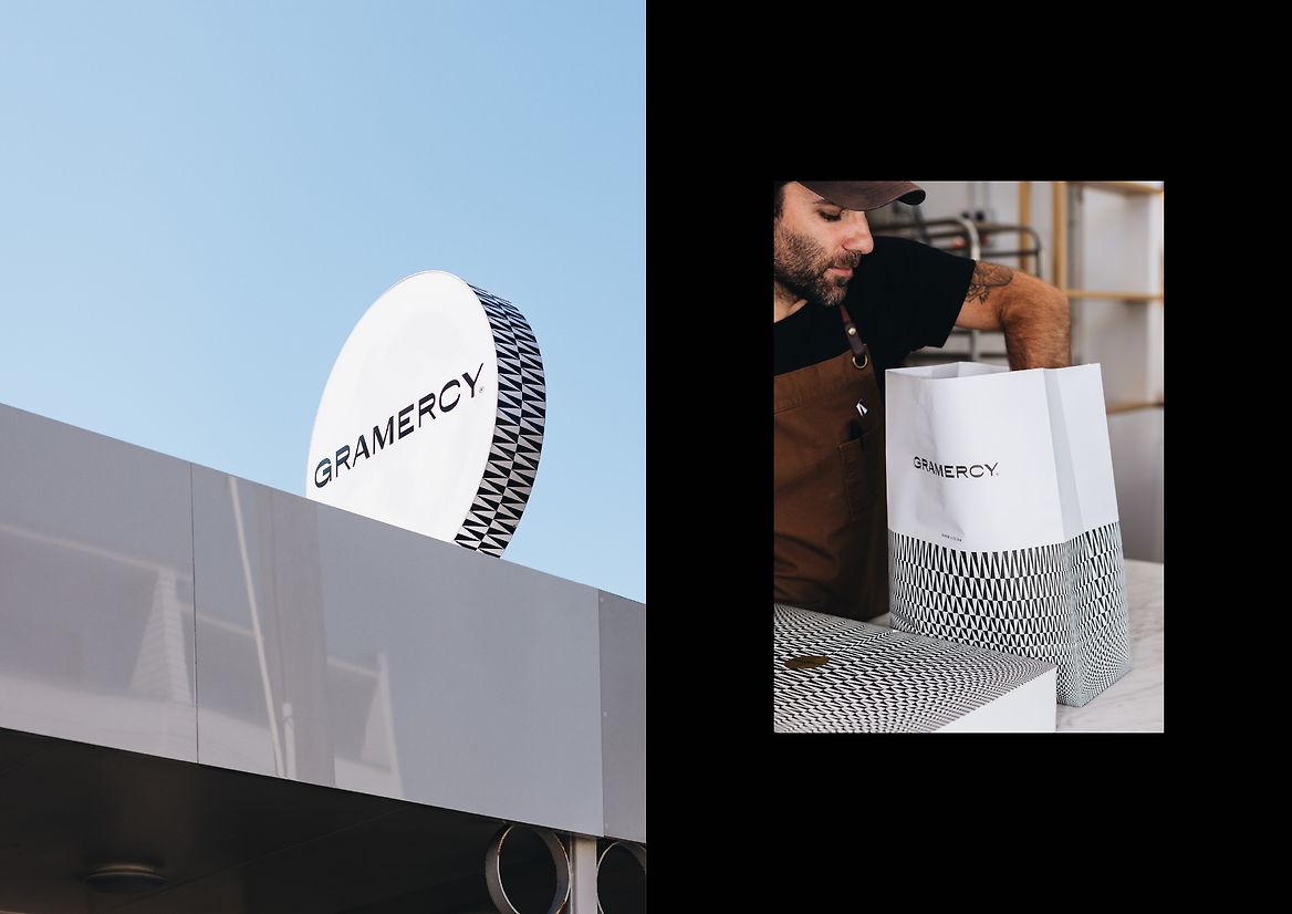
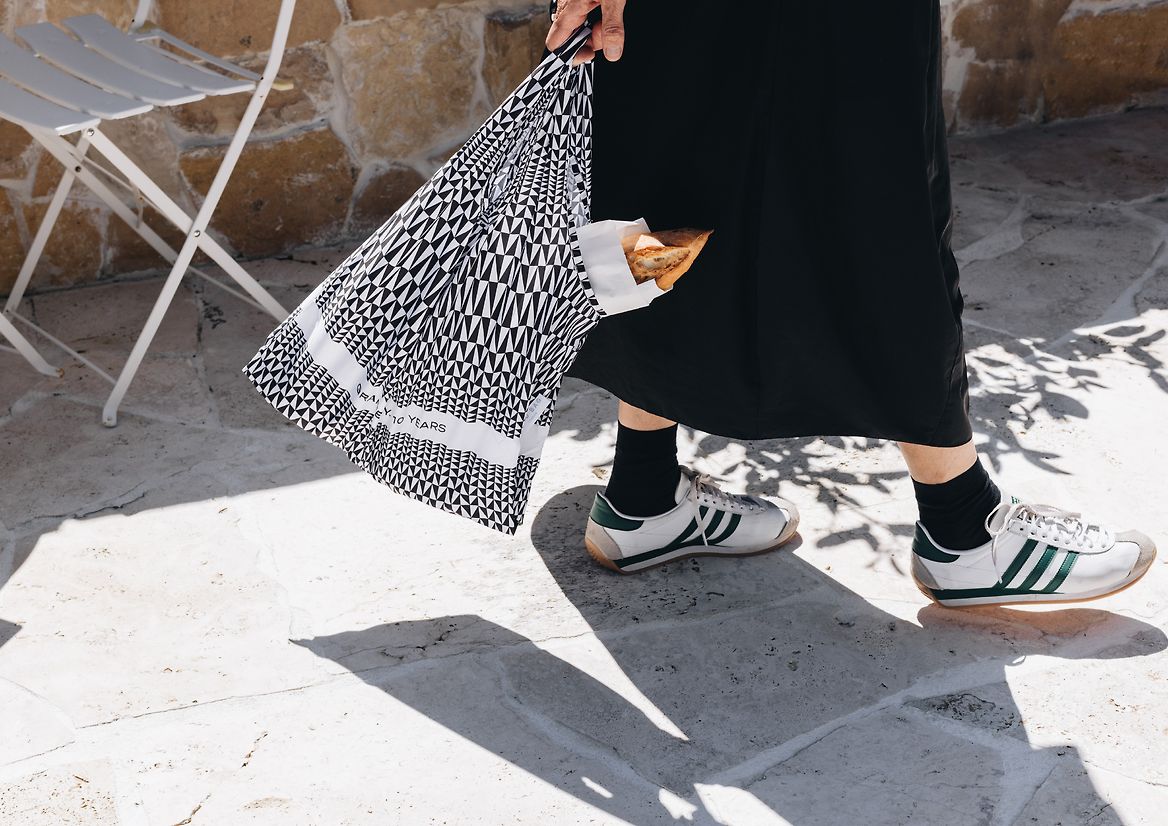
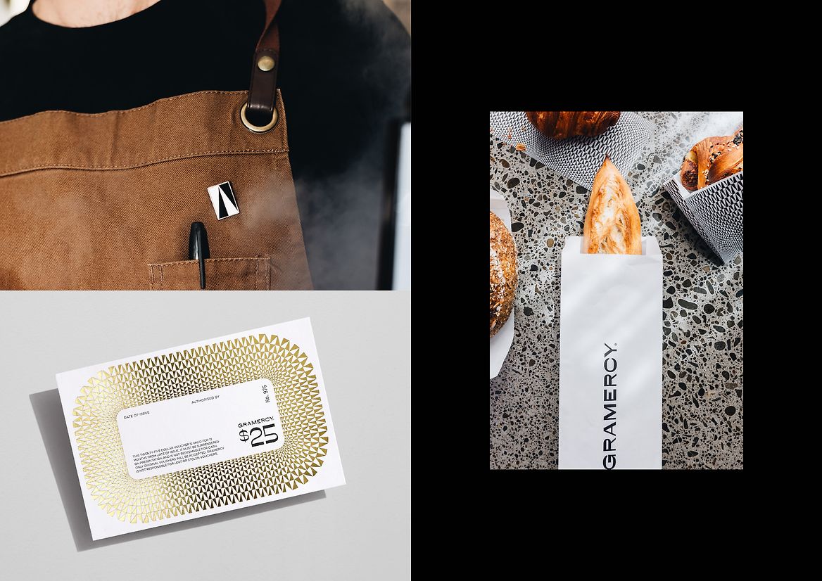
We set out to build a brand that felt as precise and considered as Gramercy’s pastries — modern, minimal, and unmistakably them. Rather than rely on conventional bakery tropes, we explored a more abstract, artful direction. The humble triangle — the foundational shape of a croissant — became our conceptual anchor. Seen also in the building’s gabled roof and faceted brass counter, the triangle offers a visual and architectural connection between product, space, and identity. From this, we developed a dynamic, bulging pattern inspired by Op Art — a visual metaphor for rising dough.
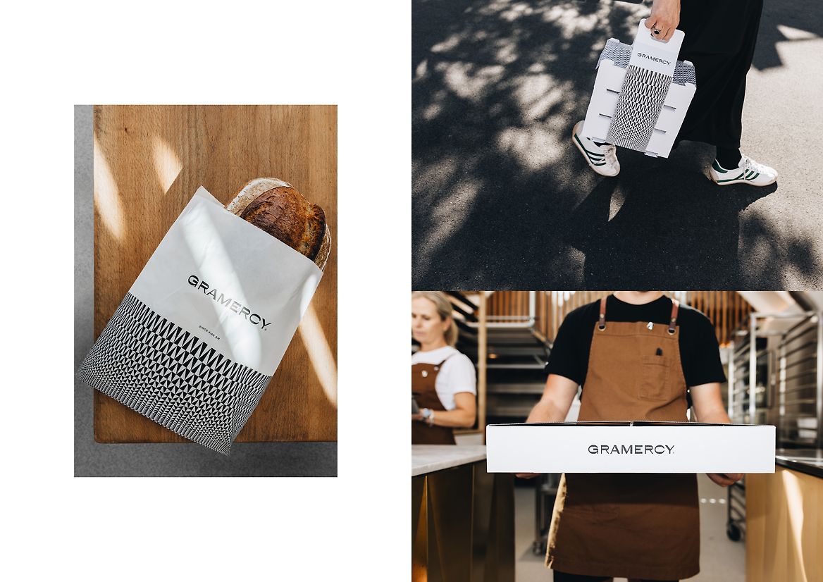
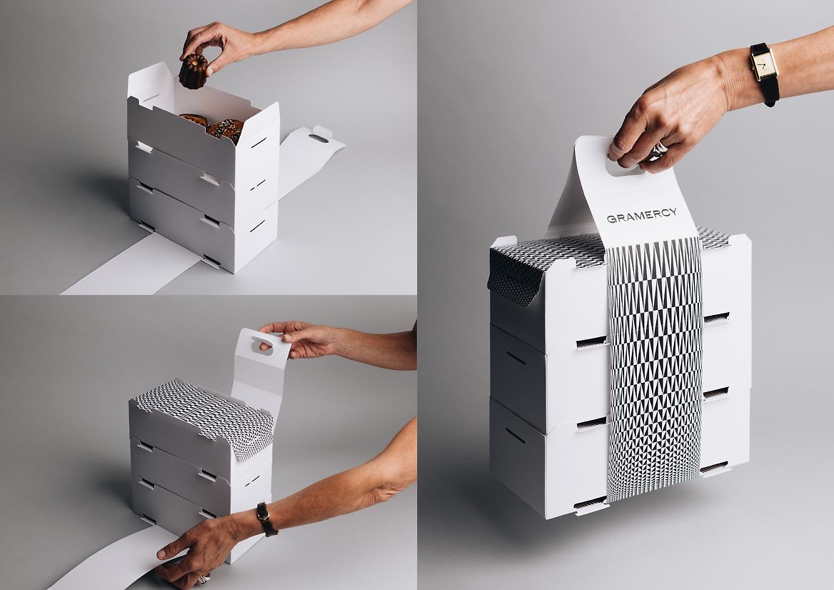
The triangle-based pattern became the brand’s signature — a bold, black-and-white system applied across packaging and print. It functions as a recognisable visual shorthand, making Gramercy instantly identifiable even in the absence of a traditional logo. Designed for high-volume use, the system is economical in its one-colour execution but elevated through thoughtful detailing, like touches of gold foil. A custom packaging solution was also developed: stackable cartons that lock together bound by a simple strap — innovative and distinctive within the category.
This identity redefines what a modern bakery can look and feel like — thoughtful, elevated, and culturally relevant. It honours Gramercy’s architectural space, baking craft, and loyal community, while creating an iconic visual language that stands apart in the industry. A quiet revolution in the world of baked goods.