Graphic
Houston 25 Hope Hospitality Foundation
-
Pou Auaha / Creative Directors
Alex Toohey (Executive Creative Director), James Calpis (Creative Director)
-
Ngā Kaimahi / Team Members
Tim Jackson, Amelia Scorgie, Gretel Maltabarow, Stuart O'Brien, Hamish McRae -
Kaitautoko / Contributors
Neil Perry, Jessica Sly -
Client
Neil Perry
Description:
Opportunity
You can’t underestimate the power of a good meal. It can brighten someone’s day; provide a moment to pause and connect, and give hope when it’s needed most.
Hope Hospitality Foundation was born of the desire to spread more hope. Having begun service during the uncertain and challenging months of 2020 following fires, floods and everything in between, Hope Hospitality Foundation launched to provide nutritious, wholesome meals to people who need it.
Founded by celebrity chef Neil Perry, Hope Hospitality Foundation draws from years of top chef experience to prepare heart-warmingly delicious, nutritious meals for organisations on our social frontlines.
“It’s not just about filling bellies. It’s about giving people in need a moment of dignity and delight. And above all else, feeding that unmistakeably human feeling – sharing ‘hope’ one meal at a time.” – Neil Perry, Founder
Our brief was to support and propel the organisation’s ambitious mission with a brand to connect with partners, donors and diners, to fill even more plates with high-quality, nourishing meals for Australia’s most vulnerable people.
Approach
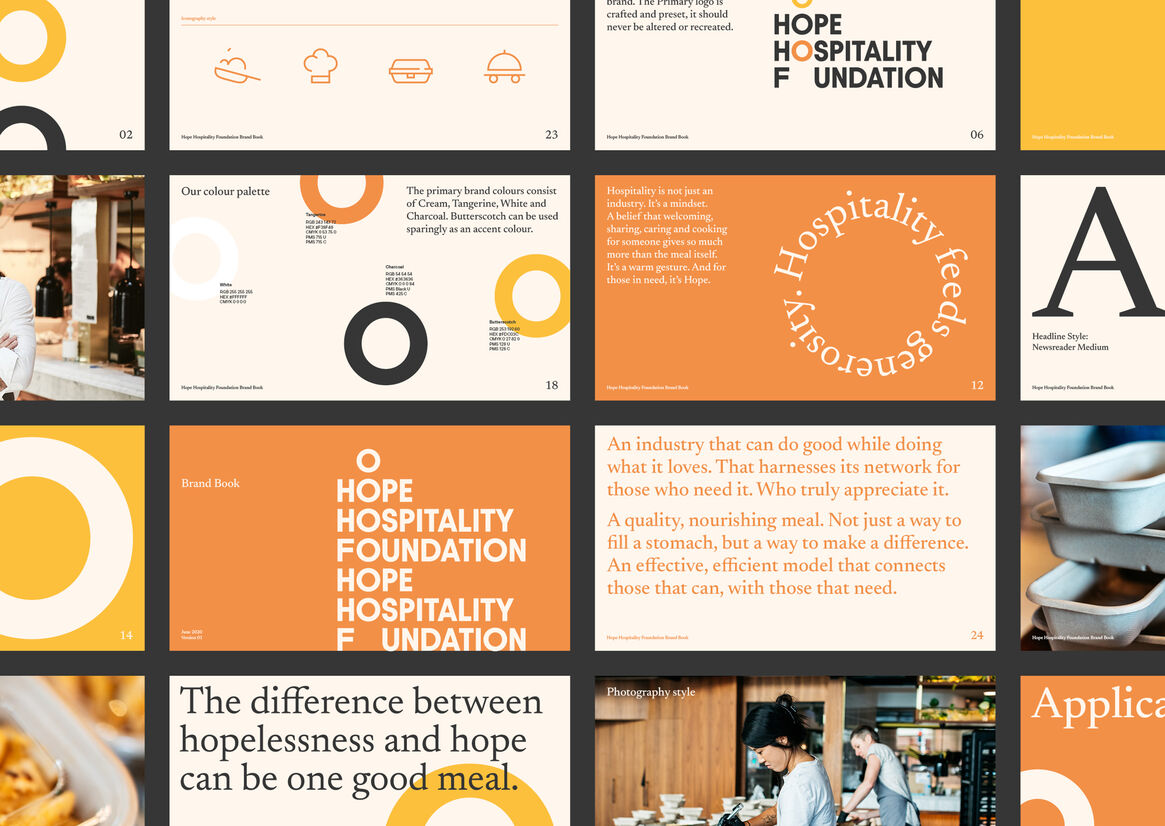
Our brand solution was inspired by the notion that true hospitality is not just an industry, it’s a mindset. A belief that welcoming, sharing, caring and cooking for someone provides much more than the meal itself. It’s an expression of generosity.
This idea translated into a dynamic, energetic visual expression to support the Hope Hospitality Foundation’s mission via a positive, confident brand identity featuring multiple dishes as a core element of the visual expression.
Execution
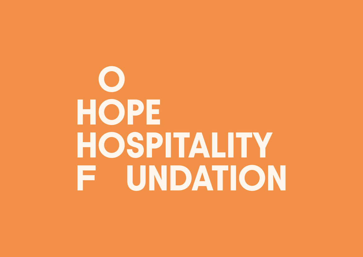
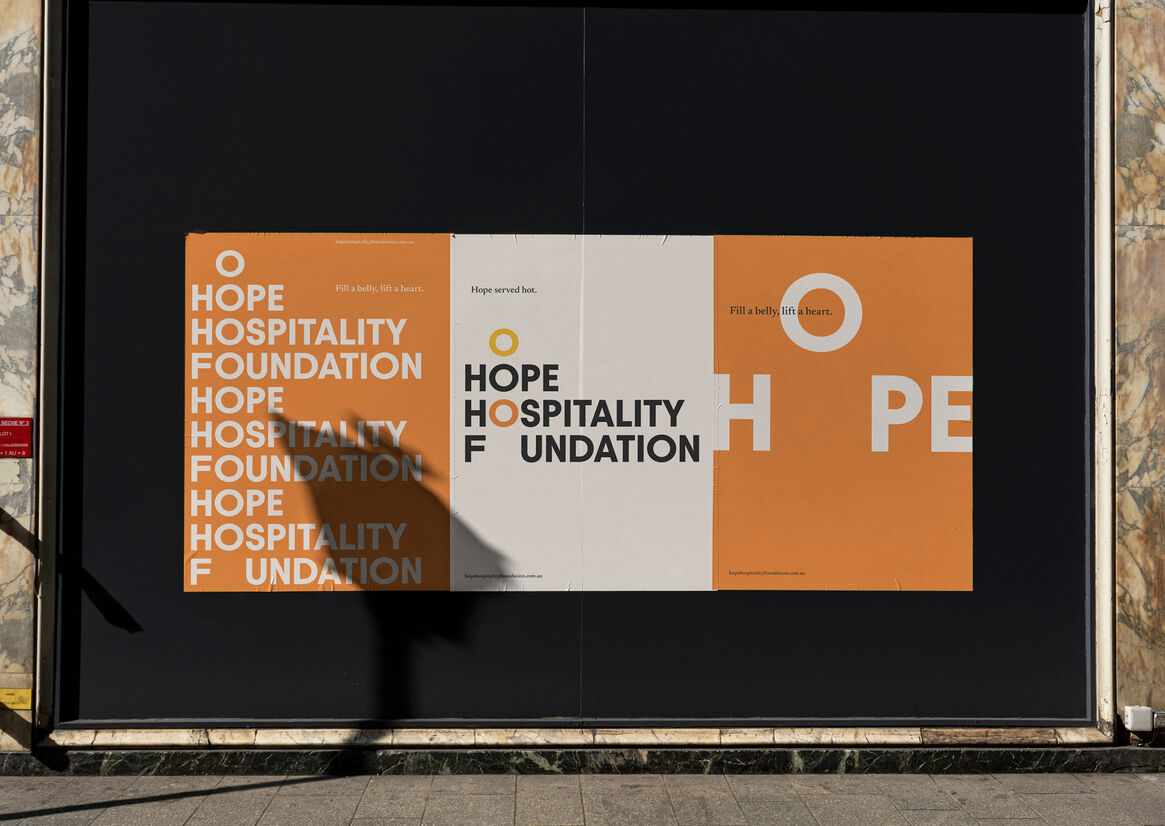
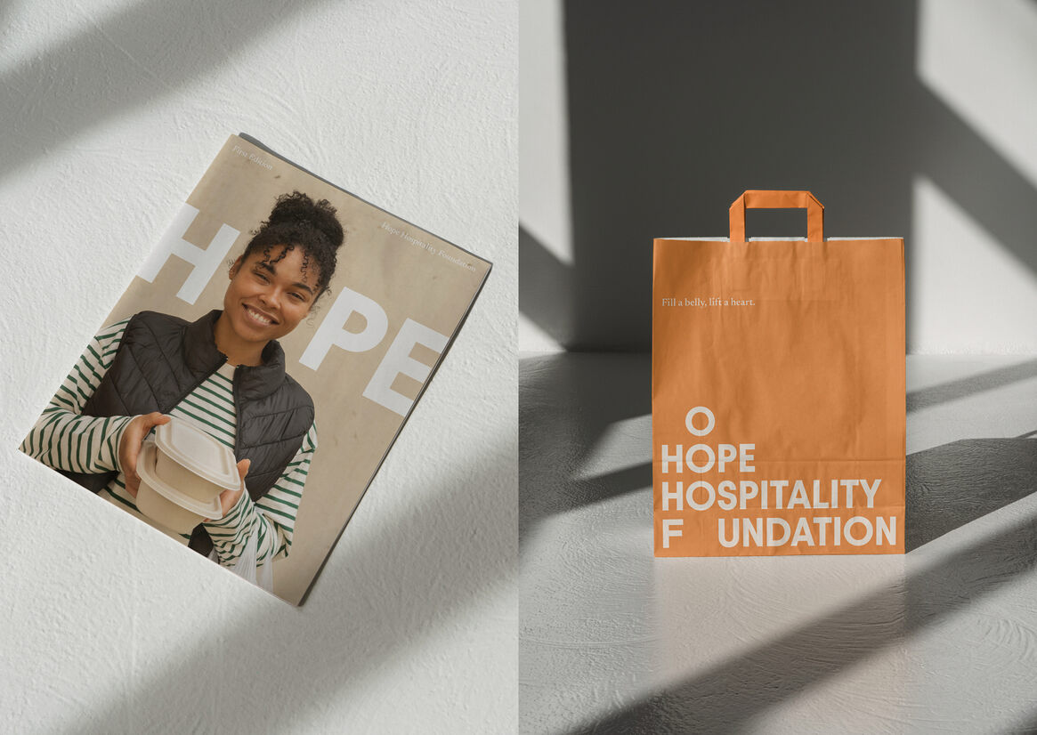
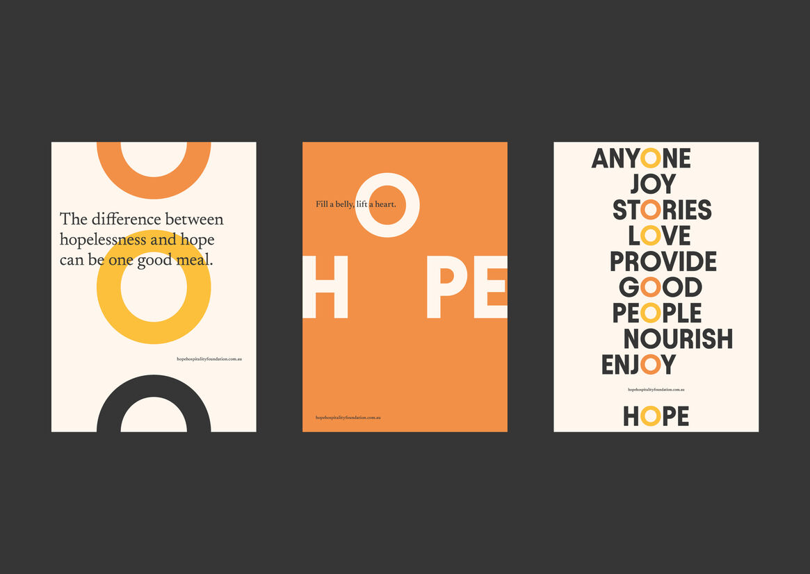
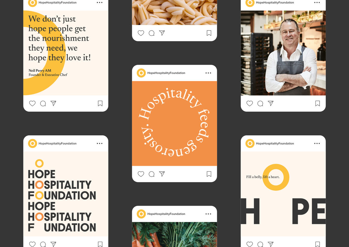
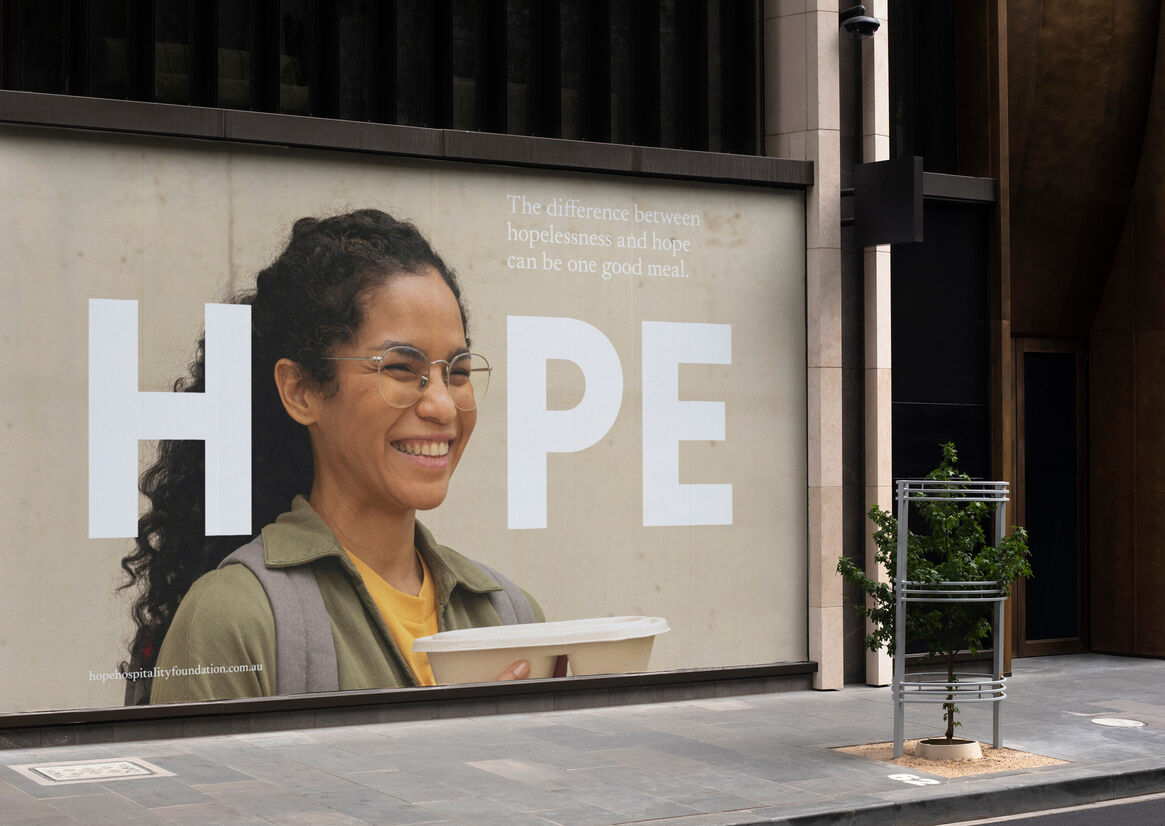
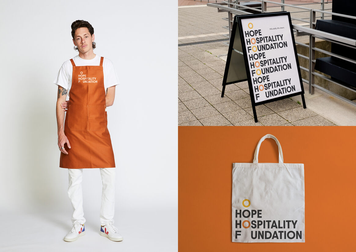
Inspired by the organisation’s simple mission to ‘provide hope one dish at a time’, notions of generosity and abundance come through the primary logo’s stacked typographic treatment, with circular letterforms representing several plates on the move, to wherever they are needed.
A bright, sunny colour palette of warm cream, tangerine, white and charcoal with accents of butterscotch add to the sense of warmth, positivity and optimism.
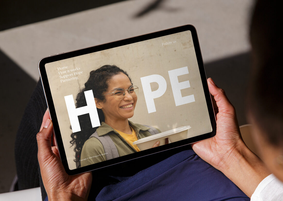
Typography is an important aspect of Hope Hospitality Foundation’s visual language, providing impact and positivity across all communications.
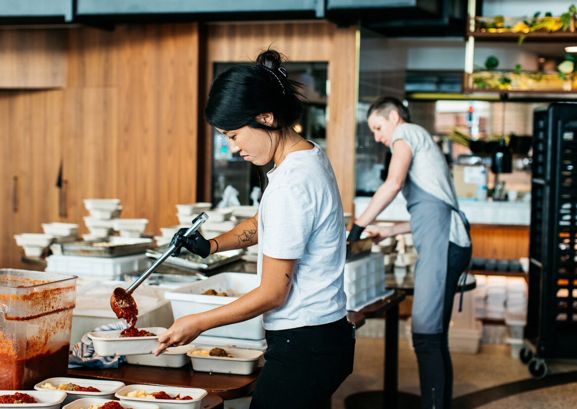
Photography style is a celebration of quality, community and craft – the many elements that contribute to Hope’s exceptional fare.
Results
Hope Hospitality Foundation is evidence that a high quality, nourishing meal is not just a way to fill a stomach, but a way to make a difference; proof that an industry can do good, while doing what it loves.
By partnering with Hope Hospitality Foundation, our team was able to support the foundation to provide that hospitality – and hope – to people who need it by expanding its growing supporter network with a confident, positive brand identity that inspires engagement.
“We’ve seen firsthand that quality food really does make a difference. And we care deeply about sharing those meals with as many people as possible. Our new brand cuts through, defying genre or sector to connect with even more donors, supporters, volunteers and partners, paving the road ahead for us to continue what we started: simply sharing more plates with more people.” – Neil Perry, Founder