Graphic
Futago 3 Ten Days on the Island — Statewide Arts Festival
-
Pou Auaha / Creative Directors
Aldous Kelly, Daniel Zika -
Pou Rautaki / Strategic Lead
Daniel Zika
-
Ringatoi Matua / Design Director
Kate Owen -
Kaituhi Matua / Copywriter Lead
Carolyn Watson
-
Ngā Kaimahi / Team Members
Broden Balsley-Polley, Manhou (Tang) Deng, Laura Purcell -
Kaitautoko / Contributor
Keith Pemberton -
Client
Ten Days on the Island
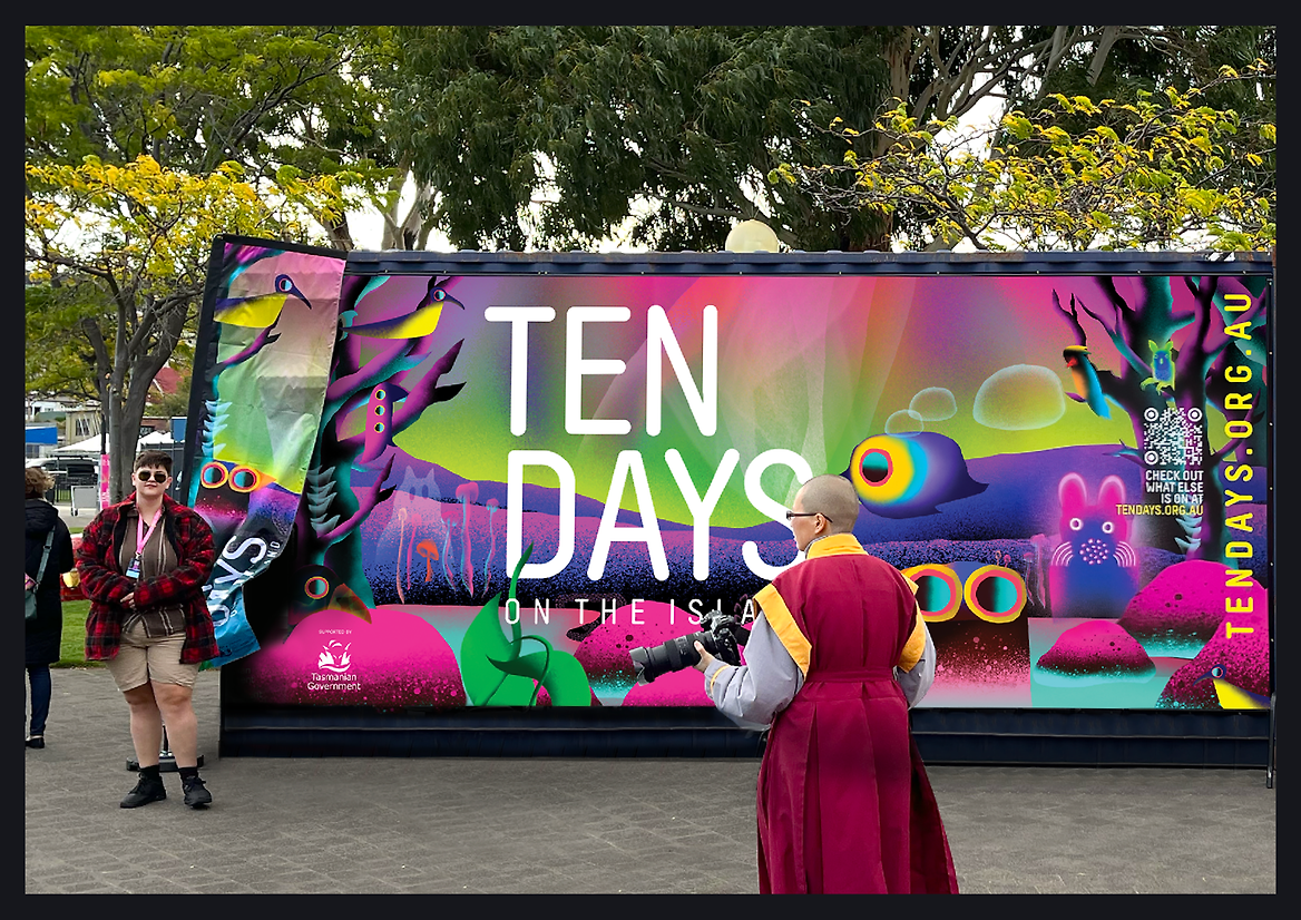
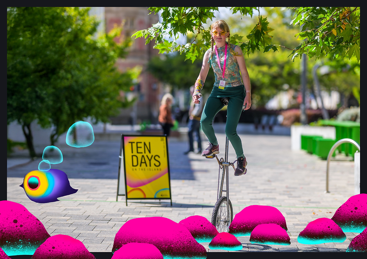
Description:
‘Ten Days on the Island’ is Tasmania’s only state-wide, international arts festival, celebrating creativity, storytelling, and the island’s distinctive cultural identity. The brief for this new brand was clear: create a vibrant, contemporary visual identity that could cut through the noise of the national and international festival calendar while staying deeply rooted in place.
Crucially, the Festival wanted to move away from overused Tasmanian symbols like the Tiger or colonial history. The new identity had to feel recognisably Tasmanian without resorting to clichés, while appealing to both local audiences and visitors from beyond the island.
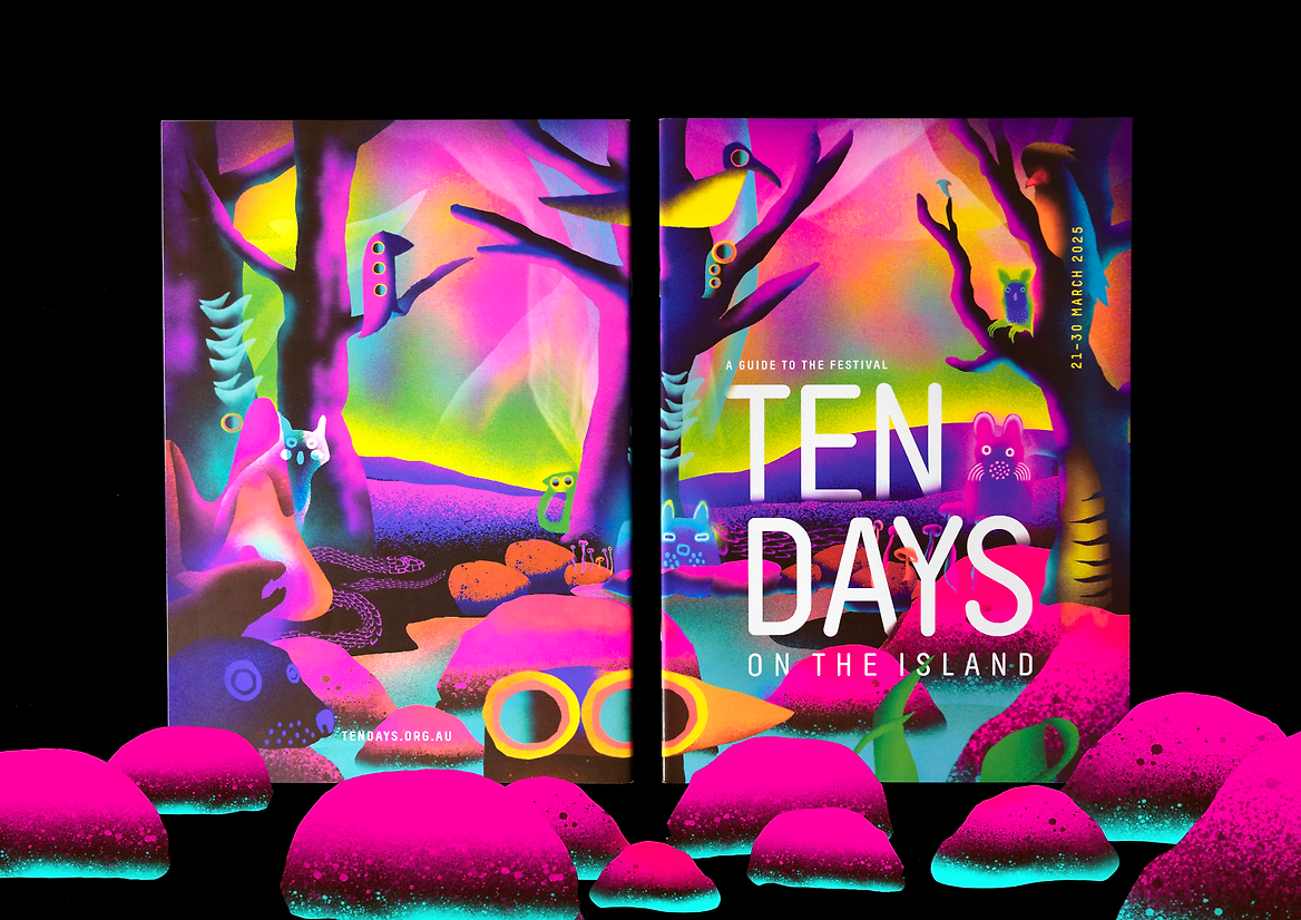
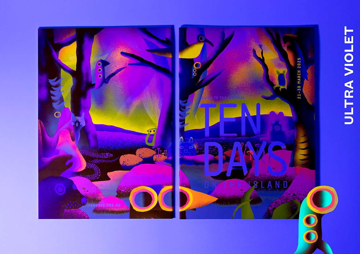
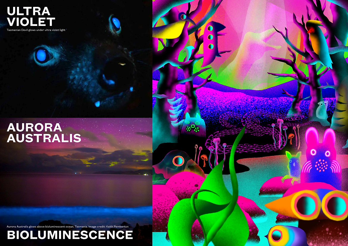
The design team’s approach started with a deep dive into the island’s unique natural phenomena. Bioluminescent beaches, glowing marsupials under UV light, and the ever-changing Aurora Australis inspired a concept that celebrates the hidden, magical qualities of Tasmania’s landscape and people. The artwork was created by a standout illustrator within the design team, whose talent became part of the Festival’s own creative story. Through a collaborative process involving the Artistic Director, the design team, and the Festival’s marketing manager, the artist was able to respond intuitively to conversations and ideas as they unfolded. The result was a dynamic, evolving visual identity that felt deeply embedded in the spirit and energy of the Festival itself.
The idea: an evolving festival identity that shifts and builds momentum in step with the Festival calendar.
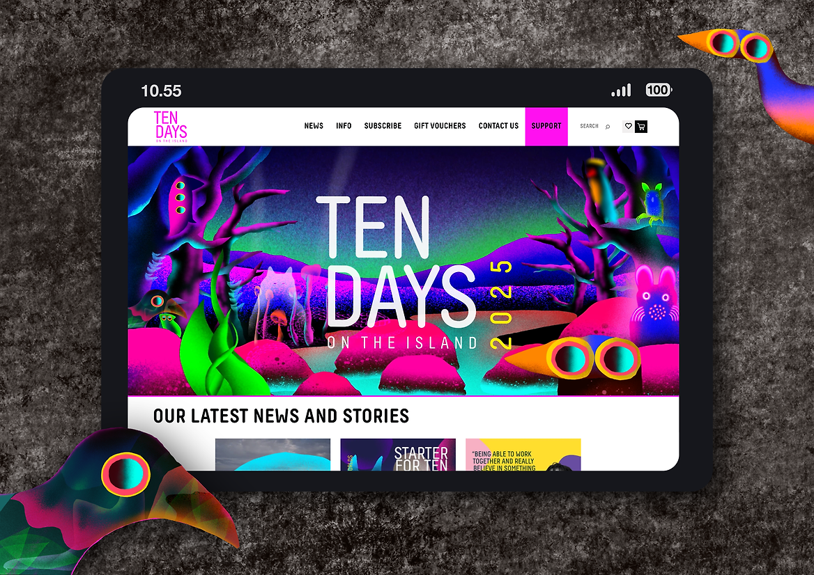
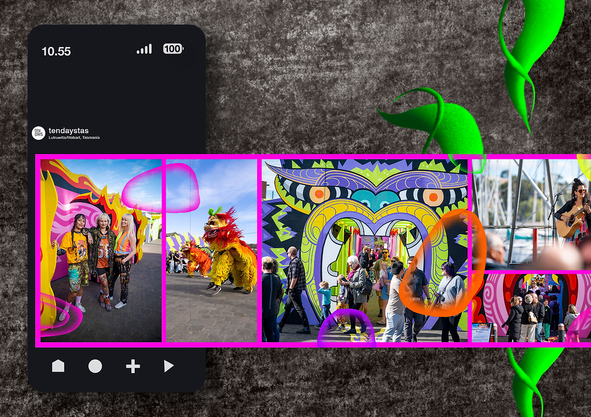
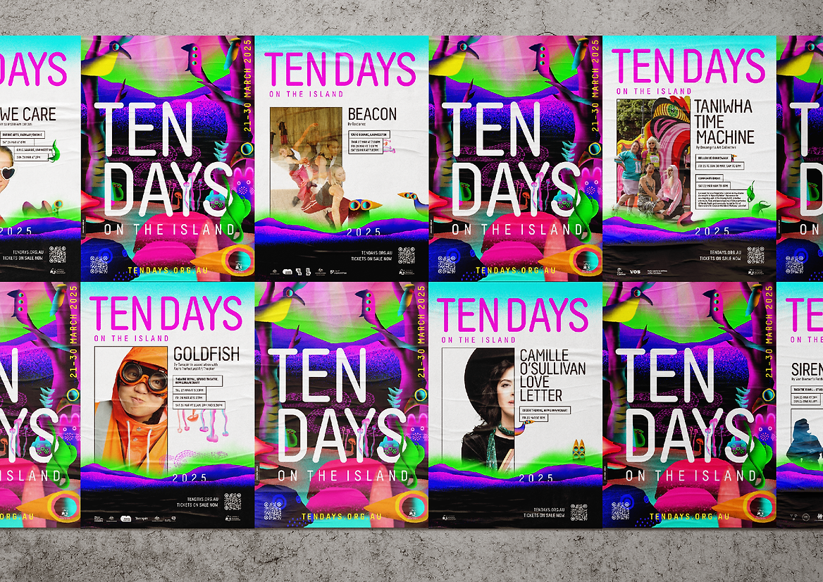
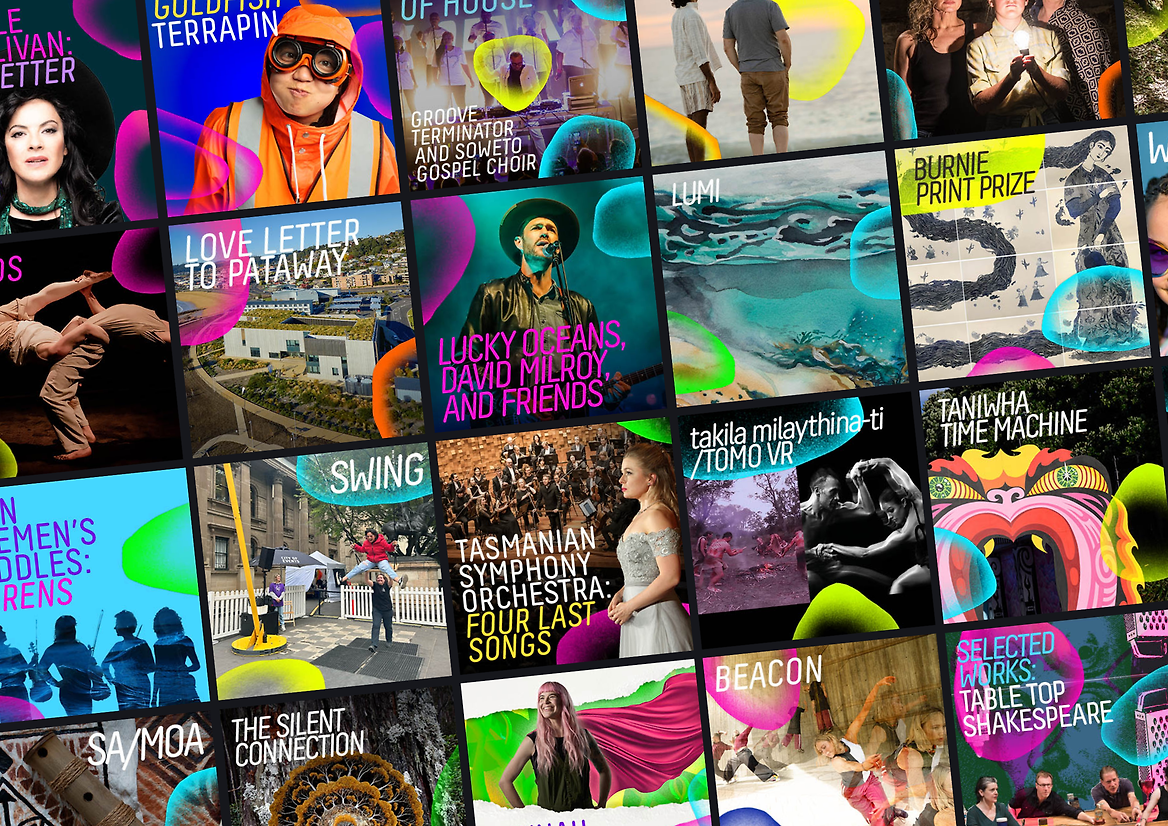
The visual system started soft and anticipatory in the Festival’s early phases — featuring vibrant, punchy colour fields that signal something exciting on the horizon. As the Festival launch approached, the design language gained nuance and depth — incorporating translucent textures, layered graphics, and evolving visual energy. By festival time, the brand reached full intensity: otherworldly, luminous, and impossible to ignore.
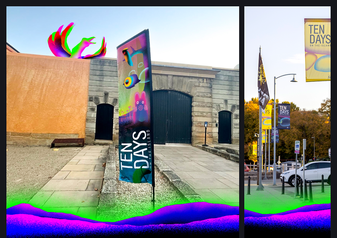
A playful family of illustrated Tasmanian critters further reinforces the sense of wonder and discovery, while bold, modern typography anchors the identity with clarity and accessibility.
Technically, the project pushed production boundaries. In print, fluorescent inks replaced standard cyan and magenta to deliver brightness and standout on the page. Digitally, the RGB palette was pushed to its limits to ensure maximum vibrancy across social, web, and screen-based applications.
Outcomes have been overwhelmingly positive. The bold new identity has expanded the festival’s visual footprint, helping to attract new and younger audiences while deepening engagement with long-term supporters. Social media engagement increased, program pick-up rates rose, and there was clear anecdotal feedback from audiences and partners who felt re-energised by the Festival’s new look and feel.
Beyond visual impact, the project has contributed to Tasmania’s broader cultural and economic wellbeing by helping position ‘Ten Days on the Island’ as a leading creative event. The work captures the essence of Tasmania: quirky, surprising, and extraordinary.
This rebrand is not just a visual refresh — it’s a cultural statement. A celebration of the island’s magic. An invitation for audiences to look closer, lean in, and discover something unforgettable.