Graphic
Fuman 27 JYRO - Pure wild flight
-
Pou Auaha / Creative Director
Jon Chapman-Smith
-
Ringatoi Matua / Design Director
Gio Trevilla -
Kaituhi Matua / Copywriter Lead
Mark Easterbrook
-
Ngā Kaimahi / Team Members
Katie Hamilton, Caleb Gopal, Hattie Sadler, Grace Chapman-Smith, Brya Taylor -
Kaitautoko / Contributor
Val Cabadonga -
Client
JYRO
Description:
It takes a certain wild attitude and energy to throw your body into freefall with nothing but a parachute canopy attached. That audacious courage is what we hoped to capture with JYRO, a full strategic rebrand of the prosaically named NZ Aerosports.
This project was a very personal one for the client — it came about following the passing of its founder. His daughter, Luci, wanted to bring the brand into a new era, with a clearly defined brand essence and a sense of meaning which honoured her father. Our brief was to create a full strategic rebrand for the business, to help propel them into this new era.
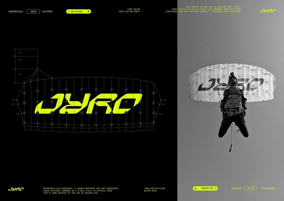
To create a brand that would have meaning, impact and longevity, we went right back to basics and started with their name. The new brand name, Jyro, was the founder’s nickname. And it’s his spirit, in all its renegade wildness, that is infused into the business and the brand.
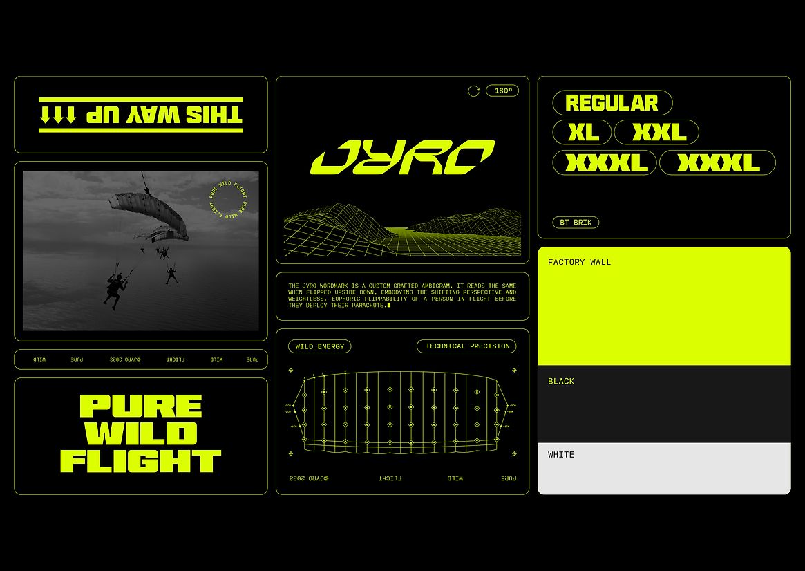
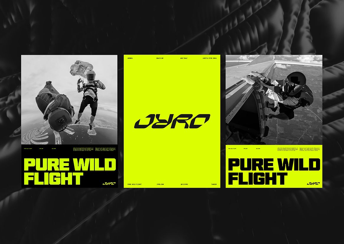
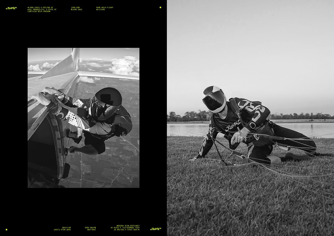
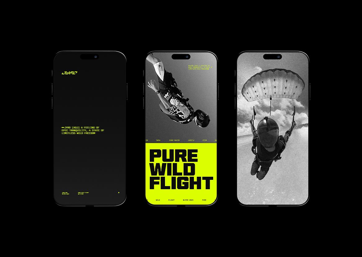
We chose to make his name an adjective for the feeling of epic tranquillity, the state of limitless, wild freedom that only aerosports athletes truly know. With the visual expression of the brand, the aim was simple: evoke those moments of pure euphoria and the experience of pure wild flight.
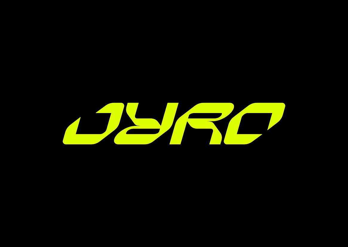
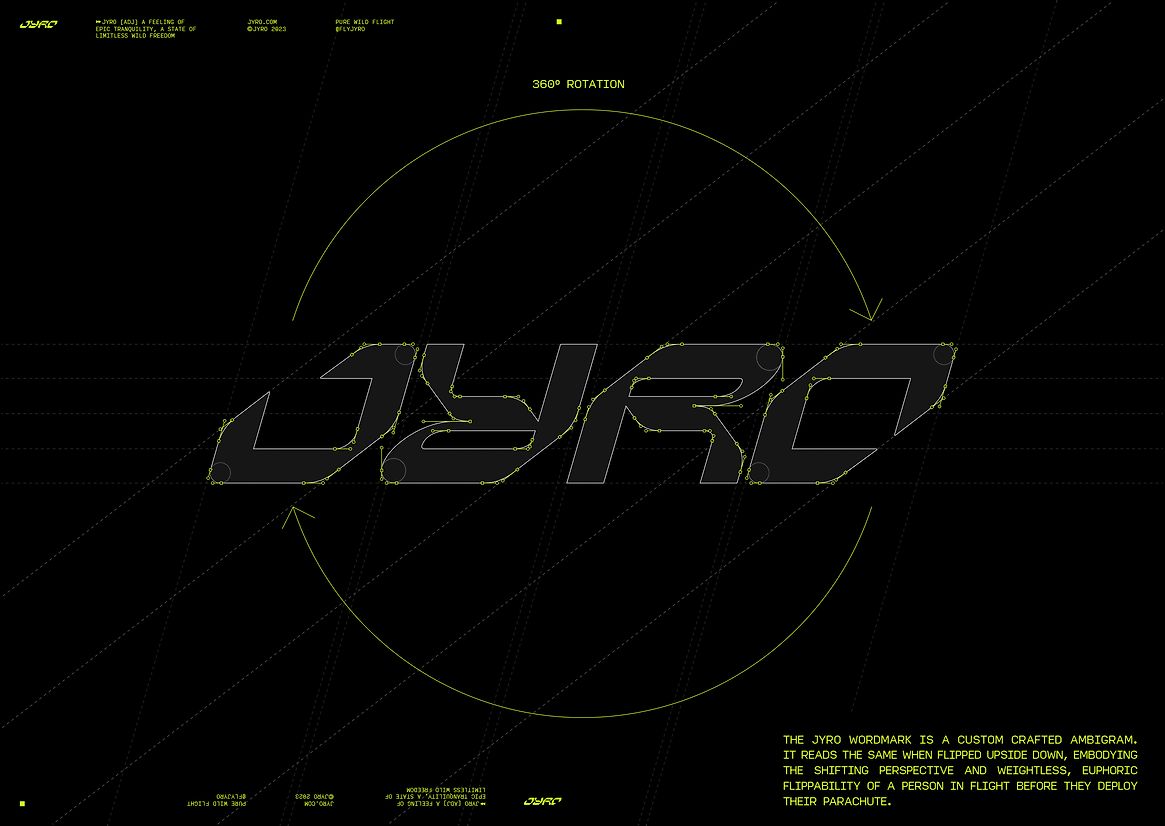
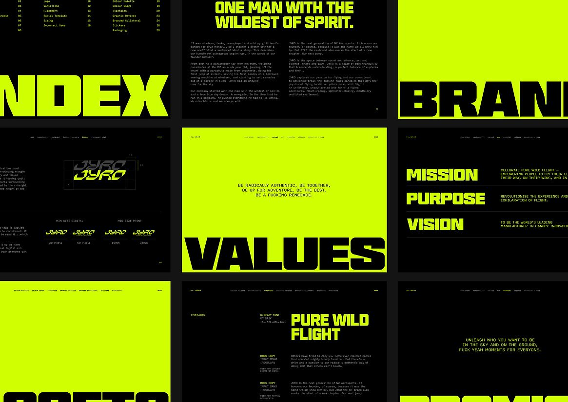
The JYRO wordmark is a custom crafted ambigram. It reads the same when flipped upside down, embodying the shifting perspective and weightless, euphoric flippability of a person in flight before they deploy their parachute in flight and channels intense movement and colour.
It was serendipitous that the name could be an ambigram. For a parachute brand, visibility is vital but there’s no fixed point of view from which a spectator might see the wordmark. Its flippability was an elegant and powerful way to overcome that particular challenge.
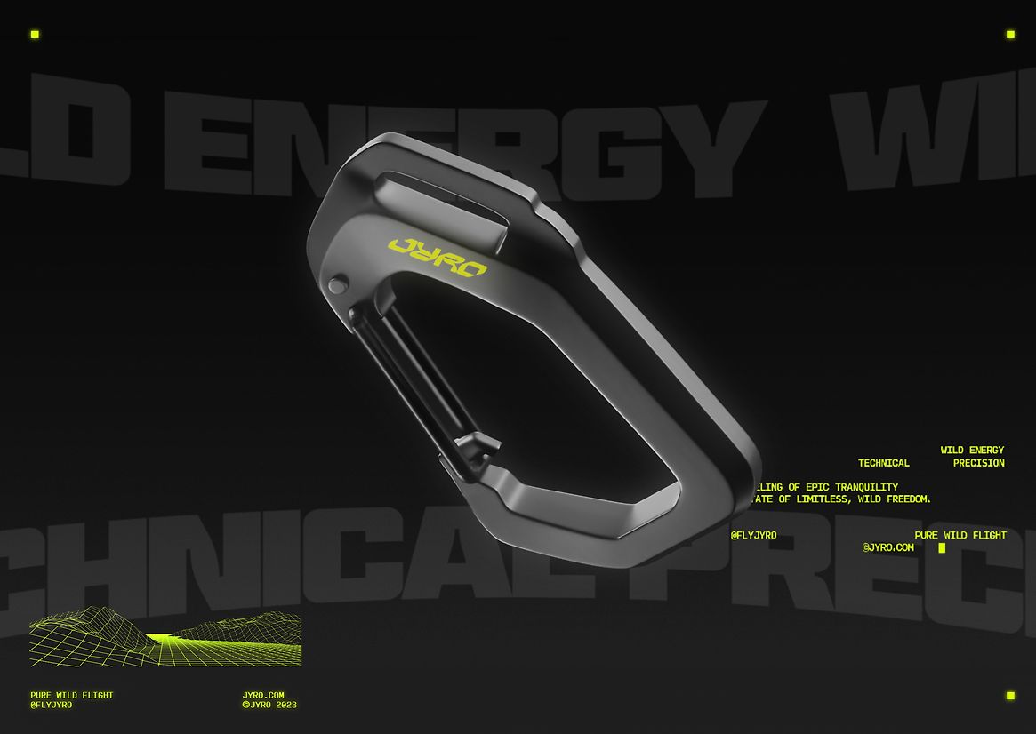
The wordmark is bold, bright and geometric, rendered in neon yellow or black. The supporting colour palette is stripped right back to black, white, neon yellow channelling an era when adventure sports were brash, big and running at full throttle. Type and supporting graphics create a bold, flexible and adaptable design system that captures the versatility and adventurous attitude of an aerosport athlete and is inspired by high performance leisure and sport tech brands.
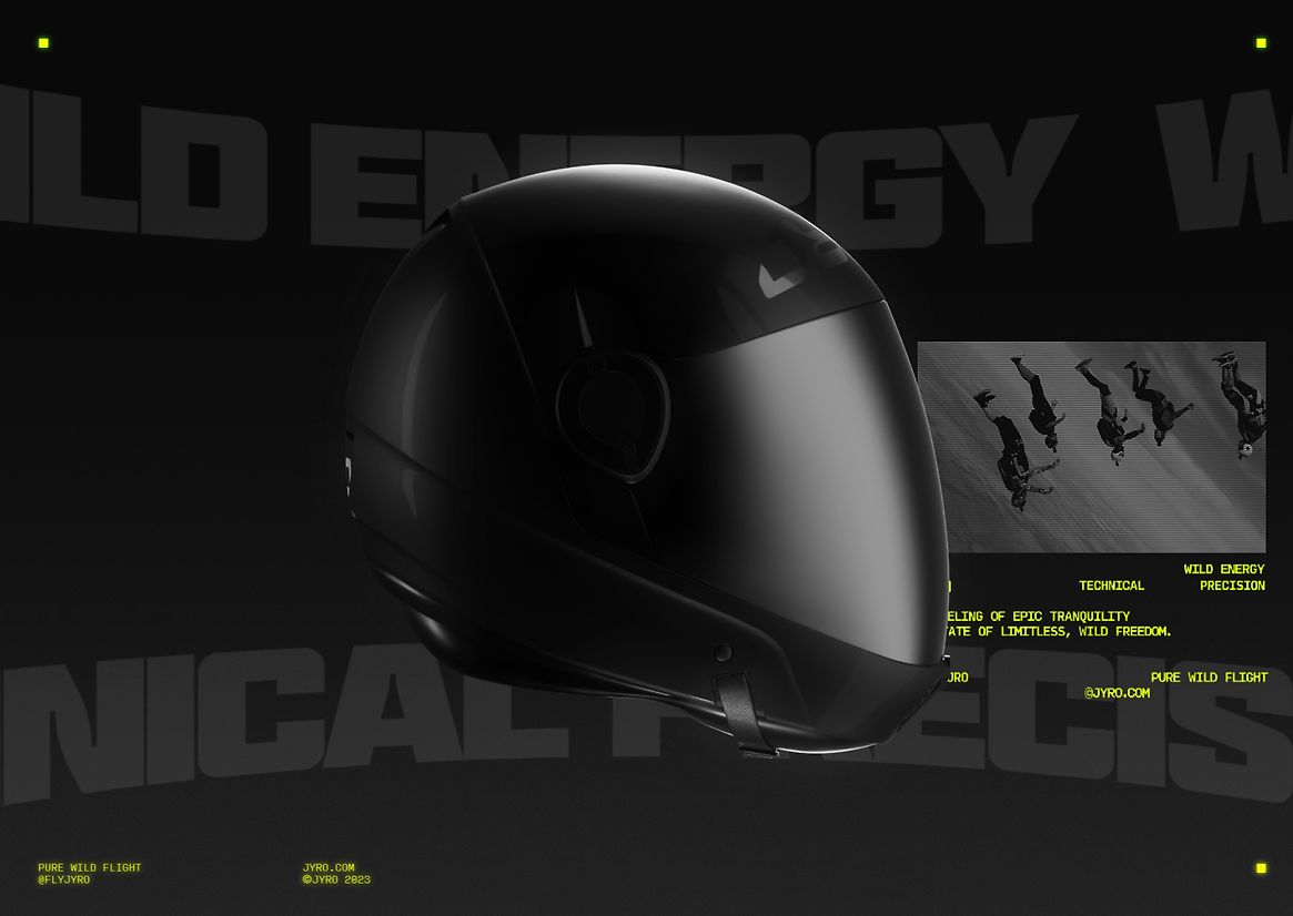
Balancing the wild energy is a technical precision: JYRO is a high performance brand underpinned by leading edge technology and exacting engineering. Its customers need absolute trust in the product they buy: their lives literally depend on it. By developing a modern, professional, visually consistent brand, we were able to signal that there was thought and care behind every element of the business.
However, that precision never detracts from the unique essence of the brand. JYRO is distinctive, brave and bold, with a playful and dynamic personality that’s unmistakeable — even flipped upside down.