Graphic
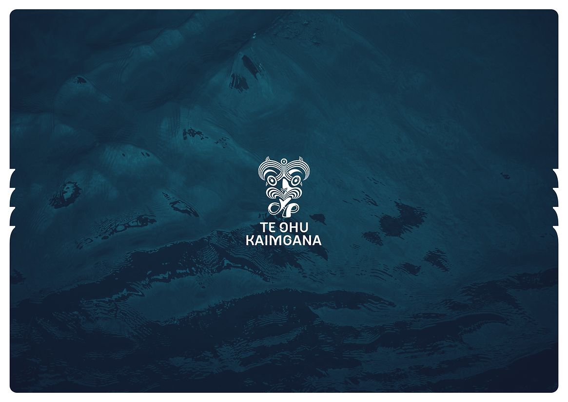
Fay & Walter Te Ohu Kaimoana identity
-
Pou Auaha / Creative Directors
Tim Hansen, Kereama Taepa, Bede Dwyer -
Pou Rautaki / Strategic Lead
Bede Dwyer -
Pou Taketake / Cultural Leads
Kereama Taepa, Bede Dwyer
-
Ringatoi Matua / Design Directors
Tim Hansen, Kereama Taepa, Bede Dwyer
-
Kaitautoko / Contributors
Erica Sinclair, Brian Morris, Leanne Molloy -
Client
Te Ohu Kaimoana

Description:
Te Ohu Kaimoana plays a vital yet complex role in safeguarding Māori rights to fisheries guaranteed under the Treaty of Waitangi and confirmed in the first pan-Māori treaty settlement in the history of Aotearoa.
Balancing the need to act as a guardian for the marine environment and act in the interests and rights of its iwi through political advocacy for 58 organisations across Aotearoa, the organisation needed a brand that reflected not just its purpose – but its tuakiritanga, whakapapa, and rangatiratanga.
The opportunity was clear: evolve the brand to match a new strategic direction, the organisation’s first ever brand strategy and to create a timeless, culturally grounded identity that iwi could see themselves in – and be proud of. What was required wasn’t just a new logo, but a brand that could communicate the organisation’s legacy, authority, and commitment to future generations.
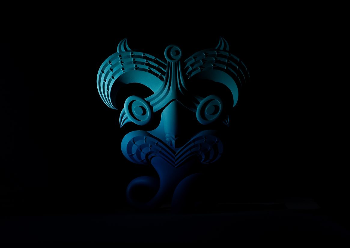
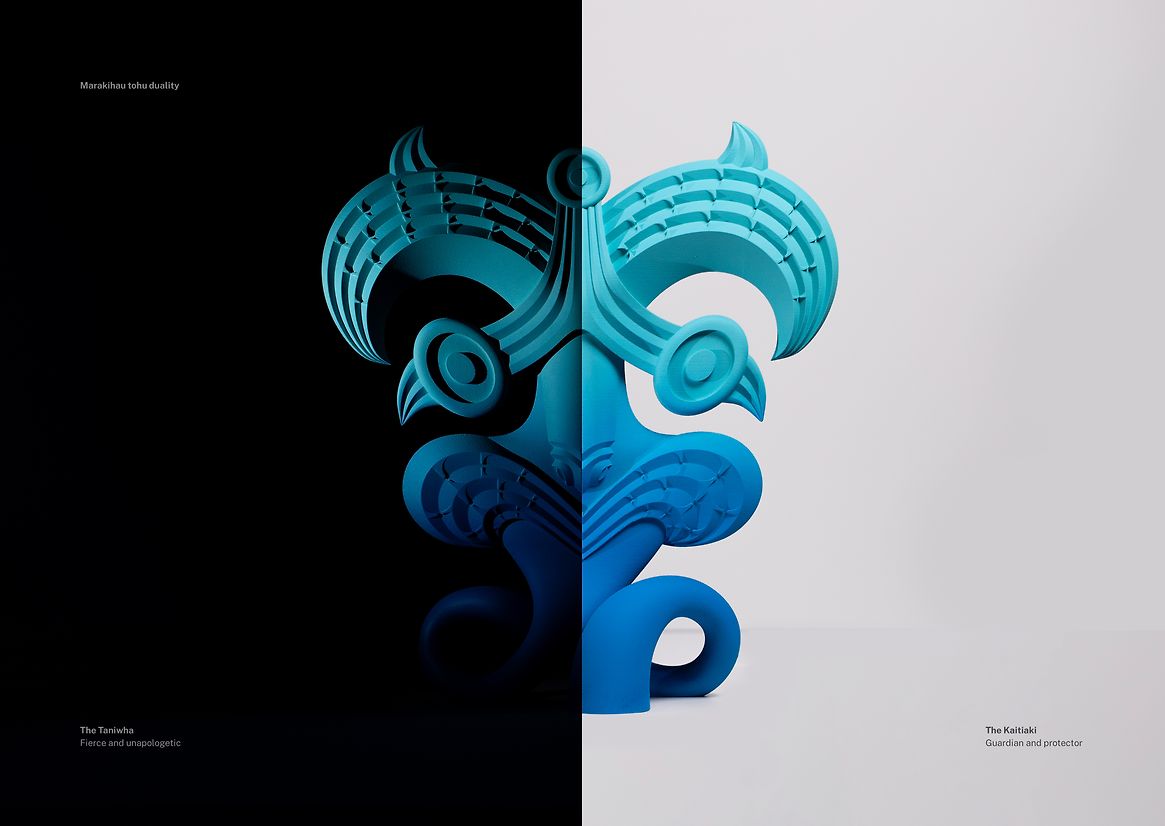
The creative approach began with an immersion into te ao Māori – Māori worldview, knowledge systems, and storytelling. Through research, consultation and kōrero, one powerful concept rose to the surface: the marakihau, a moana-dwelling taniwha. In traditional pūrākau, marakihau protect the seas and the people, act as guardians – but can also be known to be fierce, uncompromising and often misunderstood.
This became the central metaphor and visual cornerstone of the brand.
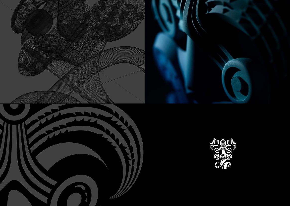
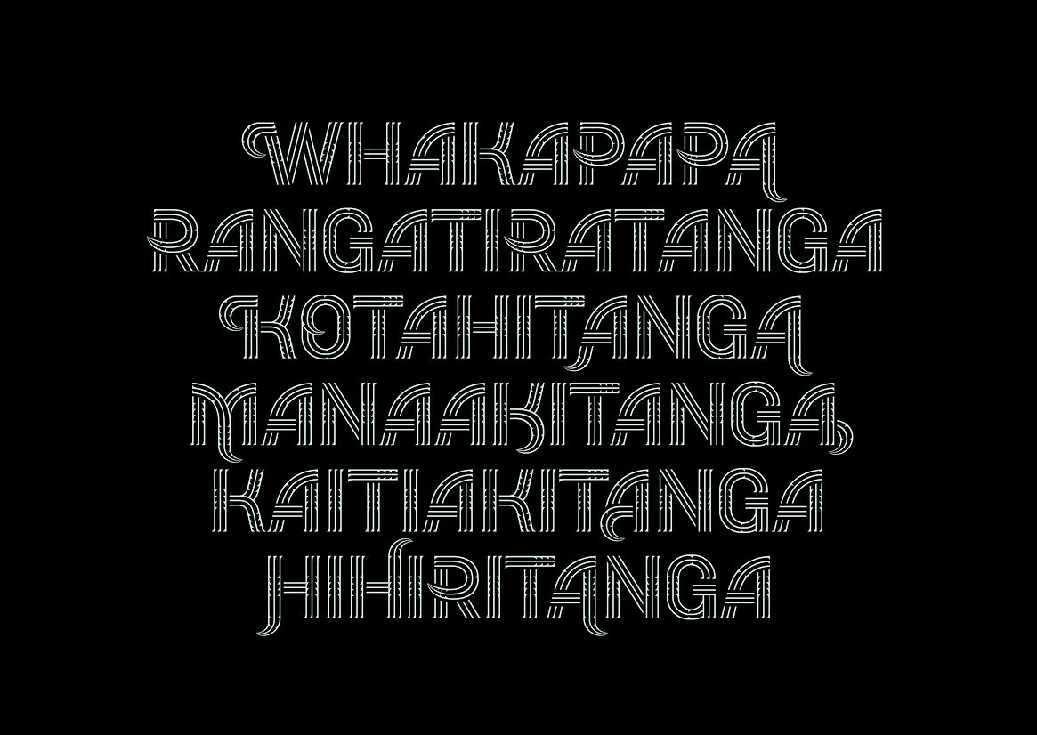
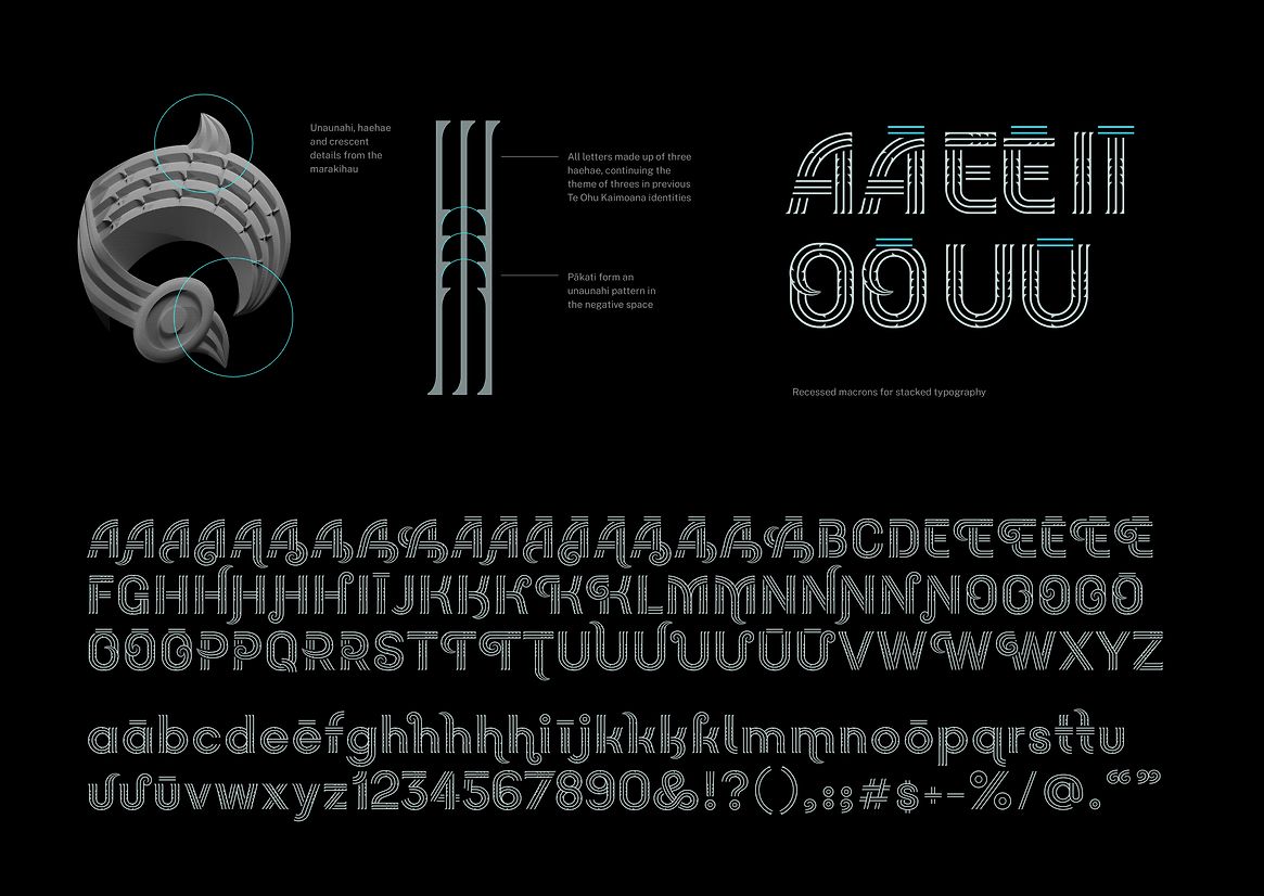
The marakihau tohu (symbol) was custom-designed using principles of whakairo (carving), embodying adaptability, leadership, unity and guardianship. The physical taonga features 58 pākati (carved notches) – one for each iwi Te Ohu Kaimoana represents – expressing strength through unity. A bespoke typeface inspired by whakairo and the whakapapa of Te Ohu Kaimoana was also developed to ensure the brand spoke fluently and authentically.
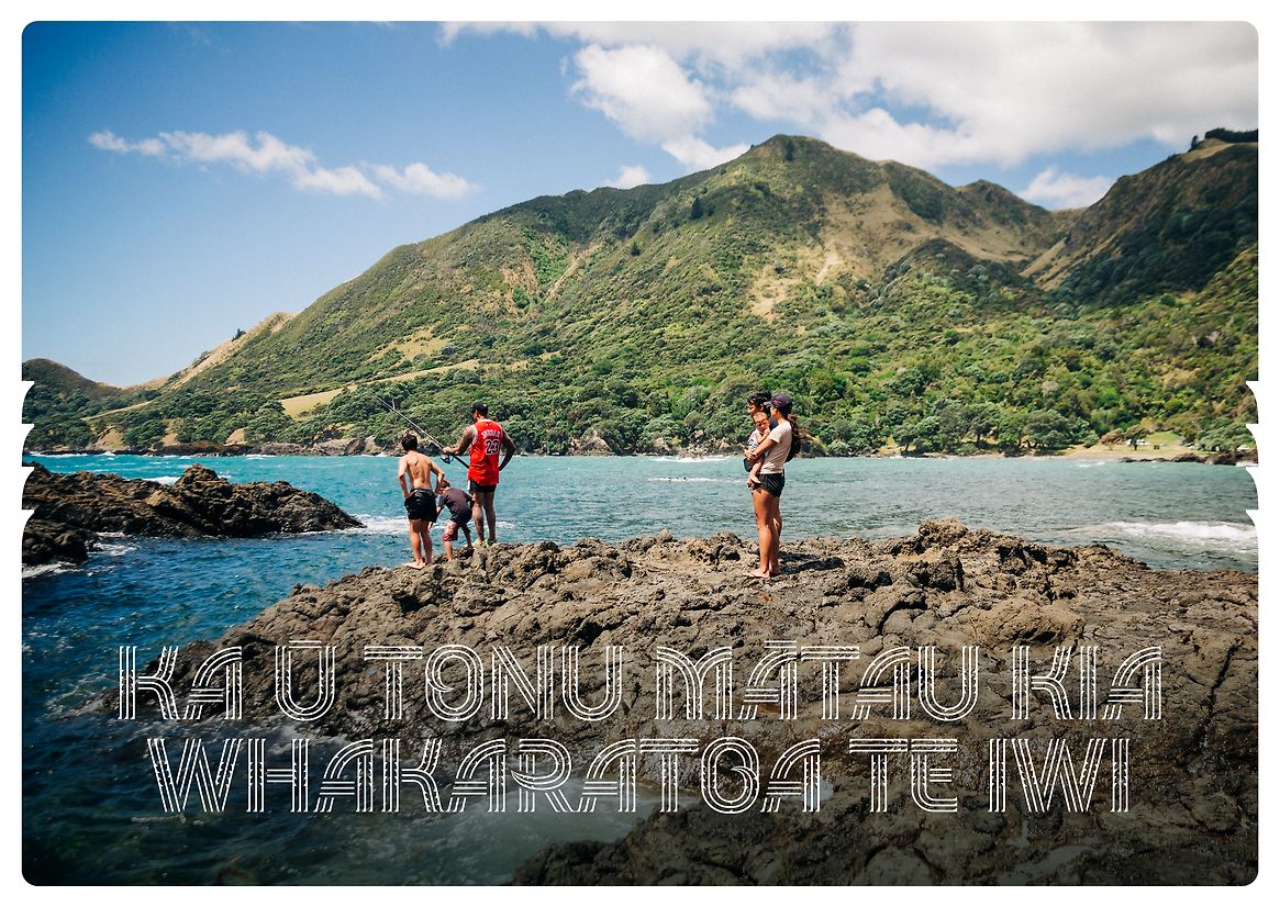
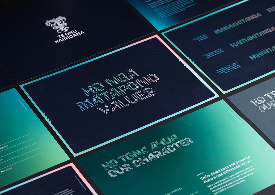
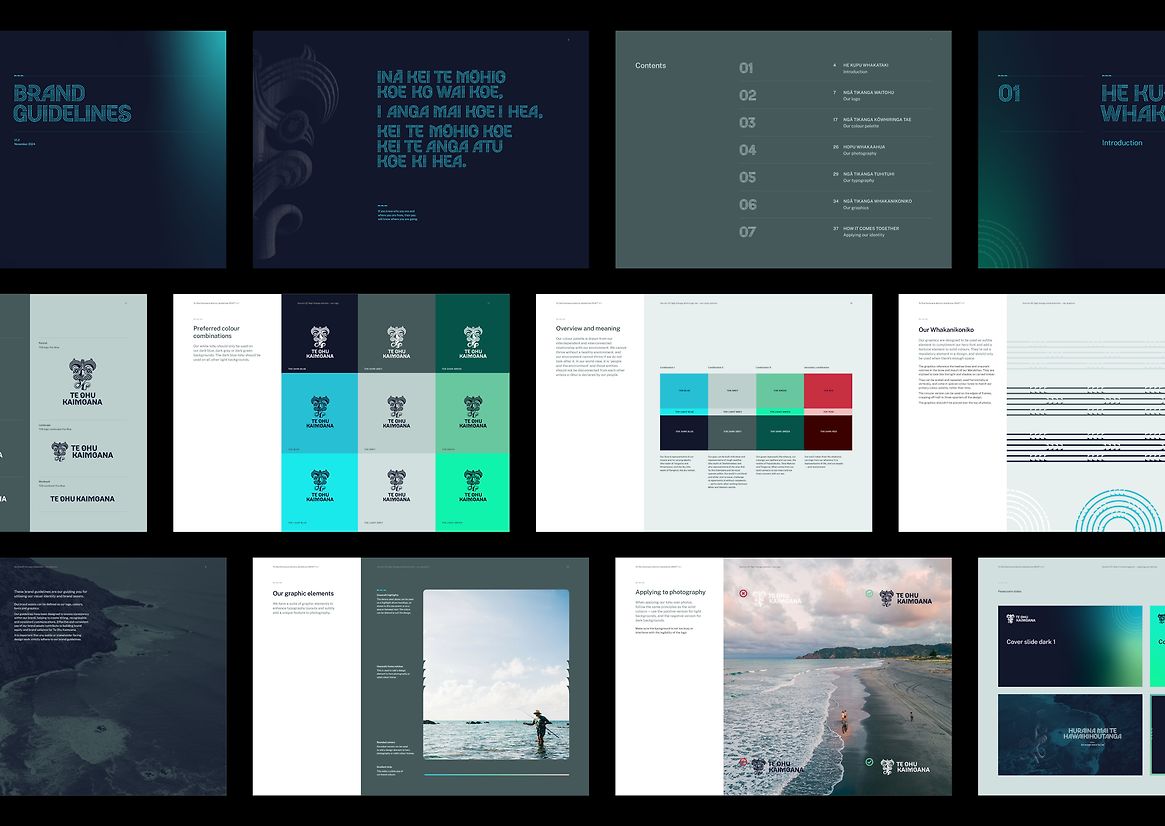
Supporting the visual identity is a refined colour palette drawn from the ocean and whenua, alongside bespoke patternwork referencing tāniko and hīnaki forms. These visual elements work together across digital, physical and print platforms – from websites to documents to physical taonga – maintaining consistency and cultural integrity in each medium.
The outcomes have been significant. The new brand has been embraced by the Board and iwi stakeholders, and has been implemented across a new website, digital collateral, signage, and more. A 3D-printed marakihau sculpture now resides in the office of Te Ohu Kaimoana office – a physical embodiment of the brand’s enduring values and purpose.
This project is more than a rebrand – it is a revitalisation. It is a statement of unflinching identity, sovereignty, and indigenous influence. It shows how Indigenous design can lead with depth, meaning and innovation – creating a brand that is both ancient and future-facing, grounded and aspirational. It honours the past, empowers the present, and protects the legacy of tomorrow.