Feature (formerly Feature Landscapes) is a premium Auckland-based landscaping business, working in both public spaces and the high-end residential space. Over the last 10 years Feature has cultivated a strong reputation within the industry for their quality-led approach, integrity and professionalism, and are the go-to landscapers for Auckland’s best landscape designers.
Feature had outgrown their existing brand, and were operating in a cluttered market with identical service offerings and repetitive messaging. Poised for growth, Feature is expanding their offering to encompass design, pools and maintenance.
Feature needed a clearly articulated brand positioning and refreshed identity that could evolve with their growing business. The new platform is designed to demonstrate market leadership and design credibility, enabling Feature to connect with new, upwardly mobile audiences looking for a design partner, rather than a tradie.
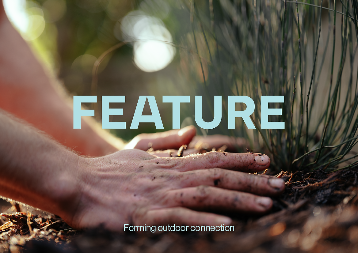
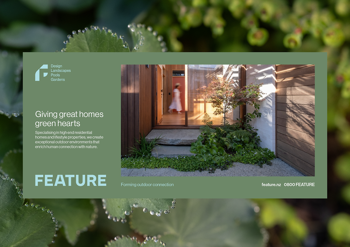
Cultivating the connection between people and the earth is at the core of the business. The new brand idea and tagline, ‘Forming outdoor connection’, demonstrates Feature’s commitment to creating exceptional outdoor environments that enrich that connection for their clients.
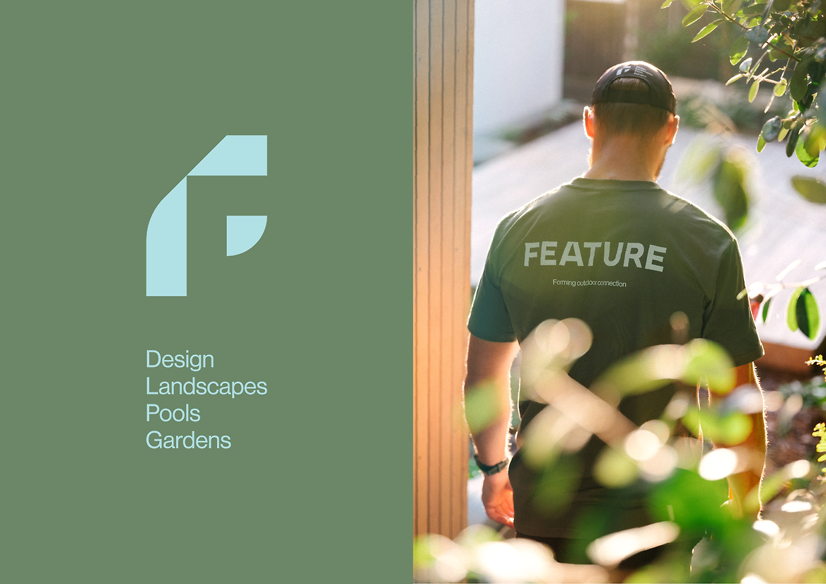
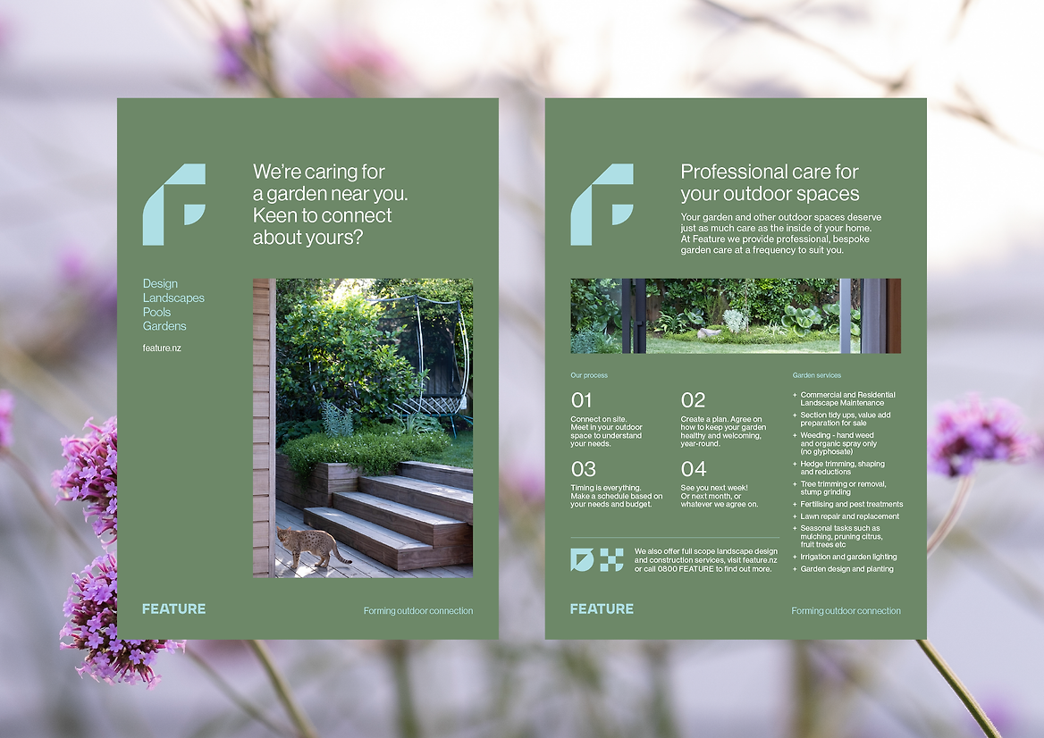
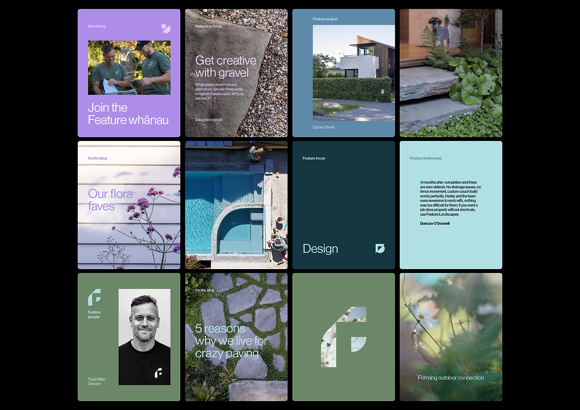
Presenting the service offering (design, landscapes, pools, gardens) as a key brand element was essential to support Feature’s name change and position Feature as full-service outdoor specialists.
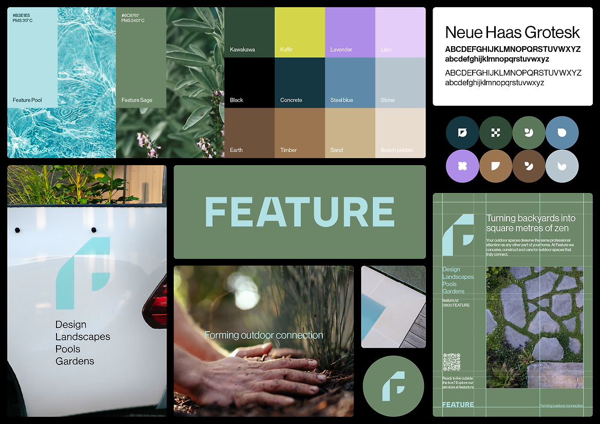
The logo exudes a timeless confidence that is fitting for Feature’s architecturally aligned service offering. Feature’s supporting monogram echoes the forms of spatial design and the relationship between physical structures and the outdoor spaces surrounding them.
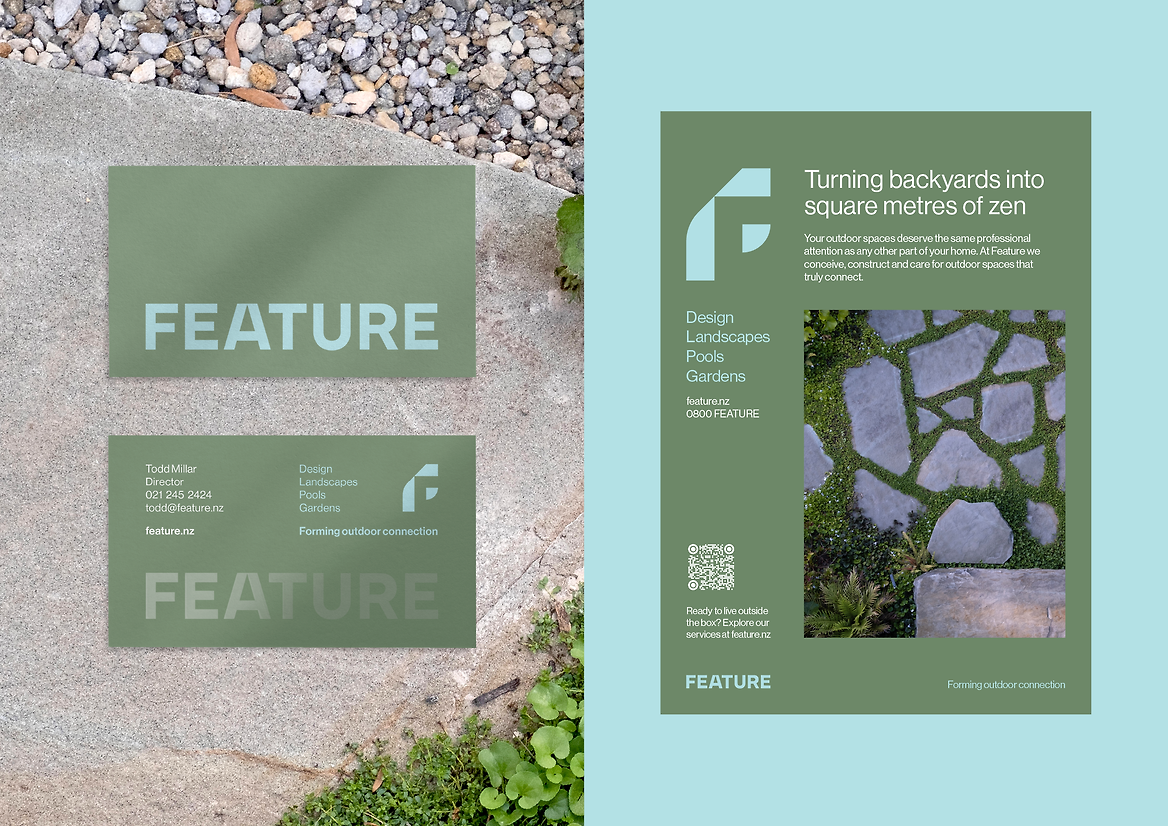
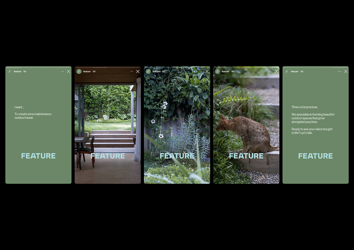
A calming colour palette, inspired by the natural world and industry materials provides a serene backdrop for Feature’s case study photography. A minimal approach to typography and grid-based layouts were employed to further cement Feature’s position as design leaders.
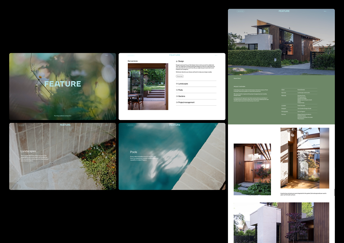
Video forms a key part of Feature’s visual signature. Ethereal close ups of intimate moments in nature were captured to make the viewer feel like they were there in the moment, creating pockets of calm and ease. This immersive content is brought to life on the new Feature website, where subtle animations and scrolling colour transitions add dynamic flair to the digital experience.
The rebrand aligns Feature with design excellence, more accurately reflecting the calibre of their work and providing a platform for the next decade in business.
Description:
Feature (formerly Feature Landscapes) is a premium Auckland-based landscaping business, working in both public spaces and the high-end residential space. Over the last 10 years Feature has cultivated a strong reputation within the industry for their quality-led approach, integrity and professionalism, and are the go-to landscapers for Auckland’s best landscape designers.
Feature had outgrown their existing brand, and were operating in a cluttered market with identical service offerings and repetitive messaging. Poised for growth, Feature is expanding their offering to encompass design, pools and maintenance.
Feature needed a clearly articulated brand positioning and refreshed identity that could evolve with their growing business. The new platform is designed to demonstrate market leadership and design credibility, enabling Feature to connect with new, upwardly mobile audiences looking for a design partner, rather than a tradie.
Cultivating the connection between people and the earth is at the core of the business. The new brand idea and tagline, ‘Forming outdoor connection’, demonstrates Feature’s commitment to creating exceptional outdoor environments that enrich that connection for their clients.
Presenting the service offering (design, landscapes, pools, gardens) as a key brand element was essential to support Feature’s name change and position Feature as full-service outdoor specialists.
The logo exudes a timeless confidence that is fitting for Feature’s architecturally aligned service offering. Feature’s supporting monogram echoes the forms of spatial design and the relationship between physical structures and the outdoor spaces surrounding them.
A calming colour palette, inspired by the natural world and industry materials provides a serene backdrop for Feature’s case study photography. A minimal approach to typography and grid-based layouts were employed to further cement Feature’s position as design leaders.
Video forms a key part of Feature’s visual signature. Ethereal close ups of intimate moments in nature were captured to make the viewer feel like they were there in the moment, creating pockets of calm and ease. This immersive content is brought to life on the new Feature website, where subtle animations and scrolling colour transitions add dynamic flair to the digital experience.
The rebrand aligns Feature with design excellence, more accurately reflecting the calibre of their work and providing a platform for the next decade in business.