Graphic
Design Dairy 9 Body Island / Motu Tinana
-
Pou Auaha / Creative Director
Jonathan Templman
-
Ngā Kaimahi / Team Member
Frank Turner -
Kaitautoko / Contributors
Māhia Jermaine Dean, Emma Cosgrove, Jinki Cambronero, Charles Howell, Shabnam Shiwan, Nancy Wijohn, Taane Mete, Rose Tapsell, Jahra Wasasala, Kelly Nash, Joshua Faleatua, Mark Easterbrook, Lydia Harden Bull -
Client
Kelly Nash
Description:
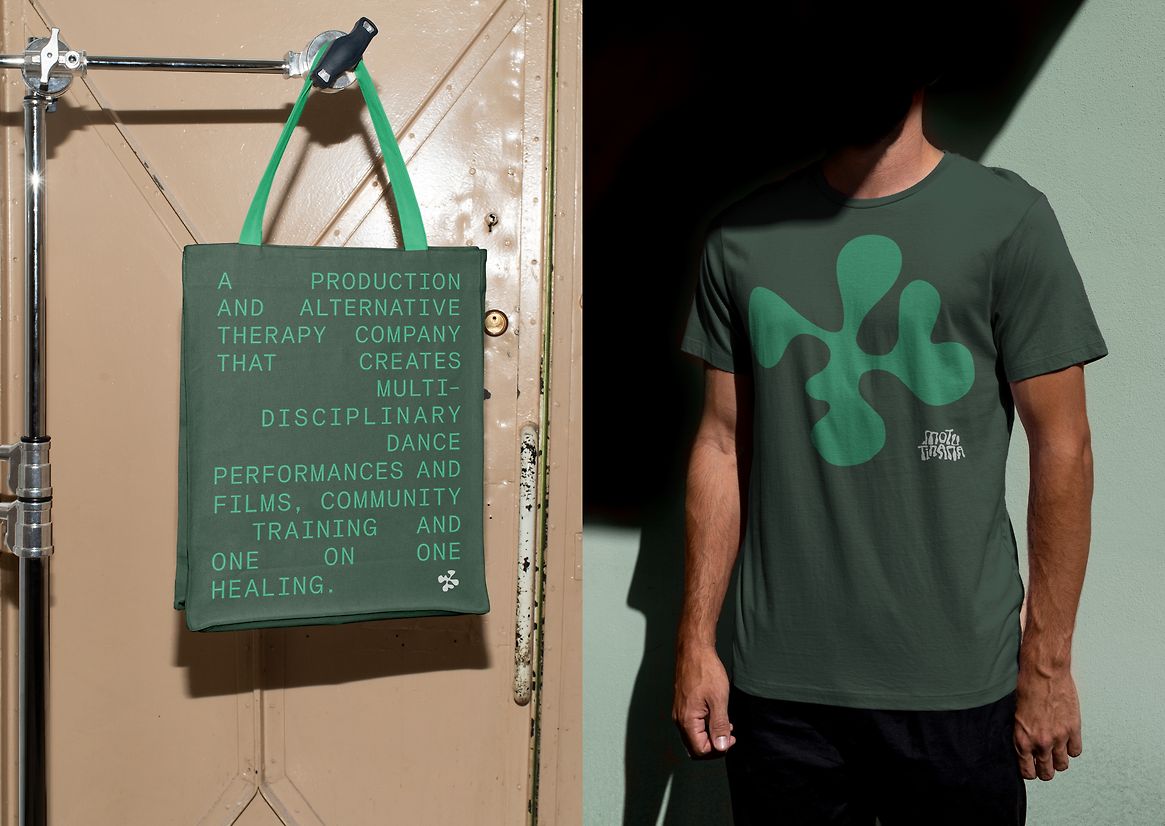
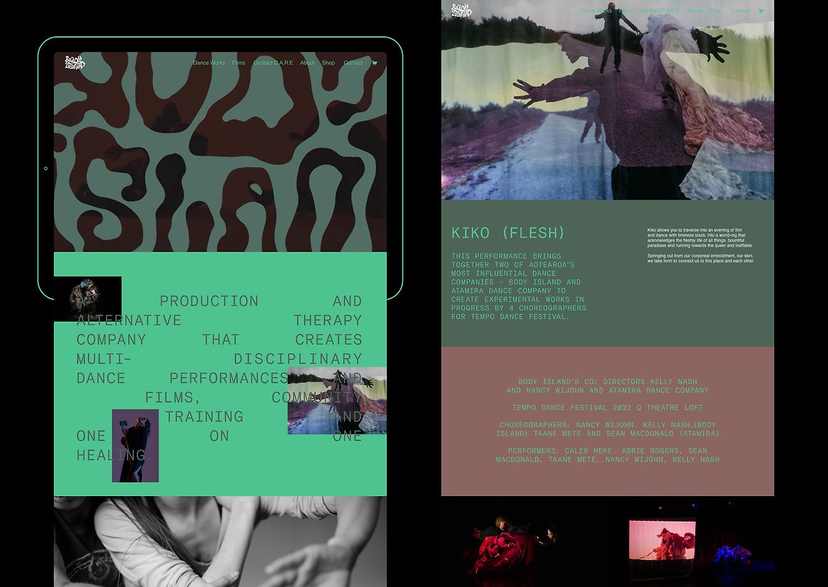
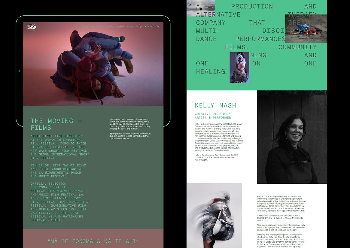
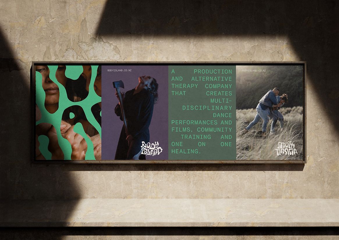
Body Island/Motu Tinana are a production and alternative therapy company that create multi-disciplinary dance performances and films, and offer community training and one on one healing.
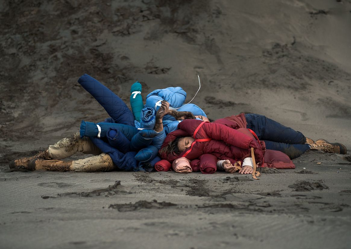
Body Island exist to express embodied cross-cultural, physical narratives, empowered through the imaginative sharing of art and life. Creative Directors and partners, Kelly and Nancy, wanted to develop a new brand identity that would invigorate and better represent this diverse offering. Their brief to us was for a design system that felt energetic, modern and unique, one that could function harmoniously for the two main streams of their work: their artistic performances and film productions, and their health and the wellbeing offering.
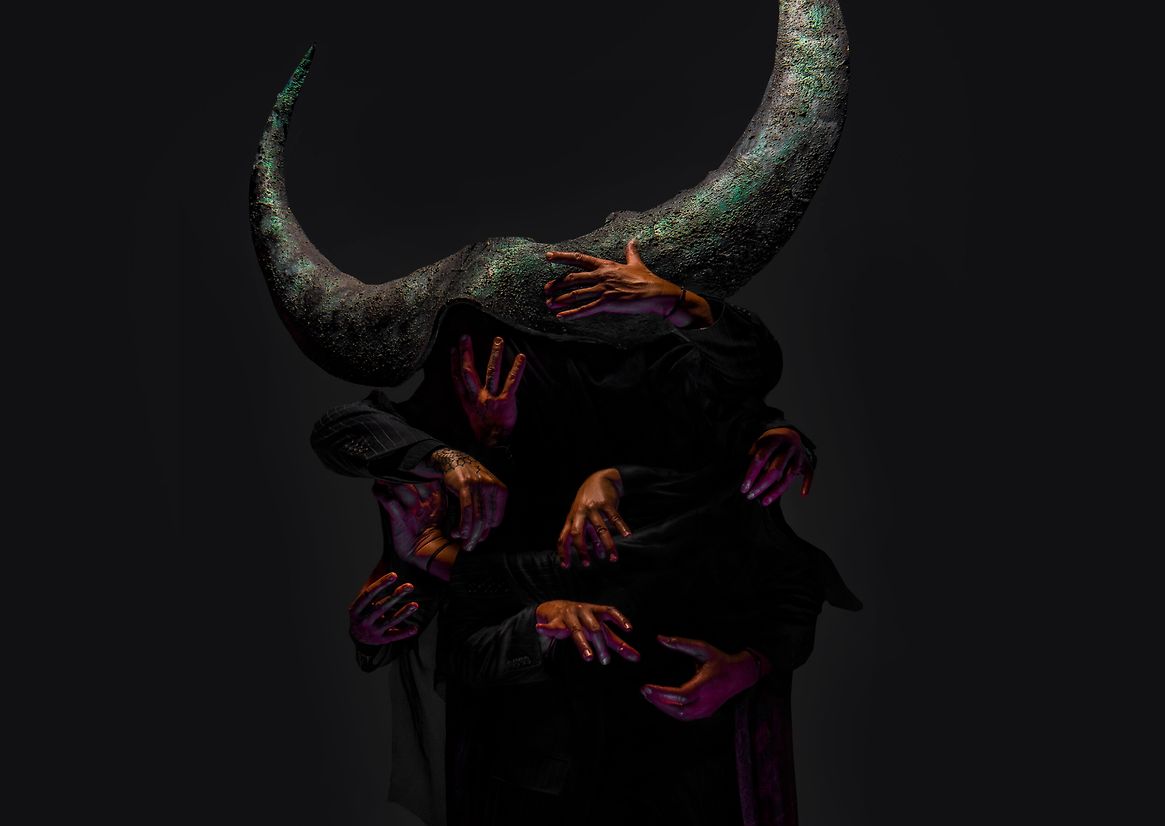
Each Body Island work, whether a film or production, has its own story and distinct visual feel. This meant their design identity needed to be both impactful and subtle, adaptable enough to work well at any size and maintain its distinctiveness, without dominating.
We approached this challenge with the principle of whanaungatanga foremost in our minds — expressing the interrelation and kinship between all elements of creation, within the living and spiritual realms. Our strategy was built on bringing fluidity and tension into the relationship between the Body Island brand and the subject matter of any particular element.
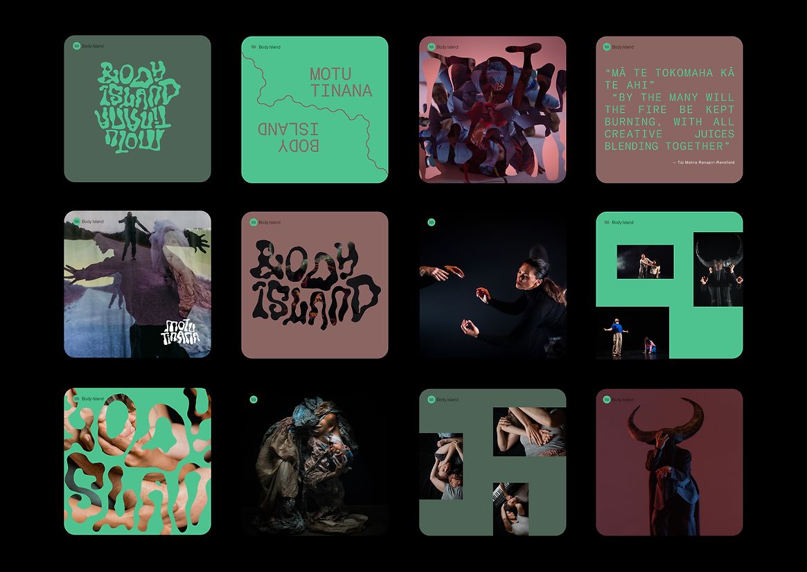
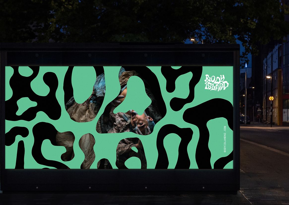
This allowed each element — conceived of as a ‘performance’ of the brand — to reflect a unique perspective. The design identity would provide the stages for these performances, imagined as fluid, inter-related islands within a cohesive whole.
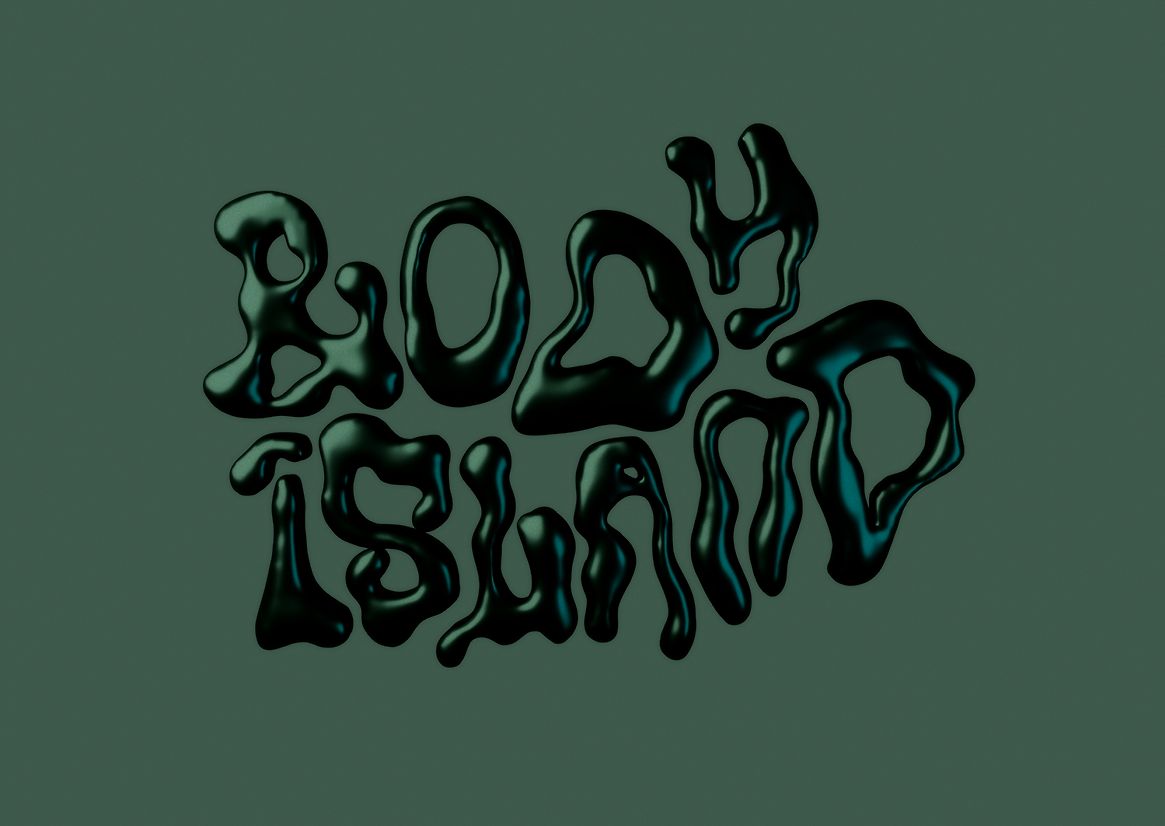
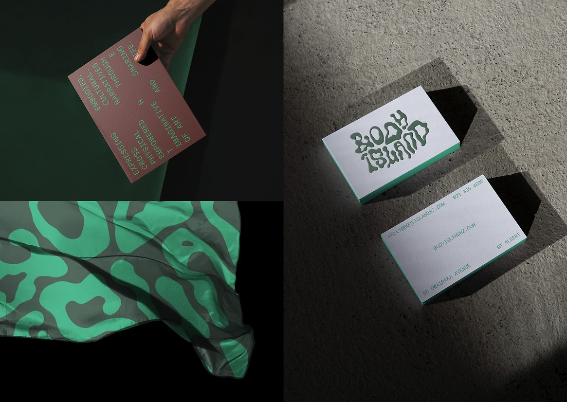
The idea of stages and performances is most strongly expressed in the twin logo marks (one in Te Reo Māori, one in English). These marks needed to work at both a micro and macro level, both identifying the brand and creating a lens into the work. The type is formed from loose, island-like shapes that are imperfect and reflect the liminal space where bodies of water and land meet — and the push and pull this creates. They also echo the movements of human bodies, referencing the dance and performance roots of the organisation.
What elevates this work for Body Island/Motu Tinana is the balanced interplay between a limited set of elements: the dynamic, graphic island shapes; the distinctive logo marks they inform; the tension within the title typography; and the quietly strong colour palette. Together, they can form any number of stages upon which the brand can perform.