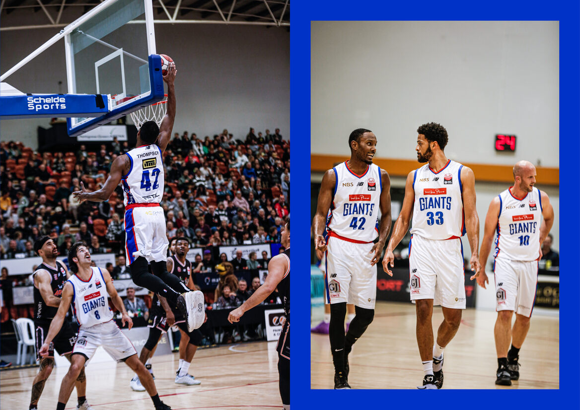
When your hometown basketball team approaches you for a new brand, marking their 40th anniversary, you don’t say no.
As the oldest team in the NZBL, the Nelson Giants needed a new brand that would honour their rich history while bringing them into the present and serving them well into the future. The brand needed to appeal to all ballers, fanatics and ‘Nelson Proud’ - both young and old. It also needed to work within league constraints and incorporate sponsor branding, with apparel and social media being the main outputs for the brand.
Starting our process with an in-depth brand strategy workshop with the client, deep-diving into the club history and future aspiration "to be the most professional amateur club in New Zealand" we focused our brand look & feel to embody ‘distinctive, fresh and established’ which drove our concept work and decision-making throughout.
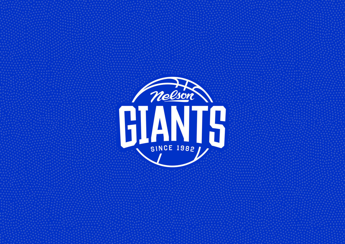
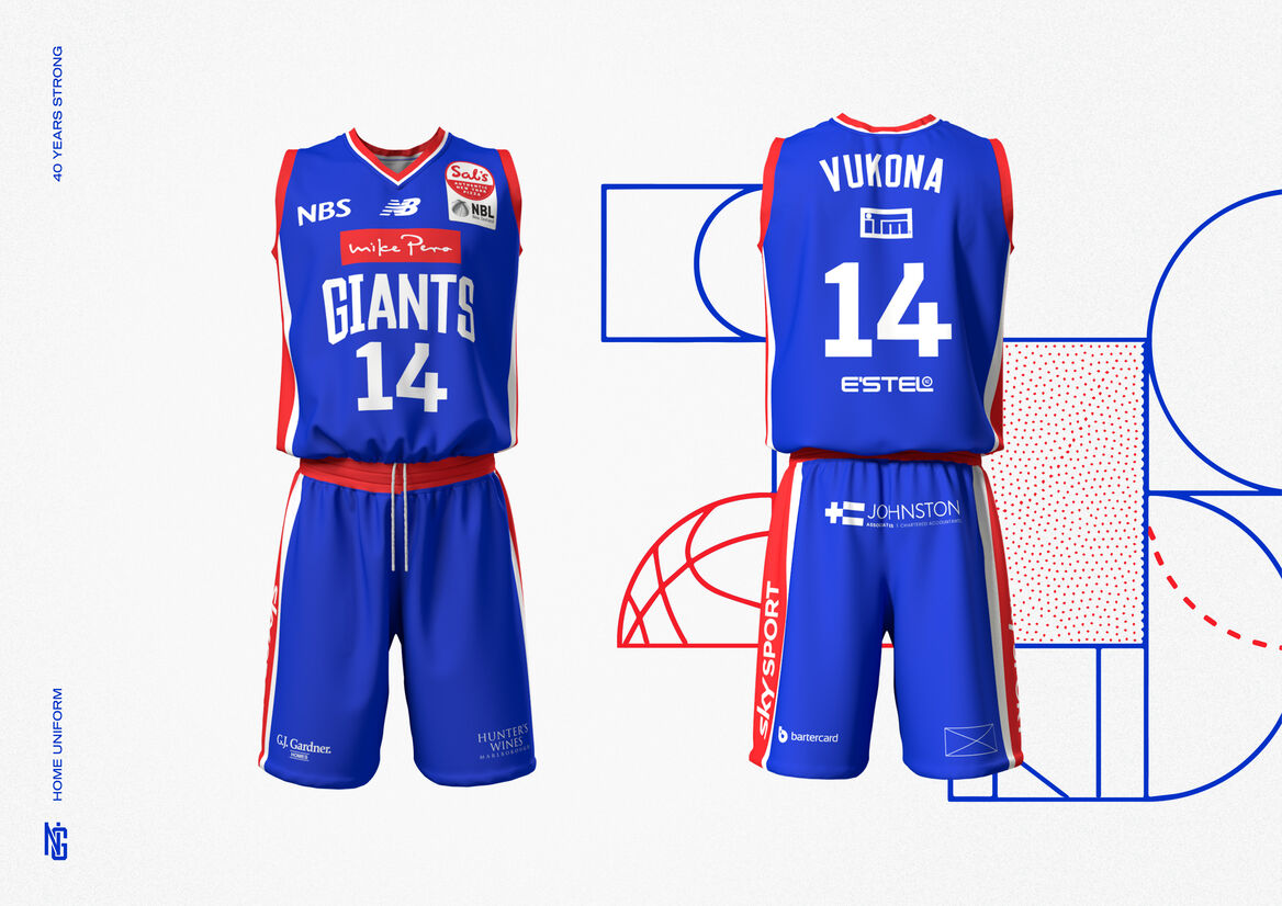
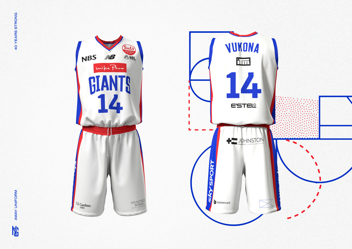
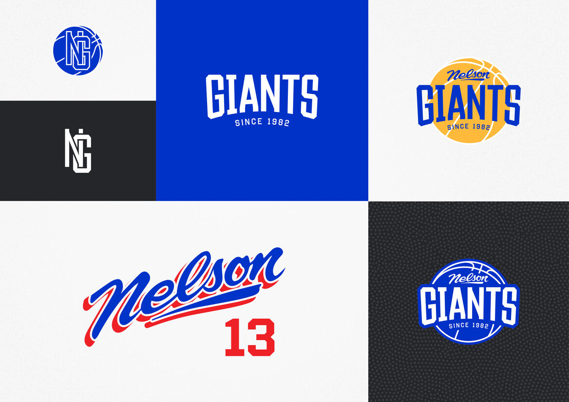
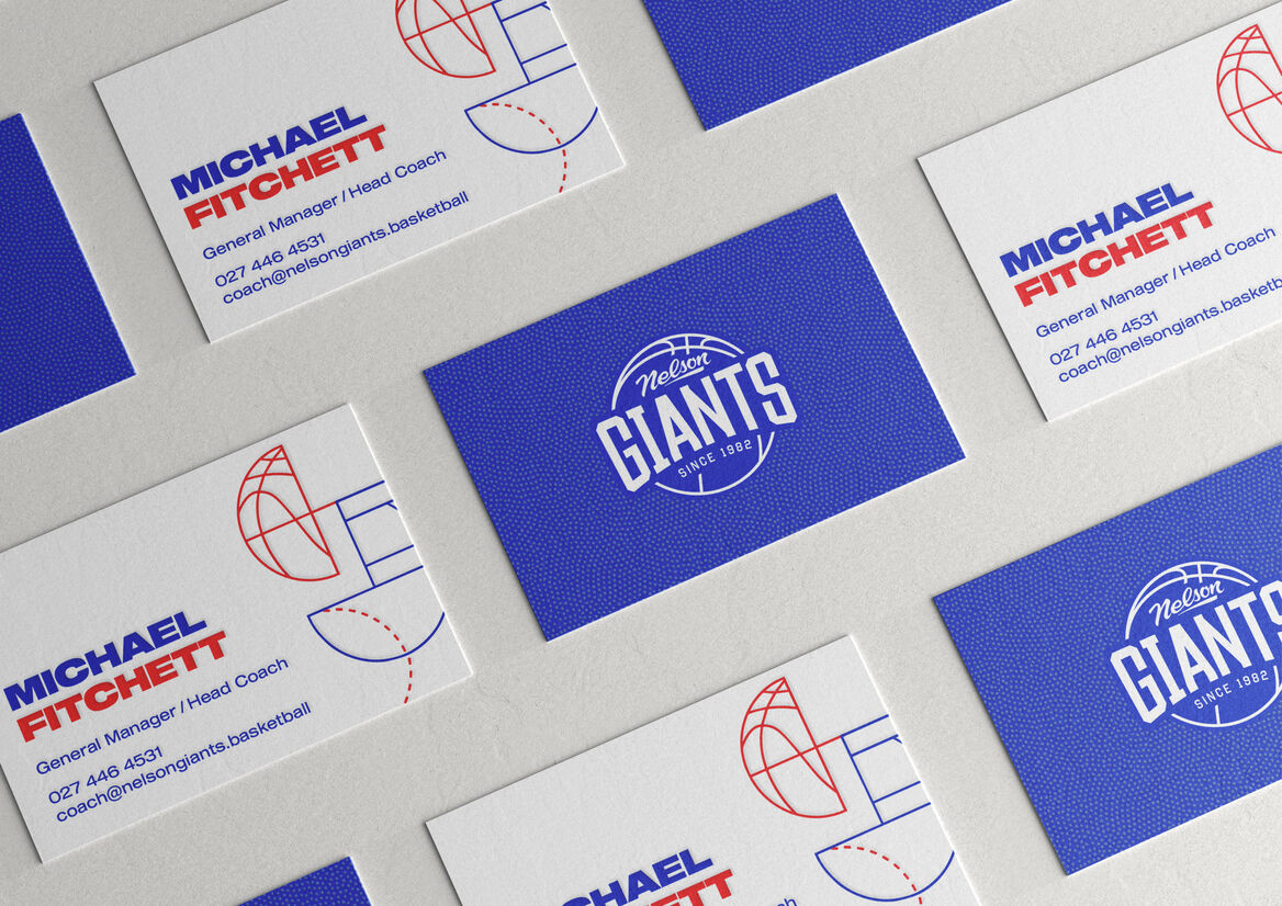
We were fortunately supplied with an epic trove of the team’s brand material and photos from the past 40 years to use as reference in their brand development. The new brand’s elongated college typeface refers to the team’s classic 1994 logo, while the custom ‘Nelson’ type is derived from the 1986 team photo placard, producing a sense of nostalgia that reflects the team’s long history in the league and connection to local business. Vibrant, primary blue and red are the new key brand colours, chosen specifically in reference to the team’s 1992 identity and to accommodate the red of long-standing sponsor, Mike Pero.
The hero logo combines the distinctive college and brush typography with clean line illustration for a modern take on the conventional ‘sports badge’ motif. Modern type treatments, including a chunky wide sans, and unconventional layouts in the broader collateral offset the wordmark’s nostalgia.
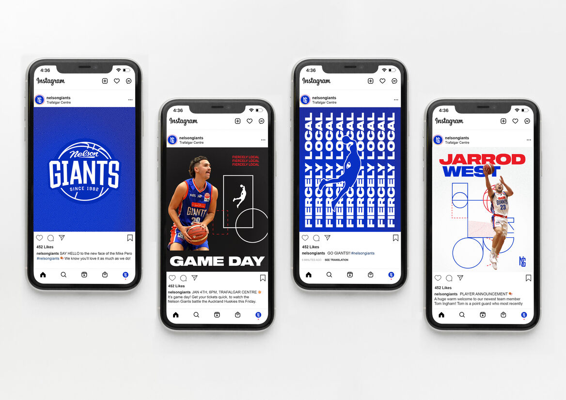
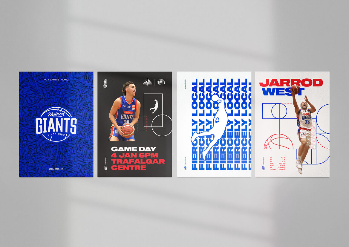
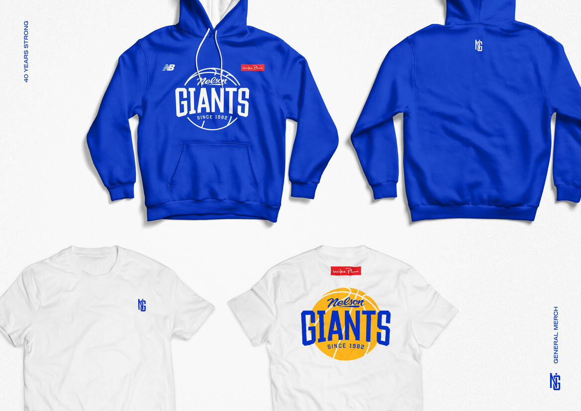
A set of robust brand guidelines ensured the standard of the brand has been maintained since handover. Apparel across a range of requirements (on / off court, home / away games, training, warmups, merch) is slick, consistent and worn proudly by the team. Easy-to-use social media templates have allowed the client to keep their online presence consistent and professional, with added pops of brand personality such as the animated logo.
The new Nelson Giants brand is modern and memorable, making a distinct impression in every instance of its use and doing the team, and all Nelsonians, proud.

Description:
When your hometown basketball team approaches you for a new brand, marking their 40th anniversary, you don’t say no.
As the oldest team in the NZBL, the Nelson Giants needed a new brand that would honour their rich history while bringing them into the present and serving them well into the future. The brand needed to appeal to all ballers, fanatics and ‘Nelson Proud’ - both young and old. It also needed to work within league constraints and incorporate sponsor branding, with apparel and social media being the main outputs for the brand.
Starting our process with an in-depth brand strategy workshop with the client, deep-diving into the club history and future aspiration "to be the most professional amateur club in New Zealand" we focused our brand look & feel to embody ‘distinctive, fresh and established’ which drove our concept work and decision-making throughout.
We were fortunately supplied with an epic trove of the team’s brand material and photos from the past 40 years to use as reference in their brand development. The new brand’s elongated college typeface refers to the team’s classic 1994 logo, while the custom ‘Nelson’ type is derived from the 1986 team photo placard, producing a sense of nostalgia that reflects the team’s long history in the league and connection to local business. Vibrant, primary blue and red are the new key brand colours, chosen specifically in reference to the team’s 1992 identity and to accommodate the red of long-standing sponsor, Mike Pero.
The hero logo combines the distinctive college and brush typography with clean line illustration for a modern take on the conventional ‘sports badge’ motif. Modern type treatments, including a chunky wide sans, and unconventional layouts in the broader collateral offset the wordmark’s nostalgia.
A set of robust brand guidelines ensured the standard of the brand has been maintained since handover. Apparel across a range of requirements (on / off court, home / away games, training, warmups, merch) is slick, consistent and worn proudly by the team. Easy-to-use social media templates have allowed the client to keep their online presence consistent and professional, with added pops of brand personality such as the animated logo.
The new Nelson Giants brand is modern and memorable, making a distinct impression in every instance of its use and doing the team, and all Nelsonians, proud.