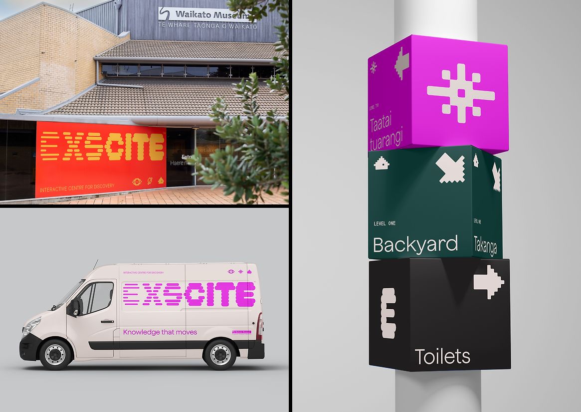
Housed in Te Whare Taonga o Waikato / Waikato Museum, Exscite is a permanent multi-level interactive education science exhibition. It provides a learning experience in an exciting and engaging tactile environment - allowing people of all ages to explore, discover and play.
A physical refresh of the Exscite science gallery space represented an opportunity to update the visual identity and establish a brand that embodied the goals of the site redesign: curriculum coverage, Maatauranga Maaori and contextual ties between concepts. The new Exscite brand also needed to invite curiosity and delight, prompting children and adults alike to explore, play and learn.
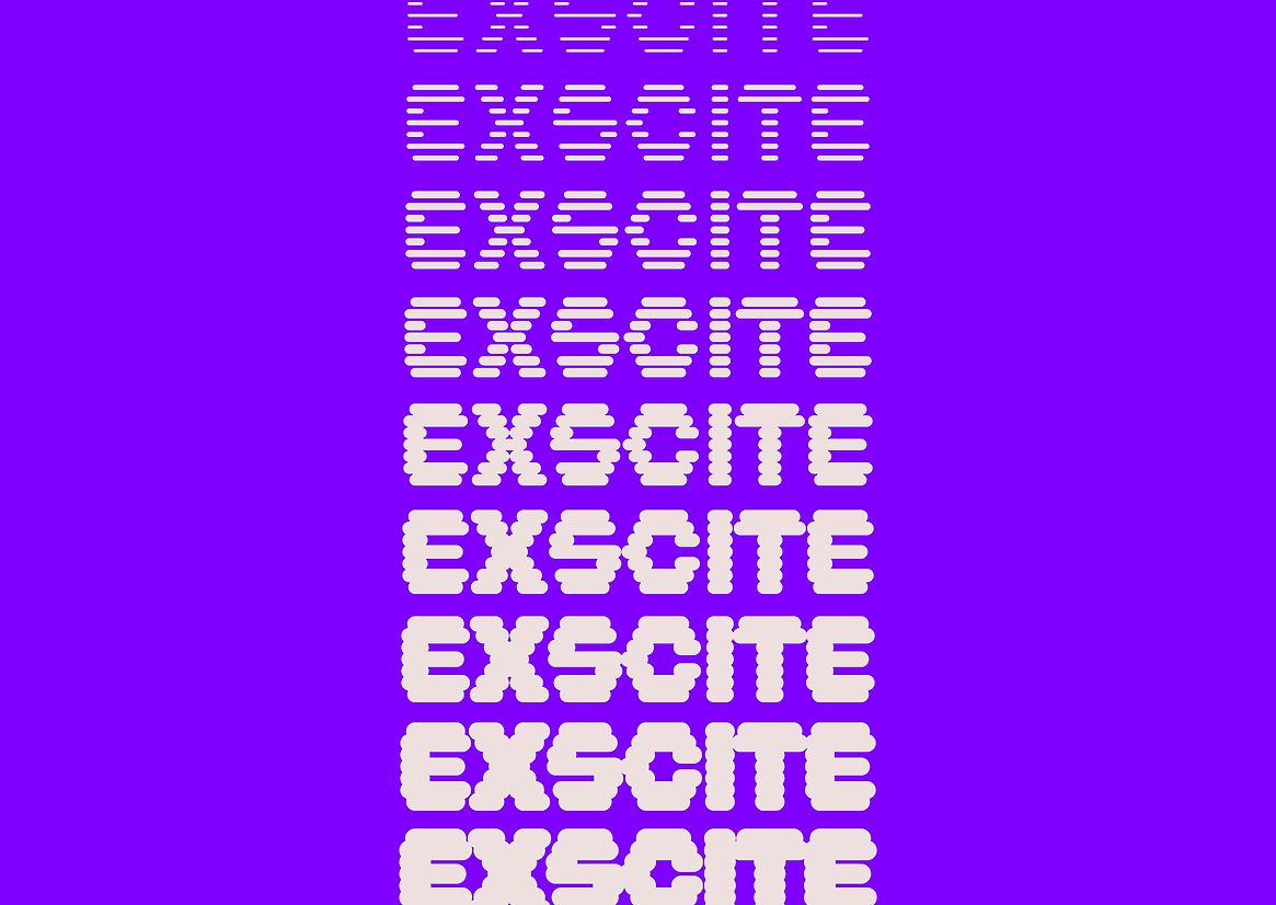
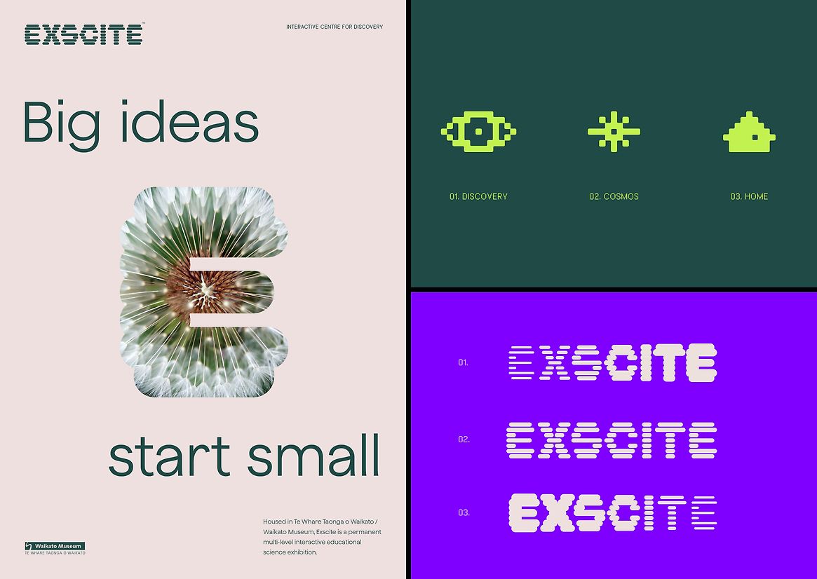
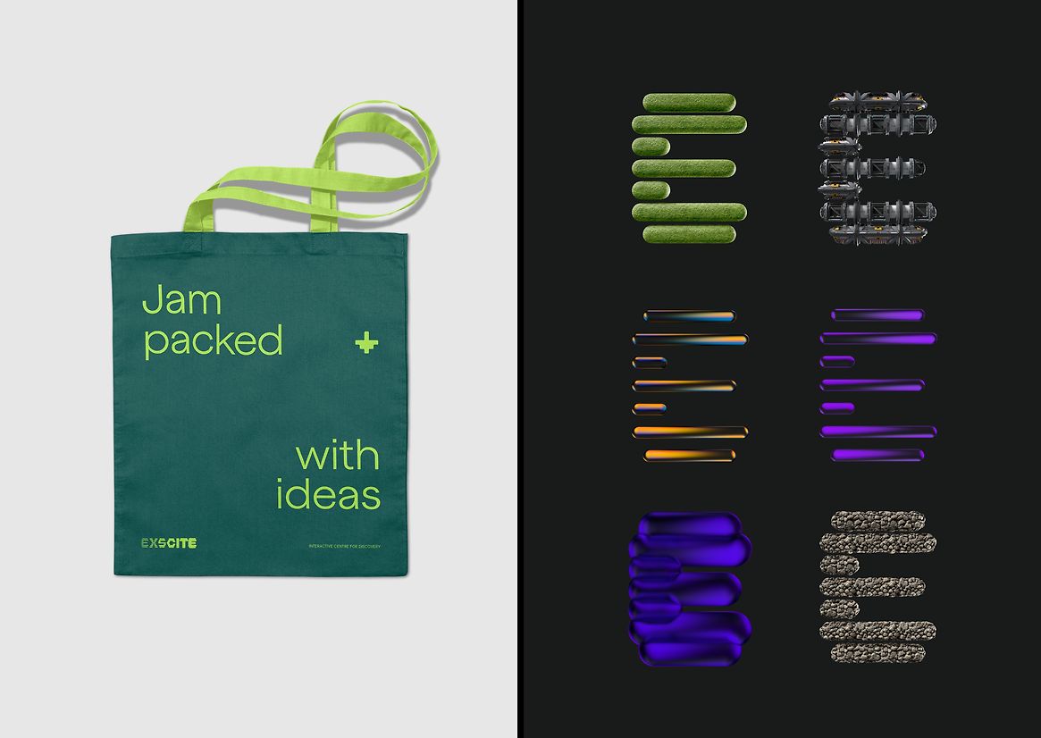
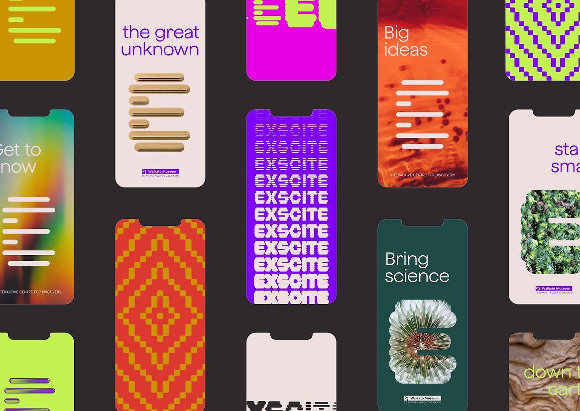
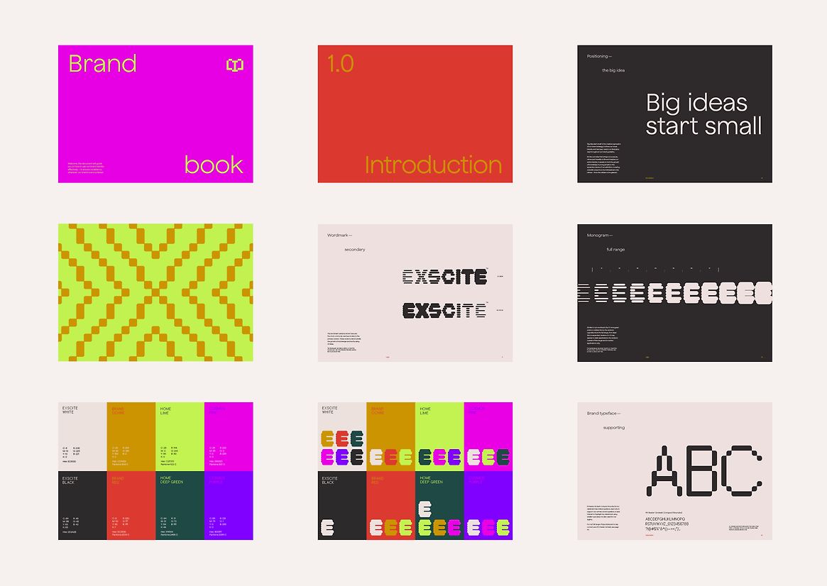
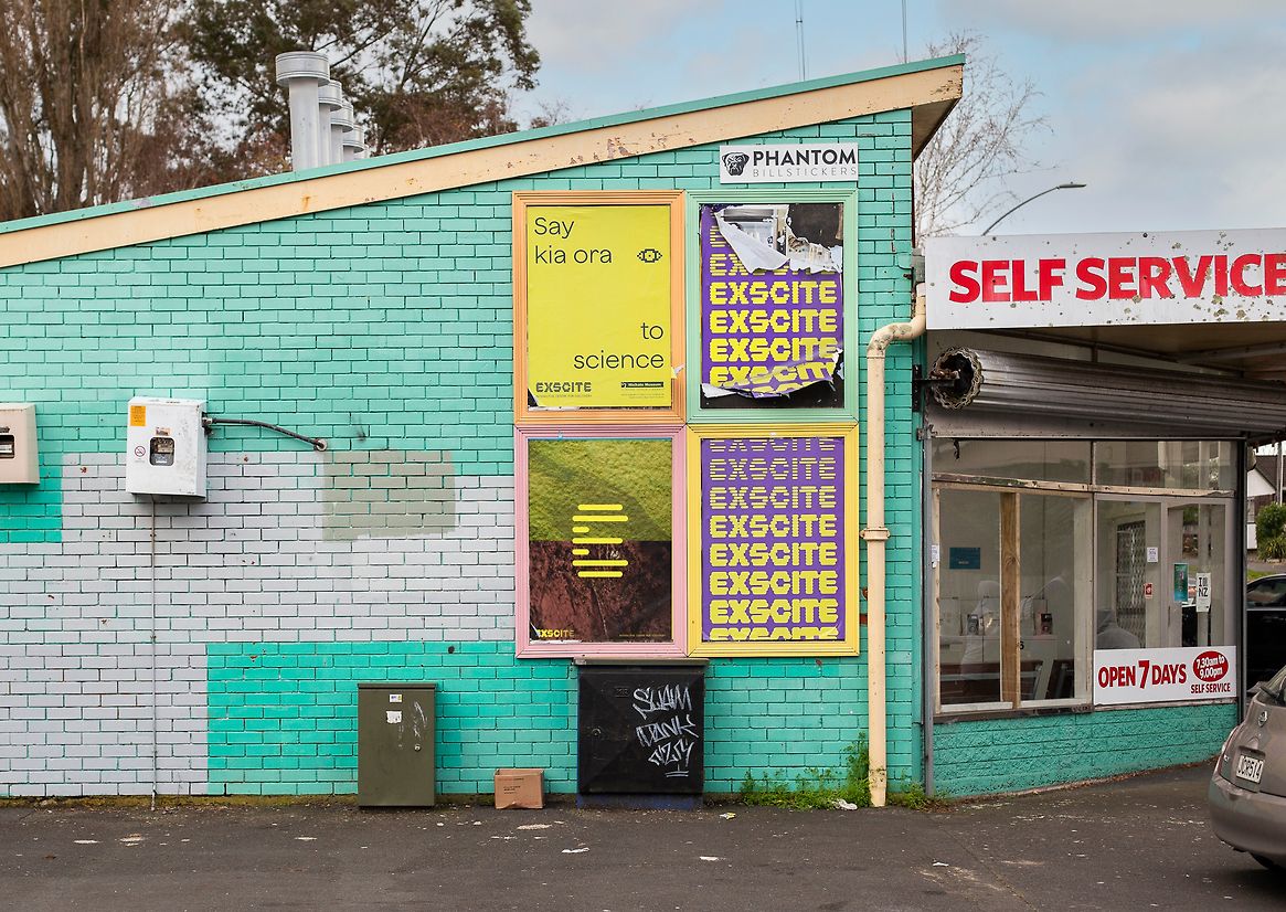
The Exscite wordmark is dynamic, experimental and playful. It leverages the breadth of Exscite’s exhibition space into a wordmark that can scale from laser thin to fully expanded. In its multiple and changing forms it demonstrates the ‘scale of the universe’ concept for the new space. The iconic nature of the ‘E’ lends itself to a monogram that is also used in a range of weights and further expanded into 3D rendered iterations, showcasing materials related to the current exhibit.
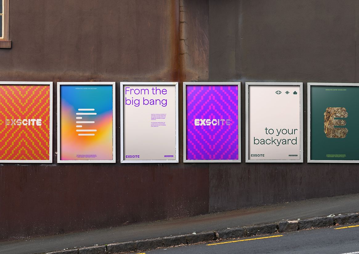
Exscite wanted to present the science curriculum areas (Material World, Living World, Planet Earth and Beyond) as layers, with each layer composed of the building blocks of the previous layer. Complexity builds, but remains connected. This connection and cyclical nature of all things is fundamental to Maatauranga Maaori.
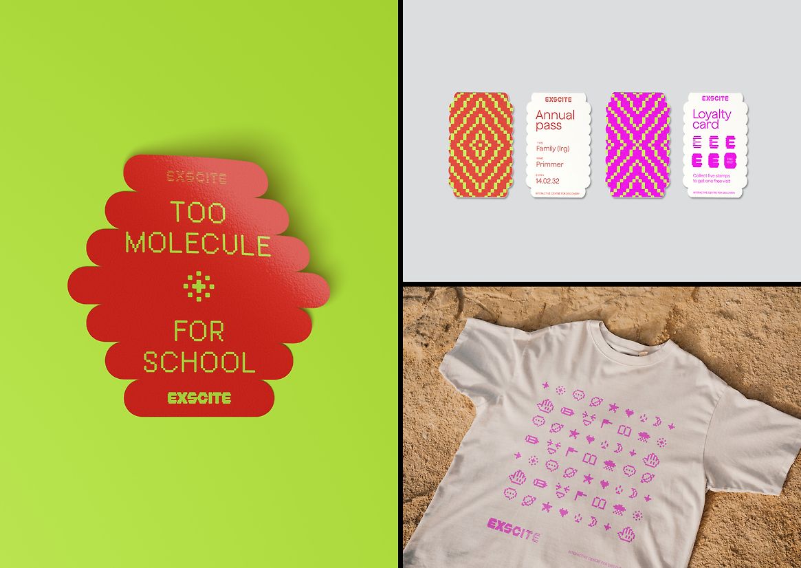
A ‘pixelated’ theme is introduced in the icons, patterns and some type, referencing the creation of something larger or more complex from smaller elements. With three main icons for ‘discovery’, ‘cosmos’ and ‘home’ and a comprehensive suite of supporting icons, these assets allow the rest of the brand to remain clean and minimal while still providing context, fun and intrigue.
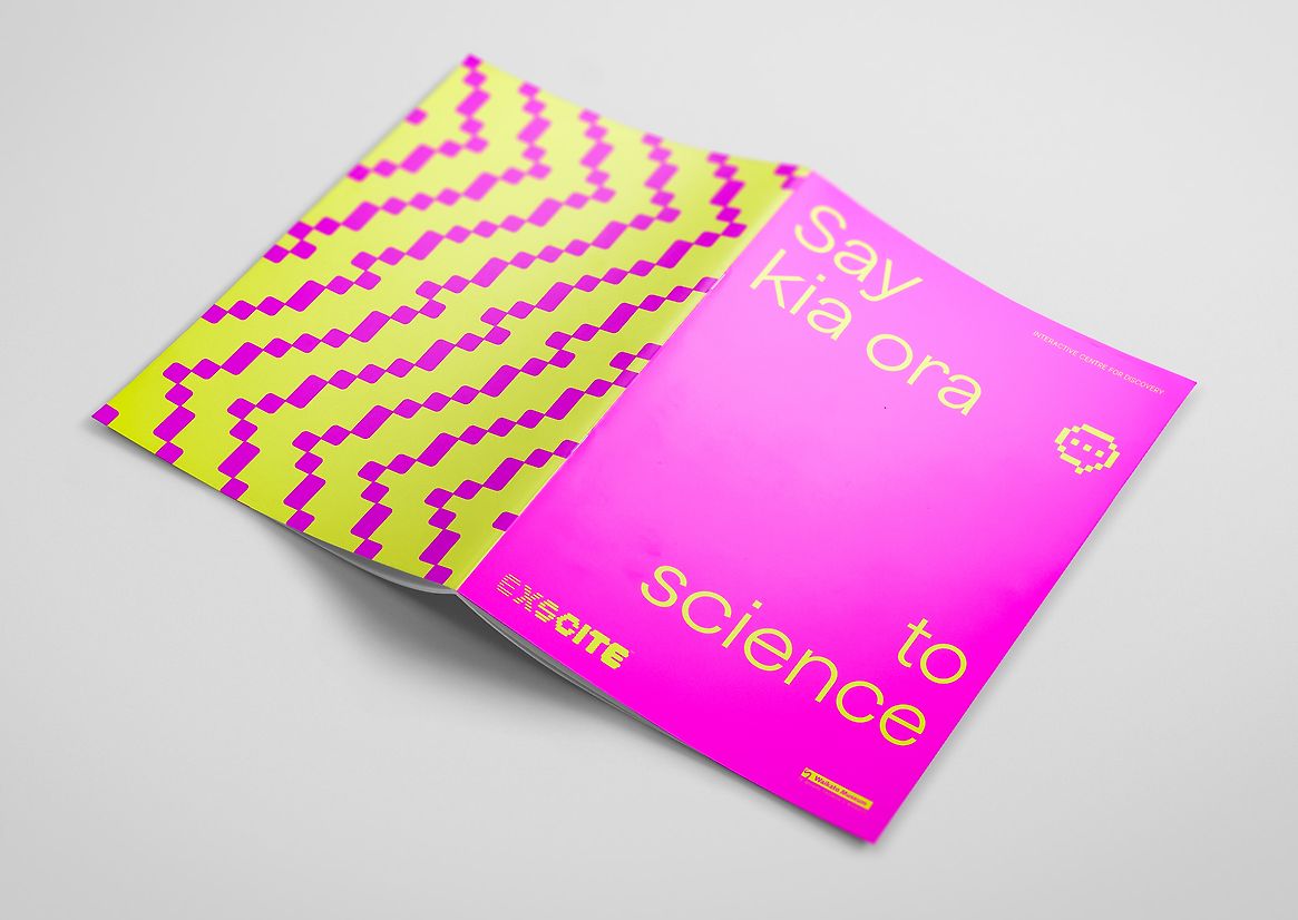
The colour palette is varied and bright to tick the playful box and excite Exscite’s main audience: kids. The swatches are typically paired together with two warm colours for the brand itself, two greens for ‘backyard’ and vivid pink and purple for ‘cosmos’.
Exscite’s new brand has breathed some new life into a facility that is well-known and loved by Hamilton families. It is bold and inspiring, attracting visitors to not only explore the extensive exhibition but the little things in their own backyard too. Big ideas start small.
Description:
Housed in Te Whare Taonga o Waikato / Waikato Museum, Exscite is a permanent multi-level interactive education science exhibition. It provides a learning experience in an exciting and engaging tactile environment - allowing people of all ages to explore, discover and play.
A physical refresh of the Exscite science gallery space represented an opportunity to update the visual identity and establish a brand that embodied the goals of the site redesign: curriculum coverage, Maatauranga Maaori and contextual ties between concepts. The new Exscite brand also needed to invite curiosity and delight, prompting children and adults alike to explore, play and learn.
The Exscite wordmark is dynamic, experimental and playful. It leverages the breadth of Exscite’s exhibition space into a wordmark that can scale from laser thin to fully expanded. In its multiple and changing forms it demonstrates the ‘scale of the universe’ concept for the new space. The iconic nature of the ‘E’ lends itself to a monogram that is also used in a range of weights and further expanded into 3D rendered iterations, showcasing materials related to the current exhibit.
Exscite wanted to present the science curriculum areas (Material World, Living World, Planet Earth and Beyond) as layers, with each layer composed of the building blocks of the previous layer. Complexity builds, but remains connected. This connection and cyclical nature of all things is fundamental to Maatauranga Maaori.
A ‘pixelated’ theme is introduced in the icons, patterns and some type, referencing the creation of something larger or more complex from smaller elements. With three main icons for ‘discovery’, ‘cosmos’ and ‘home’ and a comprehensive suite of supporting icons, these assets allow the rest of the brand to remain clean and minimal while still providing context, fun and intrigue.
The colour palette is varied and bright to tick the playful box and excite Exscite’s main audience: kids. The swatches are typically paired together with two warm colours for the brand itself, two greens for ‘backyard’ and vivid pink and purple for ‘cosmos’.
Exscite’s new brand has breathed some new life into a facility that is well-known and loved by Hamilton families. It is bold and inspiring, attracting visitors to not only explore the extensive exhibition but the little things in their own backyard too. Big ideas start small.