Graphic
Daylight 25 Fair Food
-
Pou Auaha / Creative Director
Charlie Godinet -
Pou Rautaki / Strategic Leads
Lee Lowndes, Kristen Morris, Zoe Scheltema
-
Ringatoi Matua / Design Director
Billy Baxter -
Kaituhi Matua / Copywriter Leads
Scott Moyes, Bronwyn Mackay
-
Ngā Kaimahi / Team Members
Antalya Atkinson, Yi Lau, Conal Wilson, Ezra Whittaker-Powley -
Kaitautoko / Contributors
Geoffery Matautia, Kimberley Torrie -
Client
Fair Food
Description:
Fair Food is a not-for-profit dedicated to tackling food insecurity in Aotearoa. Despite producing enough food for 40 million people, over 40% of New Zealanders face inadequate access to kai, while a third of this goes to waste. Fair Food rescues this kai from major supermarkets before it expires, redistributing it to community groups and families in need.
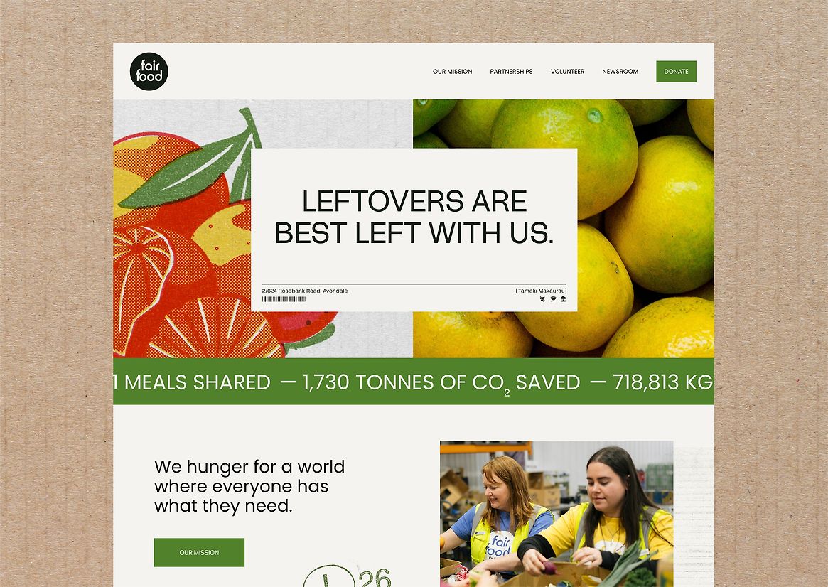
With waste and inequity rates still rising, Fair Food needed a new brand identity to increase its visibility and make a greater impact. It had to encompass all touchpoints - from website and volunteer recruitment, through to annual reports and funding applications - reinforcing their mission of feeding people, not landfill.
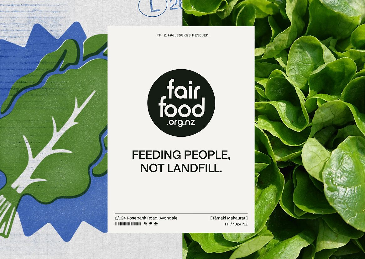
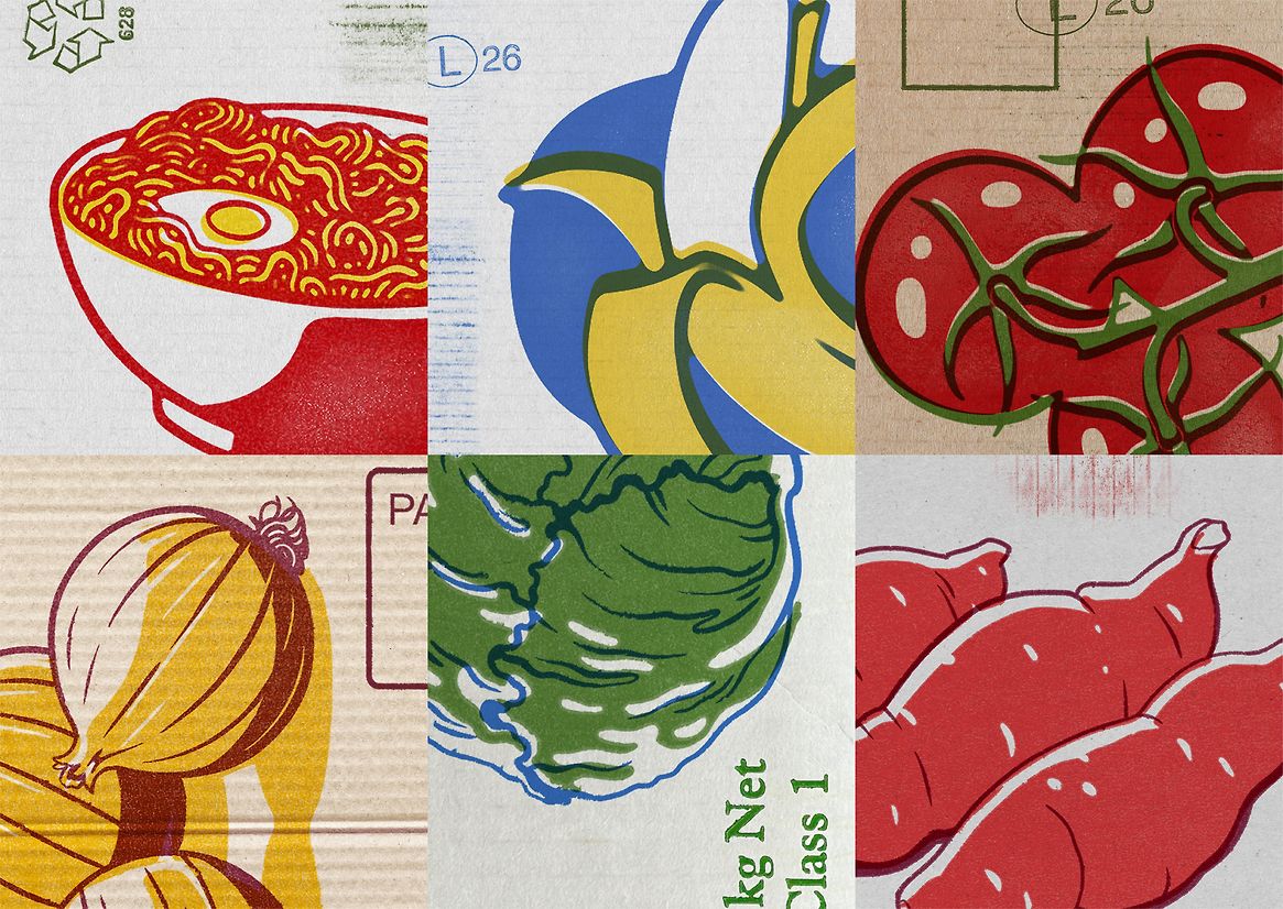
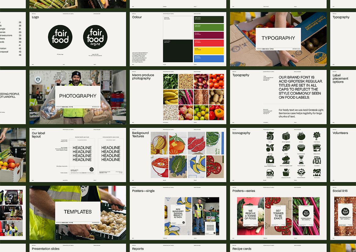
The idea was to create a brand identity packed with purpose by rescuing and recycling aesthetics from bulk food packaging. This was to acknowledge the tonnes of kai saved every day, instilling the Fair Food kaupapa in every design element.
Over the course of a month, we tracked the most common items of packaging entering the warehouse, using this as a conceptual starting point to forge the identity.
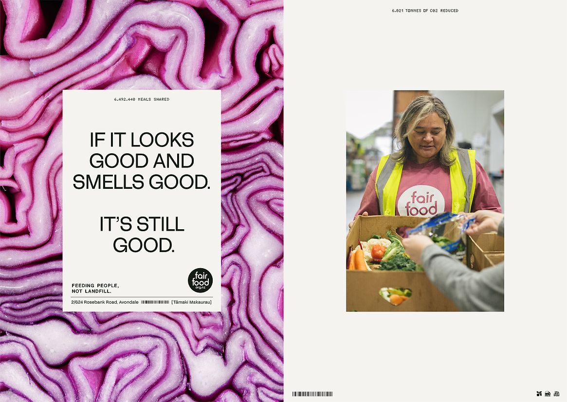
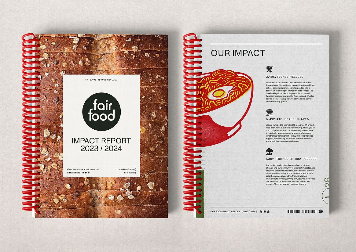
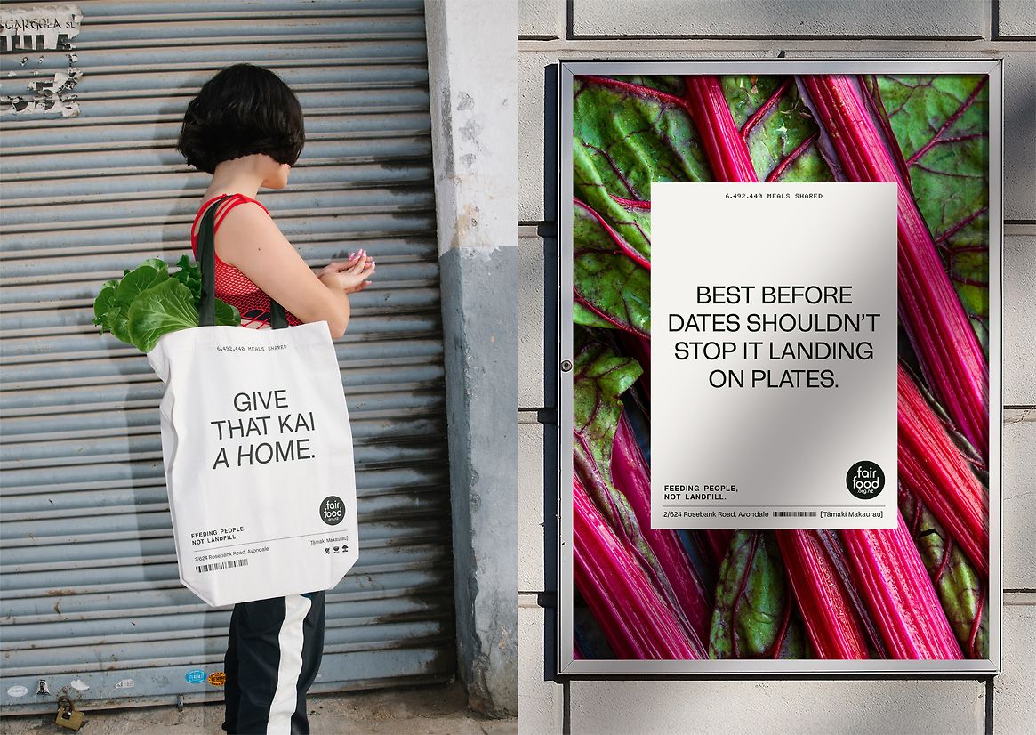
At the heart of this design system is a central label, inspired by the industrial labelling found on pallets from major manufacturers. Monochromatic for maximum clarity, this graphic device holds all of Fair Food’s essential messaging, delivered in an intentionally stripped-back sans serif typeface. This is accompanied by a secondary bit-dot font, taken from best-before stamps and a set of bespoke iconography based on ingredient markings.
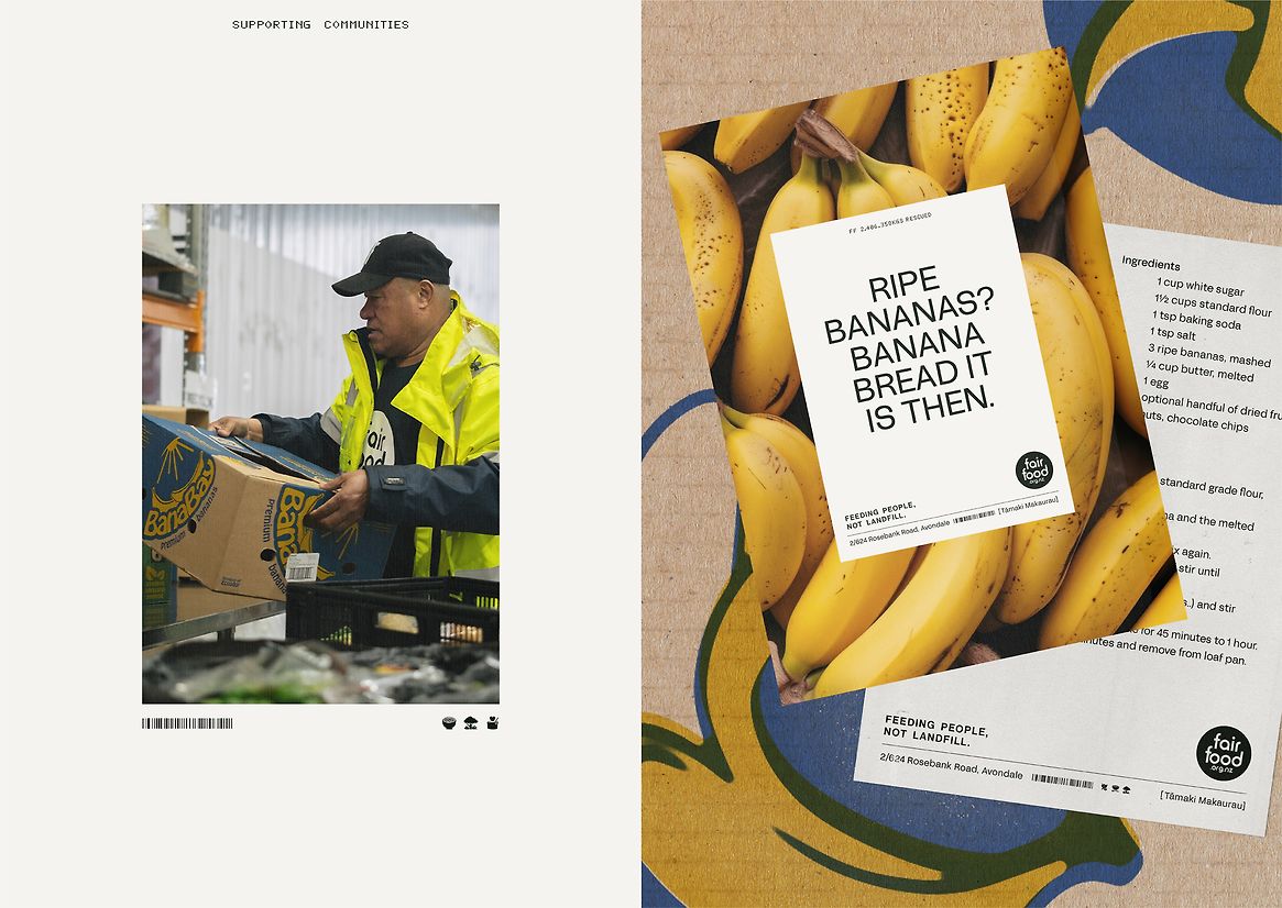
An illustrative world was crafted from the hundreds of fruit and vegetable boxes unpacked daily, creating a seasonal library of illustration. This selection of hand-drawn produce was then reapplied to cardboard, giving this identity a truly textural feel. Core colours were also sampled from these flexographically printed corrugated boxes, in which the ink soaks in – giving the new colour palette a muted quality, and allowing for brightness to stem from stunning photography.
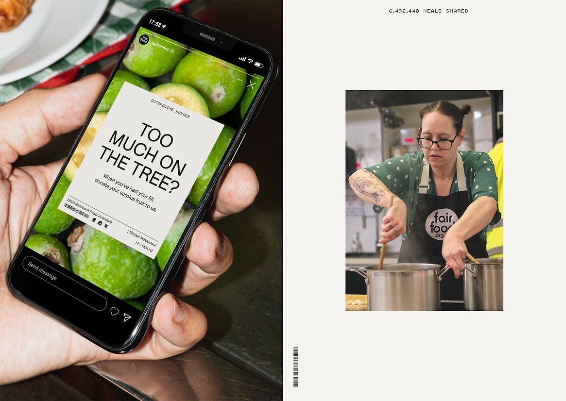
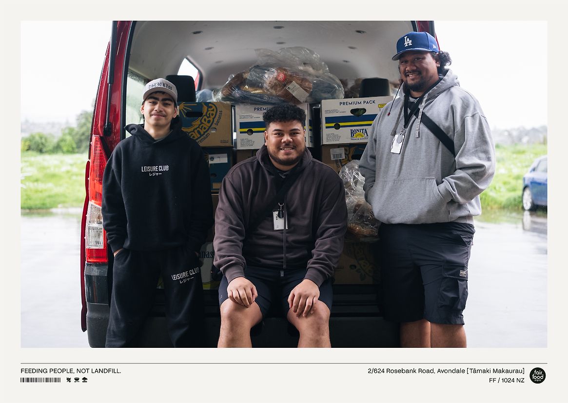
Two different photographic streams complete this brand identity, captured at Fair Food’s very own HQ. Firstly, macro food shots that showcase the freshness of the kai being served, breaking the stigma that surrounds food rescue. Secondly, documentary-style photography of Fair Food’s people and volunteers in action, highlighting every facet of their process.
Launching at the start of 2025, this brand identity is already hard at work. From crucial partner presentations that have helped rescue 278,284kgs of precious kai and counting, all the way through to staff T-shirts that unite the team.
The effects of Fair Food’s new brand can also be felt in their campaigns, including their hugely successful Mother’s Day drive. This initiative supported over 100 struggling mums and their children, ensuring it was a day of celebration in times of hardship.