Yehalae came to us as a start-up with a vision and energy that’s rare even for start-ups. With a passion for health and a nose for seeking out the fun in absolutely everything, the founding duo were sick of having to choose between the ‘good-for-you but un-fun’ options, and the ‘fun, flavourful but unhealthy’ ones. Recognising it can be hard to live life to the full while sticking to your health goals, Yehalae wanted to deliver both the fun AND the healthy. With clean alternatives to favourite tasty treats, people can say yes to the things they love. No dairy, no gluten, no nasties: just good clean fun.
Let’s be honest, many new generation brands take themself too seriously – particularly in the “free-from”, sustainable and wellness space. And it’s no wonder: we take our health seriously! But Yehalae saw an opportunity to break this mould. To stand out from its competitors by being a health-focused brand that has something else to offer alongside its clean, healthy image: a personality.
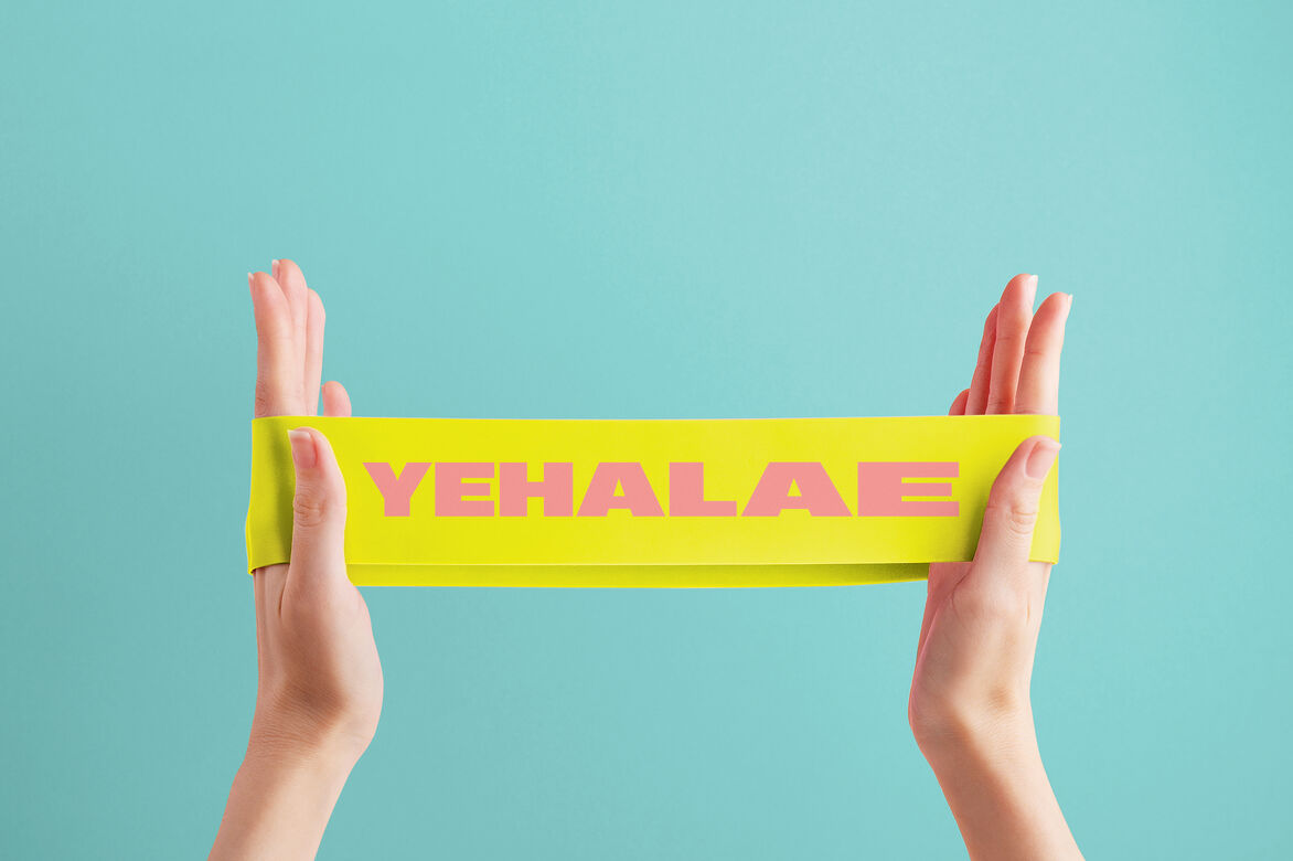
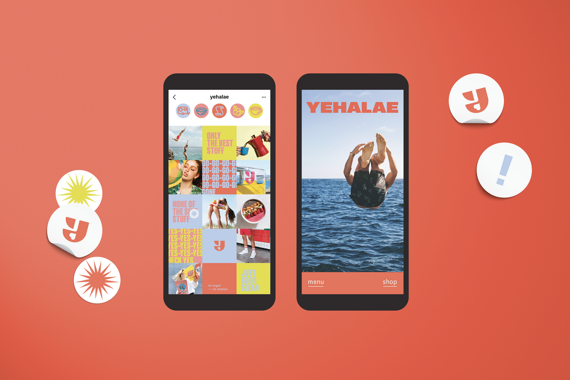
Tasked with bringing the brand to life, we landed on the driving idea of ‘Good Clean Fun’. This became the mantra for the design programme, realised by integrating a vibrant colour palette, off-beat imagery that evokes vitality and dynamism, and bold, graphic branding. In order to enable Yehalae’s personality to shine through, we broke with traditional conventions, designing the contemporary sans serif font name with the ability to take on any hue in the brand’s colour palette.
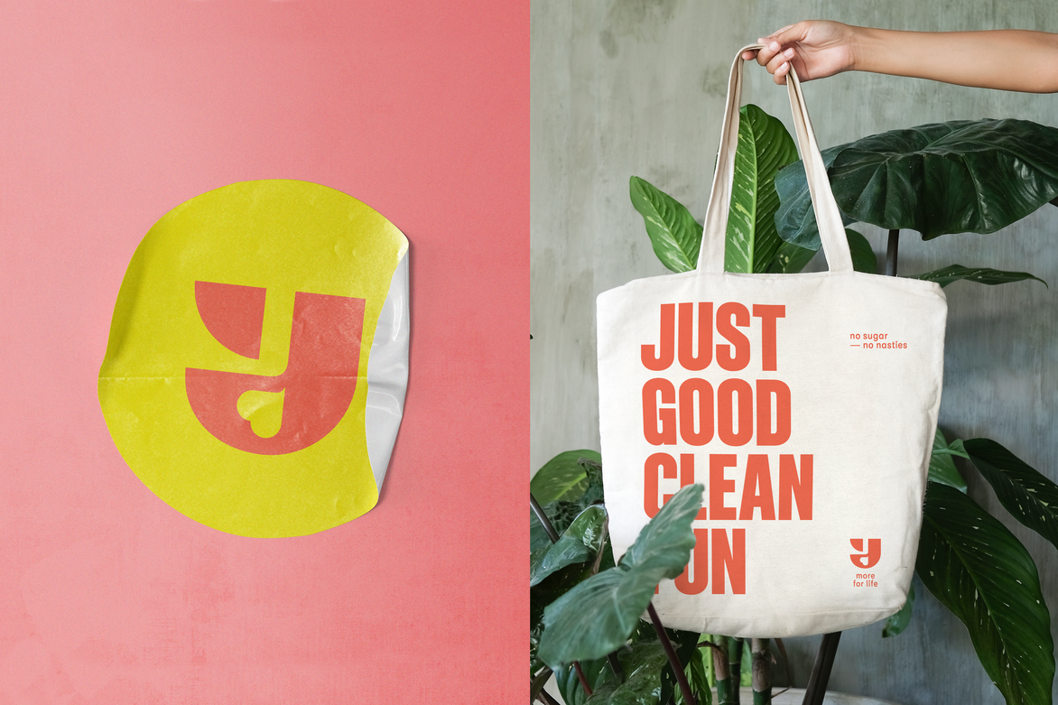
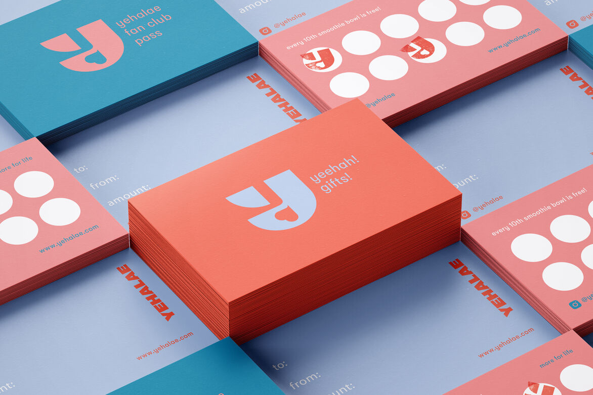
An additional distinctive brand asset – a ‘Y’ monogram – was designed to have flexible use, either in conjunction with the main branding or alone as a ‘teaser’ icon. These components became the ‘control’ design foundation, around which the lively imagery, typography and tone of voice was built.
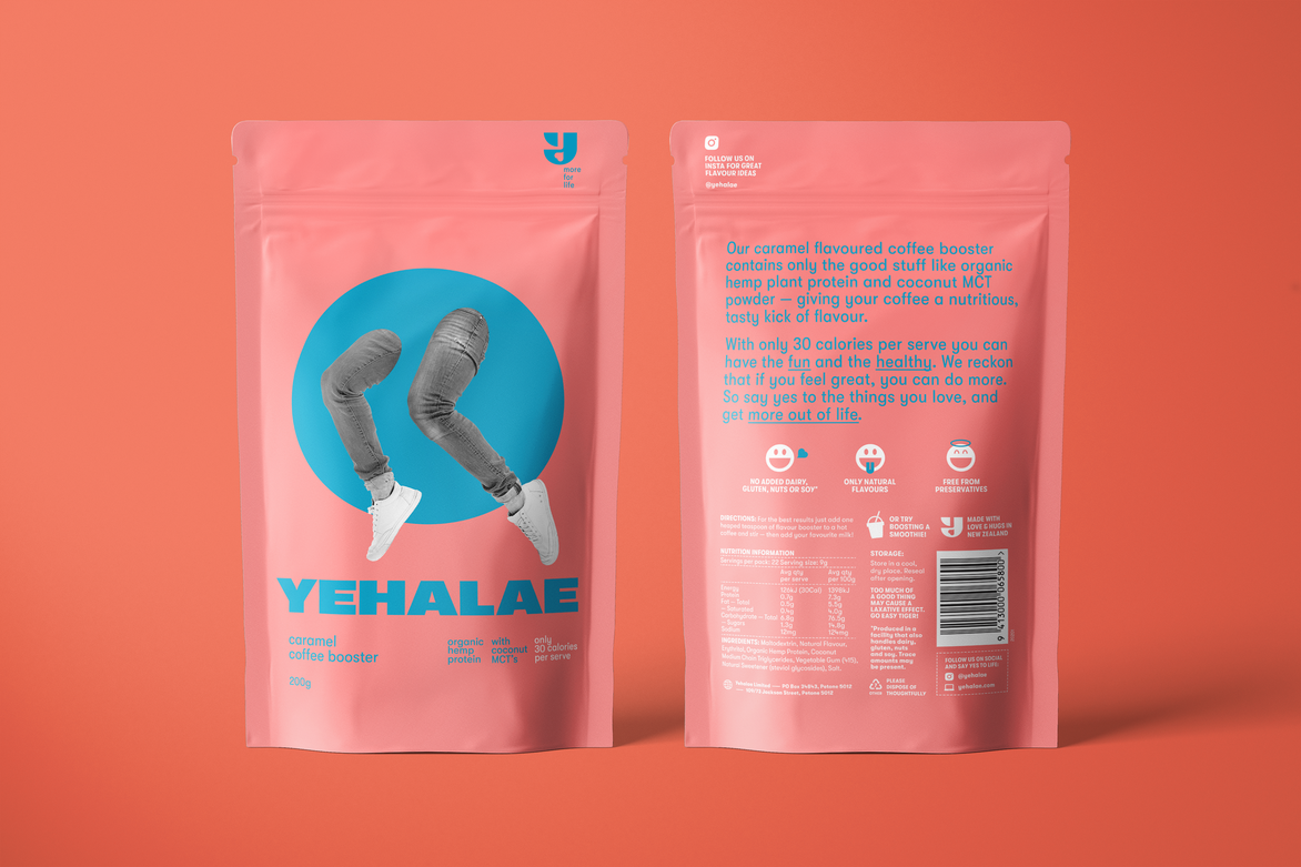
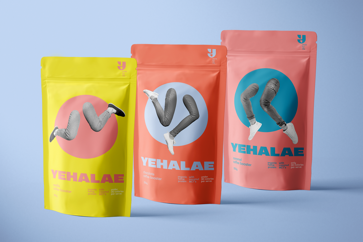
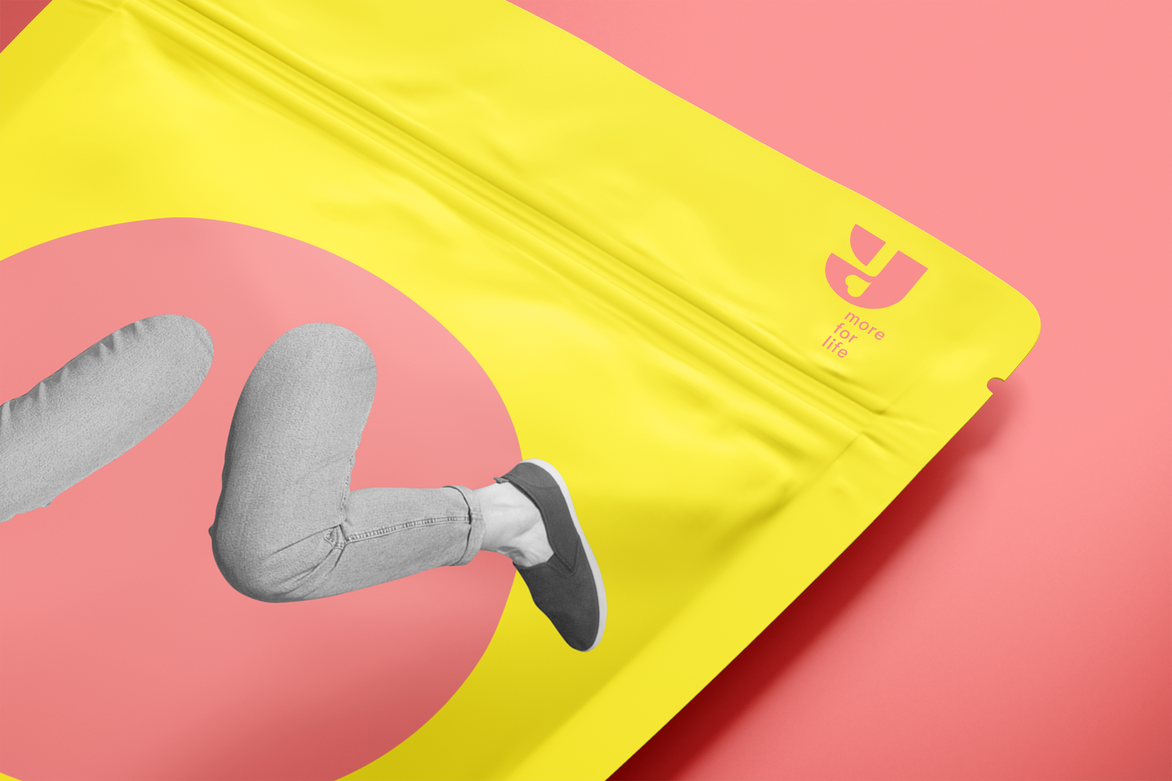
This design strategy was brought to life through the Coffee Booster packaging first. With a dynamic presentation in mind, each flavour was allocated a key colour from the brand palette. Elements of fun and health were then introduced in a whimsical tone. With a view to add an active, human touch – but avoid boxing ourselves into any certain demographic – we developed a collage with different posed legs to create the desired effect in a surreal, contemporary way. The legs in tones of black added an attitude which dovetailed perfectly with the vibrant, contemporary variant colours.
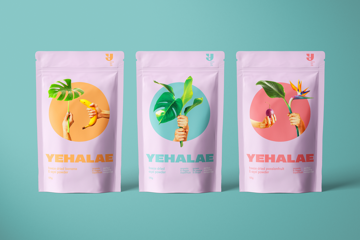
This thinking was then switched up on the Acai Powder packaging, where a more muted background colour was complemented by vibrant imagery featuring collaged hands and plant life. This reflected the natural ingredients of the product, while retaining the surreal and creative feel of the brand. The design programme was completed with various forms of consumer communications, combining the different graphic elements with lifestyle imagery.
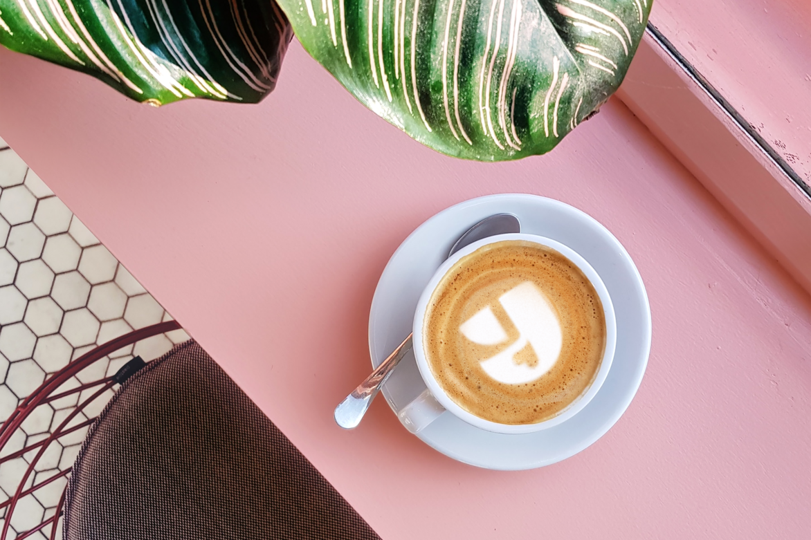
Selling online and in cafes, the brand leapt into the market late last year and are delighting café-goers and home coffee lovers everywhere with their exuberant and tasty approach to drinks – and life.
Description:
Yehalae came to us as a start-up with a vision and energy that’s rare even for start-ups. With a passion for health and a nose for seeking out the fun in absolutely everything, the founding duo were sick of having to choose between the ‘good-for-you but un-fun’ options, and the ‘fun, flavourful but unhealthy’ ones. Recognising it can be hard to live life to the full while sticking to your health goals, Yehalae wanted to deliver both the fun AND the healthy. With clean alternatives to favourite tasty treats, people can say yes to the things they love. No dairy, no gluten, no nasties: just good clean fun.
Let’s be honest, many new generation brands take themself too seriously – particularly in the “free-from”, sustainable and wellness space. And it’s no wonder: we take our health seriously! But Yehalae saw an opportunity to break this mould. To stand out from its competitors by being a health-focused brand that has something else to offer alongside its clean, healthy image: a personality.
Tasked with bringing the brand to life, we landed on the driving idea of ‘Good Clean Fun’. This became the mantra for the design programme, realised by integrating a vibrant colour palette, off-beat imagery that evokes vitality and dynamism, and bold, graphic branding. In order to enable Yehalae’s personality to shine through, we broke with traditional conventions, designing the contemporary sans serif font name with the ability to take on any hue in the brand’s colour palette.
An additional distinctive brand asset – a ‘Y’ monogram – was designed to have flexible use, either in conjunction with the main branding or alone as a ‘teaser’ icon. These components became the ‘control’ design foundation, around which the lively imagery, typography and tone of voice was built.
This design strategy was brought to life through the Coffee Booster packaging first. With a dynamic presentation in mind, each flavour was allocated a key colour from the brand palette. Elements of fun and health were then introduced in a whimsical tone. With a view to add an active, human touch – but avoid boxing ourselves into any certain demographic – we developed a collage with different posed legs to create the desired effect in a surreal, contemporary way. The legs in tones of black added an attitude which dovetailed perfectly with the vibrant, contemporary variant colours.
This thinking was then switched up on the Acai Powder packaging, where a more muted background colour was complemented by vibrant imagery featuring collaged hands and plant life. This reflected the natural ingredients of the product, while retaining the surreal and creative feel of the brand.
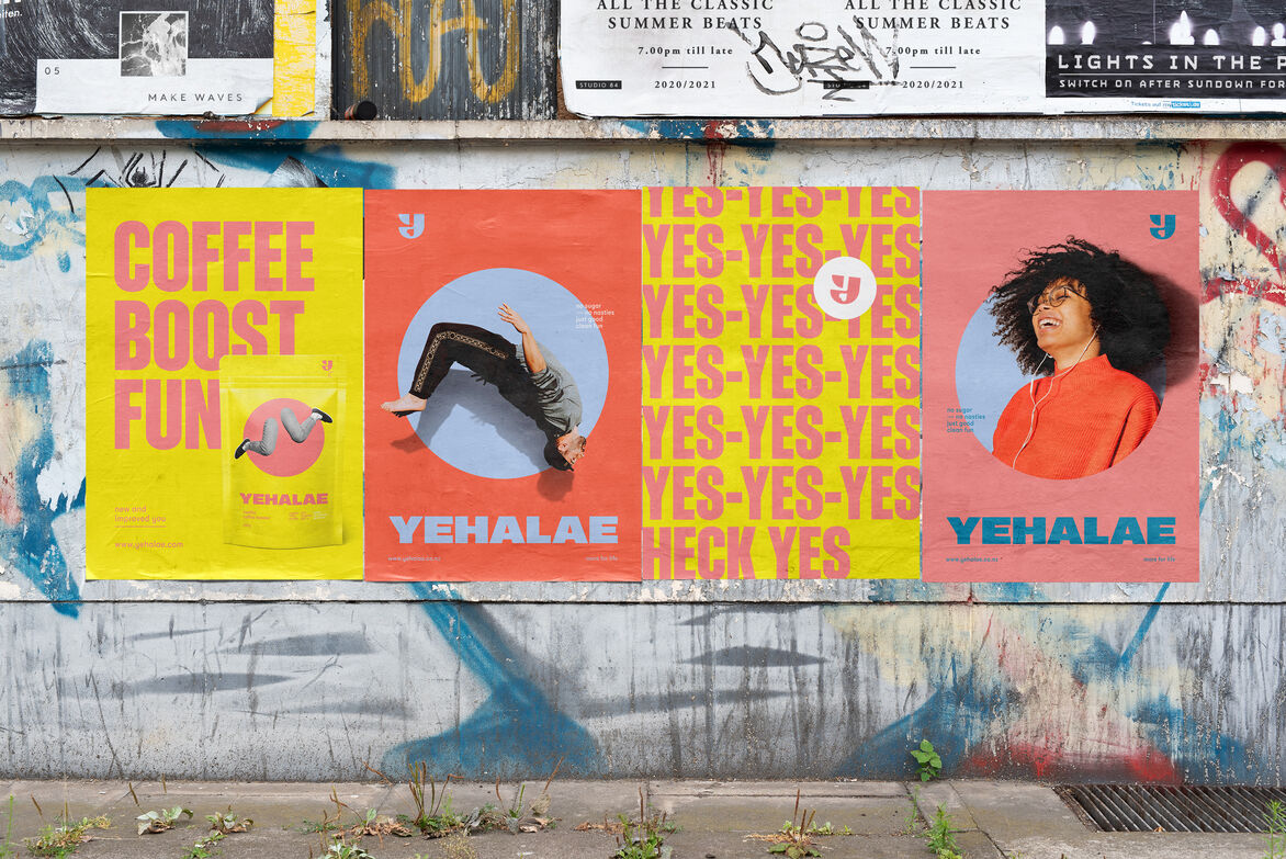
The design programme was completed with various forms of consumer communications, combining the different graphic elements with lifestyle imagery.
Selling online and in cafes, the brand leapt into the market late last year and are delighting café-goers and home coffee lovers everywhere with their exuberant and tasty approach to drinks – and life.