Graphic
Curative 25 Canteen Aotearoa
-
Pou Auaha / Creative Director
Logan Bradley -
Pou Rautaki / Strategic Leads
Eddy Royal, Anna Cernis
-
Ringatoi Matua / Design Director
Kaan Hiini
-
Ngā Kaimahi / Team Members
Lauren Wepa, Jono Cole, Georgia Hoffman, Laura Gamble -
Client
Canteen Aotearoa
Description:
Canteen wants to ensure rangatahi across Aotearoa never face cancer alone. But they weren’t sure how the 25 year-old brand was being received by young people and their whānau. The team wanted to shift the brand to address the needs, barriers, and motivations of rangatahi needing support.
After gathering insights, we knew we needed to shake off the nostalgia that had stagnated around the brand and bring it into the present while drawing on the credibility of its history. We wanted to highlight that Canteen is all about connection within a community of support, and address the perception that Canteen was only for young people with cancer.
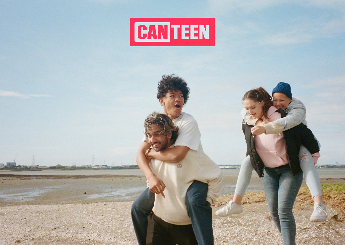
The refreshed Canteen brand aims to connect with all rangatahi, not just those directly impacted by cancer. We’re helping young people turn towards hard things together – ensuring those who need support feel less alone. Because Canteen isn’t a cancer charity for young people. It is a community of support led by, and for, rangatahi themselves.
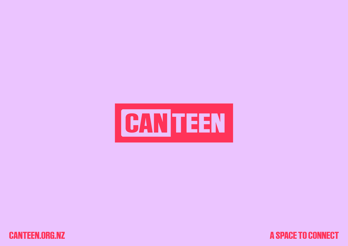
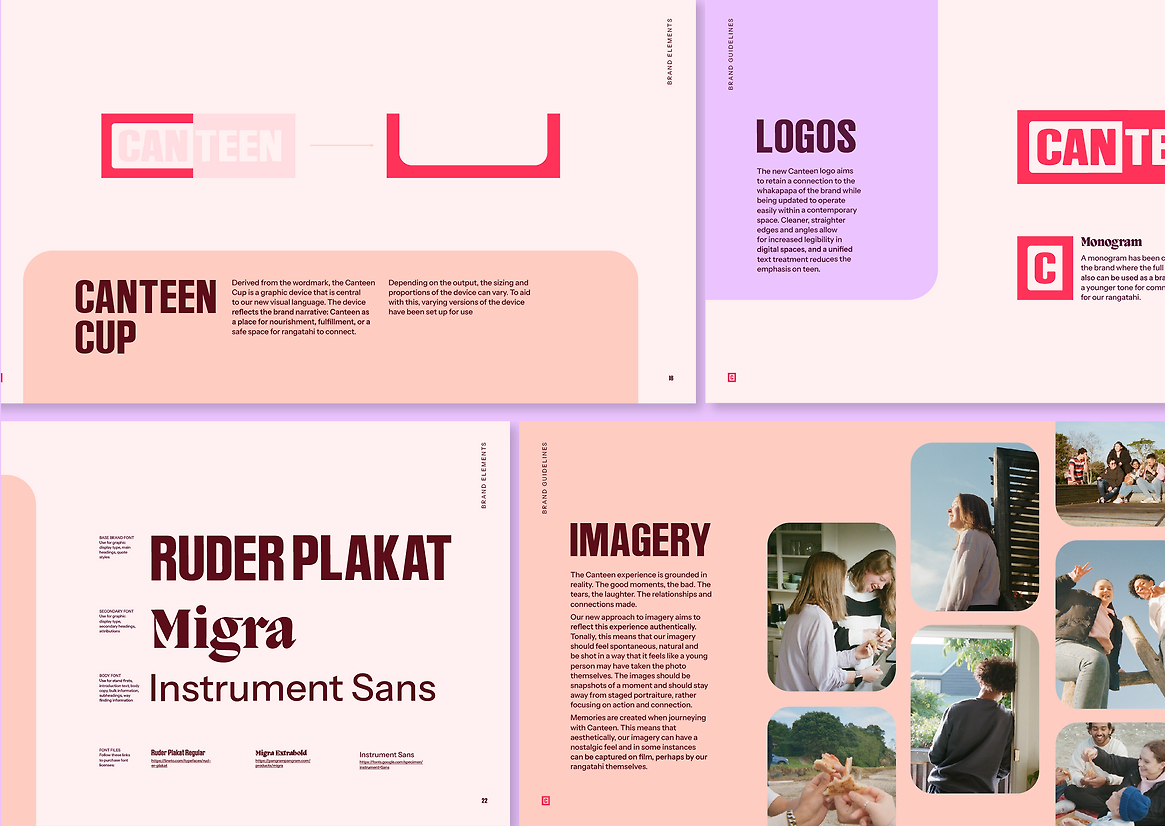
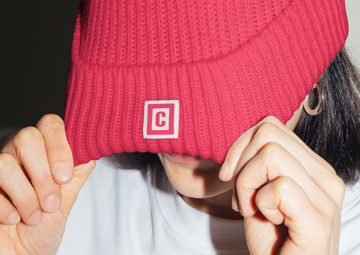
To retain Canteen’s existing brand recognition while ensuring the organisation is relevant for rangatahi today, we modernised the logo, retaining a connection to the whakapapa of the brand while updating it to operate easily within a contemporary space. A cleaner execution allows for increased legibility in digital spaces, and a unified text treatment reduces the emphasis on ‘teen’, extending the brand to young adults.
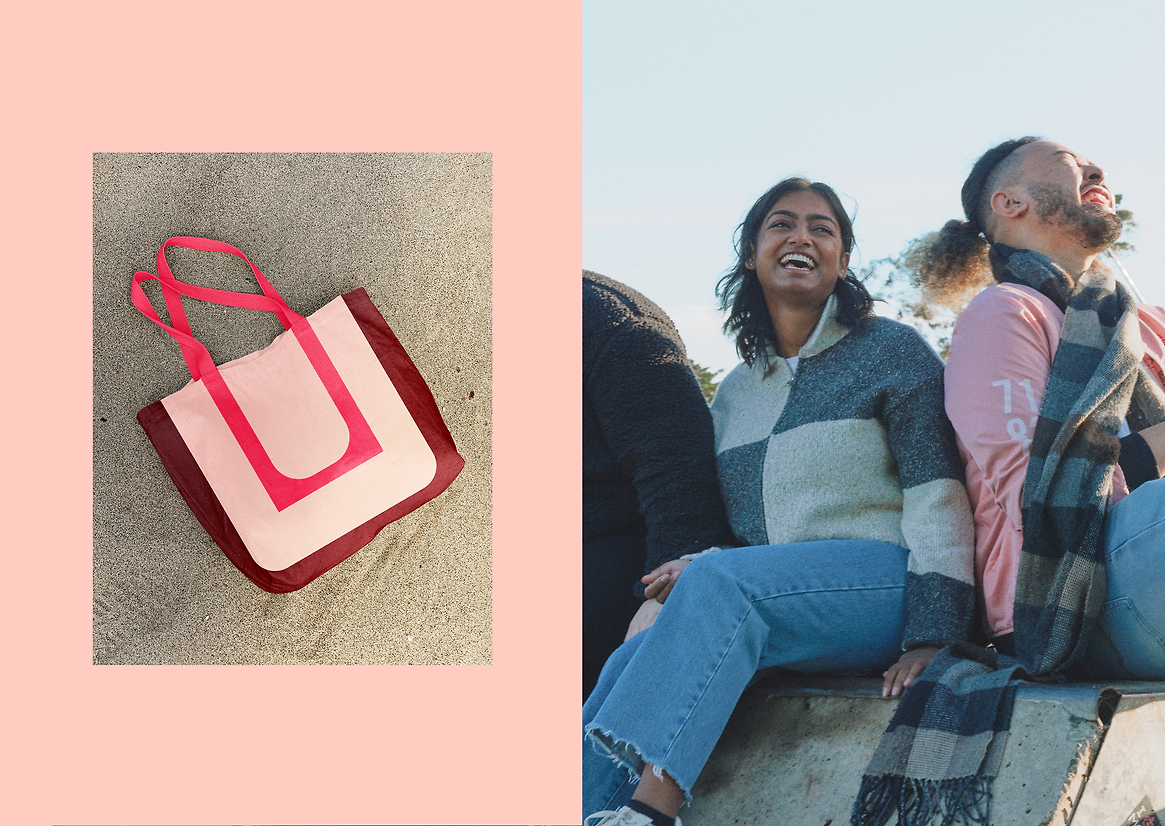
We also refreshed the brand palette, shifting Canteen’s signature red to a less clinical, more contemporary tone. We paired this with youthful, warm, vibrant hues, encapsulating the diverse personalities of the rangatahi Canteen supports.
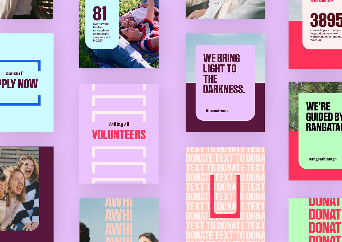
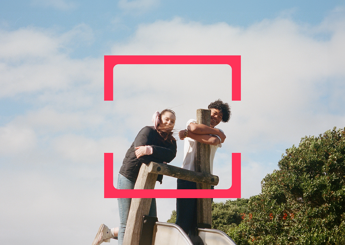
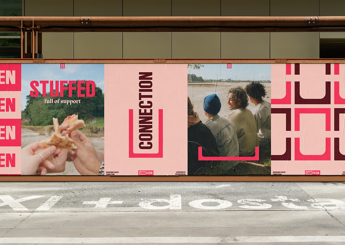
Alongside the updated logo and colour palette, we developed a flexible graphic device that acts as a strong brand identifier, inspired by the word ‘canteen’. A canteen is a place where people gather for nourishment, conversations and for laughter. A canteen is also a vessel that brings sustenance. It’s made to be filled up, to revitalise you and keep you going.
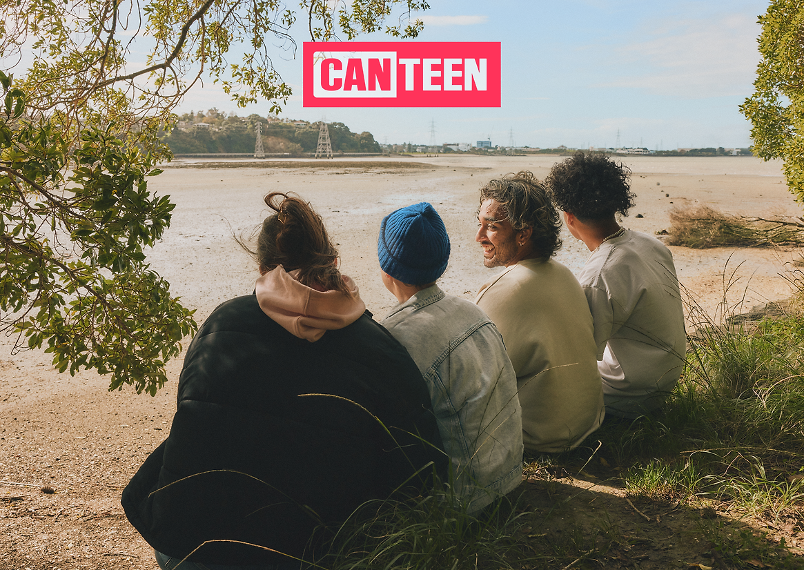
These narratives shaped the updated brand identity, underlining the power of the Canteen community support to revitalise you and ‘fill your cup’. The graphic device of the ‘Canteen cup’ is derived from the wordmark and is central to the new visual language. It can be used to hold imagery, emphasise text, and create bespoke patterns.
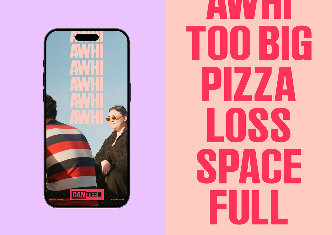
Alongside this, we created new brand imagery that shifted the brand from its reliance on stock imagery to true, authentic imagery of young people who are impacted in some way by cancer. Exploring this further, we armed the Canteen community with disposable cameras, allowing them to candidly capture their world, their interactions and their joy. This has meant that the brand has an ever evolving image library that feels real and deeply connected to those engaging with the brand.
Canteen’s refreshed brand identity takes all of the brand recognition it’s built over time and brings its offering into contemporary focus: a safe space to connect, share the tough stuff, and get a break from cancer in an environment of big, nourishing support.