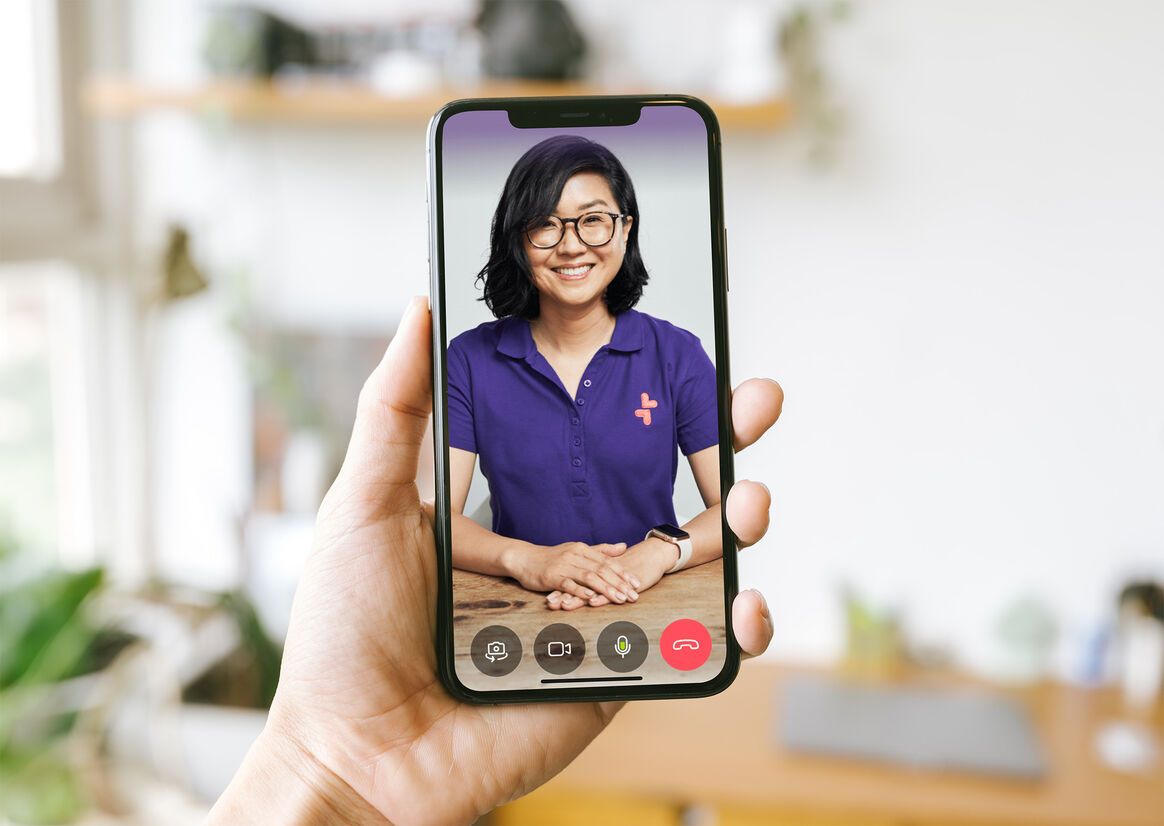
Tend is a revolutionary healthcare app that enables Kiwis to see their doctor right from their phone, fostering ongoing dialogue between customers and their healthcare teams with communication that doesn’t stop when you leave ‘the clinic’. Our positioning is centred on healthcare that finally puts control back in the hands of the customer, no longer beholden to a system that sometimes feels impossible to navigate, instead empowering Kiwis to live happier, healthier lives.
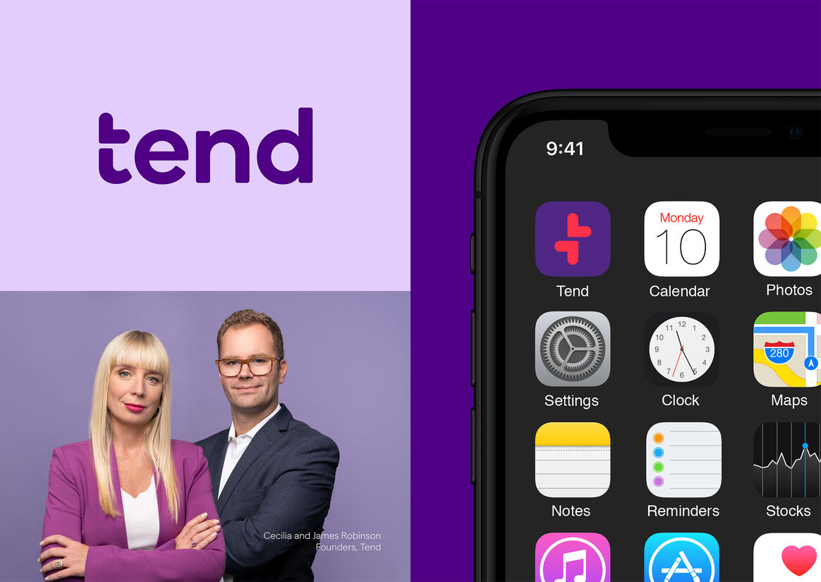
Cecilia and James Robinson, Tend’s founders, were driven by the fundamental belief that Kiwis deserve a whole lot better than what the industry currently offers and were determined to bring a modern approach to challenge the bricks-and-mortar, one-size-fits-all legacy. It was an outstanding challenger vision that lead to us partnering on a project spanning strategy and positioning, naming, design and identity, and ultimately becoming ongoing guardians for the brand.
Tend came to us with a brave, singular vision: to revolutionise healthcare in New Zealand and become the country’s largest healthcare provider by 2030. We didn’t want a 3.0 name – we and the Tend team wanted a name that reflected care, attention and a focus on you. Thus, Tend was born – clear minded, memorable and with the right amount of warmth to balance a bold visual tone and language.
Built on the key brand benefit ‘Empowering Health’, we created a visual identity system that brought to life our creative idea: ‘life at the centre’. Our wordmark is inspired by the humanist sans serif ‘Boing’, setting an approachable tone right from the get go. Our icon represents the notion of life, love and good health at the centre. Its versatility becomes a tool for multiple uses and rich storytelling.
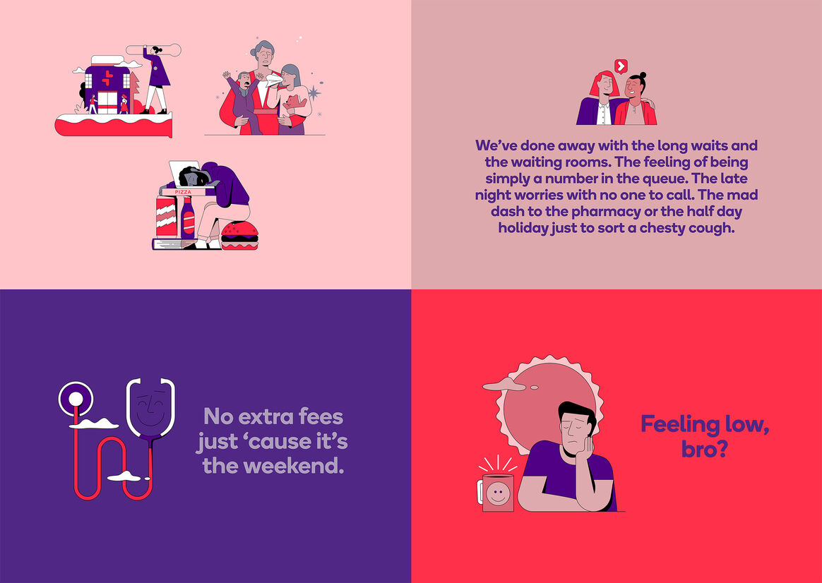
Enhancing the visual identity was our tone of voice, embodying the opposite of typical ‘healthcare speak.’ Traditionally, healthcare has been the preserve of soft, sanitised, generic language or uses clinical speak that means little to anyone but the experts. Tend wanted to make health, and healthcare, newly relevant and much more engaging. So we created a fresh, confident and down-to-earth voice, straight-talking and real, making complex or embarrassing things easier and more comfortable.
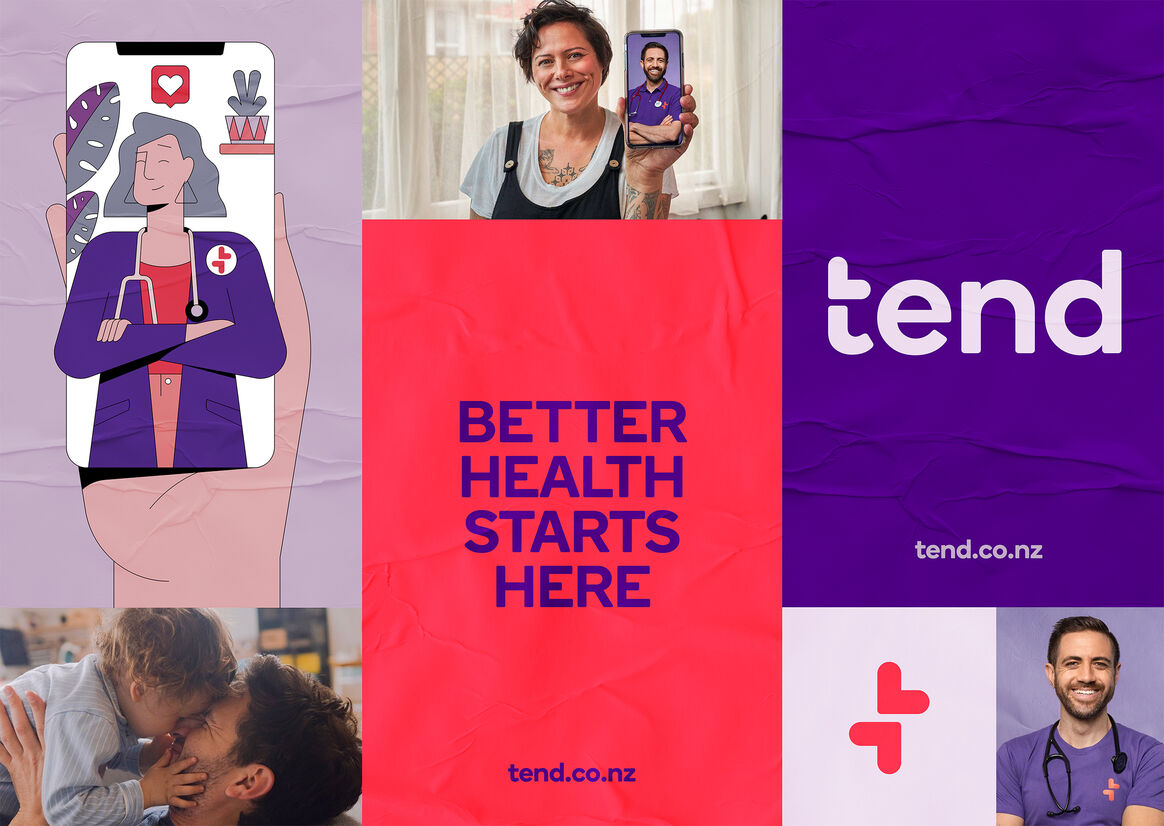
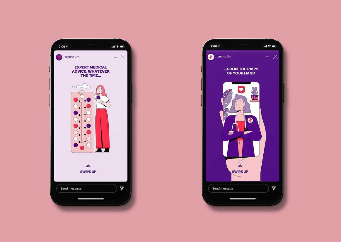
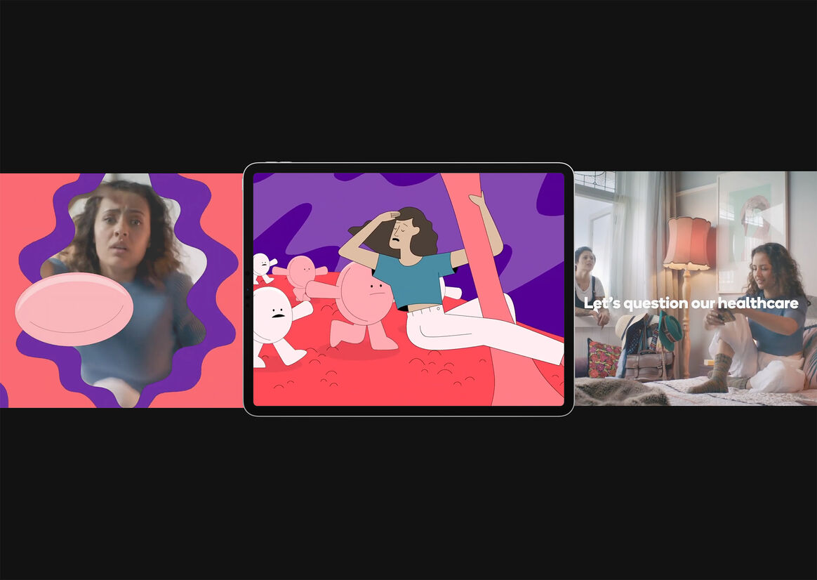
We partnered with illustrator Joe Carrington and YoungShand to bring to life all the different scenarios each of us experience when needing to check in on our health. Quirky, beautifully seamless illustrations and animations that explain what Tend is and how to use the app.
"We found the entire process to be both well-guided and inspiring, furthering our own understanding of what the business would look, feel and sound like. Culture&Theory uncovered a rich territory which really speaks to our key point of difference, or as the team put it — “not what we do, but how we do it”. We’ve quickly fallen in love with the brand and the fact that it has become so instantly recognisable in-market is a testament to the time and care that the C&T team invested in the project." – James Robinson, Founder, Tend


Description:
Tend is a revolutionary healthcare app that enables Kiwis to see their doctor right from their phone, fostering ongoing dialogue between customers and their healthcare teams with communication that doesn’t stop when you leave ‘the clinic’. Our positioning is centred on healthcare that finally puts control back in the hands of the customer, no longer beholden to a system that sometimes feels impossible to navigate, instead empowering Kiwis to live happier, healthier lives.
Cecilia and James Robinson, Tend’s founders, were driven by the fundamental belief that Kiwis deserve a whole lot better than what the industry currently offers and were determined to bring a modern approach to challenge the bricks-and-mortar, one-size-fits-all legacy. It was an outstanding challenger vision that lead to us partnering on a project spanning strategy and positioning, naming, design and identity, and ultimately becoming ongoing guardians for the brand.
Tend came to us with a brave, singular vision: to revolutionise healthcare in New Zealand and become the country’s largest healthcare provider by 2030. We didn’t want a 3.0 name – we and the Tend team wanted a name that reflected care, attention and a focus on you. Thus, Tend was born – clear minded, memorable and with the right amount of warmth to balance a bold visual tone and language.
Built on the key brand benefit ‘Empowering Health’, we created a visual identity system that brought to life our creative idea: ‘life at the centre’. Our wordmark is inspired by the humanist sans serif ‘Boing’, setting an approachable tone right from the get go. Our icon represents the notion of life, love and good health at the centre. Its versatility becomes a tool for multiple uses and rich storytelling.
Enhancing the visual identity was our tone of voice, embodying the opposite of typical ‘healthcare speak.’ Traditionally, healthcare has been the preserve of soft, sanitised, generic language or uses clinical speak that means little to anyone but the experts. Tend wanted to make health, and healthcare, newly relevant and much more engaging. So we created a fresh, confident and down-to-earth voice, straight-talking and real, making complex or embarrassing things easier and more comfortable.
We partnered with illustrator Joe Carrington and YoungShand to bring to life all the different scenarios each of us experience when needing to check in on our health. Quirky, beautifully seamless illustrations and animations that explain what Tend is and how to use the app.
"We found the entire process to be both well-guided and inspiring, furthering our own understanding of what the business would look, feel and sound like. Culture&Theory uncovered a rich territory which really speaks to our key point of difference, or as the team put it — “not what we do, but how we do it”. We’ve quickly fallen in love with the brand and the fact that it has become so instantly recognisable in-market is a testament to the time and care that the C&T team invested in the project." – James Robinson, Founder, Tend