Credits
-
Pou Auaha / Creative Directors
Sonya Milford (Creative Director and Senior Digital Designer), Dave Brady (Group Creative Director & Head of Brand Design), Hāmiora Bailey (Creative Consultant)
-
Ngā Kaimahi / Team Members
Sonya Milford (Senior Designer), Angela Watson (Managing Director), Kate Smart (Senior Project Director), Shona McCullagh (Artistic Director, Auckland Arts Festival), Ataahua Papa (Kaihautū Māori / Director of Māori Programming and Language, Auckland Arts Festival), David Inns (Chief Executive, Auckland Arts Festival), Ashley David (Head of Marketing and Communications, Auckland Arts Festival), Tim Wong (Senior Designer & Brand Manager, Auckland Arts Festival), Simon Vicars (Chief Creative Officer)
-
Client
Ashley David
Description:
The theme for this year's Auckland Arts Festival was Truth. Through partnership, Sonya Milford (Ngāti Kahungunu, Ngāti Hāmoa) & Hāmiora Bailey (Ngāti Porou Ki Harataunga, Ngāti Huarere) considered the many contexts of truth within their own lived experience, upbringings and relationships. As Tauira (identifying as learners within Te Ao Māori), they relished the opportunity to be in relation to Ataahua Papa (Waikato, Ngāti Raukawa, Ngāti Koroki Kahukura), the Kaitauhū Māori at the Auckland Arts Festival.
Together this design system was co-created, to articulate truth not as an objective absolute - as it is often framed within a Western paradigm - but instead, as a revelation affirmed through whanaungatanga: the exchange of lived experience.
In te ao Māori, truth is a matapono or epistemological foundation. Known as “tika” & "pono;" truth is an investiture, a way of being, and a technology of whakapapa. Tika and Pono can mean fair, just, respectable, accurate, appropriate, and culturally sound. Working together with aroha (kindness), Tika and Pono ensure harmony and accountability for all. These design systems look to communicate Tika & Pono as the shared human exchange of truth.
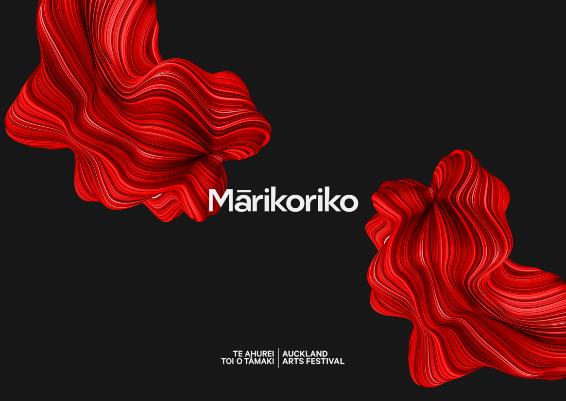
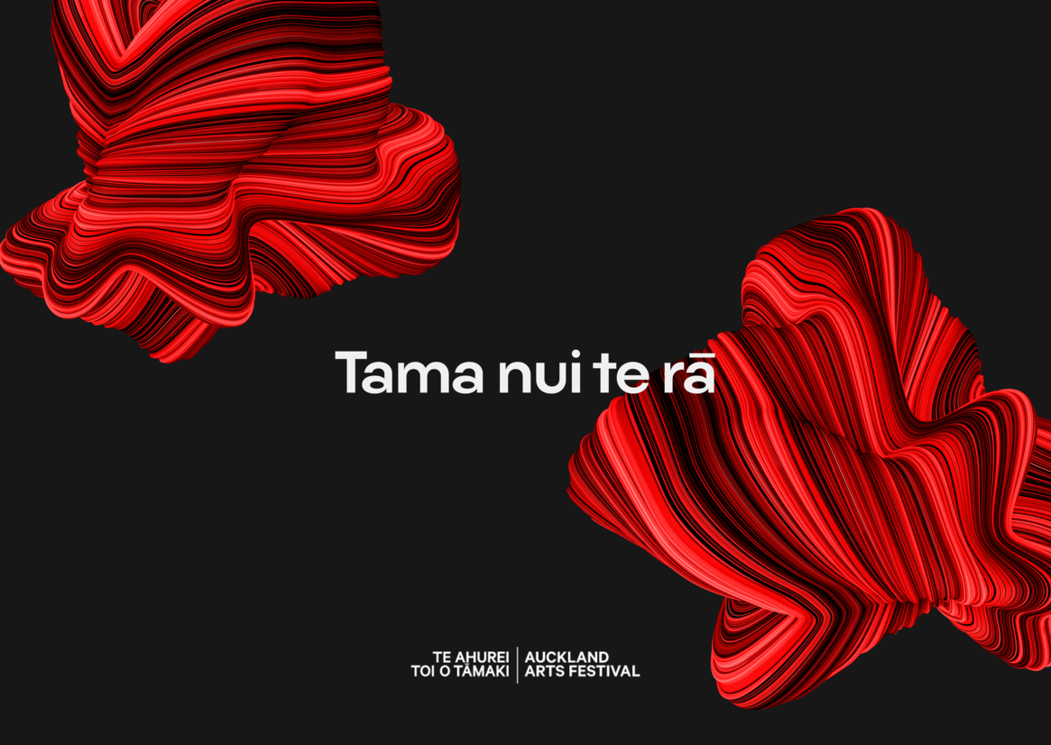
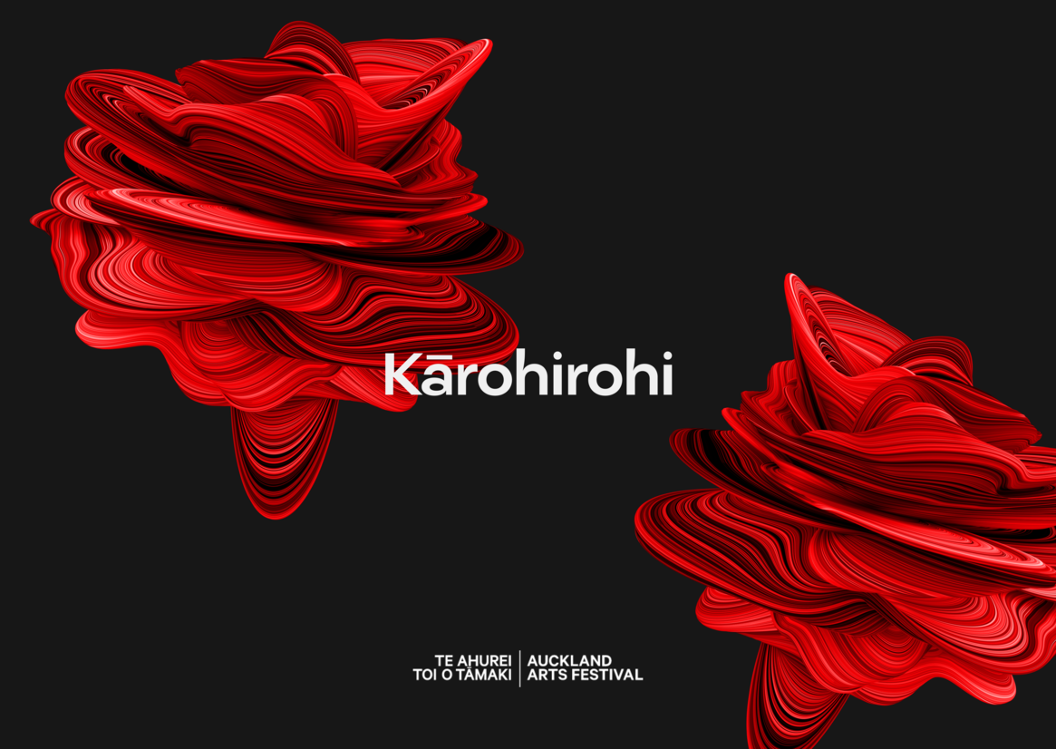
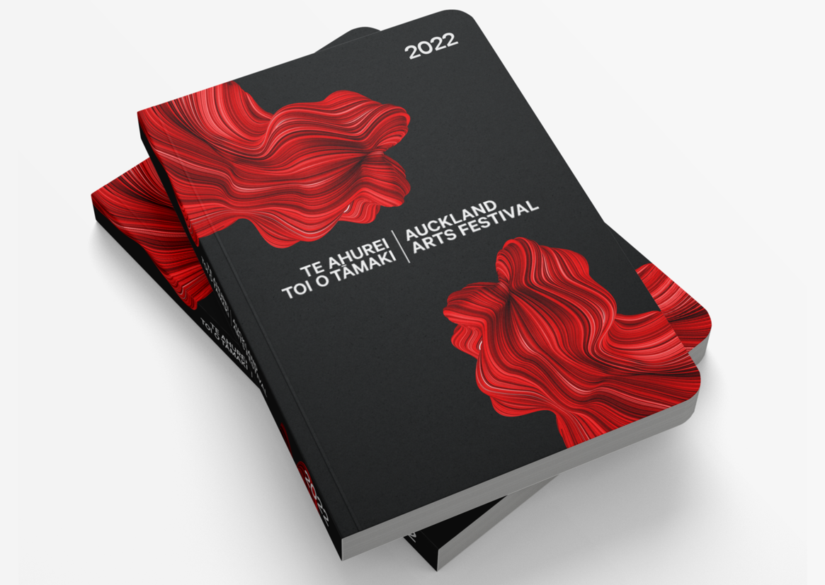
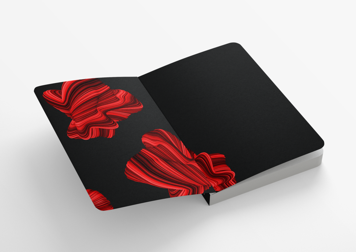
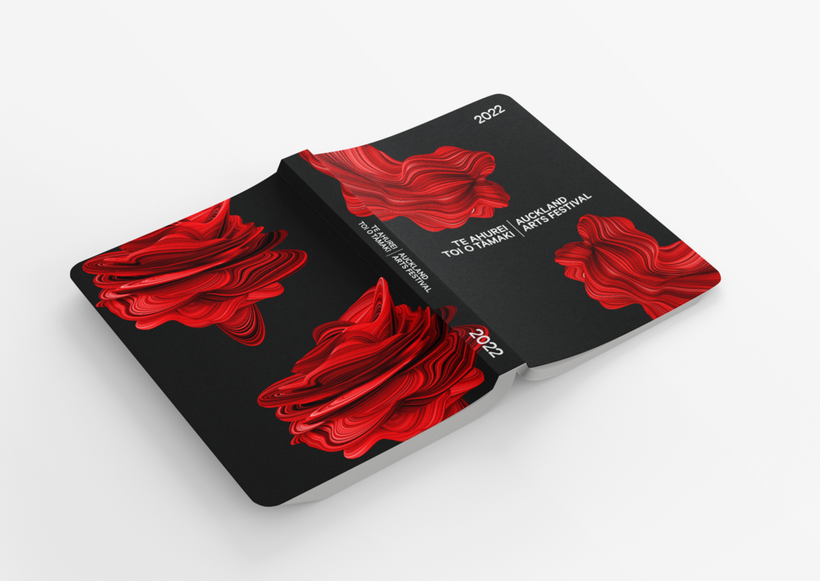
Three forms were created in this design system to honour that within Te Ao Mārama, it is light and clarity that informs truth. These three forms are manifestations of different times of the day, different Atua of light - different truths of the universe; Tama Nui Te Rā, our Atua of the sun and morning; Mārikoriko who is the in-between time as the sun sets or rises; and Kārohirohi the shimmering light of day
Each form has used the same three features to communicate truth.
1. The colour red, which honours the importance of our tohu whenua (rhythms within the natural environment). Specifically, the sunrise & sunset in how kahuhura, (the visible light spectrum) begins with red to affirm our ontological truth in Ranginui & Papatūānuku.
2. Ridges and contours, that communicate whakapapa - the layering of being that suffuses the universe.
3. The Typography of Nan Jaune, for its subtle ink traps that acknowledge Kaiwhakairo (Master Carvers) for their legacy in Te Ao Tawhito, having carved a way forward for us as ringatoi Māori to express ourselves now.
The three forms informed the visual identity of the Auckland Arts Festival, and were used as key assets across a range of digital, direct and above the line executions.