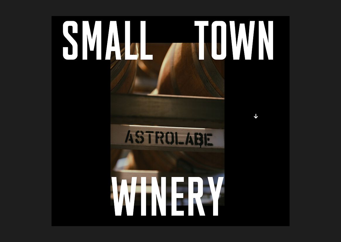
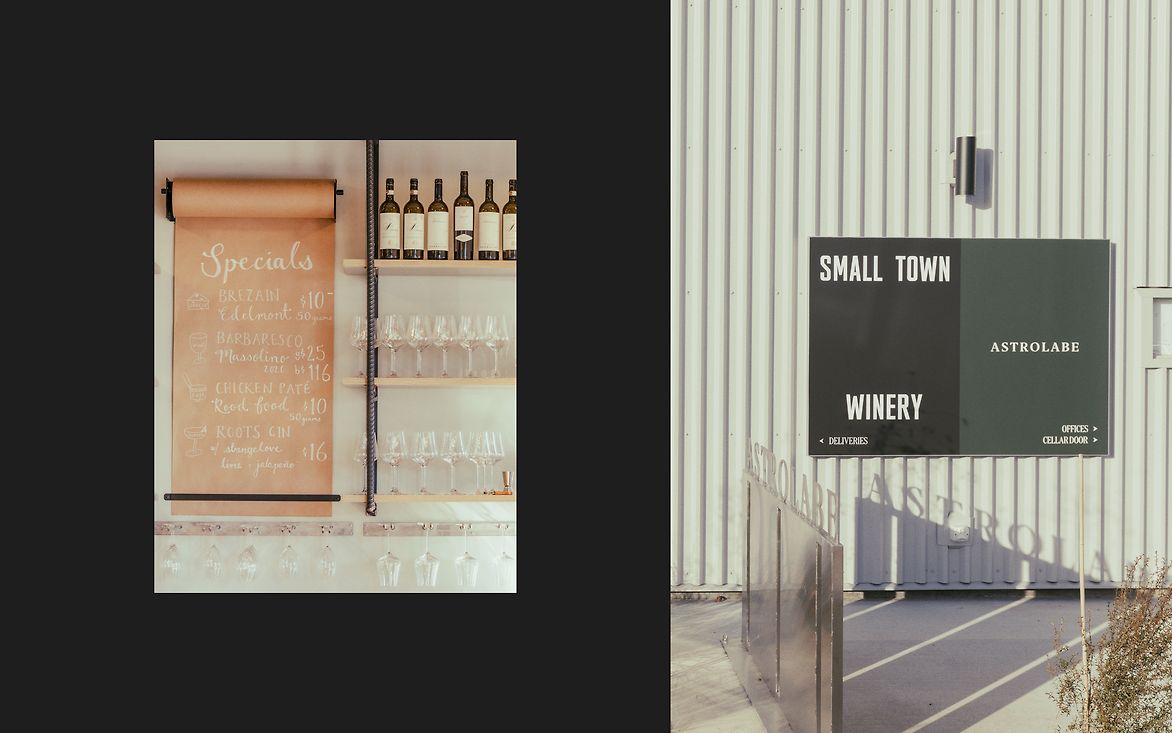
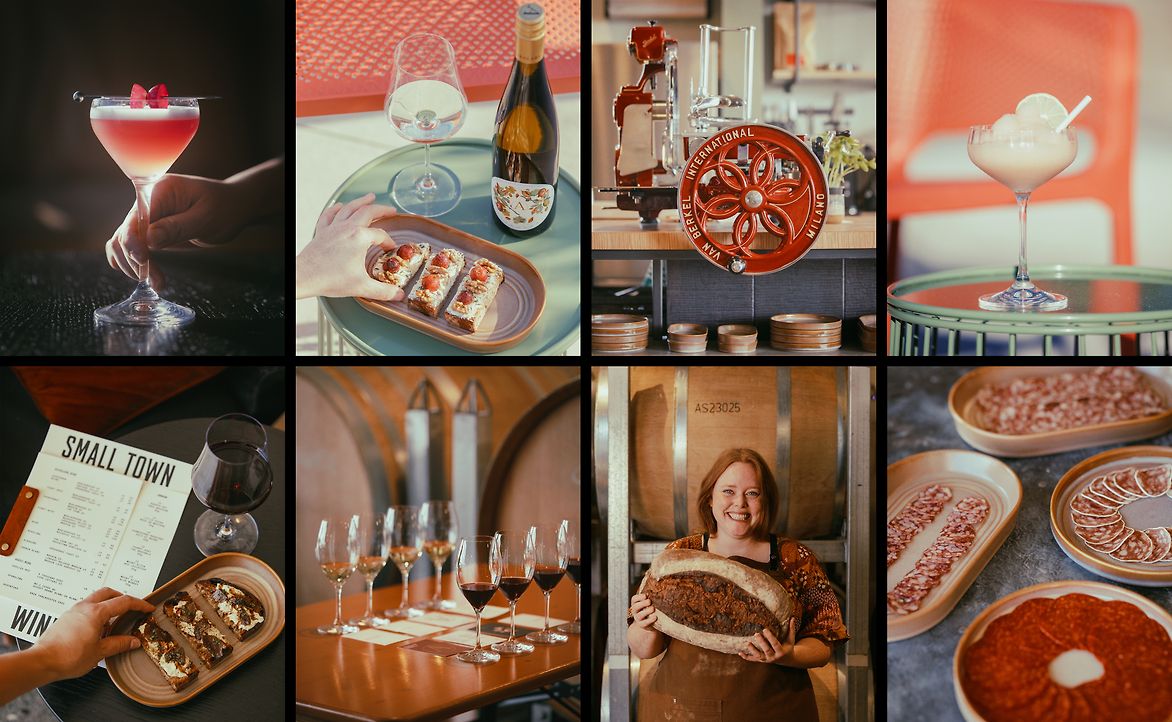
In partnership with the Rangitāne o Wairau, Astrolabe launched a small urban winery on industrially zoned land beside the railway in the centre of Blenheim, which was returned to the Rangitāne as part of a treaty settlement. This winery would only be for small batch winemaking, so the small urban winery required its own brand to be honest about the fact that not all Astrolabe wine would be made on site. The winery was named the Small Town Winery in reference to its town location, its size and its role as the smaller winery, producing Astrolabe’s premium hand-picked and barrel-aged wines.
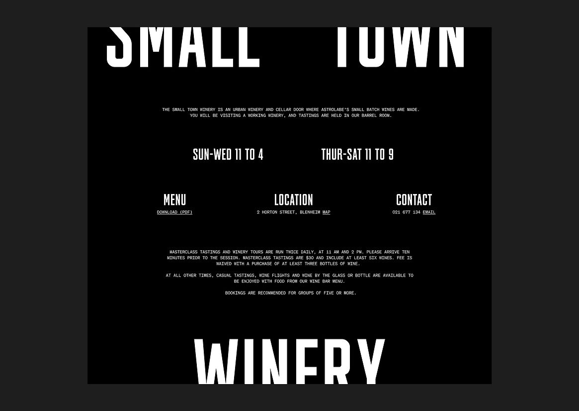
The task was to design a brand that would sit alongside the existing wine brand while also having its own identity, as the space would function as a cellar door for Astrolabe as well as a wine bar.
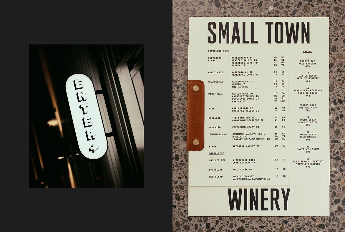
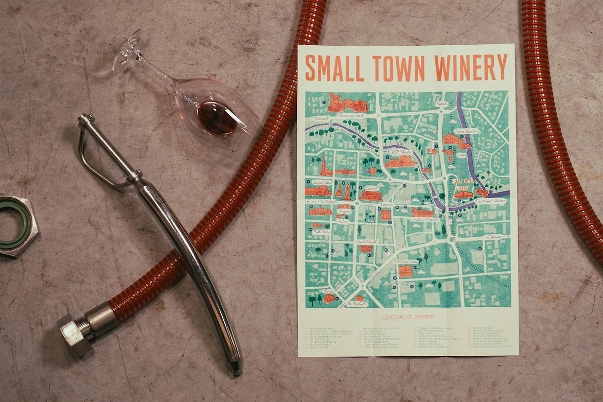
An identity was built around the concept of small town New Zealand signage. This industrial, prosaic and often hand-wrought lettering is familiar and nostalgic and a departure from the slick corporate style associated with a lot of the wine industry. An all-caps typeface was chosen for the wordmark that would give a sense of the bold, hand-painted typefaces seen in dairies and vegetable stores around the country while also being harmonious with the fonts used by Astrolabe.
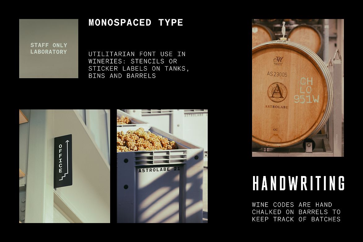
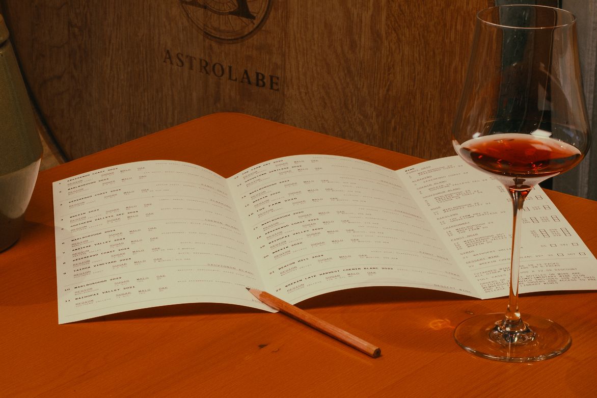
Utilitarian monospaced fonts were brought from their place in the winery cellar through to menus, signage and wine tasting forms. With monotype font and tabulated, office-form inspired design, function tied well with the aesthetic aims of the project. Printed materials in the cellar door are tools both for staff and customers.
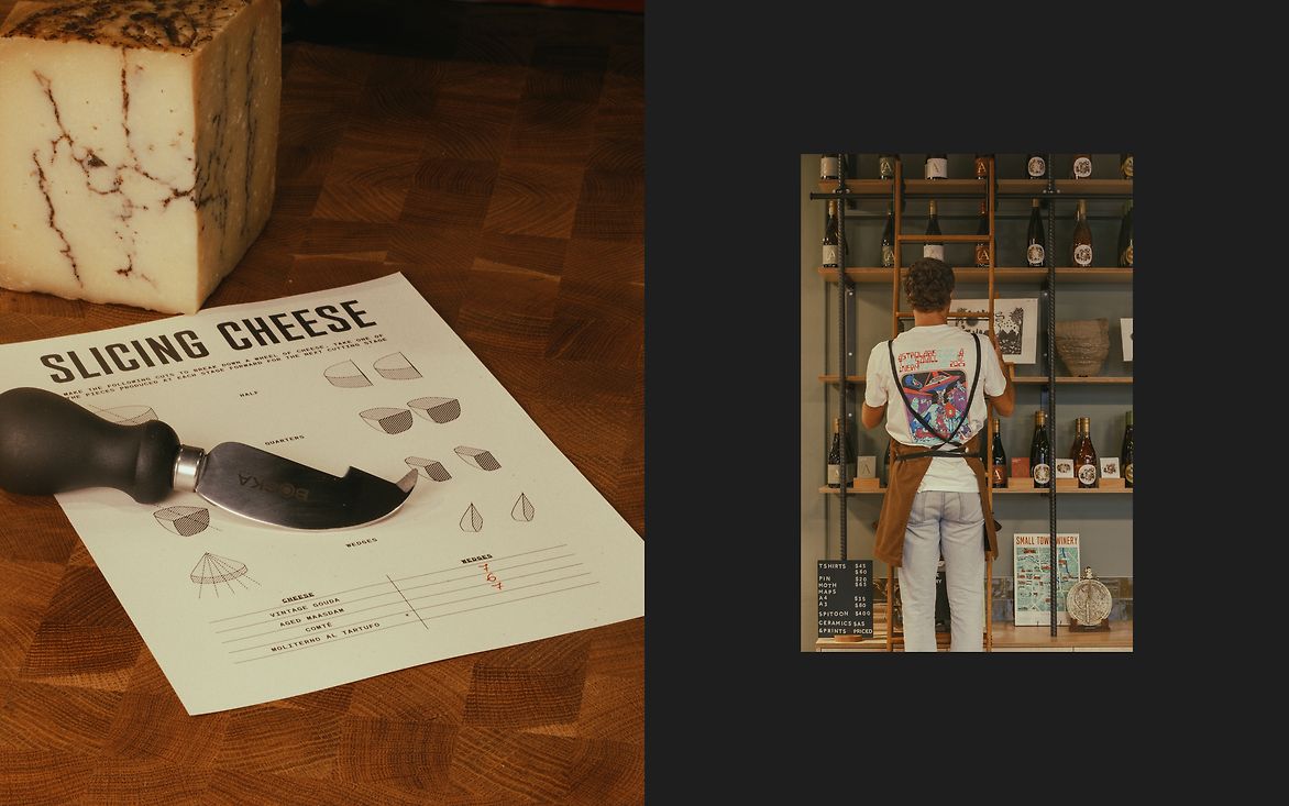
The Small Town winery hospitality space encompasses an open kitchen, bar and barrel hall, so everything visible had to have a consistent identity: from menus on tables through to instructional documents and recipes for the staff. Warm-toned white paper with recycled fibre softens utilitarian monospaced type. Talented people in the team contributed pottery, leatherwork and illustration, bringing warmth and texture that matches the beautiful oak housed in this industrial building of concrete and steel.

Description:
In partnership with the Rangitāne o Wairau, Astrolabe launched a small urban winery on industrially zoned land beside the railway in the centre of Blenheim, which was returned to the Rangitāne as part of a treaty settlement. This winery would only be for small batch winemaking, so the small urban winery required its own brand to be honest about the fact that not all Astrolabe wine would be made on site. The winery was named the Small Town Winery in reference to its town location, its size and its role as the smaller winery, producing Astrolabe’s premium hand-picked and barrel-aged wines.
The task was to design a brand that would sit alongside the existing wine brand while also having its own identity, as the space would function as a cellar door for Astrolabe as well as a wine bar.
An identity was built around the concept of small town New Zealand signage. This industrial, prosaic and often hand-wrought lettering is familiar and nostalgic and a departure from the slick corporate style associated with a lot of the wine industry. An all-caps typeface was chosen for the wordmark that would give a sense of the bold, hand-painted typefaces seen in dairies and vegetable stores around the country while also being harmonious with the fonts used by Astrolabe.
Utilitarian monospaced fonts were brought from their place in the winery cellar through to menus, signage and wine tasting forms. With monotype font and tabulated, office-form inspired design, function tied well with the aesthetic aims of the project. Printed materials in the cellar door are tools both for staff and customers.
The Small Town winery hospitality space encompasses an open kitchen, bar and barrel hall, so everything visible had to have a consistent identity: from menus on tables through to instructional documents and recipes for the staff. Warm-toned white paper with recycled fibre softens utilitarian monospaced type. Talented people in the team contributed pottery, leatherwork and illustration, bringing warmth and texture that matches the beautiful oak housed in this industrial building of concrete and steel.