Koi Tū Centre for Informed Futures is a social think tank, dedicated to tackling the complex, long-term challenges shaping Aotearoa New Zealand’s future. Spearheaded by Sir Peter Gluckman, and incubated at the University of Auckland over the last five years, in 2025 Koi Tū became an independent entity. The shift involved a rethink in strategy and required a comprehensive rebrand. The asks were multiple: develop distinctive visual branding that was at the same time professional and assured, appealing to policymakers and researchers, but which had the flexibility to connect with wider publics. The styling needed to have a New Zealand flavour, multicultural affinities, but was also required to work effectively in international settings such as at conferences or state-level engagements. Additionally, ongoing collateral needed to be simple enough for non-designers to work with – especially report and research templates, being the key outputs. Finally, it needed to be done within a tight budget and timeframe: only four weeks to brief, concept develop, liaise with Trust stakeholders, and produce collateral for an official launch event. Fortunately, Antipode had been working with Koi Tū from its inception and were able to hit the ground running and work closely with the operations manager to deliver. We focused on the name, which had been gifted by Ngāti Whātua Ōrākei. ‘Koi’ is the sharp end of a spear (also to be bright and clever). ‘Tū’ is to stand, to set in place and implies resilience. Koi Tū colloquially means “sharp as!” The ‘notch’ motif is made by the pointed spear end. The twin triangles echo other symbolism: forwards and futures; the simplified shape of the NZ map; simple geometric patterning found in Māori art but also the creative combinations of a tangram puzzle. The ‘dark teal’ base colour lends a seriousness which is offset by two vibrant support colours, crimson and turquoise. The palette will be expanded as we develop sub-branding for additional research arms. Boldness and simplicity have led in collateral development: open source font use; simple templates for non-designers; stylised pattern use over images. Our aim is to make Koi Tū look good while helping put valuable resources towards the ultimate goal of effecting social impact.


Description:
Koi Tū Centre for Informed Futures is a social think tank, dedicated to tackling the complex, long-term challenges shaping Aotearoa New Zealand’s future. Spearheaded by Sir Peter Gluckman, and incubated at the University of Auckland over the last five years, in 2025 Koi Tū became an independent entity. The shift involved a rethink in strategy and required a comprehensive rebrand.
The asks were multiple: develop distinctive visual branding that was at the same time professional and assured, appealing to policymakers and researchers, but which had the flexibility to connect with wider publics. The styling needed to have a New Zealand flavour, multicultural affinities, but was also required to work effectively in international settings such as at conferences or state-level engagements. Additionally, ongoing collateral needed to be simple enough for non-designers to work with – especially report and research templates, being the key outputs.
Finally, it needed to be done within a tight budget and timeframe: only four weeks to brief, concept develop, liaise with Trust stakeholders, and produce collateral for an official launch event.
Fortunately, Antipode had been working with Koi Tū from its inception and were able to hit the ground running and work closely with the operations manager to deliver.
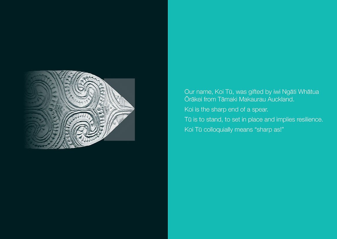
We focused on the name, which had been gifted by Ngāti Whātua Ōrākei. ‘Koi’ is the sharp end of a spear (also to be bright and clever). ‘Tū’ is to stand, to set in place and implies resilience. Koi Tū colloquially means “sharp as!”
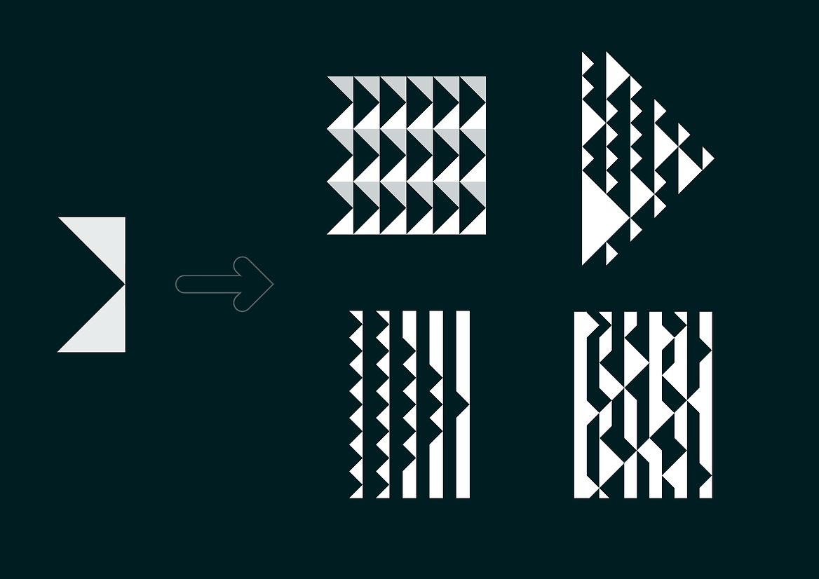
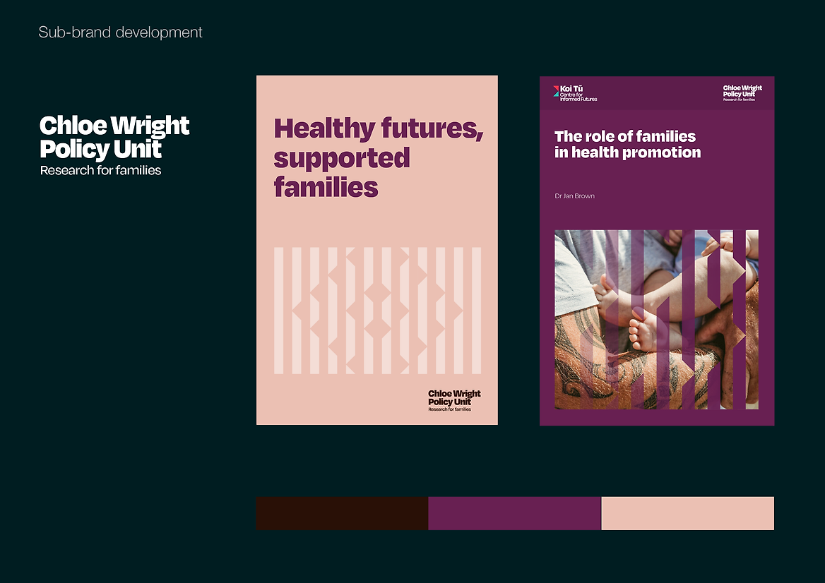
The ‘notch’ motif is made by the pointed spear end. The twin triangles echo other symbolism: forwards and futures; the simplified shape of the NZ map; simple geometric patterning found in Māori art but also the creative combinations of a tangram puzzle.
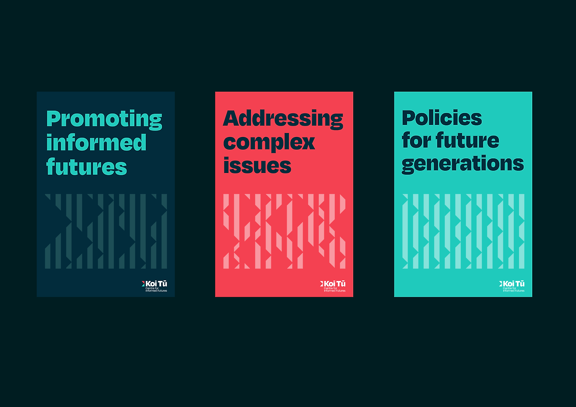
The ‘dark teal’ base colour lends a seriousness which is offset by two vibrant support colours, crimson and turquoise. The palette will be expanded as we develop sub-branding for additional research arms.
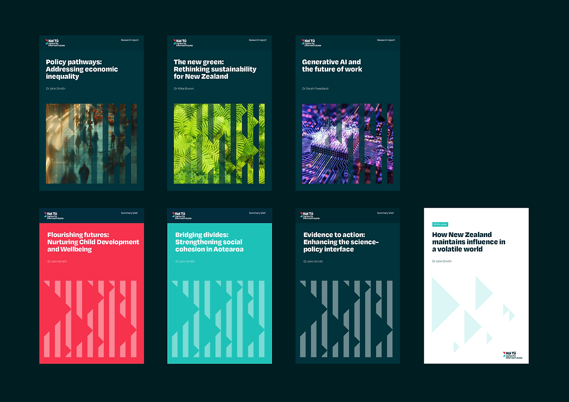
Boldness and simplicity have led in collateral development: open source font use; simple templates for non-designers; stylised pattern use over images. Our aim is to make Koi Tū look good while helping put valuable resources towards the ultimate goal of effecting social impact.