Graphic
Alt Group 159 Good Sh*t Soda
-
Pou Auaha / Creative Director
Dean Poole -
Pou Rautaki / Strategic Lead
Ben Corban
-
Ringatoi Matua / Design Director
Rei Konza
-
Ngā Kaimahi / Team Members
Dean Poole, Rei Konza, Hamish Clark, Jungie Choi, Tim Gomez, Megan Au, Dean Murray, Aaron Edwards -
Client
Poptimist
Description:
Soft drinks are understood as universally bad. Could we make a soft drink that's good for you?
We all know the phrases ‘gut feeling’ and ‘what's your gut telling you’. The gut microbiome—all two kilos of it—controls 95% of serotonin levels, that’s mood and happiness, and 50% of our dopamine levels, pleasure and satisfaction.
Soda, however, is super bad for your microbiome, all that sugar absolutely kills it. But Good Sh*t isn't just a low-sugar soda, it's a soda that boosts your gut health by delivering one billion probiotics in every can along with 39% of your daily fibre needs. (A world first.)
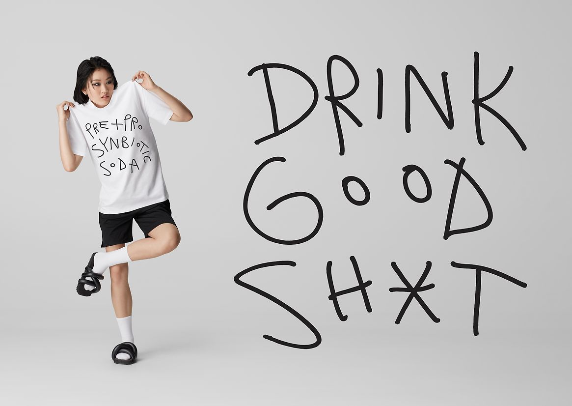
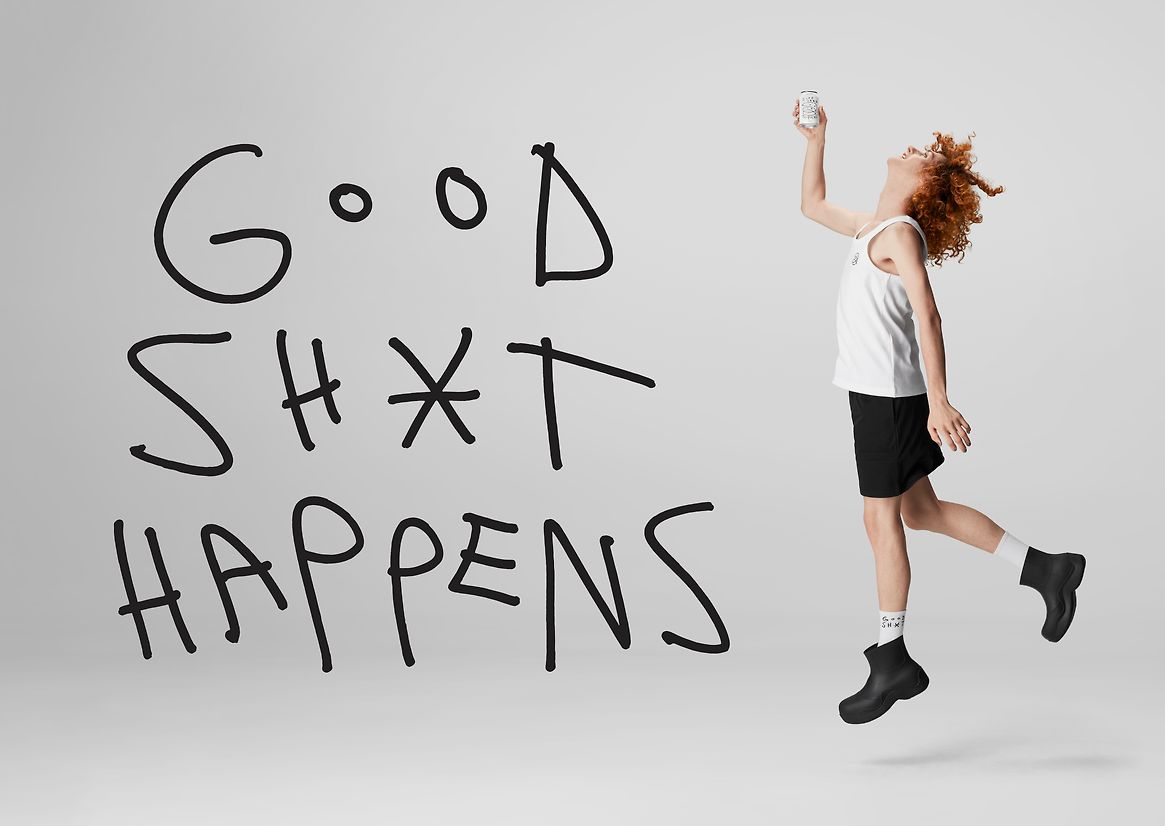
How could we signal difference in an ultra-traditional product category? Give the product a name that’s simple and memorable and, if possible, communicates what it does. To boil it down, good-stuff in equals good-stuff out—so we called it Good Sh*t. This isn't toilet humour, it's just being very matter of fact. It had to be simple because we’ve got a lot to communicate. The product is a disruptor, and the brand needed to reflect this attitude.
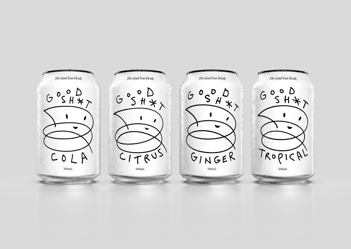
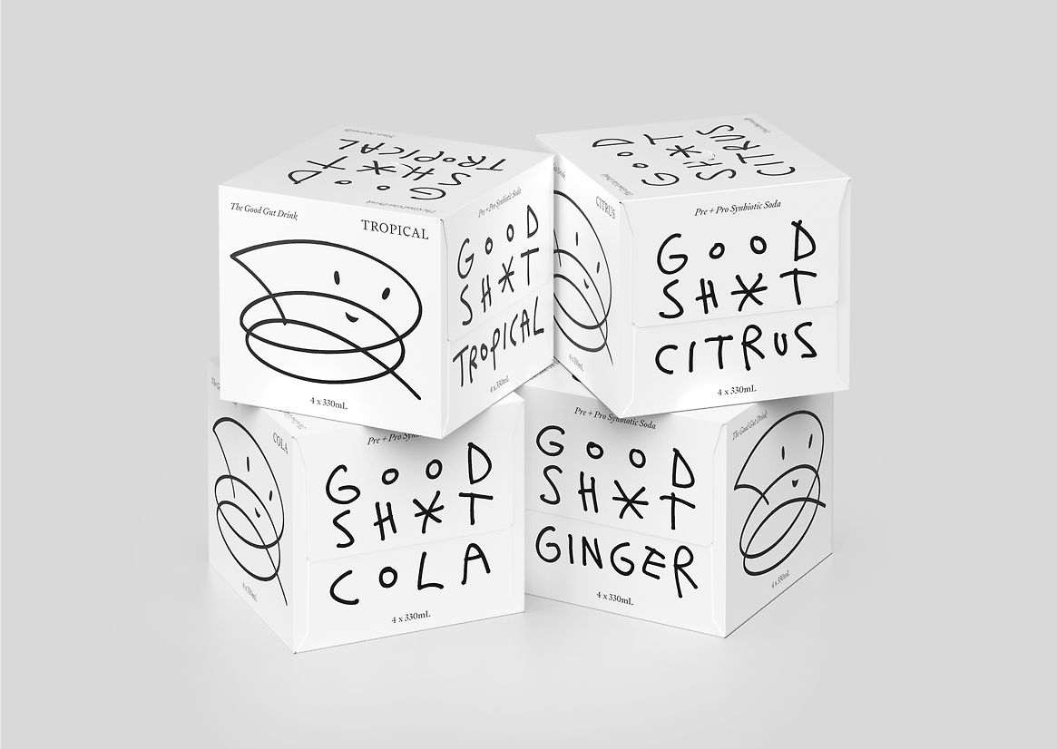
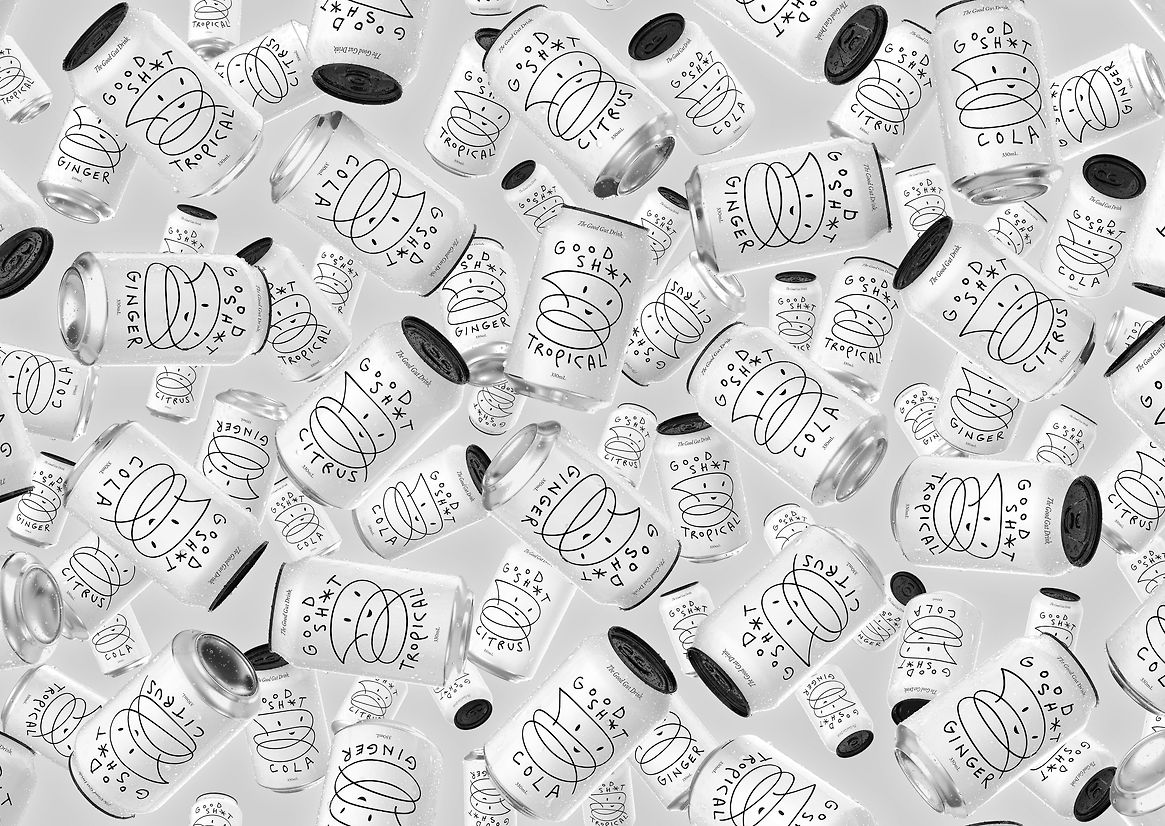
Why is brand mission critical for start-ups challenging the status quo? There are three primary components to every brand—colour, type and logo. For Good Sh*t, we also had to consider where and how the product would appear on supermarket shelves. A can was chosen, immediately signalling that it is a fizzy beverage or soda. It's also convenient, stackable, easy to transport, and recyclable. It signalled that this is an everyday, accessible drink, not a supplement or artisanal brew.
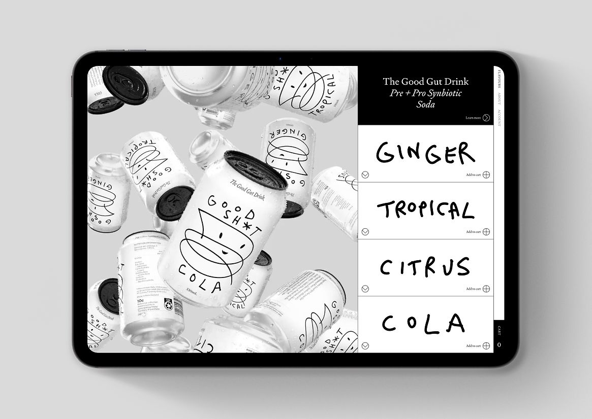
To compete on shelves we kept to a strict black and white palette, knowing our competitors would be a rainbow of pastels, fluoros, illustrations and imagery. A white can, en masse, would dominate the visual space.
For authenticity and cheekiness, we looked to bespoke handwriting and hand-drawn illustrations. The logo, flavour, and the ‘Poot’ are all drawn individually for each product—adding irreverence and joy to the tongue-in-cheek nature. Across the product range, no two Poots are the same. The can is different from the 4-pack, which is different from the shipper, which is different from the ads and the website—all emphasising the idea of movement and individuality, to show that everybody is unique.
The typeface, Signifier, provides an authoritative tone and is deployed within a considered grid that provides a counterpoint to the playful handwriting and illustrations. The combination, in total, reflects ‘serious science that doesn't take itself too seriously’.
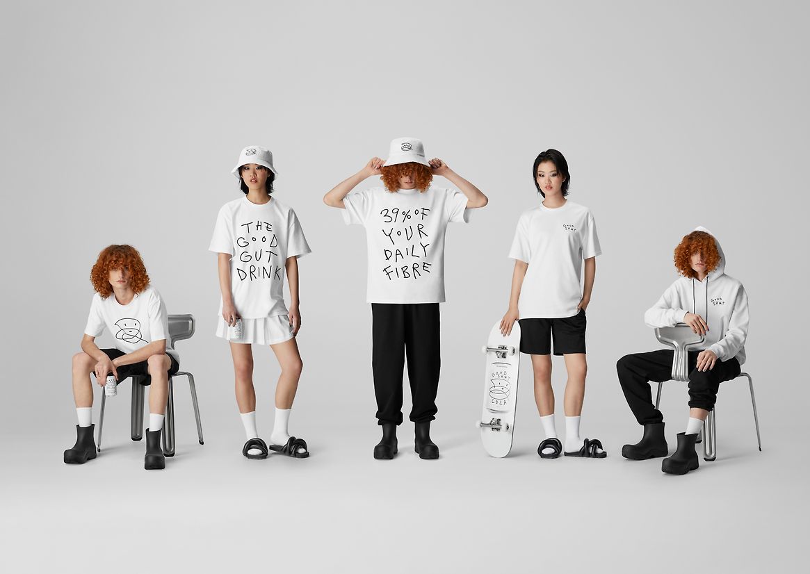
Against brand’s black and white, bright and bubbly colour hues evoke each soda flavour’s qualities, and are deployed in advertising, website, digital communications and campaigns. Uniforms for tasting teams are designed to be a little ‘off-kilter’—on the edge of fashionable—to contribute to our goal of standing out from the crowd, helping the brand be as different and impactful on the outside as the benefits of the drink are on the inside.
Judge's comments:
An irreverant name for a category creating brand. A distinctive graphic language, with energy and dynanism flowing through it. Conceptual rigour and depth with flawless craft. Playful and serious, with clever, positive messaging that is educational and impactful. Incredibly consistent across all touchpoints.