Graphic
Alt Group 159 A Holes
-
Pou Auaha / Creative Director
Dean Poole
-
Ngā Kaimahi / Team Members
Tim Gomez, Janson Chau


Description:
Many designers boast the ability to identify a typeface from a glyph, but do you know what it is just from the counter? Can you tell Arial from Helvetica? Baskerville from Bodoni? Graphic from Futura?
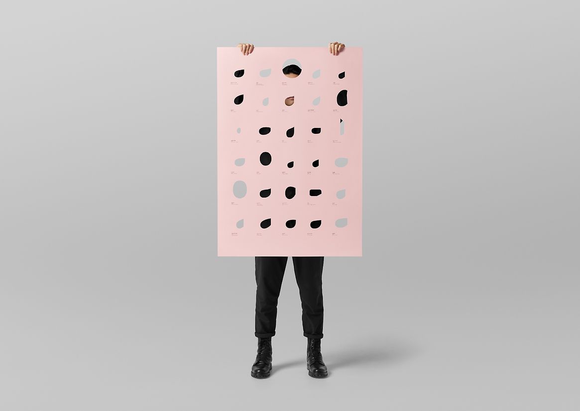
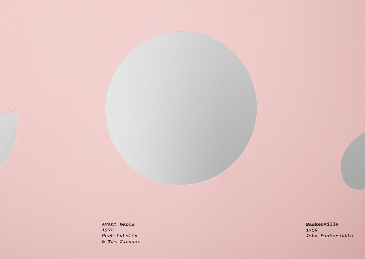
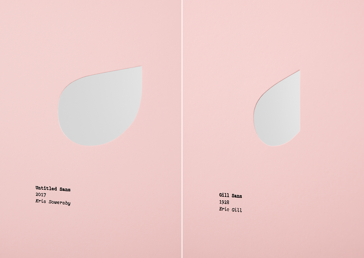
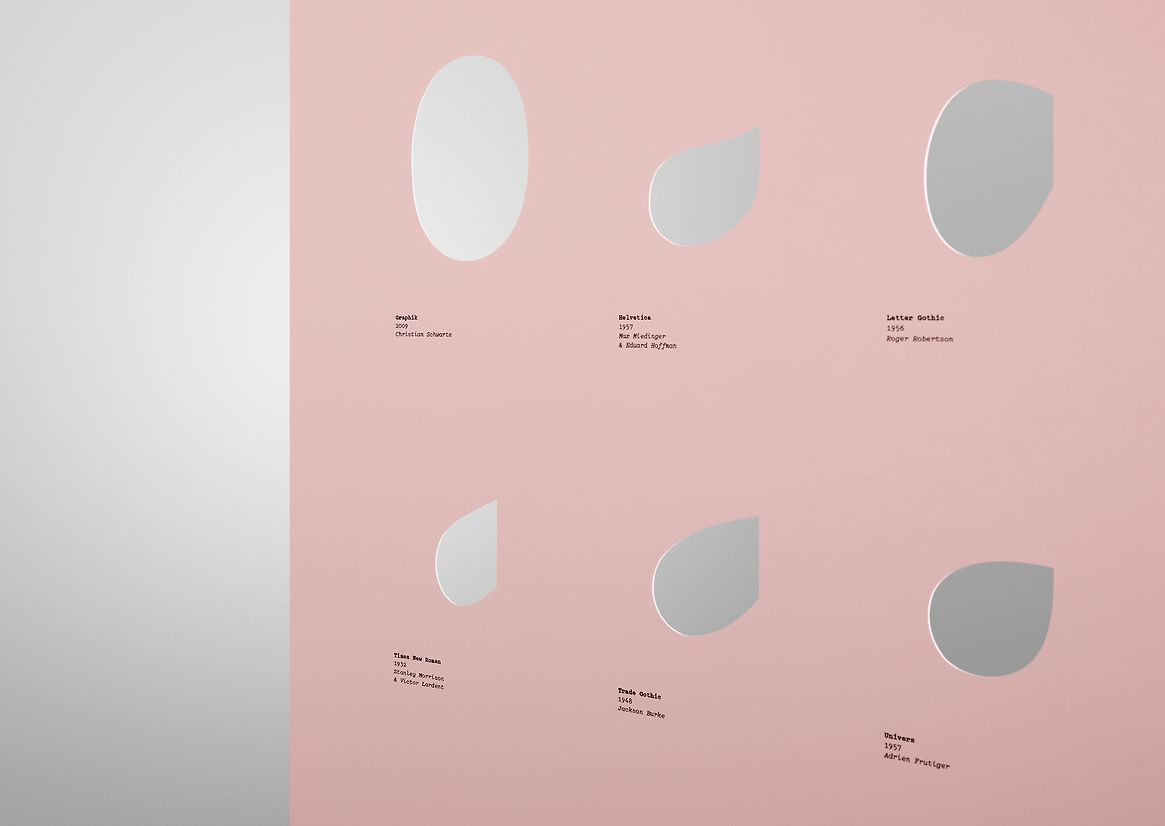
Create an A0 type specimen using only the most distinctive part of the most distinctive character in a typeface—the counter of a lowercase a. 30 of the most important fonts of all time are seen in a new way, revealing the craftsmanship and detail within. Futura isn't close to a circle but Avant Garde is; Gill Sans is remarkably close to Times New Roman; and Arial has surprisingly smoother curves than Helvetica.
How do you pick 30 from an almost infinite number of typefaces? What belonged, what didn't. What had a lasting impact, what was revolutionary, what has become timeless, what had a key role in moments of history; and what was the typographer like?
Extensive research was carried out on the histories, design and production of each typeface to track its provenance and understand its role in the canon.
The results were produced on a flesh pink poster with the counter forms die-cut to be truly negative—a series of a-holes on an A0.
Judge's comments:
The one time it’s a positive to focus on the negative! A strong idea, tongue and cheek humour, perfectly executed and beautifully simple.