Graphic
ZURU Edge 35 DAISE Beauty
-
Pou Auaha / Creative Director
Monique Robins -
Pou Rautaki / Strategic Lead
Kelly McAuliffe
-
Ringatoi Matua / Design Director
Nikki Ravlich
-
Ngā Kaimahi / Team Members
Stacey Leong, Alex Wong, Jevin Yan, Paul Groenendijk, Nicole Miller Wong, Ethan Wilson, Sam Brock, Elle McClure -
Kaitautoko / Contributor
Think Packaging -
Client
ZURU Edge - DAISE
Description:
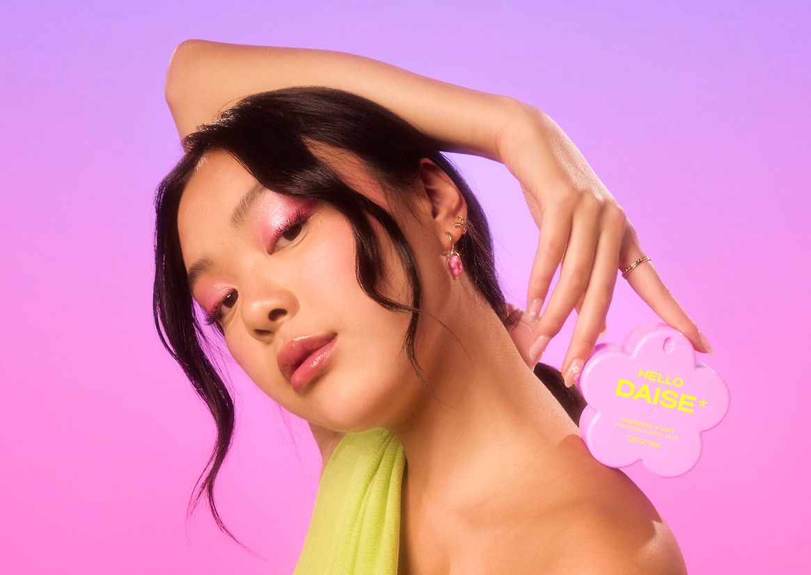
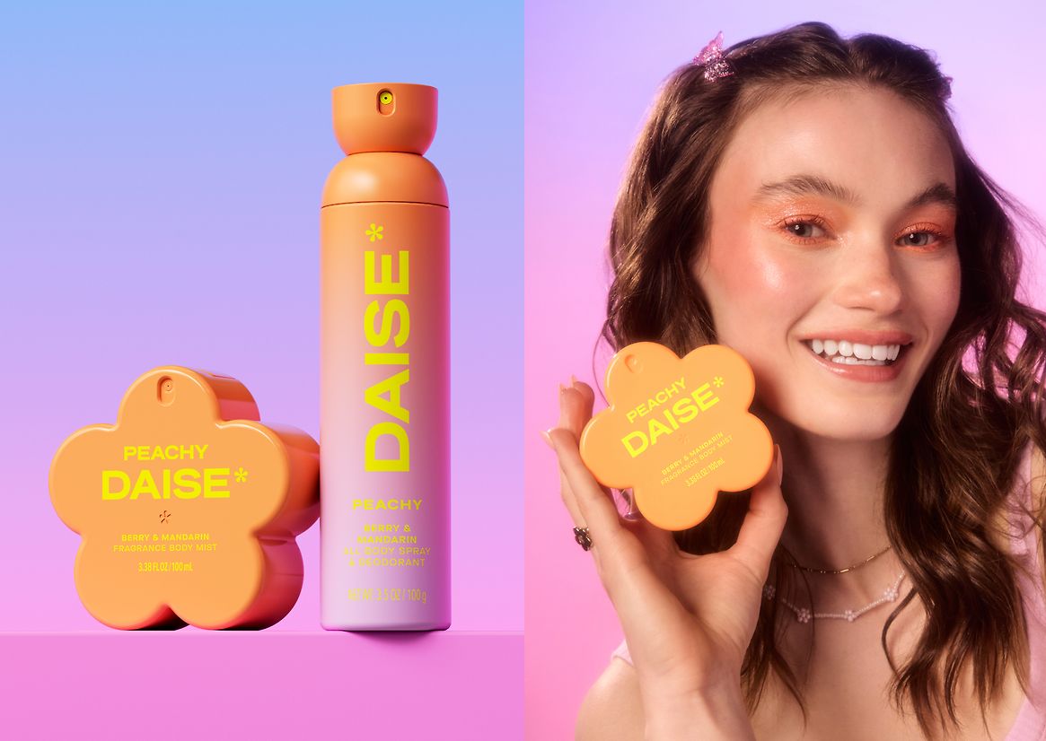
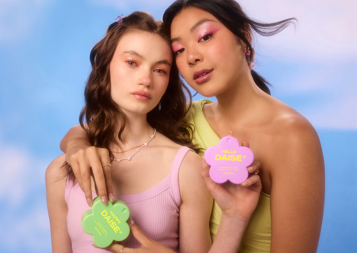
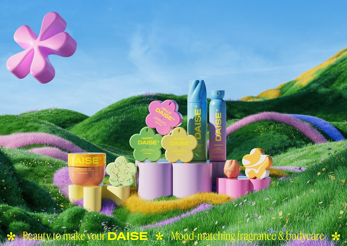
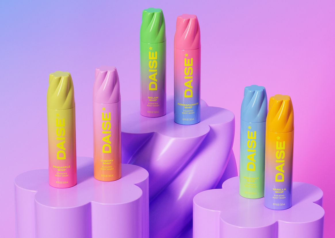
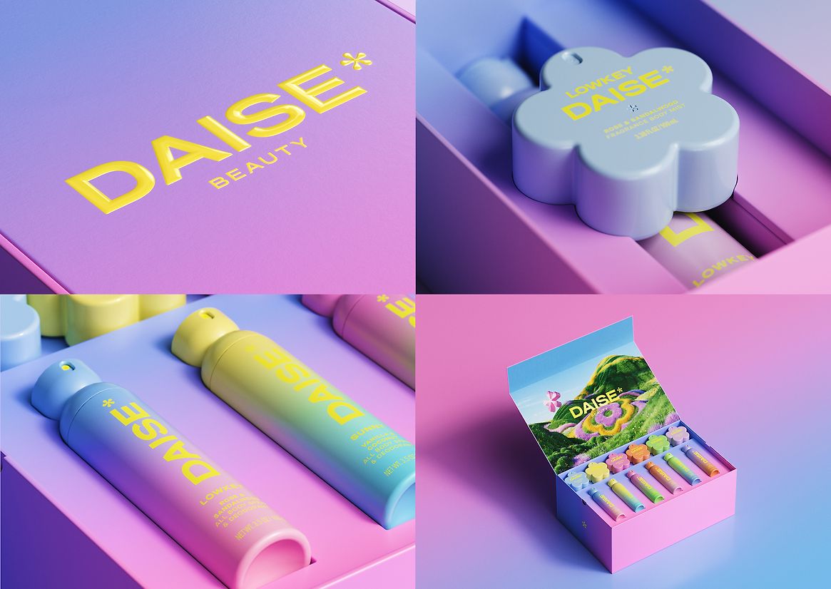
Enter DAISE: a bold new season in beauty. Rooted in play and expressive form, DAISE reimagines beauty as joyful, tactile, and immersive—designed specifically for Gen Zalpha.
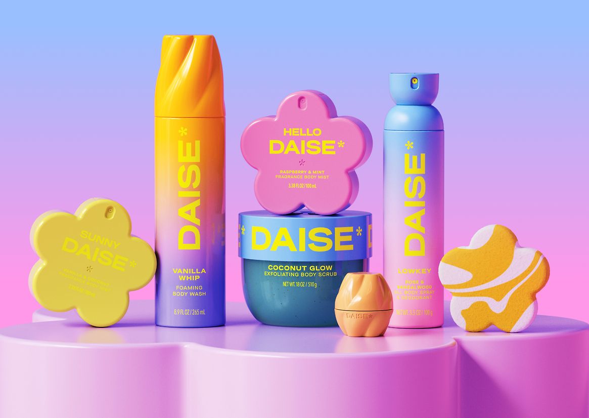
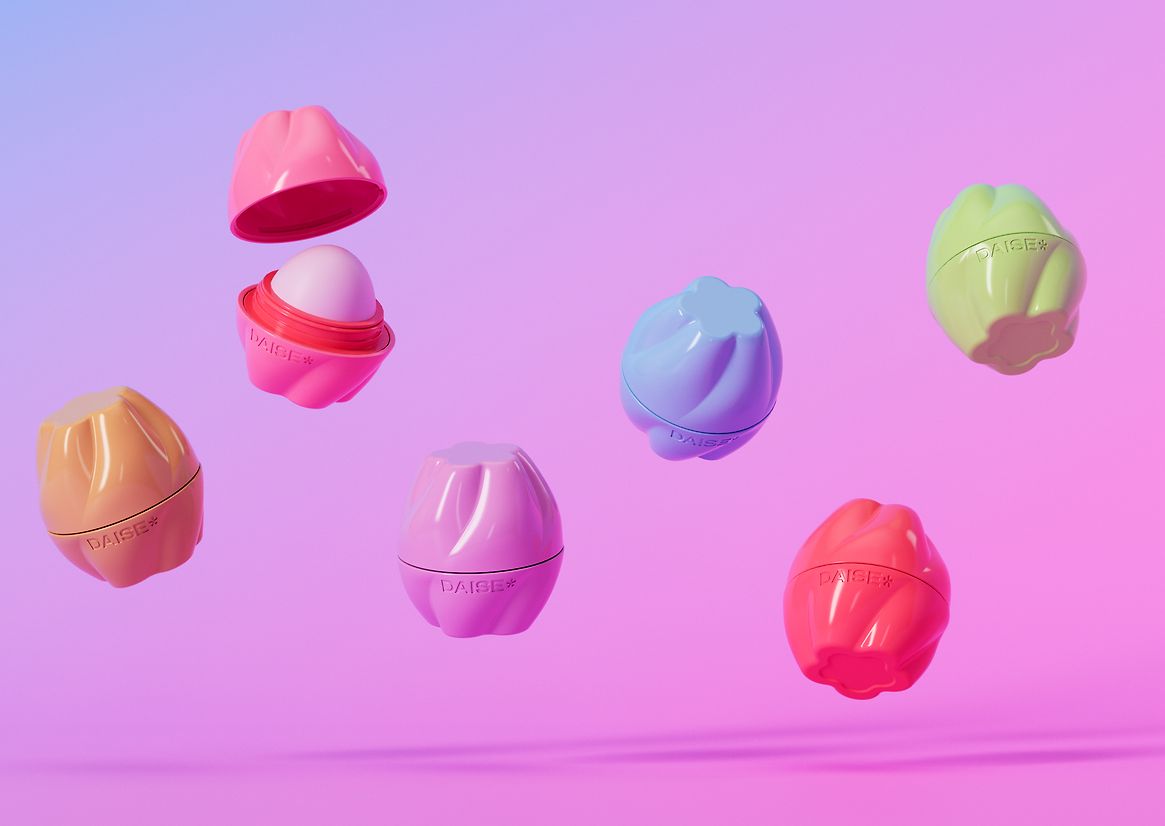
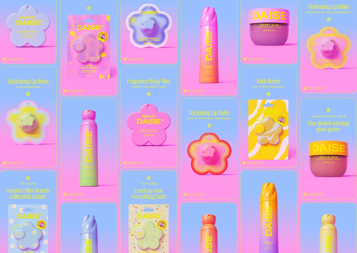
Inspired by blooming petals and spring light, the structural design leans into sculptural forms finished in satin and high-gloss textures that reflect light and invite touch. Each of the five fully custom-designed formats balances play with purpose—made for smaller hands, yet bold and collectible in feel.
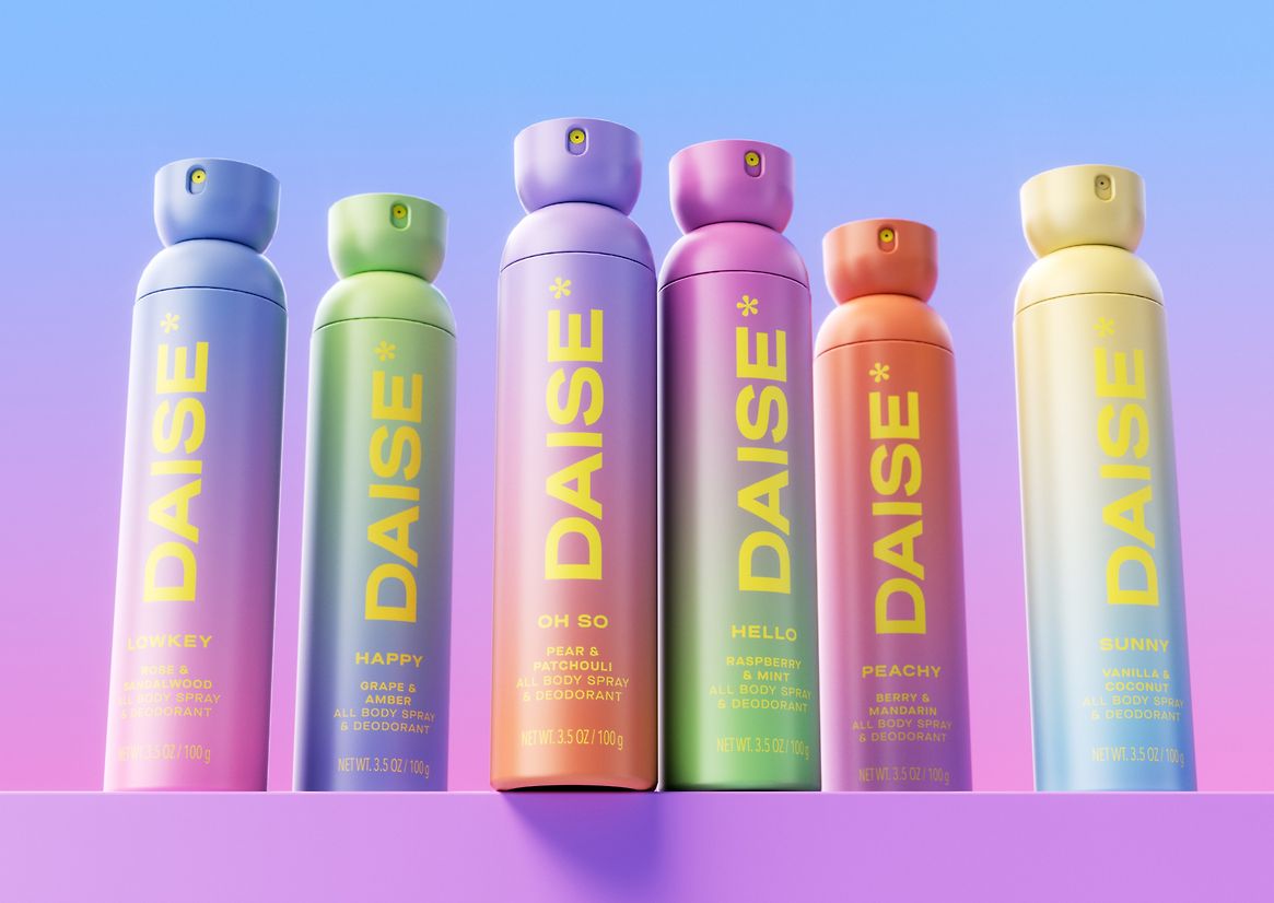
At the centre is the hero: a chubby, flower-shaped mist bottle with a built-in lock to prevent accidental sprays while on-the-go. The flower motif threads through the range—appearing as a lid swirl on the foaming whip, playful edges on the balm, a blooming bud on the aerosol, and a surprise reveal in the bath bombs.
Soft pastels contrast with the bright neon pop of the DAISE logo marque, while the flower-shaped asterisk acts as a visual side note—a playful wink suggesting there’s always more to discover. Each SKU is distinguished by vibrant ombré gradients, refined through extensive press testing for consistency and standout.
Inside, the playful experience continues: velvety balms, airy mists, and whipped foams designed for layering and sensory exploration.
From iconic form to tactile function, DAISE is packaging designed to be played with—and remembered.
Judge's comments:
Irresistible!