Water doesn’t have to be boring. Daeli was designed to transform daily hydration into a healthy, nourishing ritual worth looking forward to. Inspired by the bustling streets of Hong Kong, where salty, electrolyte-rich beverages are an entrenched part of urban life, Daeli offers a premium, science-backed hydration solution that’s as delicious as it is functional.
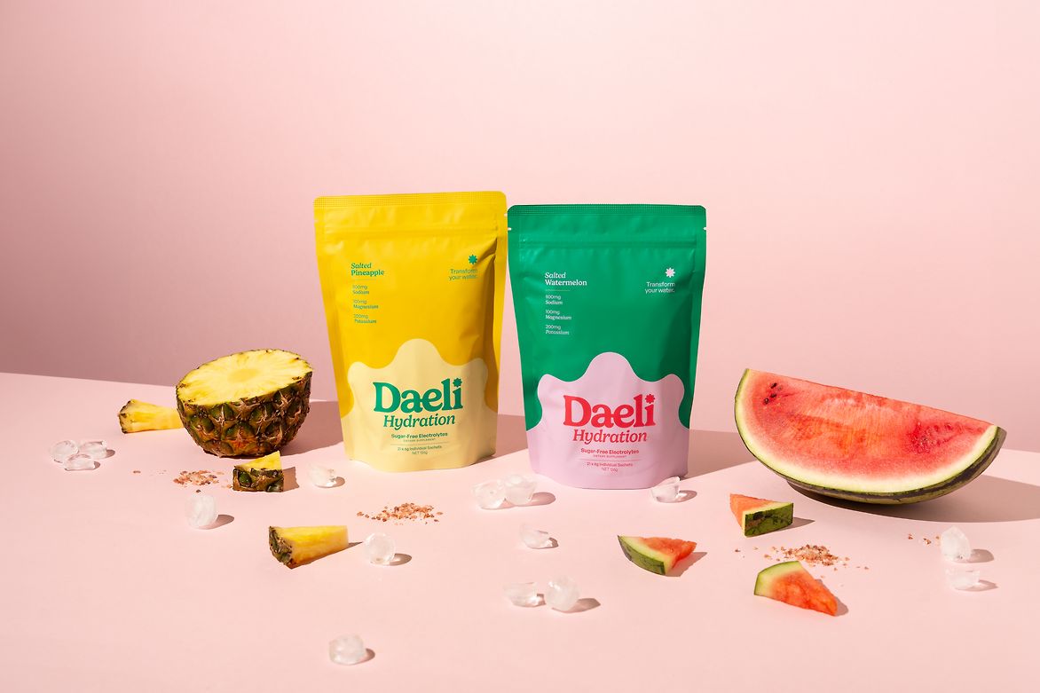
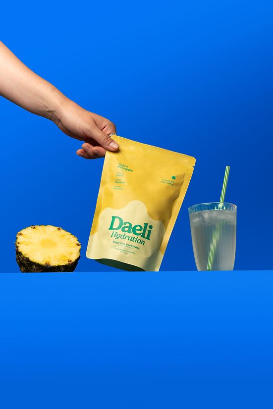
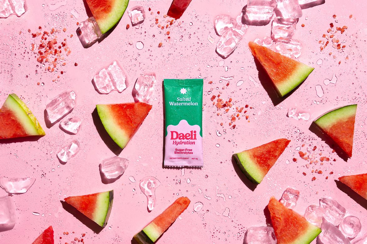
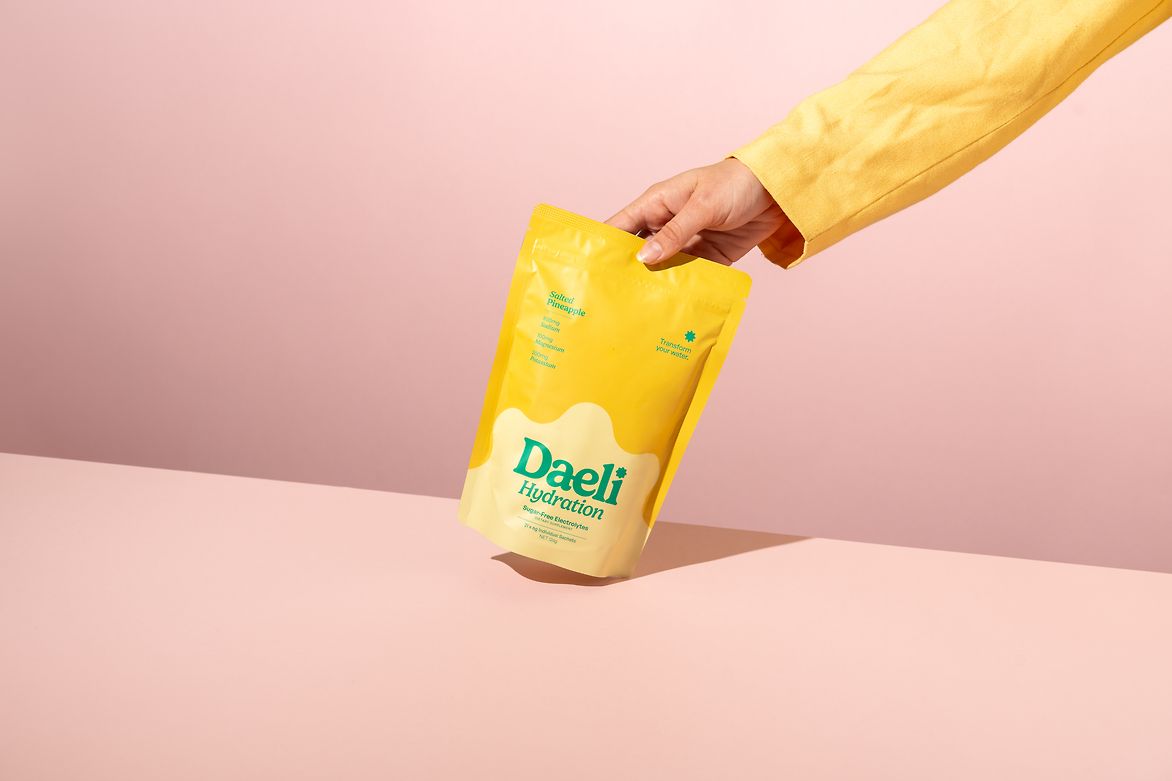
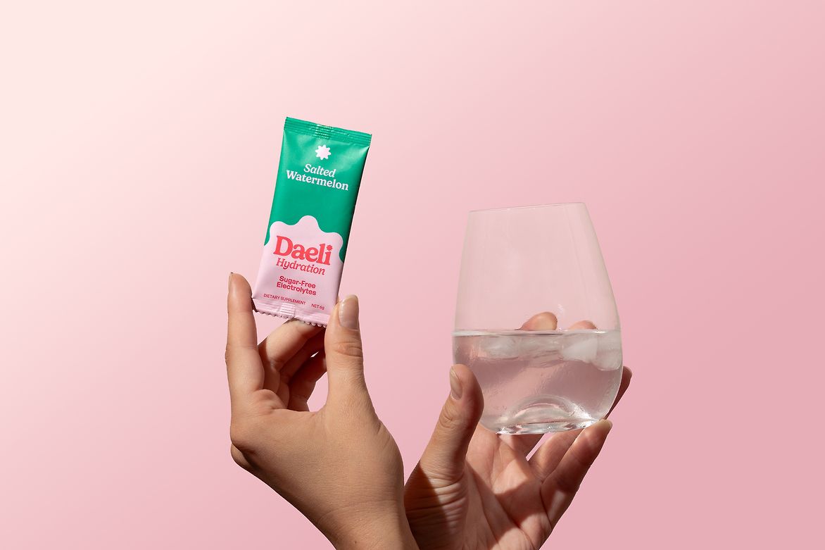
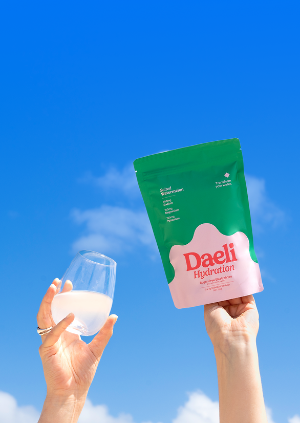
Our brand strategy was to develop a product that seamlessly blended aspiration with accessibility. We positioned Daeli as a daily essential, not just for sports enthusiasts, but for anyone looking to improve their hydration. Our concept revolved around the idea of transforming water into an experience worth looking forward to. This mission is at the heart of our packaging strategy. Vibrant, beautiful pouches become proudly displayed countertop showpieces while convenient, compact stick packs provide ease of use and transportability, wherever the day might take you. This energetic colour palette begs to be picked up – walking out the door with Daeli is a breeze.
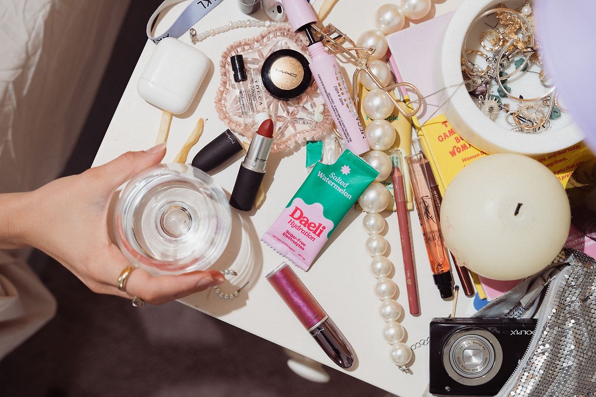
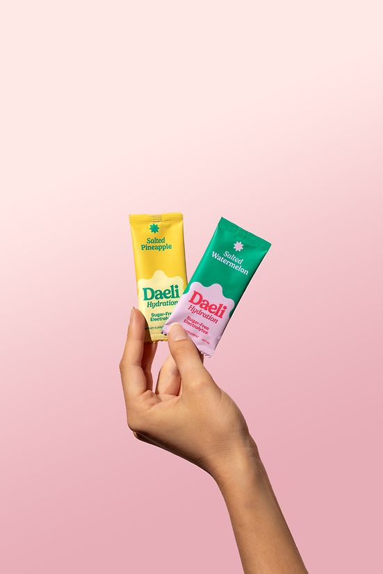
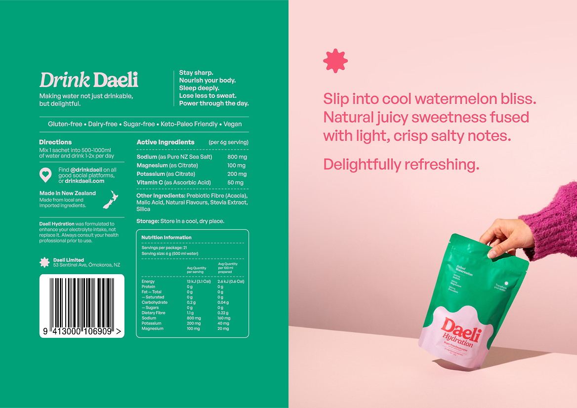
Whereas the brand colours are tethered to values and brand story, we opt for a more utilitarian packaging palette denoting the product’s flavour profiles. While the brand emanates a soft, meditative aura, the packaging is vibrant and loud, thoughtful yet enthusiastic. Daeli packaging is begging to be picked up, plucked from the supermarket shelf, or dug out of the depths of a gym bag. This shift in palette is essential in imbuing our packaging with purpose, and making it a part of the Daeli ritual.
The brandmark gains new dimension and prominence on the stand up pouch. Positioned to depict the daily rising and setting of the sun in direct reference to the brand’s core mission: to help people entrench consistent daily, healthy habits. We display key nutritional information in a way that is curated, steering clear of high octane imagery and embellished ‘science' motifs that are hallmarks of this market niche. We appeal to the brand’s focus on transparency and honesty. We pull back the curtain on the product’s sugar-free electrolyte composition, placing these figures front and centre, giving the discerning customer everything they need to make an informed decision. It’s all goodness, no fluff around here.
Daeli is a product born out of a desire to help people be healthier. It is electrolytes for everyone, not just performance athletes. It is hydration for the classically dehydrated (which turns out to be most people). Daeli’s packaging is a fundamental part of the product experience, and is more than a mere vehicle to be discarded. It is a reminder that water can be delightful.
Daeli’s project supports social and economic wellbeing by promoting healthier hydration habits and offering an accessible, premium product made with pure New Zealand sea salt. The brand’s identity and messaging were crafted to resonate with a diverse audience beyond the typical demographic that hydration products are marketed to, promoting healthy daily habits for everyone. The innovative design and strategic execution elevate Daeli beyond typical electrolyte drinks, making it a standout product in the market.
Description:
Water doesn’t have to be boring. Daeli was designed to transform daily hydration into a healthy, nourishing ritual worth looking forward to. Inspired by the bustling streets of Hong Kong, where salty, electrolyte-rich beverages are an entrenched part of urban life, Daeli offers a premium, science-backed hydration solution that’s as delicious as it is functional.
Our brand strategy was to develop a product that seamlessly blended aspiration with accessibility. We positioned Daeli as a daily essential, not just for sports enthusiasts, but for anyone looking to improve their hydration. Our concept revolved around the idea of transforming water into an experience worth looking forward to. This mission is at the heart of our packaging strategy. Vibrant, beautiful pouches become proudly displayed countertop showpieces while convenient, compact stick packs provide ease of use and transportability, wherever the day might take you. This energetic colour palette begs to be picked up – walking out the door with Daeli is a breeze.
Whereas the brand colours are tethered to values and brand story, we opt for a more utilitarian packaging palette denoting the product’s flavour profiles. While the brand emanates a soft, meditative aura, the packaging is vibrant and loud, thoughtful yet enthusiastic. Daeli packaging is begging to be picked up, plucked from the supermarket shelf, or dug out of the depths of a gym bag. This shift in palette is essential in imbuing our packaging with purpose, and making it a part of the Daeli ritual.
The brandmark gains new dimension and prominence on the stand up pouch. Positioned to depict the daily rising and setting of the sun in direct reference to the brand’s core mission: to help people entrench consistent daily, healthy habits. We display key nutritional information in a way that is curated, steering clear of high octane imagery and embellished ‘science' motifs that are hallmarks of this market niche. We appeal to the brand’s focus on transparency and honesty. We pull back the curtain on the product’s sugar-free electrolyte composition, placing these figures front and centre, giving the discerning customer everything they need to make an informed decision. It’s all goodness, no fluff around here.
Daeli is a product born out of a desire to help people be healthier. It is electrolytes for everyone, not just performance athletes. It is hydration for the classically dehydrated (which turns out to be most people). Daeli’s packaging is a fundamental part of the product experience, and is more than a mere vehicle to be discarded. It is a reminder that water can be delightful.
Daeli’s project supports social and economic wellbeing by promoting healthier hydration habits and offering an accessible, premium product made with pure New Zealand sea salt. The brand’s identity and messaging were crafted to resonate with a diverse audience beyond the typical demographic that hydration products are marketed to, promoting healthy daily habits for everyone. The innovative design and strategic execution elevate Daeli beyond typical electrolyte drinks, making it a standout product in the market.